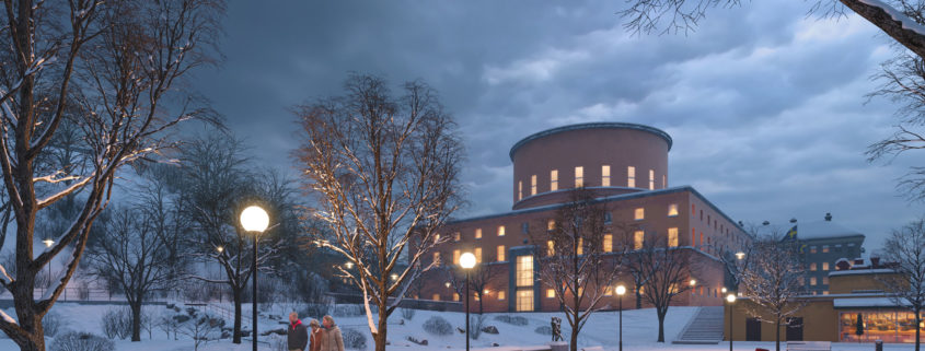
A new and exciting challenge is about to begin! Tomorrow is back for the 3rd time and looking for their next star. The best submission will be awarded 1000 Euro cash prize and a well-paid full-time position at Tomorrow with benefits such as social welfare, exercise bonus, field-trips and most of all become a proud Tomorrow team member.

Tomorrow 2019 Challenge entry by Jeremy Gamelin

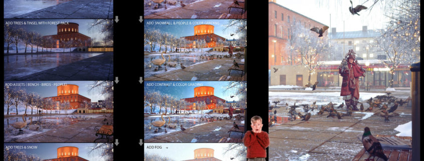
I use 3ds Max & Fstorm Render & Photoshop for color grading

Home Alone is my inspiration because i was home alone when i made this image with the movie in background. 🙂

I hope that this image will take you back to 90’s nostalgia as it does with me.

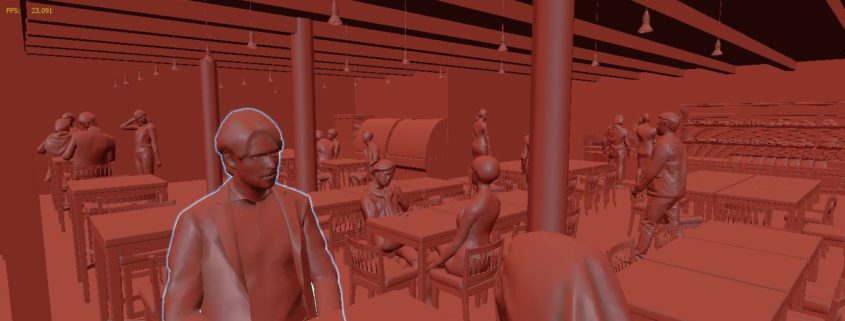
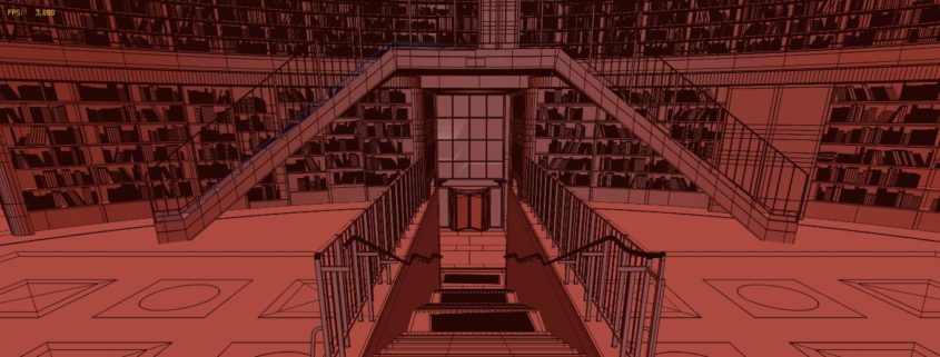
I am a bit sorry, because my workstation died on January 6, I had to receive a new pc last week to finalize my other images but unfortunately the delivery will be done next week. I post my latest version of the external view. Unfortunately the entire contest will not be made for me, I am out of play, but it does not matter, I had a lot of fun on this project.

Et Voilà !

Tomorrow 2019 Challenge entry by peter hofstetter

Unfortunately – as I expected – I was not able to finish all the deliverables but I wanted to share the work I have done with you anyway.
Try new software:
My goal to try some new software.
I worked with the quixel mixer for the first time and was impressed how easy it was to use. I did the texture for the steps with the mixer. A stone floor with wetness added and some decal on it to break up the tidiness.
The second thing I wanted to try was the speedtree software. The very particular shape of the trees was perfect for that task because I had nothing comparable in my library. I didn`t get it quite right but keeping in mind that it was the first time working with that software the result was close enough for me. I am quite happy my generated trees.
Composition:
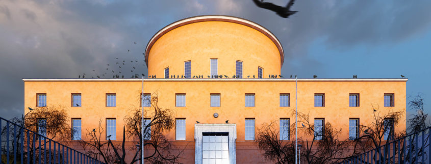
I wanted to reflect the regular shape of the building in my image so I went for a square format. The main ledge of the library is dividing the image in two equal halves. The shadow ends at the lower third of the image – following the rule of thirds but breaking them a bit.
I put a flying crow on the top right third to catch the eye and lead them towards the building. Also the man is situated on one of the thirds walking to the building.
Light:
I wanted to create an autumn morning mood right after a storm. The bottom third of the image is still in the shadow to set the focus on the main character – the building with most of its parts already lit by the morning sun.
The reflection of the sun in the glass of the main entrance is slightly out of the center and its bright reflection hitting the wet surface of the stairs again leads the eye of the viewer to the main focus of the image.
Materials:
Two materials were very important for me. Firstly, the color and texture of the facade with its significant stains. I think I nailed that part. And secondly the worn and wet texture of the walls next to the steps leading to the library.
I used a distance map to get the stains under the letters and AO maps to get the wet stains on top and bottom of the wall. Maybe the contrast here is a bit too strong.
After all I am happy with the result and I hope you guys like it too.