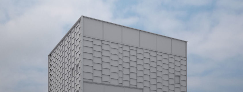
Tomorrow Challenge entry by User-64260028

The first step approaching the challenge was to gather as many references as possible on the web.
Added to the images provided, I started crossing information to establish the measures.
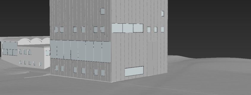
It took time, but it granted me to replicate the wall covering as close as possible to reality, respecting the particular pattern that makes the building highly recognisable.
Once the inner structure has been modelled, I moved forward the wall covering, creating and duplicating (Instancing in 3ds) single boxes in rows mantaining the option to edit a single row at once.
With the entire building done I then moved on to model the terrain. I subdivided the surface, and applied a displace modifier to simulate little level changes in the terrain.

Tomorrow Challenge entry by User-12535892

The first thing I have done is to try to understand the project and its dialogue with environment and its interior functioning.
Afterwards I stood out with a main idea which is to show the relationship between the museum, the lake, the park, the castle and the city, and to bring out the important interior spaces.
So it was necessary to find the right shot that gathers the max of elements, that’s why I chose this view that shows the project and the lake and the castle and the two interior spaces that communicate with the park and the lake and the town, which are the white box where one side can open completely to bring the park and lake inside, and the library which has a view over the city.
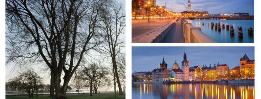
At first I chose to make bare trees to make the museum more visible, and for the mood I chose the early evening to have a little light from the sky, and bring out the two Interior spaces by artificial light, and also to have the reflection of the museum and the castle on the lake, and playing with the depth of field to put the museum in value while adding a bokeh effect with hexagonal shape inspired from interior tables designed by Tham & Videgård Arkitekter.

Tomorrow Challenge entry by User-12590773

unfortunately the timing for this challenge is not very good for me because of the projects that i have to deliver to the clients this month.
so far the most challenging part for me was the modeling the wood planks because of absence the good blueprints for elevations.
i wish that i can make it to the end regarding the lack of time.

Tomorrow Challenge entry by User-12535892

Afterwards I stood out with a main idea which is to show the relationship between the museum, the lake, the park, the castle and the city, and to bring out the important interior spaces.
So it was necessary to find the right shot that gathers the max of elements, that’s why I chose this view that shows the project and the lake and the castle and the two interior spaces that communicate with the park and the lake and the town, which are the white box where one side can open completely to bring the park and lake inside, and the library which has a view over the city.
At first I chose to make bare trees to make the museum more visible, and for the mood I chose the early evening to have a little light from the sky, and bring out the two Interior spaces by artificial light, and also to have the reflection of the museum and the castle on the lake, and playing with the depth of field to put the museum in value while adding a bokeh effect with hexagonal shape inspired from interior tables designed by Tham & Videgård Arkitekter.