Tomorrow Challenge entry by User-76078368

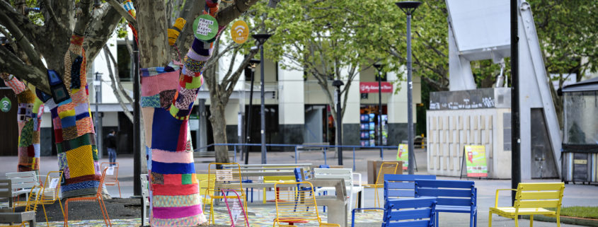
As this is an art museum i have decided to do something artsy. Since i am showing the museum in more or less its natural environment i needed to be creative about how i dressed the environment. I want to keep the feeling that the dressing is temporary. The pop-up park and social study in garema place, canberra caught my eye.

Tomorrow Challenge entry by User-4453215

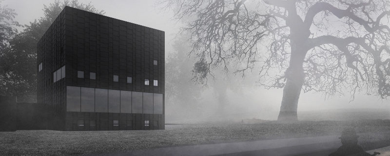
I got the inspiration looking at some photographs of Sweeden, where I noticed many of them were surrounded by huge trees and dense fog. It immediately occurred to me Tschumi’s idea.
The rest was a research for the composition and atmosphere. I based my work on some photographs of Peter Zumthor’s thermal baths in Vals, (the way water and stone complemented each other and a dense fog hovering above the water); and from some photographs taken in Venice in a similiar situation.
As for the composition, I decided to show the library a bit far away, from the water, with a misterious human figure in the foreground, while the background disappeared in the fog.

Tomorrow Challenge entry by User-78401243

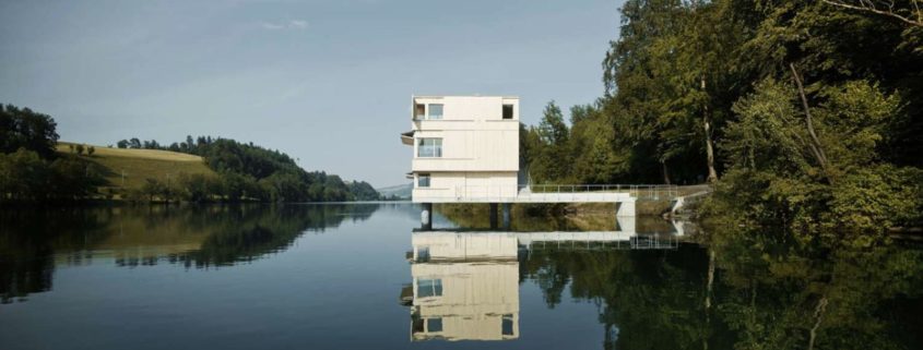
I had initially planned to base the project around a dry and warm environment such a desert. But then i stumbled on this particular set of images on Pinterest and felt the architecture of the Kalmar Museum of Art would sit nicely in place of the existing Zielturm Rotsee..

Tomorrow Challenge entry by User-64260028

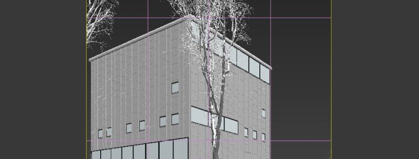
After modelling the building, I placed the camera, following the concept I had in mind. I really liked the great window of the gallery so i decided to show that side of the building. The following step was adding the exterior lamps, the trees, vegetation, snow on the roof and some snow mounds, to create visual interest and guide the viewers eye.
I then placed a dome light with a HDRi map to simulate a sky with an overcast sun. The dome light was linked to a vray sun system with a very low sun contribution, just to light more the side wall of the Museum. To test the light I made some renders with an override material. Then I placed the interior lights, a mix of planar and ies light, balanced the overall lighting setting and started to apply materials. Once satisfied with the lights, I started to apply materials. The materials set up was really simple, but I pushed it a bit more forward for the ground texture, using normal maps to simulate height change, saving resources for the displacement used instead in the snow mounds. The ground material is made by two different textures mixed by a mask in a vray blend material. It was then rendered in two different version, to have some freedom of choice. The trees were rendered apart too, to mantain flexibility in the compositing phase. The main render setup is a combination of brute force and light cache in a linear workflow. I rendered all the passes needed to composite my image such as Zdepth, ObjectID, Reflection, Refraction and so on.
Once all was done i moved to the compositing phase.

Tomorrow Challenge entry by User-17017549

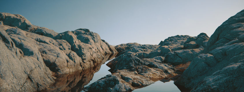
The modeling process was little tricky, instead of modeling stone by stone I decided to divide the landscape to 5 parts, and for each part I created two 8k maps (32bit displacement and 8bit normal map). I used GeometryHD in Zbrush, each part of landscape has 150 mln. polygons. I refused to use Mari, even 8k maps were not enough for decent quality texture. So, I textured everything in 3dsmax, through Bercon Noise.