Hello friends!
I am very excited to be participating in this challenge. It is a fantastic opportunity for me and I appreciate it a lot.
I started with going through the provided model and noticed some misaligned placement of windows. I corrected this by following reference pictures and publicly available drawings. This helped me give a good understand of the shape of the building and how it fits to its cramped surrounding area.
I really like the design of the building, with its rusted steel metal plates as it fits in perfectly with the surrounding brick layered buildings.
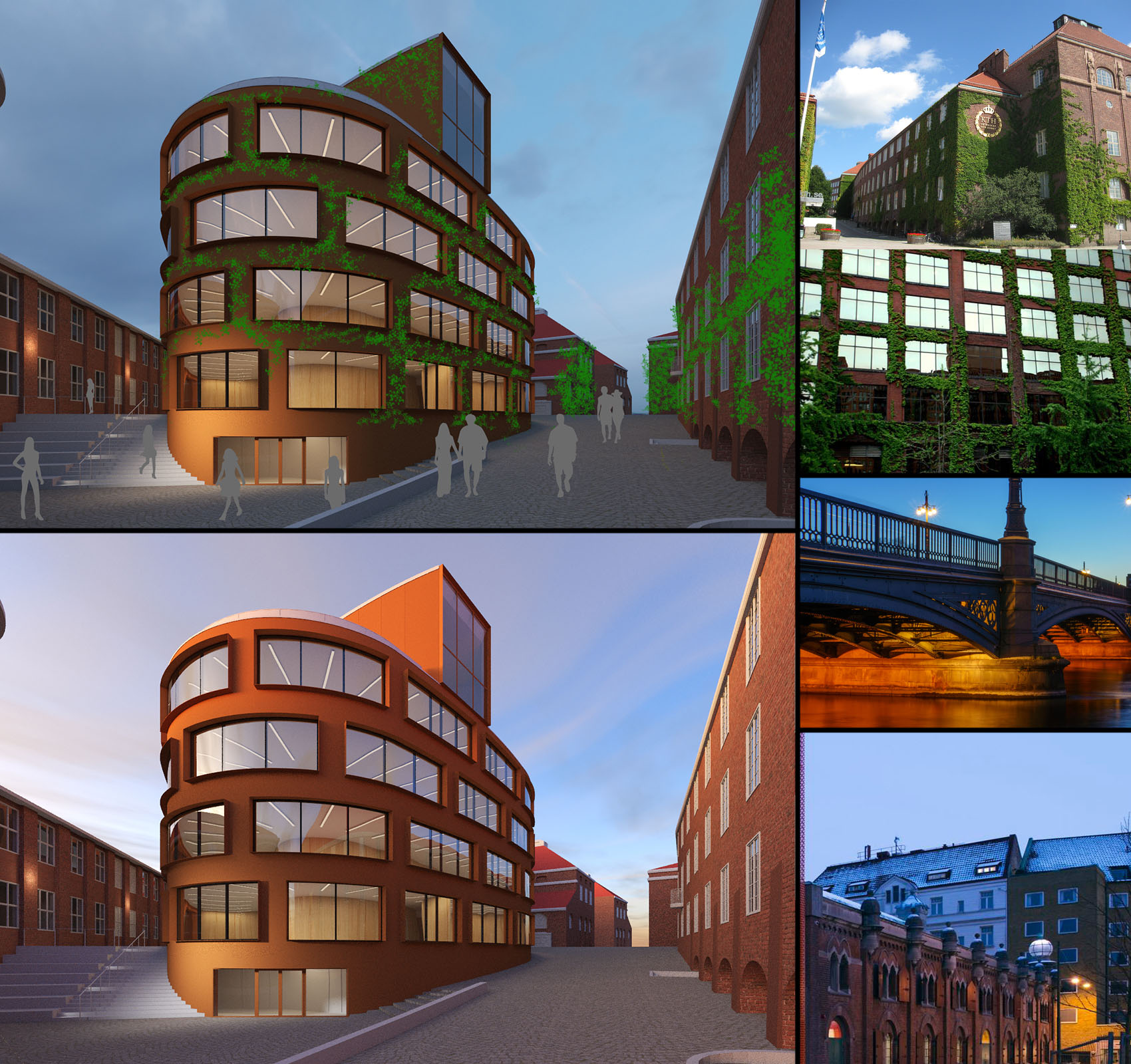
I wanted to add more life and contrast to the facade by adding ivy along the wall. Ivy is also something that is coherent with the campus entrance. The colours I am going for are a contrast to the striking red facade with a clear and cold blue sky. A cold and calm Stockholm evening.
Early render of the new model and reference images are provided.
Happy New Year!


