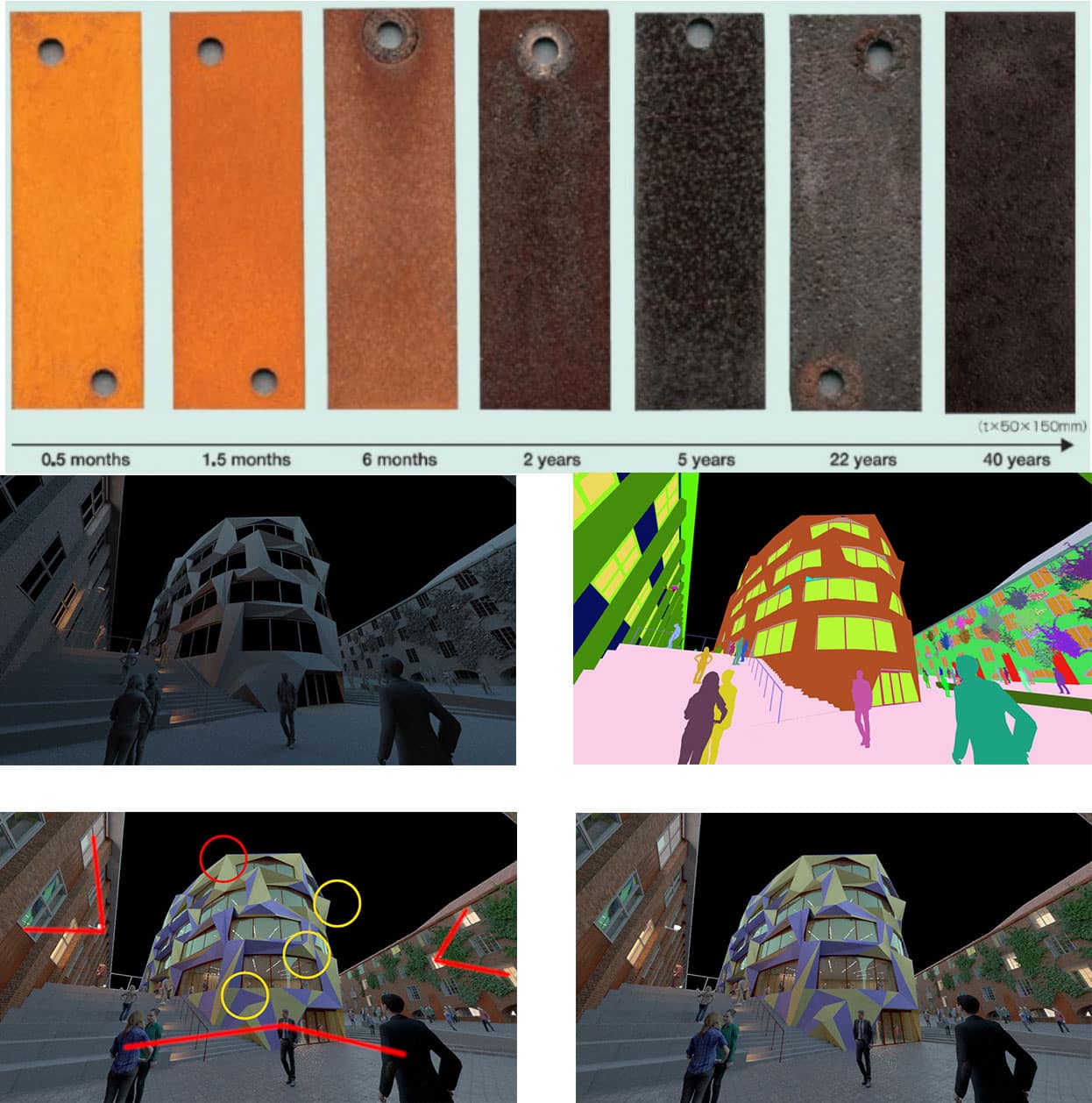
I subscribe to Materia.nl Newsletter. When I researched the materials used on this Building I noted the colour range and weathering the material goes through over a period of 20 years. I have also attached images of various render outputs, that I use when compositing in Photoshop.
In the Image with the Markings, you can see that I have done a lot of deliberate lighting and object placement, I have lit up 3 windows on the right building to create a visual arrow, and again on the left to create a visual arrow, the three yellow circles, you can see where I have deliberately modelled triangular faces to lead the eye around the building, and finally the Swedish Flag colours have been used with predominantly darker blues on the base, and lighter yellows on the top of the building to further lead the eye across the building. I have not focused on the interior of the building, and am trying to establish a juxtaposition between old Sweden and New Sweden.


