UPDATE – March 20
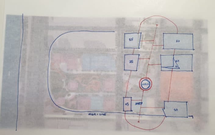
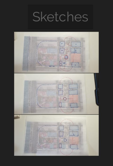
With the concept of the ARM in mind, I developed it’s massing accordingly to the master plan of Hudson Yards from our brief resources.
_Through the rough sketches, I would like to have the mass as simply as possible so it could strengthen the initial concept without any spare additional “legs”._
_Also, By sketching on the master plan, I see that vertically there is need to have a connection between the ARM and the VESSEL underneath. This should be noticed and developed further in the next stage._
_At first, I think the materiality for the ARM could be covered by 100% transparent glass, then I came up with the idea of divide the skin of the ARM structure into multiple parts where it will be opaque glass, this gives the skywalkers a feeling of resting and framing the view better rather than distracting by spinning around._
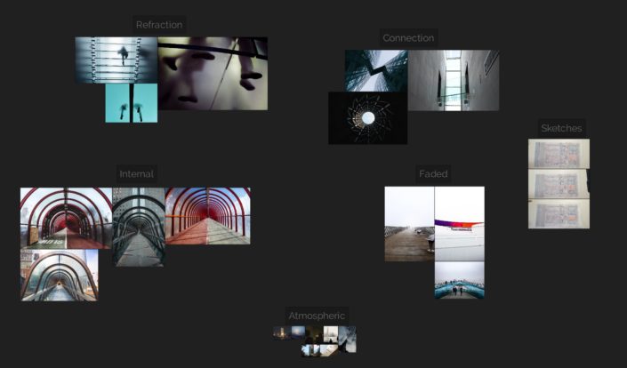
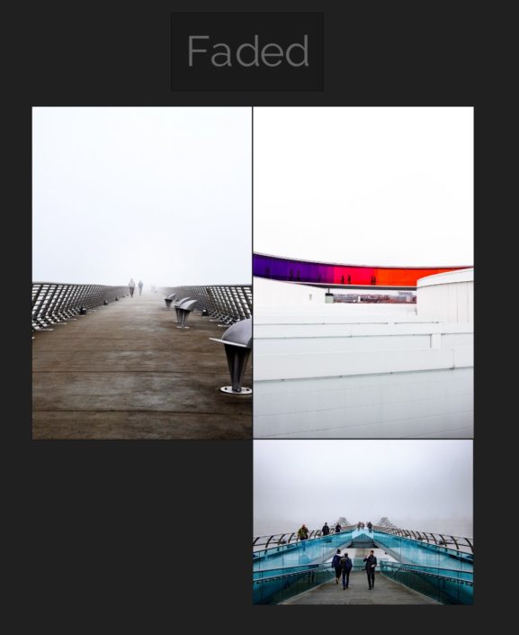
_I collected a few photos of what helps me form an understanding of how sky bridges connections could be captures emotionally._
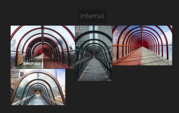
_Internal spaces are put on my list of potential views I could end up having at least one in order to explain how it will look like from the inside, and these pictures evoke a lot more ideas for me at this stage:_
_And having some part of the structure opening out to the sky:_
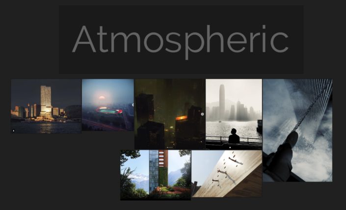
_Finally, I put together the atmospheric images I saved long time ago which reminds me of interesting compositions, colour palettes, lighting conditions and camera angles that I can study and learn from._
Image credit (Not in order) : Alex Hogrefe, alisonbrooksarchitects, andrew whitmore, christopher burns, aron-van-de-pol, janurschel, henninglarsenarchitects, powerhousecompany, rafal-naczynski, tim-mossholder, ryan-johnston.
Thank you for visiting the post,
C&C is very much welcome!
Duy Phan




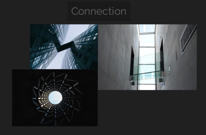
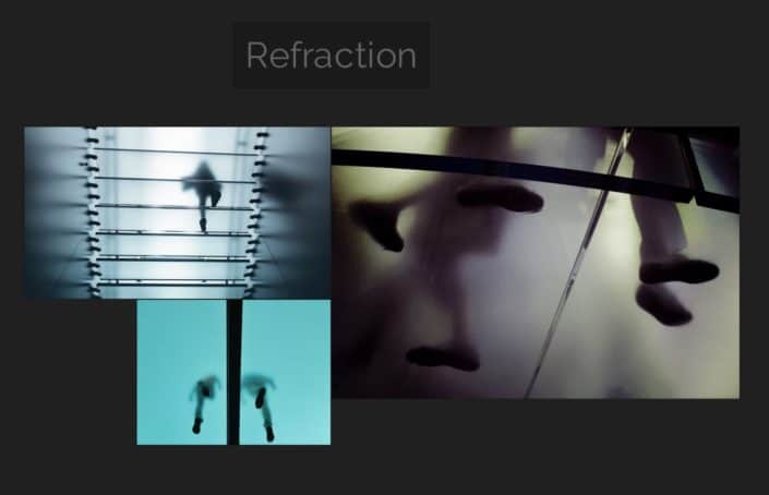


Highlighting this part so people check the original post and see these (I might need to allow the full post to go into TALK… one more for the DEV team).
For sure no extra legs! go go go
Thanks a lot, @ronen !
I thought I was doing something wrong with my post when didn’t see the other images here!
Working on it now and will come back with new update soon!
Hi Duy, I like so much the concept and it’s social meaning. I think you could work both on galss textures (opaque/transparent/mirror) internal lighting (maybe exterior night view?) and different weather condition (interior of the bridge with rain?).
I don’t know why but you make me remind this image of Muti Gianluca (totally different context)
Keep on going
Thanks, @Flow , the rainy mood interior image you sent is an emotion riser. Have a lot to learn from!
Cheers,
Duy