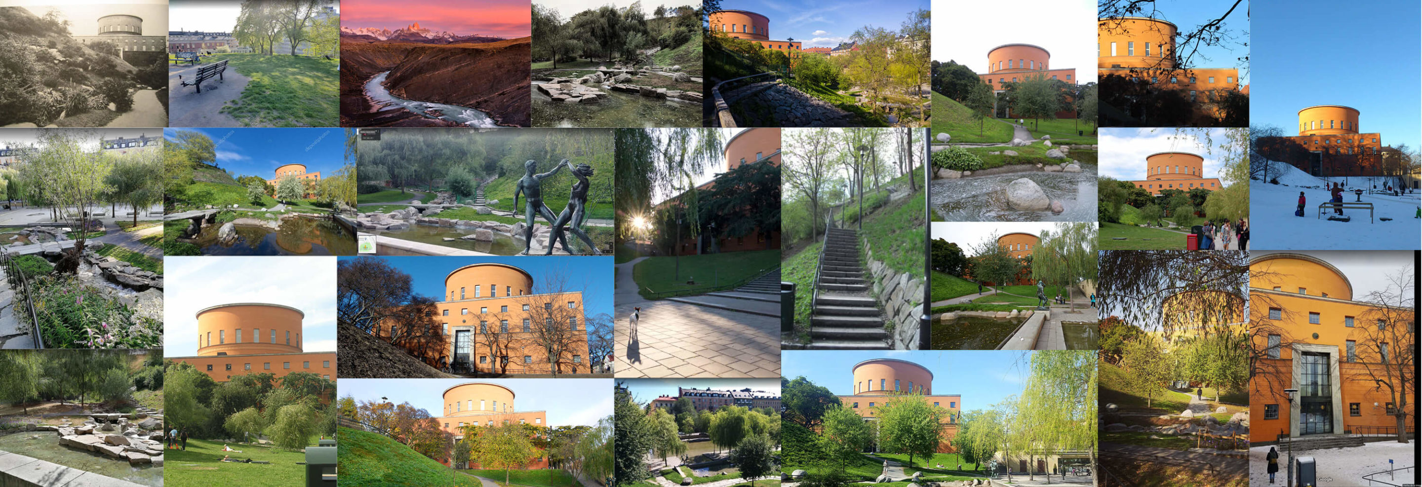
I started the whole thing by doing a little bit of research as ususal, I bumped into an article by Caroline Constant that analyzes Gunnar Asplund’s “numerous site proposals as well as his subsequent designs for the library park in order to situate the building in a broader discussion of issues central to his architecture – the relationship between space and man, between object and man, between nature and man.”
From there, I decided I wanted to focus my image on what Constant describes as Asplund’s fusion between a monumental architectural conception with a monumentalization of the natural terrain.
Here is a link to the article I talk about: (Spanish and English)
http://www.coam.es/media/Default%20Files/fundacion/biblioteca/revista-arquitectura-100/1987-1990/docs/revista-articulos/revista-arquitectura-1989-n280-pag54-67.pdf


Ok, so I just saw that I’m only allowed to upload one concept card, so I’ll have to expand:
Architecture_&_Light_Interior_Concept
I wanted to focus this interior image in the relation between architecture and light, I found this lecture by Martin Schwartz on youtube that talks about Gunnar Asplund’s considerations of light for the building. The library’s central hall was the fisrt obvious choice buecause of it’s charachteristics, but as you start wandering around the internet you stumble upon other interesting details the building has to offer. Walking around the library’s virtual tour you get to see how light linteracts with other spaces inside the buildings.
Here’s the link to the video:
[https://www.youtube.com/watch?v=xpOUhFtN-20]