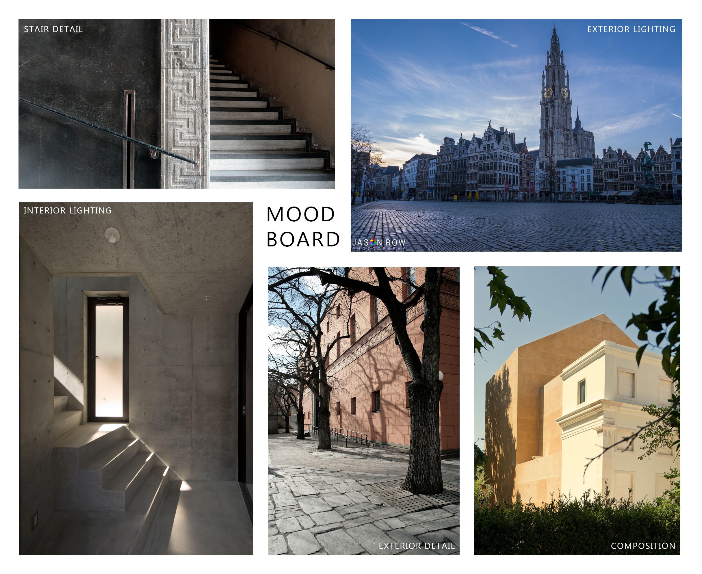
It’s been one week since the release of the building model, and I’ve been hard at work planning the mood, composition, and purpose of the three images that I’ll be submitting for this competition.
The exterior shot was difficult to pin down at first. I finally decided that a closer, more intimate view of the building would bring out the trim detail, as well as the rich stucco texture. A closer shot also makes a more interesting, minimalist composition, which I think works nicely with the geometric nature of the library.
For lighting, I imagine a crisp European morning with blue hour light illuminating the building. I want to capture the stillness of a waking city, and the foggy, misty atmosphere that comes right after a rainfall.
For the interior shot, I want to focus on the intersection of staircases in the entrance hall. This image will be an exercise in lighting and composition, using the stairs and natural light to create a powerful image.
Most of all, I want to tell a story with each image. I’ll be focusing on the people who use the space every day, and capture small vignettes of daily life in Stockholm. I’ve made some headway on the initial modeling, and am slowly honing in on the views I’d like to focus on. White models are soon to follow!


Start the discussion at talk.ronenbekerman.com