Hello everyone 🙂
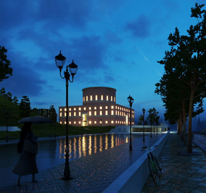
In my opinion, The absence of light in the city makes the enlighted library present as a point to invite people ! so i used to dark style and warm lighting.
First off , I used a single material to implement my desired custom lighting. Secondly, with taking a look at the reference photos, I came to realize that I should use dark spaces to make the competition subject ( Library ) dray attention with its lighting.
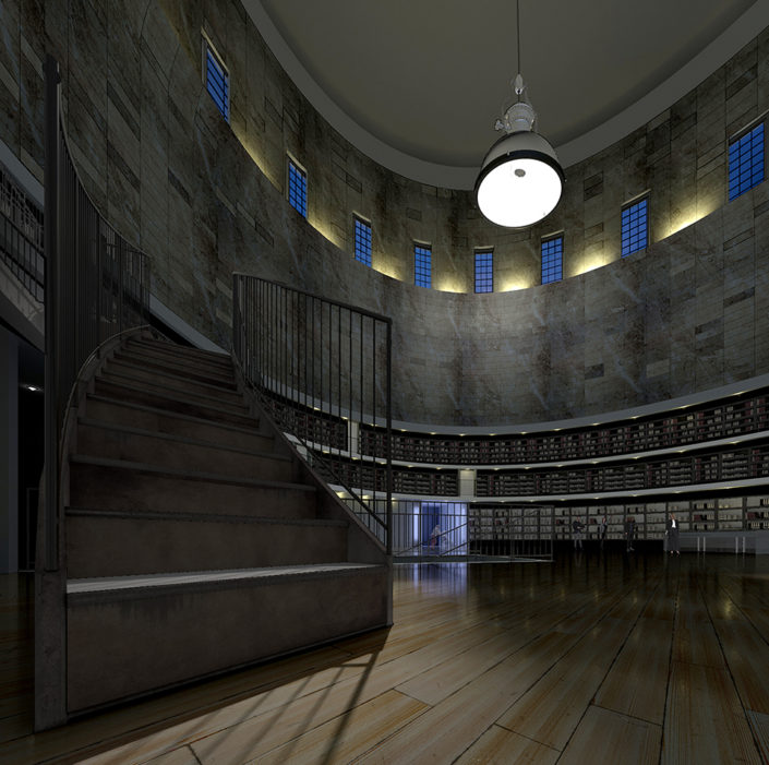
Moreover, In the interior space, I tried to use the contrast of light and shadow to have a soley dark or bright space.
One of the challenges that I face during the course of this process was the texuring and shadering of the library’s interior wall. I unwrapping !
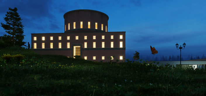
Additionally, In 2nd render it was difficult for me to place the camera since the lawn was covering the lense, However I managed to get desired frame.
Finally , Thanks for the great opportunity you give to 3d artists to get noticed.


Start the discussion at talk.ronenbekerman.com