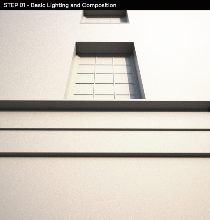
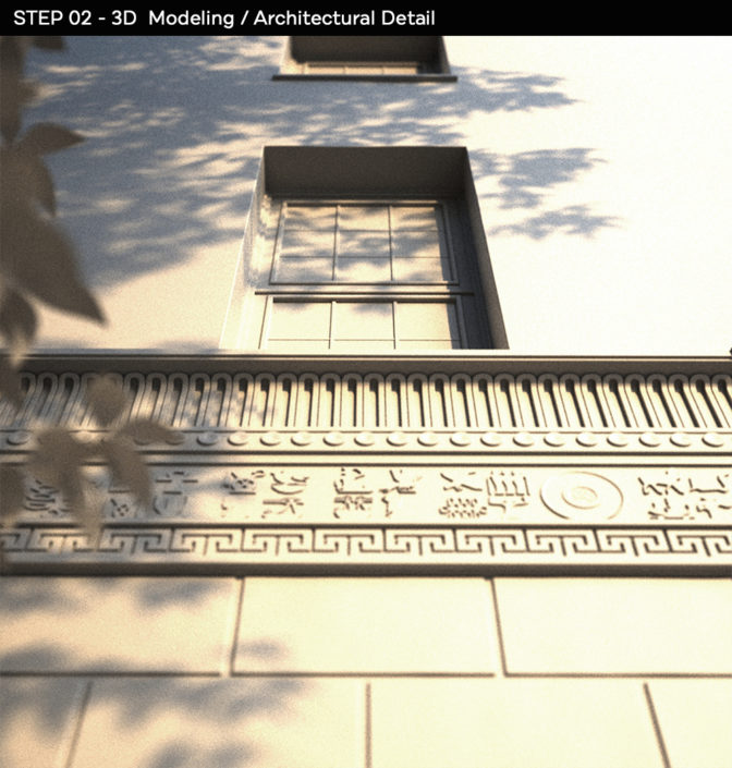
Here’s my progress on images #2 and #3, along with a quick breakdown of the steps I followed!
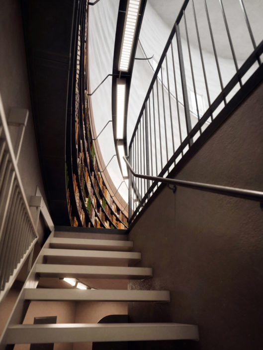
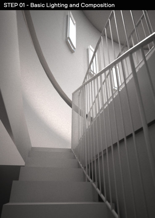
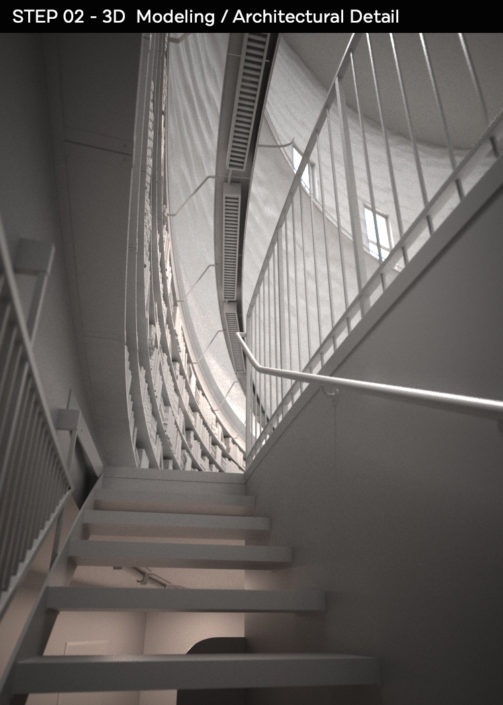
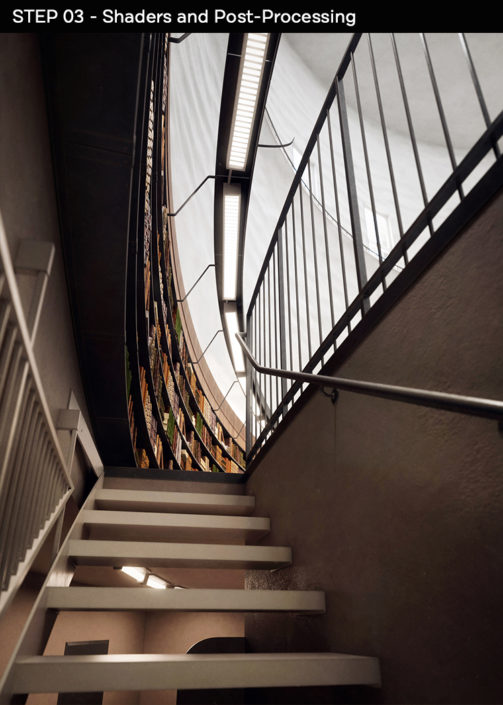
For the interior render I tried to find an angle that was more unique / interesting than just showing the entire room. I wanted to find a point of view that felt a bit more dramatic, and made you want to explore the rest of the library. I ended up choosing the staircase camera, which felt perfect: it gave the viewers a peak of the endless sea of books above, while showing off the interesting details of this room’s unique circular ceiling architecture.
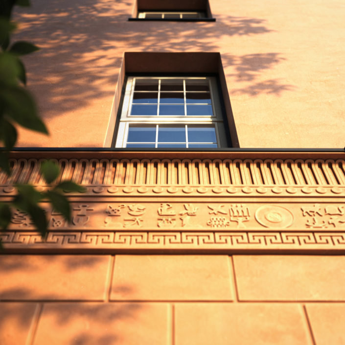
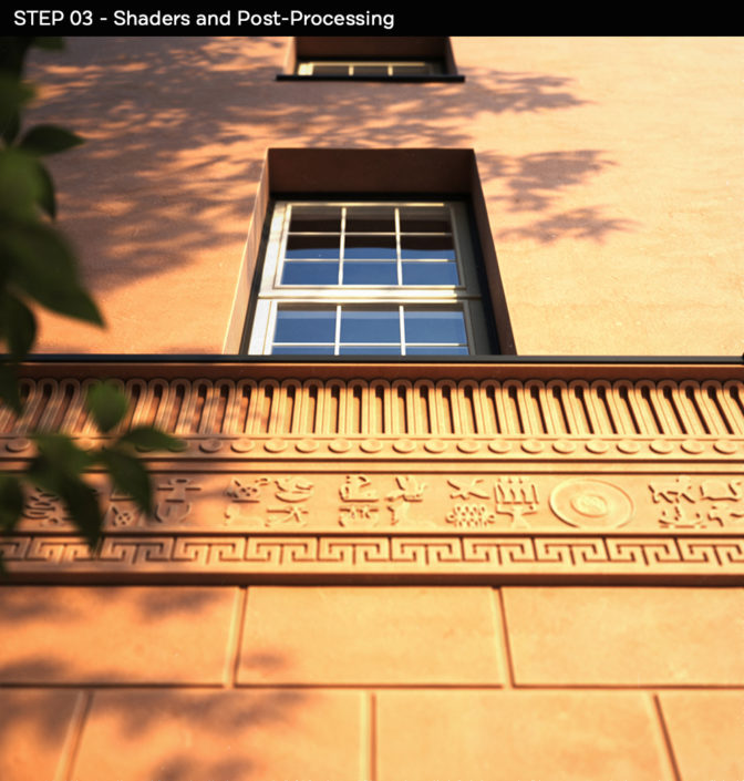
For the third render, I ended up going back to the exterior building. I felt like the architectural details weren’t highlighted enough in the main exterior shot, and decided they deserved the spotlight in my final image. I chose a symmetrical angle using one of the bottom window as the main focus. My goal was to show the architectural ornaments with as much details as possible. I refined the 3D models of everything on this part of the building, and used natural sunlight as well as shadows from a nearby tree to create a simple, yet realistic and rich render. Hope you like it!




Start the discussion at talk.ronenbekerman.com