Tomorrow Challenge entry by User-28384293
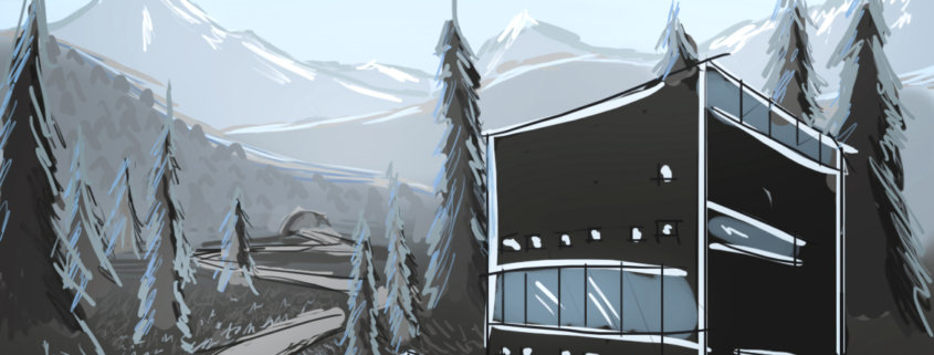
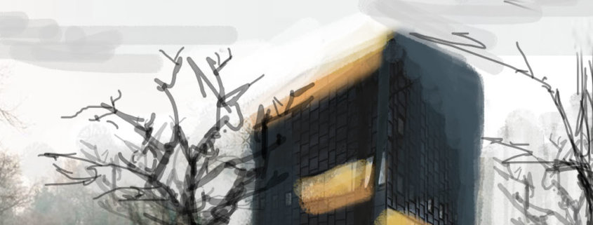
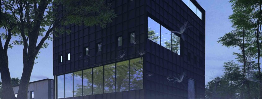
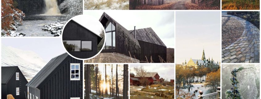
The first thing, that I did when started the project, was to gather references, as most of us do. By, analyzing the photographs I came to conclusion, that the most compositionally powerful and attractive part of the building to show is the façade of so-called “white box” gallery facing the park.
Atmosphere.
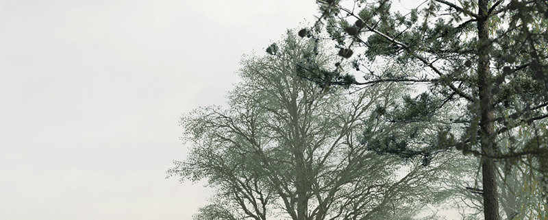
Through not so difficult research on google maps I noticed, that Kalmar can be very foggy, cold and atmospheric at times. And due to the fact that I come from cold, Northern country, I believe this mood and atmosphere are very familiar to me. It evokes feelings of the past and my childhood and that is what I miss most, living in the country where I am now. In the image I wanted to express not only my artistic skills and abilities, but also to show my personality. I remember clearly that midseason period (usually mid-November, but sometimes even late October) when not all of the leaves have fallen from trees, but winter is already on the doorstep. In my image I was looking to implement the findings about atmosphere of Kalmar and that time of the year I sometimes remember and want to come back in.
Color.
With the colour choices I made I decided to highlight, that the building is located in the Nordic Country. The colour palette was dictated by the huge amount of minimal Nordic inspirations found on Pinterest and web resources. I believe that the colour choice I made represents peace of mind, openness and purity of both nature and people living in these surroundings.
Landscape.
As for the landscape, I decided not to invent a wheel by changing the landscape completely. I suppose, this building was made for its location and is perfectly balanced with nature. What I can do as an artist to present this architecture is to slightly alter atmosphere/mood/season or even landscape in some places, play with colour to make it pop and appeal to viewers.
Light
Lighting comes along with atmosphere and mood. To communicate my idea I will use low light sun, which would give that slightly goldish tint to the image and add to the desaturated late fall colours along with highlighting the material of the façade.
That concludes my concept section.