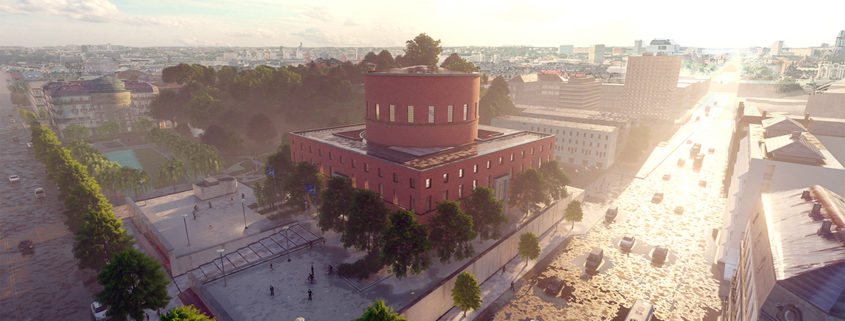
TOMORROW CHALLENGE 2019 – STOCKHOLM PUBLIC LIBRARY – GUNNAR ASPLUND, ARCHITECT
SUMMARY OF PROJECT:
This was an interesting and difficult project. The knowledge that I gained through experimentation and advice from colleagues made it a worthwhile endeavor regardless of outcome. After reading about the subject matter and investigating the building, I found that the building and setting presented a number of interesting and thought-provoking challenges.
The fact that the library is in a densely urbanized environment abutted by a park with a reflecting pond immediately indicated to me that the majority of the exterior renderings that would be submitted would be shot from one location, arguably the most attractive, being across the pond and looking up towards the building. Indeed, Gunnar Asplund’s own renderings of the building feature a shot from this angle.
The building also features numerous retail establishments along its main street face, and I am of the opinion that while utilitarian, they would distract from the visual impact of the final image if featured with too much detail.
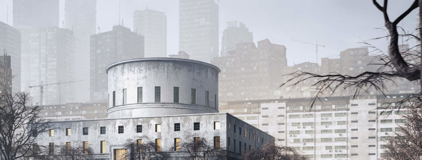
I wanted to present something that would stand out as well as tackle the challenge of rendering the site from a bird’s eye view while adhering to the stylistic guidelines of a more realistic aesthetic.
This effort proved to be more difficult than I first imagined! The masses of buildings in the near vicinity made it difficult to decide how to depict the surroundings without using the tried-and-true “white block buildings” that are most often utilized for context in large-scale architectural renderings.
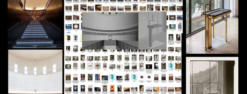
I approached this challenge from several angles. My first thoughts were to use photogrammetry of the surrounding area to create a “real mesh” from the surrounding buildings. This was a big effort, requiring the compilation and rendering of several hundred aerial images to form the final model.
I was not happy with the outcome of this attempt, and while I learned from this, I would not attempt it again, as the final mesh file was huge and when rendered revealed too many of the imperfections of the photgrammetric process. The mesh looked too lumpy and organic to be of any real use.
What’s more, the sheer size of the base model when imported into Sketchup and the fact that the software decided to smooth all of the surfaces made editing the model and applying texture a time-consuming and difficult process. I also had to prioritize, as time was not going to allow for a full rendering of the interior with its millions of books, unusual shapes and high-relief textures. I finally found a reference image of the main entry shot from inside the rotunda that I found had sufficient tension and material variability to serve as a basis for a shot from the inside.
In the end, I am grateful to have been given an opportunity to participate in this process and would like to thank Ronen for hosting yet another interesting and educational challenge. These challenges force me to look at new methodologies and techniques to attempt to submit something on-par with the exemplary work of my fellow competitors.
SHANNON MCVEY


