


Tomorrow Challenge 2018 entry by User-13546201
Final submission, I hope you enjoy it!
Access the Best Articles about Architectural Visualization. Learn about all aspects of crafting images that tell stories.
Making Of's Case Studies WorkflowsShare your work and get immediate appreciation through discussion, feedback, and a possible nomination for the…
![]()
A weekly experiment, exploring the creative minds in Architectural Visualization and more. Find out what makes us all tick and push the limits.
Listen Now! Subscribe on iTunesOut with the old and in with the new! In Converted, I’m asking you to take an in-depth look at existing architecture near you or one you love worldwide and introduce something new.
See Entries & Join! About ConvertedFinal submission, I hope you enjoy it!
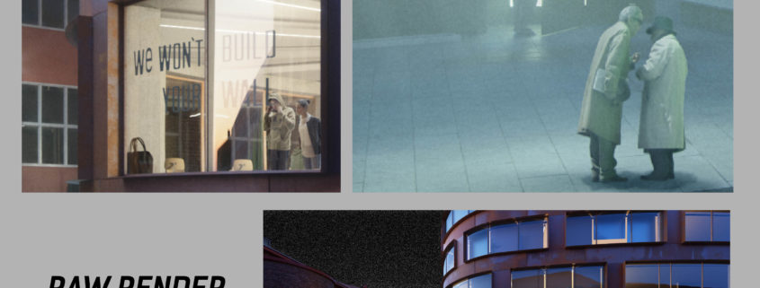
In photoshop I adjusted the characters, the light so that they could look good, the color so that they could match perfectly with the whole image. Besides, I painted the shadows and I added some atmospheric details. I spent some time in photoshop so that I could have the kind of image that I wanted from the start according to the references that I had in mind and also that I could have a natural looking image under the criteria of a cinematographic lighting.
Since this was the first time I was using Corona Renderer I can say that there were times that I would zone out and meddle with the materials mindlessly. Don’t do that ^^ One thing I learned that changing a “corona ao” output can do weird things to the material when you aim for something else, just meddle with the original maps instead 😀 It was nice to be involved in this..
Hazy days are the best.
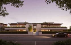
My final entry. After the Snow. Rendered in 5k (Height)
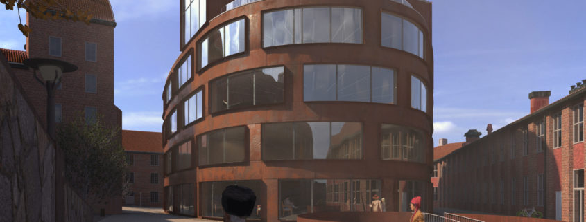
Final image
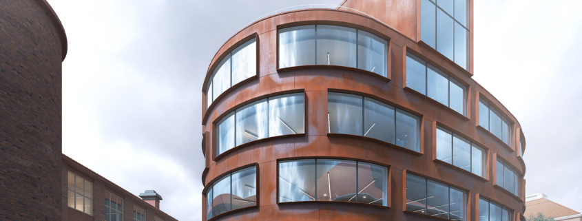
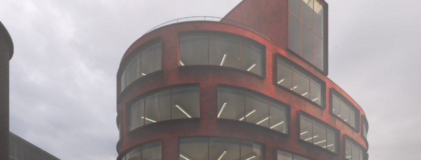
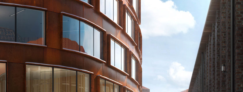
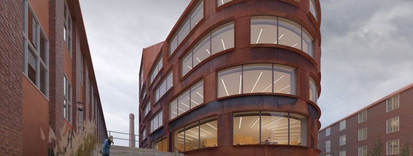
After looking at photos of the project, I developed a vision and color pallet in my head. I wanted minimalist almost monochrome cold image with the corten facade being the warmest element. I decided to go with cloudy almost overcast mood.
After deciding on mood, I roughly gave materials to scene, because I believe it is difficult to judge light by clay model. I picked and HDRI map from Vizpark collection, with overcast skies and sun seeping through clouds.
I had extra challenge due to time limits. When I started, I had only 3 day to complete this image. So I couldn’t afford to detail very wide area. This pushed me to search for good composition with less visible area, but still being visually rich and compelling.
After setting light and angle, I detailed materials. The hero material, is for sure oxidized panels. I created procedural texture based only on two bitmaps. Stains of oxidation and burnt out areas are controlled by specially dedicated splines, i.e. they are parametric. I also paid attention two variations on the ground, filled in interior to give lively
feeling.
In postproduction and color correction, I remained loyal to the main idea, realistic but minimalist colours with cool feeling.
Overall, although the process was really fast and intense, I liked working on this project. It forced me to find different ways of expession in an already well defined project with every possible photoshot available. So finding a different approach was a good challenge.
I hope you enjoy my image and good luck to all!