Tomorrow Challenge 2018 entry by User-16180394

I promised that I would do a complete writeup of my process before posting my final submission. So here we go.

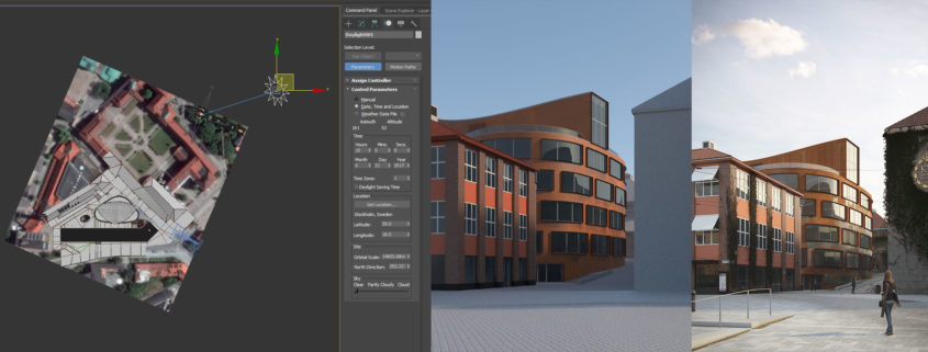
Since one of the only directions given was that the image should be natural and realistic (a point that I’ll come back to often), I thought it would be a good idea to start by studying the possible positions of the sun. To do that I used a satellite image from Google Maps as reference to find out where the building was pointed to, and then proceeded to use Max’s sun system to find out the position of the sun for Stockholm. I decided that the angle of the sun at 9 in the morning during summer would light and highlight the main building in an interesting way. Also, by positioning the camera close to the angle of incidence of the sun we would be able to see the more reflective parts of the corten steel that haven’t “rusted” out completely yet.

The final render had a V-Ray sun with an HDRI in a dome light. The V-Ray sun was set to a 5 size multiplier to simulate the light of the sun going through the early morning clouds/mist, effectively making the sun’s shadows softer. The HDRI was later added to give that “GI” feel. The sun in the HDRI was positioned in the same general direction as the V-Ray Sun. VRayEnvironmentFog was also used.

Tomorrow Challenge 2018 entry by User-16180394

To me, the most powerful and effective images in architectural visualization are the ones that show the proposed building in the context in which it will be found once it is built. To show the architectural feats of a proposed building in an image is great, and will intrigue the viewer, but only if the building is placed somewhere familiar will the image be grounded in reality, making the viewer understand the context of the proposed building and believe that its construction is feasible.
Most of Tomorrow’s best images are great examples of nonexistent buildings being shown in an existing environment. One of the reasons why the aerial view of the Gateway Tower in Chicago is one of my favorite Arch Viz images is because although the angle is not the best to show the design of the building (it is not the best angle to show that the building leans toward the road at the base, for example), the context in which the building is found in the image instantly tells the viewer the significance of the proposed building. The viewer doesn’t need to be told anything verbally to understand the significance of this image and anyone familiar with Chicago will instantly get it. Same thing with the Hyperloop image. Nobody needs to be told that’s in Dubai. Anyone familiar with the Burj Khalifa knows it. This is the kind of images I want to create.
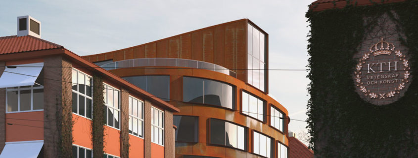
With that in mind, my concept is to create an image of the School of Architecture as if it hadn’t been built yet, as if we were proposing it to the community and I had to show anyone familiar with Stockholm and the KTH where the building would be found – what would be its context. I want to show how the shapely new building contrasts the existing angular ones, and how the weathered corten steel contrasts with the other buildings’ classic bricks and ivy-covered walls.