Tomorrow Challenge entry by User-14412875

This is most probably my last update before final submission. I am really enjoying the process. Being the only visual artist in a quite big architecture firm usually leaves no time for refinement, detailing and even desired composition. I really enjoyed the opportunity of fine-tuning composition, details, coming back to it after several days to realize what else can be improved. In short, this is my first time entering a challenge, big thanks to Ronen & Tomorrow for this exciting event, it was like a Christmas holidays for my brain and eyes 😀 !

Here is what I have done:
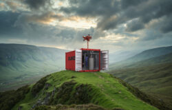
^^ I had hard times finding the lighting conditions – dark enough to clearly see illuminated interiors, but light enough to read all materials and surrounding details, also to catch a color balance between sky and interior illumination. For this reason, I decided to tonemap the HDRI, I show it in the image below (or above :))

^^I did several tests with people. I don’t have 3d people in the poses I need. So I collected photos and cut and draw them as I need, I always create what I need even if I dont have ready material for it. I decided to map poeple on planes and create billboards, and render with the scene. Since it is eye level, I had no problems with perspective. I also did a test placing them in Photoshop as in usual workflow, but I decided they are blending in scene better this way

^^I made some schemes of composition and toning, based on my view. I will use them to enhance the composition in post-production. One scheme is showing tonal depth planes and another is showing leading areas.

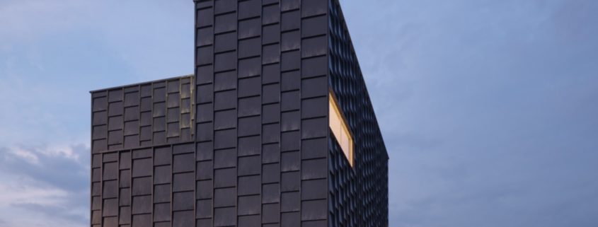
^^I placed trees with very few leaves, as in late autumn and created falling leaves caught in motion blur. I like how blurred yellow-orange leaves are seen on dark facade reflecting blue skies. Also using tree with crowded leaves would disbalance my composition by creating equally dark areas as facade.

^^Please check the sequence of images, to see how my image has emerged.

Cheers!

Tomorrow Challenge entry by User-14412875

My workline consists of iterations. At first I roughly do everything necesssary for my view – materials, rough detailing, envirenment, some initial sketching. Then I improve details, materials and other aspects according to importance and I decide on what to leave for Postproduction stage. This saves me whole lot of time.. So now it is my second iteration.

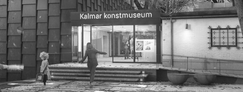
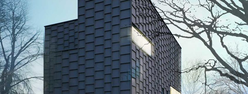
We have the flexibility of adjusting environment, so after I decided on my composition and angle, I started to look for ways to shape the landscape to enhance my composition. I took reference from facade, it reminded me of train rails with its modularity and linear elements. I wanted to add a light surrealism to my work, so I came up with the idea of railway path leading to the entrance and people balancing on rails while going to museum.

What is done: I tried several techniques from scattering to displacement, I describe it in attached images. I enhanced facade material, added random dirt, tested its behavior and decided that I am happy with it. Also I made a draft with sketching, to check how people interact with the view, how to set them up. I added several casual details, such as roof mechanics, to add variations to silhouette.

Next is adjusting landscape plants, creaing trees, adding details to interior and final retouch for materials, lighting and camera angle, before rendering THE final image.

Tomorrow Challenge entry by User-14412875

I studied wood material and well.. it is complicated 🙂 It is very reflective in low view angles, while almost diffuse in normal direction. It is glossy with very low roughness. The most glossy part, catching light are where the wood texture gets intense. Until this part I tried to get it work in clean state.

Wood plates has a layer of dirt on top, I am not sure whether to implement that in texture or go on in Postproduction. I will try that later.

Meanwhile I try some moods for weather..

Tomorrow Challenge entry by User-14412875

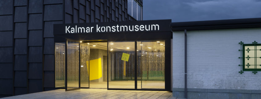
The connection of weathered building and modern yet modest design inspired me to search for a view which will reflect both – Byttan and the museum. While maintaining focus on entrance and entire museum, a window with iron bars will be reflecting the old building’s 30’s style.

For the light, I will go with early dusk, it will hit side facade, showing nice reflections and details. Illuminated windows will enhance the composition.

For the landscape, I want to emphasize the main entrance by a strong but natural looking path and a playful human character moving towards the museum.