The challenge of Tomorrow entry by 3dNinja

Hey everybody! I want to thank Ronen Bekerman, Tomorrow, and all the judges for organizing this competition again. I had a blast working on this project and I’m really excited to showcase the images I created for it!

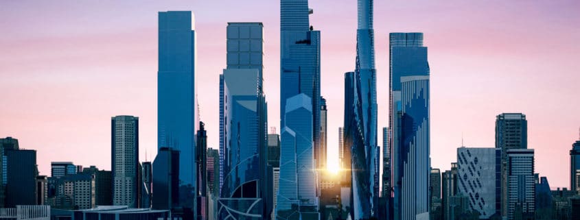
I’ve titled my collection “2040: The Lessons We Have Learned”. It wasn’t until a worldwide pandemic affected me personally, that I knew where I wanted to go with this project. I was laid off from my job due to economic issues but was lucky enough to get called to a position selling beer to-go for a local craft brewery. After a month of our taproom being closed due to quarantine, we reopened for service. It was ultimately my observations of the general public that sparked the idea for “The Lessons We’ve Learned”. The way we interact with each other has changed and I was inspired to see how that will impact us in the future. New York has been hit especially hard by Covid-19 and we keep seeing images of deserted streets and hearing news of lock-down and infection rates. I needed to show a bright future for New York City with people interacting with each other and their city. By 2040 we have learned from the events of 2020 and we implemented measures to help curb future health crises. With this in mind, I’ve shown an active city with bustling crowds and recreational activity. I placed the new automated city sanitation robots and revolutionary no-contact drone delivery in most scenes. The scenes are lively and bright suggesting better days on the horizon. I’ve done my best to give you a thriving, optimistic city twenty years in the future improved by the lessons we have learned from today.

“The Lessons We Have Learned” is also a reference to my experience working on this competition. Scale-wise, this is the largest project I’ve worked on and there were some hurdles I had to navigate. With dozens of background buildings and hundreds of assets, I had to find a way to keep myself on track and efficient. Rigid asset organization became essential to keep my view-port running smoothly and make multi matting easier. Proxying everything helped conserve RAM during rendering. I also installed an additional 64GB of RAM to my machine to cope with memory availability during render, this allowed me to efficiently work in Photoshop while rendering frames in Max. I wanted to make a fully 3D scene because I hope to come back to this project later and play with weather conditions, animations, and new views. While I have tinkered on original residential projects, I’ve definitely never designed a skyscraper from scratch. I spent a lot of time looking at photos of the existing/planned buildings for Hudson Yards and other large scale towers. Some of my buildings are completely original concepts, and some take cues from other modern architecture. I didn’t expect to have so much fun sketching out concept buildings!

I knew from the beginning that I would be creating a series of skyscrapers in the Hudson Yards neighborhood to fill out the empty blocks on the west side. We were provided with a good conceptual site plan so I used that to layout my buildings. I didn’t want to interfere with the subway depot that is currently there, so I lifted the neighborhood onto an elevated platform. I also added subway terminals, a large ramp, stairs, and sidewalk level elevators to make Hudson Yards easily accessible. I designed the new buildings so that they are distinctive, but fit in with the existing architecture and currently planned structures to make this neighborhood stand out even from a distance.

I’m proud of the work that I’ve done in the competition this year, and I hope everybody enjoys it!

The challenge of Tomorrow entry by Denis Khotin

Hi!
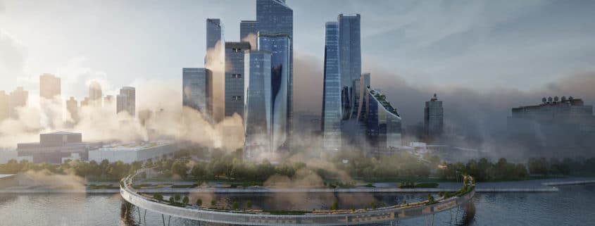
-So the main idea of the project is the extension of the highway park.
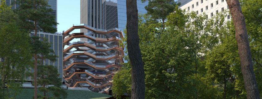
Beautiful views from the Vessel will no longer be available after construction. Therefore, in order to increase the value of real estate, the highway park must be extended and expanded towards the Hudson River. I think this is the most likely scenario.
On the lower tier of the highway highway, I located restaurants and coffee, lounge areas and art spaces.
– All skyscrapers should make up a single architectural composition.
Unfortunately I’m not an architect, but I still imagine that they will look something like I designed.
– From an artistic point of view, I really like New York in the early morning, when fog and steam from the pipes are clearly visible. This phenomenon exists only in New York, because the city has a rather rare heating system. It is very, very beautiful! Nowhere else in the world can this be found.
I set the angles and then put materials on the buildings that fell into the frame. I did not use non-existent buildings from collections of 3D models. It was a low poly study of the real environment. The existing skyscrapers and those that I came up with I tried to work out as detailed as possible.
I hope you will like it!

The challenge of Tomorrow entry by vittorio.bonapace

I imagine this project as a new heart beating center for the city.

Community is the center of these visuals. The message and the story I wanted to tell are not the architecture itself. The scheme is meant to surround and frame people’s stories and feelings.

It is not about outstanding offered services or modern and beautiful infrastructures, but how the new amazing area will inspire and change people who are living there, who are working there and who engage with it.

People having a relaxing time into the park, enjoying the sunshine on a beautiful Saturday morning. A model having a photo shoot for a magazine inside the awesome Vessel, inspirational design building which is the iconic face of the Masterplan. Some friends are enjoying life after a long day on a roof terrace with a fantastic panoramic view, enhancing the beauty and magic of lighting.

Sunshine through nature. A night in the sky. Eccentric fashion. These are the main themes I’ve explored within these visuals to tell a story about the Scheme and how beautiful it could be to interact and engage with it.

Get there. Get inspired. Eat and drink all the beauty.

The challenge of Tomorrow entry by Mohamed Mahfouz

Imagining Architecture as a movie or a memory flash back, we see how the human urban development has reformed from horizontal expansion to vertical expansion pattern, as a methodology to maximize profits, and make the best use of our limited resources such as Lands (reachable-view-value-location-services) instead of the early urban Utopian cities that imagined heaven far from our life city centers, where we have less pollution and more greens, the lower building levels and higher quality life values.
In fact this is how i imagine New York in 20 years ! it’s not gonna be bad ! But not as bright, life within 20 years will not change that much but humans will keep trying to overcome the existing feeling of horizontal expansion (which is a must sooner or later to avoid congestion), taller, agile, glossy towers with connections, bridges and some of that, a life that will expand more and more vertically, to respond to our higher density withing the congested-remaining city, within its services, buildings and existing infrastructures.
On the other hand humanity will keep using our old infrastructure ! Because come on nothing changed yet ! But less light, less attention to the those old streets, less clean and unfinished works everywhere, A real contrast of old vs new life forms, different technologies but still seems familiar, like seeing nowadays an electric car, seems a normal car ! But with a closer look in sounds different it has no compositions, no drag no noise ! Its electric.
With the observatory in the middle i tried to imitate the attempt of contrast a soft new modern structure than penetrates the existing gap, the gap between the towers, it’s our way as human to breath, break the habits and make an impact, it’s our way to overcome the hardships and see through the dark ! Yet its still possible to beat the dark.
Finally, this vision may not be real, it is not positive too, and yet to know its just a theory, but due to our life today am kind of skeptical about its bright future, hope am not too dark, but with such a healthy skeptical dose towards the future we may have a brighter one, and thanks for allowing us to be in such a very ingenious and amazing challenge.
Mohamed Ahmed Mahfouz,

The challenge of Tomorrow entry by bobrov.jpg

ARCHITECTURAL CONCEPT

I decided to focus on developing of Western Yards. There were 4 main ideas in the architectural concept:
1. I aimed to avoid the temptation to use “futuristic” architecture as much as possible. The shift in architecture between 2040 and 2020 will be about the same as the shift between 2020 and 2000.
2. In recent years, European architects have been designing more and more often in New York. I assume that the European trend will only increase in the future, so I decided to move away from the classic New York skyscraper and use European architects with an international name as reference.
3. I used the classic New York grid in plan to fit the design into the fabric of the city
4. A very important reference was the work of Superstudio

TECHNICAL SOLUTIONS

In order to better understand what New York looks like, I decided to watch the «Suits» series (and it is awesome). There were several aerials shots with cool view on Manhatten in each episode. And it inspired me to show project from different perspectives, including aerials.
From the very beginning of the project, I knew that I would make a lot of wide shots and bird-views, so I needed to quickly create an environment model. I decided to model the whole environment (even use railclone) – smacks of madness, so I decided to look for workarounds. My research led me to understand that with Blender and very basic programming, I can get a part of the model out of Google maps. Since this is a non-profit project, Google’s license doesn’t prohibit this (trust me, I watched 3 seasons of «Suits», which is almost the same as getting a bachelor’s degree in law)
All buildings of the HUYA project are modeled using railclone. This gives you a freedom to change the architecture and layout during the project and allows you to keep 3d scene light and comfortable to work with.

– image 1/9
main image 1/3
«Lighthouses»

This image is inspired by one of my favourite movies «The Lighthouse» (2019)

– image 2/9
main image 2/3
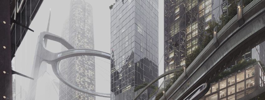
«Smog and flamingos»

This picture is an ode to my love for Superstudio (est. 1966–1978)
Adolfo Natalini wrote in 1971 “…if design is merely an inducement to consume, then we must reject design; if architecture is merely the codifying of bourgeois model of ownership and society, then we must reject architecture; if architecture and town planning is merely the formalization of present unjust social divisions, then we must reject town planning and its cities…until all design activities are aimed towards meeting primary needs. Until then, design must disappear. We can live without architecture…»
It seemed ironic to rethink their great and radical “anti-architecture” into something closer to reality and even commercial. It is interesting to observe how their ideas of “architecture of the monument”, “architecture of the image”, and “technomorphic architecture”, translated into reality, completely lose their radicalism and, at the same time, a significant part of their original meaning, reducing only to aesthetics.
The dense smog that is present on this and firther images is a reminder that 2040 may not be about robots and flying cars, but about environmental problems if we do not change our attitude to environmental issue.
I like this picture because it is quite simple, and at the same time it perfectly conveys the essence of the project.

– image 3/9
main image 3/3
«Poster 1»

The main reference was a poster for the Fritz Lang’s movie «Metropolis» (1926), which was created by Boris Bilinsky
Each project should have a name. Especially project in NY. Word «HUYA» is composed of first letters – HUdson YArds.
Initially, I had doubts whether to post this picture as one of 3 main pictures or not. But I just like it too much.

– image 4/9
additional image 1/6
«Grid»

In this picture I wanted to emphasize the facade architecture with creating the illusion of an «endless» grid by reflecting the facade in the water. I’ve decided to play with scale by having «endless» grid and small but very bright person in the middle of the image.
There is still a hint of Superstudio, but the main reference was the work of David Chipperfield.

– image 5/9
additional image 2/6
«Red circle»

This image is inspirated by photoproject «ALTERNATIVES LANDSCAPES» (2012) by Benoit Paille.

– image 6/9
additional image 3/6
«The Weather Project»

Image is inspired by installation «The Weather Project» which Olafur Eliasson has created in 2003. And ofcourse I did not miss the opportunity to pay tribute to the brilliant «Blade runner 2049» (I really wanted to not do this in this project in order to avoid any references to the «futuristic» future, but I could not resist).
This image supports topic of air pollution which I started in image 2/9.

– image 7/9
additional image 4/6
«Drone»

Initially, I wanted to add drones in this project, because I am sure that in the 2040m delivery by drones will play an important role. However, I decided to do it less straightforward. I wanted to create a flying drone feel in this picture without showing the drone itself.
Another important element is the texture of the render itself. Render noise differs from film noise and ISO noise in photos. But it also has its own aesthetics.
For some time I have been reflecting on the fact that the texture of paints in painting and film noise in photography have long been important elements of artistic expression. While at CG we are still trying to hide the texture while we are trying to disguise our work as a «perfect photography».

– image 8/9
additional image 5/6
«Plastic and whales»

I did not want to create a picture of a post-apocalyptic flooded city. I wanted to give a feeling of weird dream. When real objects meet those that cannot be there.
Water plays a big role in this project (water in the park and a view of the river). In this picture I wanted to hyperbolize this connection. I wanted to show turbid water (which still does not lose its beauty) as a continuation of the previously mentioned pollution topic.
This picture is not some kind of manifesto or appeal. This is a strange dream of an ordinary resident of HUYA. After this dream, he wakes up and decides that it is time to sort plastic a little more carefully.

– image 9/9
additional image 6/6
«Poster 2»

This is a view from the Vessel on the opposite bank.
This is an experiment about balance between abstract emotions and concrete facts.
Formally, the picture shows Western Yard’s buildings and the view, but in reality it does not show anything. As well as it gives accurate data about the areas in this project, however, in reality, these data seem totally abstract to us.