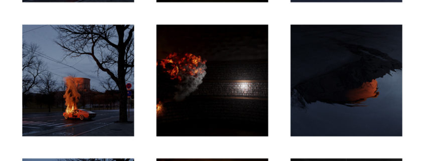
The challenge of Tomorrow entry by bobrov.jpg
ARCHITECTURAL CONCEPT
I decided to focus on developing of Western Yards. There were 4 main ideas in the architectural concept:
1. I aimed to avoid the temptation to use “futuristic” architecture as much as possible. The shift in architecture between 2040 and 2020 will be about the same as the shift between 2020 and 2000.
2. In recent years, European architects have been designing more and more often in New York. I assume that the European trend will only increase in the future, so I decided to move away from the classic New York skyscraper and use European architects with an international name as reference.
3. I used the classic New York grid in plan to fit the design into the fabric of the city
4. A very important reference was the work of Superstudio
TECHNICAL SOLUTIONS
In order to better understand what New York looks like, I decided to watch the «Suits» series (and it is awesome). There were several aerials shots with cool view on Manhatten in each episode. And it inspired me to show project from different perspectives, including aerials.
From the very beginning of the project, I knew that I would make a lot of wide shots and bird-views, so I needed to quickly create an environment model. I decided to model the whole environment (even use railclone) – smacks of madness, so I decided to look for workarounds. My research led me to understand that with Blender and very basic programming, I can get a part of the model out of Google maps. Since this is a non-profit project, Google’s license doesn’t prohibit this (trust me, I watched 3 seasons of «Suits», which is almost the same as getting a bachelor’s degree in law)
All buildings of the HUYA project are modeled using railclone. This gives you a freedom to change the architecture and layout during the project and allows you to keep 3d scene light and comfortable to work with.
– image 1/9
main image 1/3
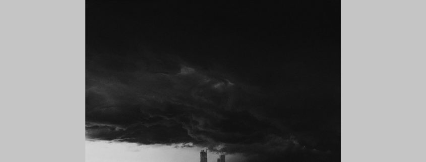
«Lighthouses»
This image is inspired by one of my favourite movies «The Lighthouse» (2019)
– image 2/9
main image 2/3
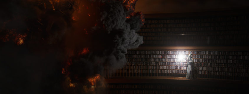
«Smog and flamingos»
This picture is an ode to my love for Superstudio (est. 1966–1978)
Adolfo Natalini wrote in 1971 “…if design is merely an inducement to consume, then we must reject design; if architecture is merely the codifying of bourgeois model of ownership and society, then we must reject architecture; if architecture and town planning is merely the formalization of present unjust social divisions, then we must reject town planning and its cities…until all design activities are aimed towards meeting primary needs. Until then, design must disappear. We can live without architecture…»
It seemed ironic to rethink their great and radical “anti-architecture” into something closer to reality and even commercial. It is interesting to observe how their ideas of “architecture of the monument”, “architecture of the image”, and “technomorphic architecture”, translated into reality, completely lose their radicalism and, at the same time, a significant part of their original meaning, reducing only to aesthetics.
The dense smog that is present on this and firther images is a reminder that 2040 may not be about robots and flying cars, but about environmental problems if we do not change our attitude to environmental issue.
I like this picture because it is quite simple, and at the same time it perfectly conveys the essence of the project.
– image 3/9
main image 3/3
«Poster 1»
The main reference was a poster for the Fritz Lang’s movie «Metropolis» (1926), which was created by Boris Bilinsky
Each project should have a name. Especially project in NY. Word «HUYA» is composed of first letters – HUdson YArds.
Initially, I had doubts whether to post this picture as one of 3 main pictures or not. But I just like it too much.
– image 4/9
additional image 1/6
«Grid»
In this picture I wanted to emphasize the facade architecture with creating the illusion of an «endless» grid by reflecting the facade in the water. I’ve decided to play with scale by having «endless» grid and small but very bright person in the middle of the image.
There is still a hint of Superstudio, but the main reference was the work of David Chipperfield.
– image 5/9
additional image 2/6
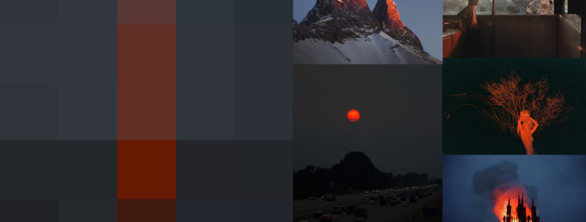
«Red circle»
This image is inspirated by photoproject «ALTERNATIVES LANDSCAPES» (2012) by Benoit Paille.
– image 6/9
additional image 3/6
«The Weather Project»
Image is inspired by installation «The Weather Project» which Olafur Eliasson has created in 2003. And ofcourse I did not miss the opportunity to pay tribute to the brilliant «Blade runner 2049» (I really wanted to not do this in this project in order to avoid any references to the «futuristic» future, but I could not resist).
This image supports topic of air pollution which I started in image 2/9.
– image 7/9
additional image 4/6
«Drone»
Initially, I wanted to add drones in this project, because I am sure that in the 2040m delivery by drones will play an important role. However, I decided to do it less straightforward. I wanted to create a flying drone feel in this picture without showing the drone itself.
Another important element is the texture of the render itself. Render noise differs from film noise and ISO noise in photos. But it also has its own aesthetics.
For some time I have been reflecting on the fact that the texture of paints in painting and film noise in photography have long been important elements of artistic expression. While at CG we are still trying to hide the texture while we are trying to disguise our work as a «perfect photography».
– image 8/9
additional image 5/6
«Plastic and whales»
I did not want to create a picture of a post-apocalyptic flooded city. I wanted to give a feeling of weird dream. When real objects meet those that cannot be there.
Water plays a big role in this project (water in the park and a view of the river). In this picture I wanted to hyperbolize this connection. I wanted to show turbid water (which still does not lose its beauty) as a continuation of the previously mentioned pollution topic.
This picture is not some kind of manifesto or appeal. This is a strange dream of an ordinary resident of HUYA. After this dream, he wakes up and decides that it is time to sort plastic a little more carefully.
– image 9/9
additional image 6/6
«Poster 2»
This is a view from the Vessel on the opposite bank.
This is an experiment about balance between abstract emotions and concrete facts.
Formally, the picture shows Western Yard’s buildings and the view, but in reality it does not show anything. As well as it gives accurate data about the areas in this project, however, in reality, these data seem totally abstract to us.


