Hi all, sorry for the delay. I’ve been trying to keep these updates weekly, but with the holidays it’s been hard to keep up.
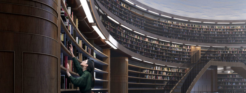
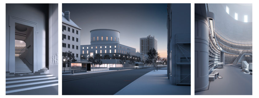
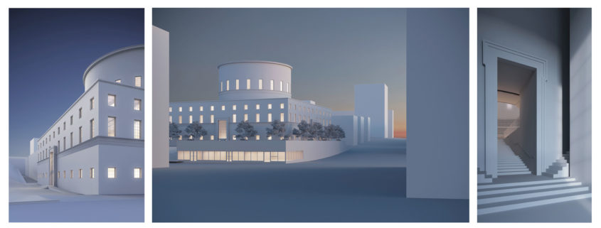
This week I’ve decided to share my progress with lighting and composition. These three views will most likely be my final choices, although I am working on an alternate view from inside of the central hall of the library. I’ll update you all if that becomes a viable option.
The first view from the left is a detail shot of the library. I wanted to show off the stucco and trim of the library, as well as create a tall, interesting composition using the geometric nature of the building. The biggest challenge I’m facing with this view is the trees that line the sidewalk- they tend to block the architecture if they are life-sized and fully leafed.
The second view is from a much farther vantage point. In contrast with the first view, I wanted to focus on the building in context with the bustling city around it, as well as the day-to-day activities of those who inhabit it. The long, wide Stockholm streets also provide a great sense of depth, and give an idea of the scale of the library.
The third view is much smaller in scope than the first two. This image will be an exercise in lighting composition, with a heavy emphasis on shadow, light, and form. The camera angle gives just a hint of the grand library beyond. I am a bit disappointed that much of the curved bookshelves are hidden in this view. I’m considering a fourth interior view, but since I am working on this project by myself, I may not take it to completion.
Overall I’m very happy with my progress so far, and I hope to have fully modeled white model renderings by the end of this weekend. Happy New Year!


