Tomorrow Challenge 2018 entry by User-26377535

To summarise, my process consisted of a brief analysis including defining the story, mood, composition, lighting and camera angle. Hand in hand with this comes an inspirational/ research phase, followed by creating the basic set up in Max. Once I have my 4 building stones in place; brief (including story, mood etc), camera angle, lighting and materials/colours my refining phase starts. I enjoy this the most, a part from creating the story. Props and some more refining follow this and then final render and post. Through out this process I do a lot of low res tests, but mainly I use the interactive. I do some minor final post but that usually don’t take more than 15 min as I like to have most work done in 3D and just tweaking in Photoshop..

Though out the project I’ve posted a few posts prior to this explaining more in detail and last thing I mentioned there was that I started the final process a bit early as I always like a buffer.. The final process went smooth and I then had time to spend on putting my final pdf submission together, I’ve never used tinypng or JPEGmini before but I it was very smooth.

Read more about my process, brief analysis and what happened on the way creating this image in my final PDF submission. Its been fun! Thanks

Tomorrow Challenge 2018 entry by User-26377535

LIGHTING & MOOD & CAMERA ANGLE
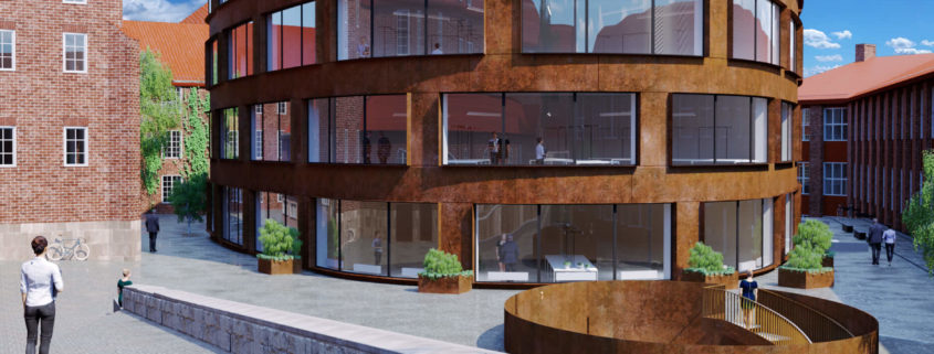
I want to have a warm inviting image that tells a story and connects with the viewer and after adding in all landscaping and props and tweaking the lighting I feel that this is now achieved. I also refined the cam angle as well a little, to extend that inviting feeling. I feel this adjustment also made the architecture more inviting and appealing.

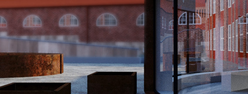
I also refined my materials a little to suit my story and mood better. The corten material is as I wanted looking very rusty, texture and nice in colour adding the feel of new but old and blending in as well as extending that warm and nice feeling. In this post I’ve uploaded a close up of the texture in a low res test (still grainy as I didn’t let it render completely as it was just a quick test). I really like this angle actually but it tells another story than what I wanted, perhaps another time..

I added in water on some of my textures and birds playing in the water extending that closeness to nature feeling I am trying to achieve without over stylise. I chose a native bird that I feel says Sweden.

Optimising
Now on to some challenges.. I’ve had to do some optimising as my computer at home started to run low on RAM in particular after adding my people to the scene.. I don’t want to use more low res people or post people as I want to do everything more or less in 3D and only use post enhancing the render rather than adding props to the image etc as that is my normal process. Another reason is that I don’t have a perfect (to my opinion) looking architect Swedish student on file in 3D or 2D and these are the closest I could find, however if I re did the assignment that would be something I would have loved to invest in. I don’t feel its crucial just something that would be another cherry on top so to speak. Over all, I am happy with the people I do have and think I have resolved that through positioning them in a dynamic way making them add to the story but not distracts the view which is what I wanted to achieve. And I feel they are right to the story I try to tell, as the image takes place in the afternoon, in late summer when the school would be fairly empty of students and when you would mainly see some teachers and the girl closest to the camera looks like a student I think.

Now on to the final process as I like to have some extra time just in case..

Tomorrow Challenge 2018 entry by User-26377535

After I finished thinking about my concept I had a “walk around” and familiarised my self more with the model and thought about mood direction and what areas I like to show in my image. I also think about lighting and cam angel. My goal is to create a feeling of Stockholm being close to the beautiful nature surrounding. However I don’t want this to be too over powering to remain realistic and natural.

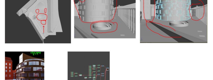
Next step I had a bit of a rough play to refine my lighting direction and added a basic setup (about a 5 min thing not anything special). At this stage its very rough, sometimes it changes pending on the story I decide to tell. This followed by setting up some camera angles, mean while thinking about the story of the image. Once I knew what the story or message I like to deliver, I sat down and added basic colours to the main areas, usually a basic corona material with a colour, however I like creating a good tone to start with which I later build my materials around or on but sometimes I have a texture on file that I like using and then I use that. I do this so that the lighting will hit the colours the way I intended.

CAM ANGLE
I wanted to show the whole building so I choose a portrait ratio to my image. I like the round shape of the main building and how it interacts with the circular shape in front and stairs going down, I like the large window element of the building at the top and its shape. So I wanted to include that in my image. I also like the stairs around the front entry but I can’t show it all and I selected my angle as I think that is more in line with my concept and mood direction. I also like the surrounding courtyard and context buildings and think they tell a story of heritage and the old Stockholm so I want to have them in my camera as well to a degree.

LIGHTING
I want my image to be day time at a time where the building looks in colour but not too late in the afternoon because I don’t want the interiors to be too predominant and I like the windows to have some nice reflections. I want part of the building in shade and part in sun as I think that will soften the look and embrace the shape of the building.

So now I have 4 parts
– My brief, a rough idea for the story I like to tell and mood I like to create
– The basic camera angle
– A basic lighting
– Basic colours in the scene

Next follows the refinement process..

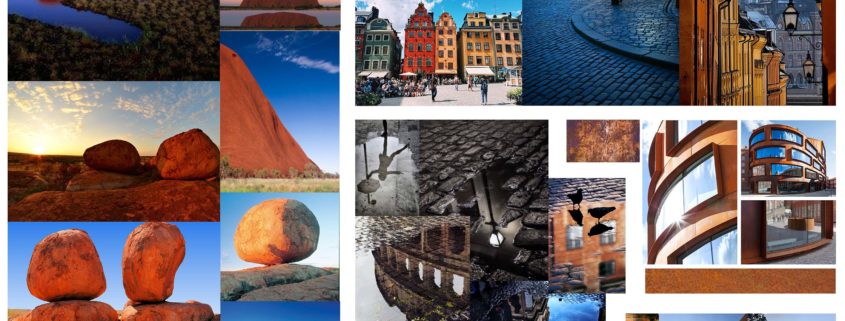
Now I think, does every element work together, in particular does the lighting work? I want to use mainly natural light in the scene and want large shadows to fall where I want it. Sometimes I am restricted by where the actual sun position would be at a given time of the day that I am aiming for, but I don’t want this to be too restricted this time. I want the building to stand out but still blend in. I want my corten material to be a little more rusty looking than the actual building, and enhance the red copper rusty tone a little. So I found some inspiration images to enhance the material in a respectful and natural way but so it to my opinion look more alluring, and started building the material. Since its a very central point of my image I spent some time on this.

Then I went on thinking about props I like to use to enhance my storytelling and their position, just a few main key items, the rest will come naturally later. Then I “lock in” my camera angle to about 90%, keeping the image composition, my story, lighting and colours in mind.

I adjust the lighting so that ie shadows are where I like them to be. And get on with the materials and their interaction with the light. I also scan through to see if there are anything I might have to model refine like panels or stones or curbs or what ever it may be and what areas needs to be more detailed ie the foreground if that’s in focus. I also check if there are any structure that is there that should not be there or is “wrong”, however since we were given the model this time I didn’t spend much time on this as I feel that that may not be the main focus for this competition. I did however find that the stairs are going the “wrong” way (read different compared to how it was built) in the courtyard circular structure in front of the main building but I like to keep it this way as that suits my camera angle better and I feel it looks more dynamic in this angle.

I have now refined my brief, concept and mood and created the basic scene, locked in my camera angle and lighting to 90% and added my materials. Next step is building on my materials ie in this case I want to add some after rain effect. I also need to refine my model and props and landscaping but I have the base.

Tomorrow Challenge 2018 entry by User-26377535

As a person I see the whole context first, when looking at a photo (or render) I look at the over all image. It is well known that different people see the same image differently and most people can be categorised to what they first see in an image. If an image is pleasing that individual on that specific categorisation, then they usually find the over all image interesting. That then follows by a secondary category and so on and usually the order they follow that determine if the person like the image or not as a whole. Sounds more complicated that it is. Anyways, to not get into too much detail I usually tend to like images that is balanced, and one strong point for me is colour and lighting. The colour is not necessarily colourful. to me the over all tone of the image and how the colours interacts is very important so I use that making my own images.

To create a strong concept, I familiarised my self with the soundings of the project site. Stockholm is an old beautiful city with lots of history and a lot of the the surrounding buildings very classic traditional old red brick and the cobblestone courtyard and the contrast between them is gorgeous.

The corten texture on the main building is very suitable and I wanted my image to reflect and respect the great architects balance between good and new making it look like it belongs even though it has a modern cladding and shape it just looks right. I want to bring out the red metal rusty look as I find it contrasting well with the beautiful minimal grey stone old cobblestones.

I also want to keep the image natural and realistic so I wanted to find inspiration in nature and let that dictate the lighting. First thing that came to mind was The Red Center and Ayres Rock in Australia. Pending on the time of the day the huge “rock” changes from orange almost a bit yellow tones to a deep red. I like the deep red and interaction with a contrasty blue sky. To soften the image I always love bringing natural element into the image and once the first stages of the process is completed I like to add in some greenery in a realistic and subtle way, if suitable, however I don’t want to take away from the natural environment I will create and I love keeping things minimal so I will have a play. I also have a faint idea of cobblestones and pigeons, however again if the image allows for that (and time) I might incorporate this.