Hi there,
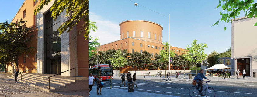
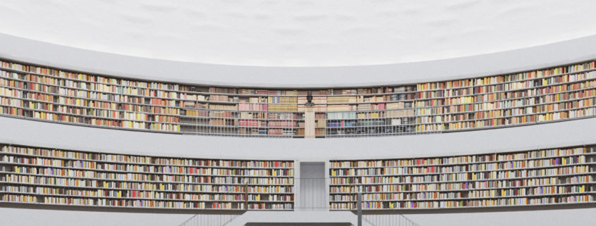
As soon as I discovered what the object of this challenge would be I started researching to get to know it more in depth and there were a few characteristics that really stood out to me right away. First, it was the lighting, the reasoning behind the rotunda, materials, height, etc. Second, it was the way it is sometimes described as a temple of knowledge. Therefore, I decided to play with these characteristics, the clever solution to illuminate the building and the idea of the library as a temple, a temple of enlightenment.
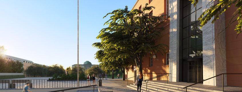
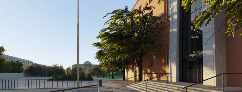
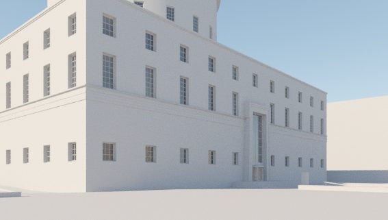
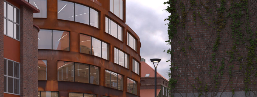
After having decided on the conceptual approach I started looking for references that could be applied to this project and to think about the best composition and lighting. I’ve decided to go with high sun and hard shadows on the exterior image to give it more depth and a better perception of the building geometry. The interior image will be symmetrical looking to the entrance and stairs but I still haven’t decided on the lighting, I like the way the sun shines on the shelves and on the floor in some parts of year but maybe a more diffuse light will better represent the lighting all around the year and better fit the idea of the ceiling and white walls as a sky. I’ll have it decided and more developed for the next update. The third image will be more intimate, with a viewer contemplating the entrance portal, to show its scale and magnificence, with a low sun shining on the facade.
Talk to you all soon


