Tomorrow Challenge entry by User-17841989

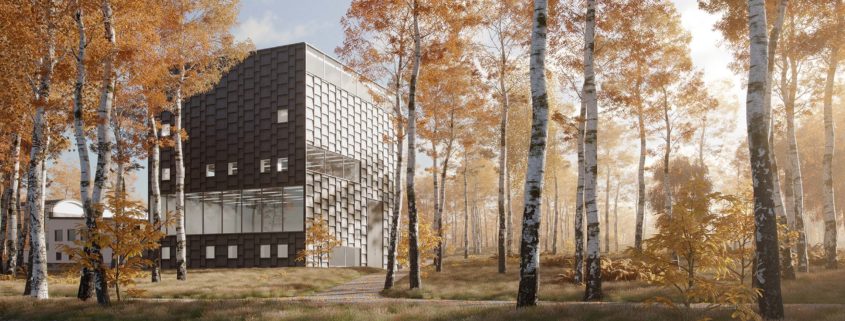
From the outset I wanted to create a scene which complimented the simplicity of the building and at the same time create a natural surrounding that would contrast the geometric forms of the museum.

Seeing as the museum itself was very dark I wanted to avoid a scene that was too dull and moody. By creating something bright would make the museum stand out and I wanted sunlight to be the main focus. I felt an Autumn feel would best compliment the dark tones of the museum. My aim was to capture the morning sunlight bursting through the tress creating long shadows and sunshafts.

The process was relatively straight forward. I began with the model; this gives me time to think about possible scenarios and familiarise myself with the building. From there I played around with camera angles and rough light setups to get an idea of possible compositions. Once I had decided on the final camera angle it was then just a case of creating the necessary assets. Some of these I had existing in my library and other I had to create. All landscape items were scattered using iToo Forest Pro. This tool, combined with interactive rendering in Corona renderer, have become invaluable for experimenting with a scene. Final lighting setup was a HDRi (Peter Guthrie) combined with a Corona sun to help emphasise the direct sun.

Post process was very simple. I wanted the image to be 90% complete from the raw render. I appreciate this is not always the most efficient method but in this instance it was possible to do. I added a few colour corrections and tone adjustments in Photoshop, but nothing else.

I would have liked to create more images for this final submission but due to the nature of the competition I felt time would be better spent on the main image. I will certainly be rendering more images from this scene, so I hope you look out for them.

Thanks for the opportunity.

Tomorrow Challenge entry by User-17841989

Having decided on the final composition I then focused on creating the necessary assets for the scene. Some of these I already had in my library but others needed to be created.

A very simple example was to create some birch leaves to scatter on the paving. I only had oak/maple leaves in my library, and since the trees are predominantly birch, it would be inconsistent to use leaves from the wrong tree types.

With the scene model nearly complete I just have the final lighting and atmosphere to set up. In this project my aim is to have a raw render which requires little post production. While this is not always the most efficient way of working because I had the time I felt it was worth doing. This approach also allows me to render out other angles at little cost because the work on the scene has been done in advance.

Final render to follow…

Tomorrow Challenge entry by User-17841989

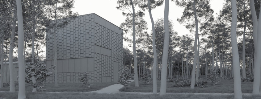
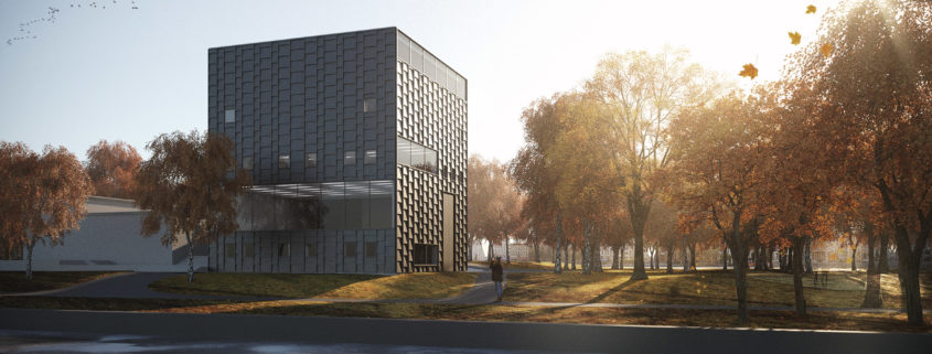
Below are some of the WIP concepts exploring the lighting and possible compositions.

The Sun’s position and the way the light interacts with the tree line is vital for the mood I’m am trying to create. Some simple considerations, like reducing the number of leaves in the trees, and focusing on the translucency of the leaf material help create the interesting shadows on the ground and sun shafts.

I am still undecided whether I will incorporate water in the foreground. This will require a wider crop and as a result the museum becomes less of a focus, therefore I will probably try two approaches and then make a decision on which is visually stronger.

Final concept to follow….

Tomorrow Challenge entry by User-17841989

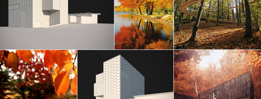
Beginning with the modelling has helped me quickly familiarise myself with the Museum and its surroundings. I did experiment a little with the Floor Generator tool (CG Source) to create the facade tiles, but nothing too out of the ordinary with the rest of the modelling process, it has just been a case of matching plans and reference images found online.

With the basic model complete, I have explored composition and lighting using interactive rendering. This is a great tool for getting instant feedback while still allowing for a degree of creative freedom.

Next steps…

I will most likely decide on an angle that captures the building in a way that has not been represented in any of the reference images. In terms of landscaping, I plan on loosely representing the real-life surroundings but with some subtle variations to help with the final composition.

I believe the existing landscape with the surrounding trees and park will provide a great opportunity to create an Autumn scene. The aim is to portray a cold Autumn morning with vibrant sunlight filtering through low-lying mist. I was particularly keen on capturing the feel of early morning with sun-shafts and long shadows to create as much interest at eye level. The warm colours should also compliment the cooler, darker colours in the Museum itself.

Below are some images of the model and a mood board so far. I will be posting the next update shortly which will show some of the initial concepts and lighting experiments.