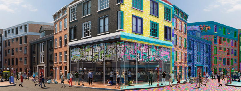
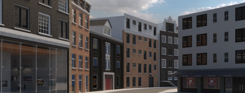
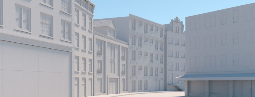
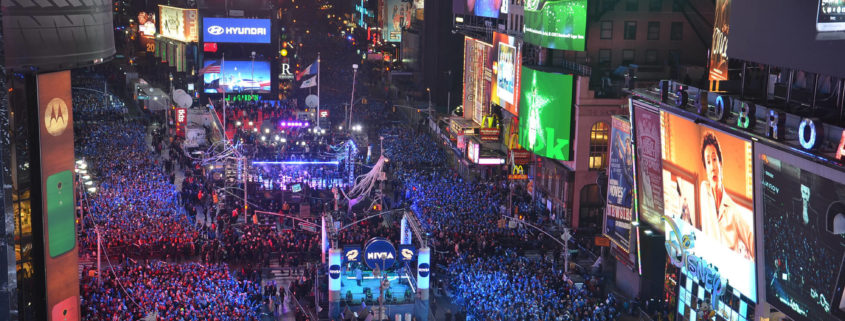
The initial idea of the project is to show two parallel worlds, which work in the same space-time but are independent.
These two universes have in common the architecture in its general shapes, but the great difference lies in the tones and colors that the people of each world used to build. On the one hand, we have materials in tones and textures conventional, something to which we are accustomed. In the other world, we can see that its inhabitants are much more of the color: Bricks are multi-tone, the street is a mixture of colorful elements and every material used is full of color. All this mixture makes this universe something completely different from what we have the concept of “conventional”. This is how this game of differences between the two universes is made. If for one its conventional material is a black brick for the alternate universe its conventional material will be bricks with all the colors that exist. This mixture makes the image seem uncomfortable in some cases, managing to catch the attention of the observer.
I wanted to draw attention to what we considered “normal” and “aesthetic” opening an endless possibility for expression, without defining parameters of good or bad.
In order to show the concept, the image is mirrored to represent the parallel universes as a kaleidoscope effect. At this point, I decided that people should wear different clothes to keep the game between the two worlds. Thanks to the software ANIMA LITE it was very simple to vary the textures of each of the characters, making each character in the two universes in the same space-time but in different combinations of colors.
Finally, when deciding the format of the image opts for a fairly wide relationship. Each universe has a 2:1 image ratio resulting in a large 4:1 image, presented as a history board, for the observer to play to find the differences between the two worlds.
It was a challenge to make this proposal, I hope you like it. Thank you!


