Tomorrow Challenge 2018 entry by User-92270532

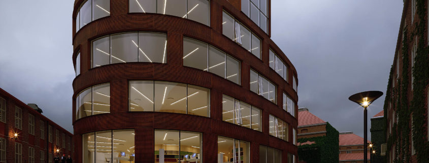
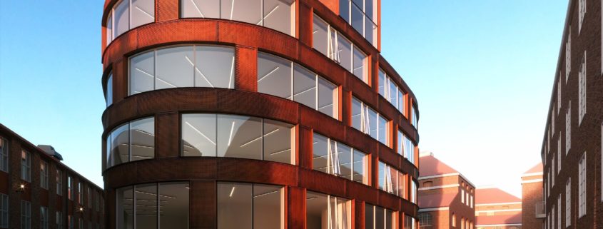
After submitting my final and resting my eyes from the project, i thought i’d have some more fun with it. This was inspired by the overcast mood where am at just before it started to rain. So i thought i’d give this another shot and try to study the overcast mood/light. So here i just share what i came up with.
Once again, this has been quite a thrill and i thank the team at Tomorrow and Ronen for putting this together.
Cheers

Tomorrow Challenge 2018 entry by User-92270532

This is my last update showing how far i’ve gone. I’m now gonna concentrate on finishing up. Areas of concern for me are, fixing the green wall at the back, fixing a few materials and adding some street furniture/props plus some more props in the interior.
I’d like to thank the Team at Tomorrow and Ronen Bekerman for putting this competition together, it’s been quite fun and a learning experience for me.
Cheers

Tomorrow Challenge 2018 entry by User-92270532

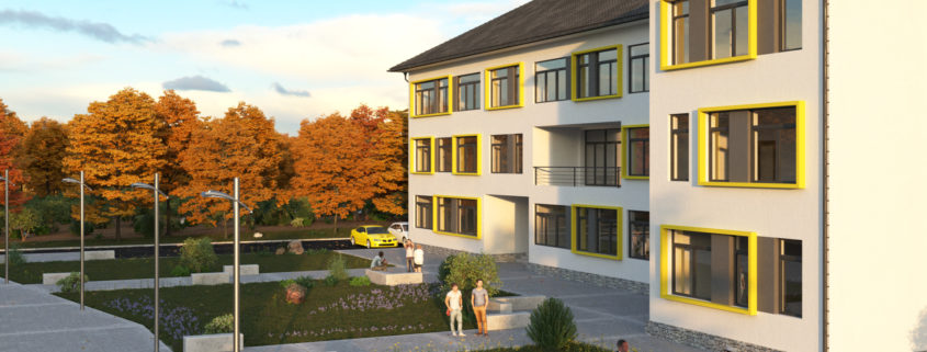
Working on detailing the exterior environment before i can get to do the interior.
So this progress looks at how the interior and some exterior artificial lighting balances out with the natural dusk general light.
There’s still a couple of areas that might need some artificial light so will get going on that.

Tomorrow Challenge 2018 entry by User-92270532

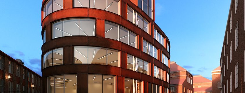
Following up on my previous progress, i took time to compare my work with the existing built project. The model provided is a good starting base that needs quite some work to get it right with the actual existing School.

So, i took to looking for various references online that’s the plans and photos to try and have a better guide to work with or from. The plans i came across were of quite low resolution and some details had to be eye-balled so as to come up with somewhat a convincing model.

When i was a little satisfied with the model, i got to rethinking the shot frame. I thought a more dynamic frame like the one of the reference photo showing the Entrance would be a good fit. So i modified the frame in order to have more dynamism.

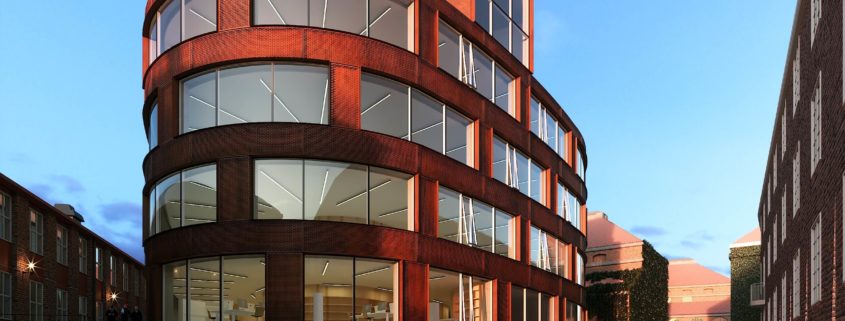
I maintained the mood, however, i played around with the rotation of the light so that i could have the warm reddish dusk light wash one side of the facade and also have the light leading into the background of the image.

Then i got to tweaking the main material for the facade, that is the corten sheets. I have two layers of cladding both with corten sheets except for the outer most being perforated. So using unwarp in max, i created a base for the corten that i later on baked-in in photoshop. The material itself was created with Bitmap2material with samples that i gathered online.

Once i was satisfied with the material, i got to working on the artificial lights so as to archive a chromatic contrast with the natural blue/reddish light. this lighting also creates an interesting change in the corten between the parts of the corten that are lit and those in the dark.

Still working on a couple of details but this is as far as i’ve gone.

Tomorrow Challenge 2018 entry by User-92270532

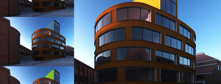
Well, even though i really like the corten cladding, it feels quite visually heavy. So i though to take advantage of the volumes/ forms that we have for the building.

The building has two distinctive forms and i thought i could explore with the top form and try and come up with an interesting contrast.

So here i got to play around with just plain colors and try to come up with a combination of contrast that felt desirable for me.

I felt that the yellow contrast works well for me because it’s closer to the red corten in the color graph and also brings an interesting warmth to the whole image.