The challenge of Tomorrow entry by flow

The project wants to draw attention to the humans behaviour in relation to climate change and sea levels rise. Following the construction of taller and taller skyscrapers over the past decades, cities have grown fast and increasingly moved away from the human dimension. On the other hand, the first effect of sea levels rise will probably be a modification of the urban layout of coastal cities. Cities are called to rise, building higher streets and readjusting existing buildings while nature reclaims the lower spaces of the old city. It’s a race against time: will humans be able to reconcile with Nature? Men have to reconvert their life in a more sustainable way as quickly as possible.
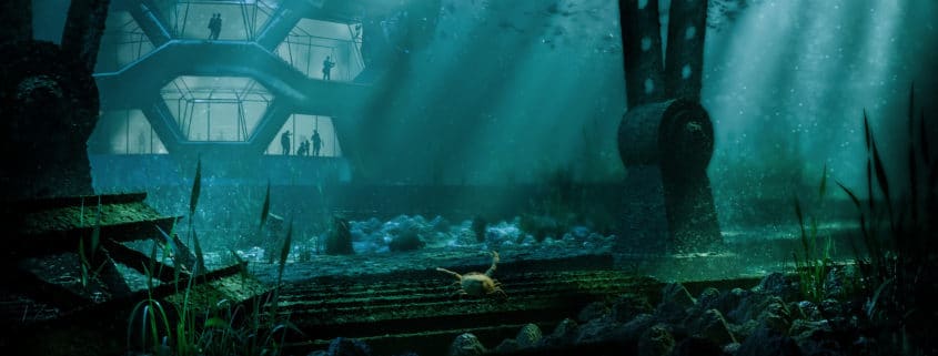
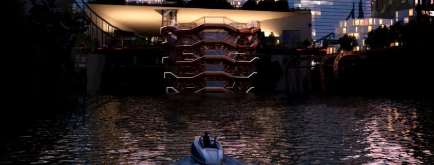
I imagined Hudson Yards’ exterior of the future as a layered space where the lower part has already been covered by water and is reachable by boat. The upper part is occupied by reconverted buildings and ongoing building sites. In this context the Vessel becomes an underwater aquarium.
I wondered how the new architecture of Hudson Yards would be In my concept’s scenario. The new architecture should be adaptable to the fast-changing urban layout. The new architecture should also be modular and based on sustainability, reuse and recycling. It reminded me of Bjarke Ingels project for Copenaghen harbour, where old container ships are reused to create residential architectures. I studied the base module of the composition that will be assembled in my project in different ways to create more complex buildings. Those modules (consisting in two joined containers) will create new residential possibilities, green and sustainable spaces bringing back architecture to an human – and Nature – focused scale.

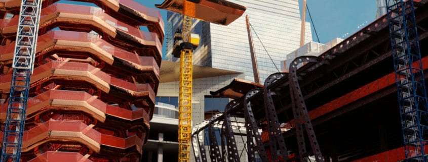
– the building site: I would like to represent the site under de-construction where the lower parts of the buildings are being dismanteld and just the structural frame remains visible. At the same time new modular containers are placed on the roof of the shed and a new footbridge is built on the upper part of the Vessel. I’d like to show the idea that in a few years’ time a recently built site is brought back under construction due to the pressure of Nature.

– the new layout: the second image represents the new layout of the square. I would like to show the attempt to change people’s lifestyle in a greener way. Obviously it won‘t be easy, especially due to the widespread of cars (I represented this difficulty with the highway in the upper part of the image).

– the new Vessel: in this scenario the Vessel becomes an underwater aquarium where people are reminded every day of the beauty of Nature and frailty of human condition With tihs image we are litterally put on the side of Nature.

The challenge of Tomorrow entry by flow

Hi guys,
here’s an update about two of my three images. Before returning to the first image (I don’t know why but it is the most complicated) I would like to push the other two images a bit far just to be sure that I can manage to finish in time without going crazy.
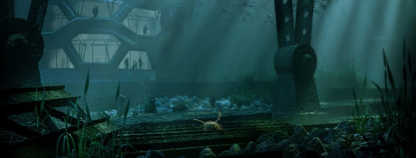
So here’s two images with some post production: i decided to post both pre and post to show what I’ve done:
– in the underwater image I worked in post with render passes but all the objects are full CGI
– in the building site i’ve done the same thing but I added people in PS.
what do you think? your comments in this phase will be very very useful.
thanks

Francesco

The challenge of Tomorrow entry by flow

Hi everybody,
here’s two work in progress images:
– the building site scene: this is the image before adding people and adding the last color grading pass (I manage post directly in corona and I did just a little bit of camera raw filter in PS). I modeled as much as possible in 3d so I don’t have to spend so much time in post.
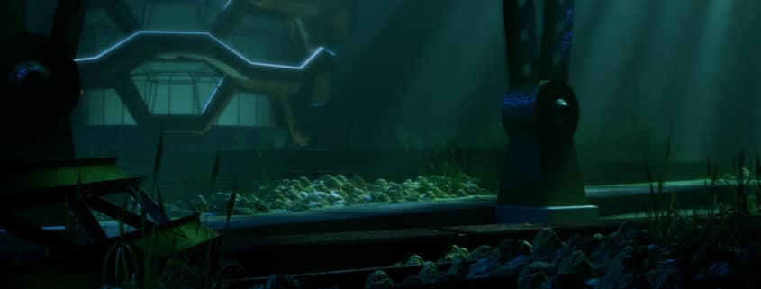
– the underwater scene: this is the base of the third scene I started to model (is WIP). It shows the lower part of the vessel and the base of the shard with its typichal basements (which will have already been de-constructed in the building site phase). Instead of working directly in corona with motion blur I preferred working with render passes and adjust it in PS to have much control of the part I want in focus (I have to manage both motion blur and volumetric material). I would like to insert fishes and maybe a crab as 3d model (I would like to model them) and maybe also 3d people to have more control of colours and shading.
Hope you like it, comments and suggestions are always appreciated.
thanks

Francesco

The challenge of Tomorrow entry by flow

Hi everybody
I haven’t finished my first image yet but I started to work on my second one.
The project will consist in these three images:
– evening image of the future scenario (when water will cover the lower part of the buildings)
– morning image of the builfing site (nowadays)
– underwater image (I hope I can do this…)
Here a first quick render of the image, i would like to represent the site under de-construction. I liked the idea that a early constructed place will be partially reconverted in 20 years. So I would like to represent the construction of the footbridge in the upper part of the vessel.
there’s more work to do both in texturing and adding details.
what do you think about? Comments and suggestions are appreciated.

The challenge of Tomorrow entry by flow

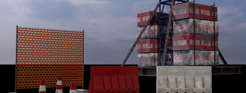
When I started this challenge I promised myself that I would have modeled all the objects in the scene (except for plants obtained with forest pack and people added in post) because I think that every 3d challenge is an opportunity to improve your skills.
Well, according to my concept the second image should be referred to a building site so I had some fun modeling some assets that I would insert in the scene.
I worked with 3ds for modeling and Corona layered materials (with vertex paint) for texturing.
Hope you like it.

The challenge of Tomorrow entry by flow

Hi everybody
I decided to follow your suggestion and revise my first image’s composition (thanks so much to you all).
I wish I give more breath to the view so I streched up the size.
There’s much more work to do specially in modeling and texturing but I just wanted to be sure that I was on the right way.
So i exported a quick render and decided to paint over the image in PS to have a clear idea in mind.
then I had a look at the desaturated image to have an overview of lighting.
I know it could be better…but I haven’t a graphic table yet (should arrive soon) so I did all the work with a mouse…please have mercy on me.
On the other hand…It’s only a work in progress : )