22 Bishopsgate Case Study
22 Bishopsgate is the tallest skyscraper in the City of London, at the heart of the financial district. Check out this case study by Walk the Room who made the amazing visuals for this project designed by PLP Architecture for AXA IM and Lipton Rogers Developments. Enjoy!
THE CONTEXT
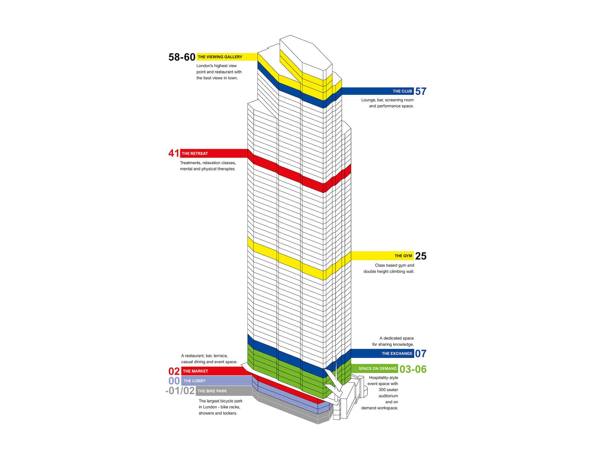
22 Bishopsgate is the tallest (278 meters, 62 stories) skyscraper in the City of London, at the heart of the financial district. It has been designed by PLP Architecture for AXA IM and Lipton Rogers Developments. The building is a “Vertical Village” of 1.3 mil. sq ft of space, built to support the 12,000 inhabitants working there. As such, it houses a fresh food market, innovation hub, gym, wellbeing retreat, and spa, curated “art walk”, business club, bike park, destination restaurant, as well as London’s highest free public viewing gallery. All such integrated amenities and social spaces (in total ca. 200,000 sq ft) are designed to create an inspiring, healthy and energizing workspace.
WtR has delivered beautiful visuals, expressing not just the architecture but also a feeling, bringing them to life. If you can be precise on the parts you will need and give them freedom in other areas where they can also show their creative skill, you will not be disappointed. We’re overall happy with the results and would work with them again. – Jérôme Rigoni, AXA IM.
THE APPROACH
AXA IM reached out to us to help them showcase the interiors of the building, focusing primarily on the lobby and the various social spaces. As the overall aim for the building is to give back to the people working and living in the City, the main challenge was to make sure all images carry a strong sense of humanity. Our aim in all images was to tell a story, capture the imagination of the viewer and evoke emotions, rather than just show the space in a traditional way.
Imagine the building you would want to work in, a place that puts people first – a “Vertical Village” in the heart of London.
COLLABORATION WITH PARTNERS
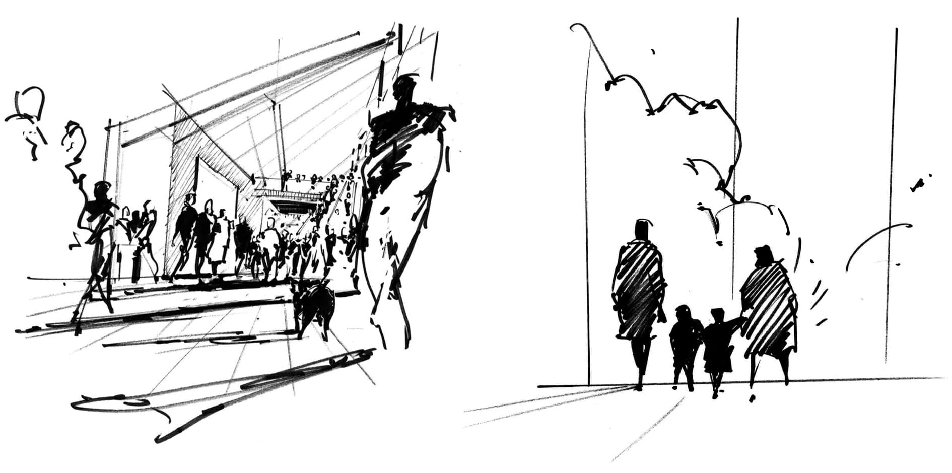
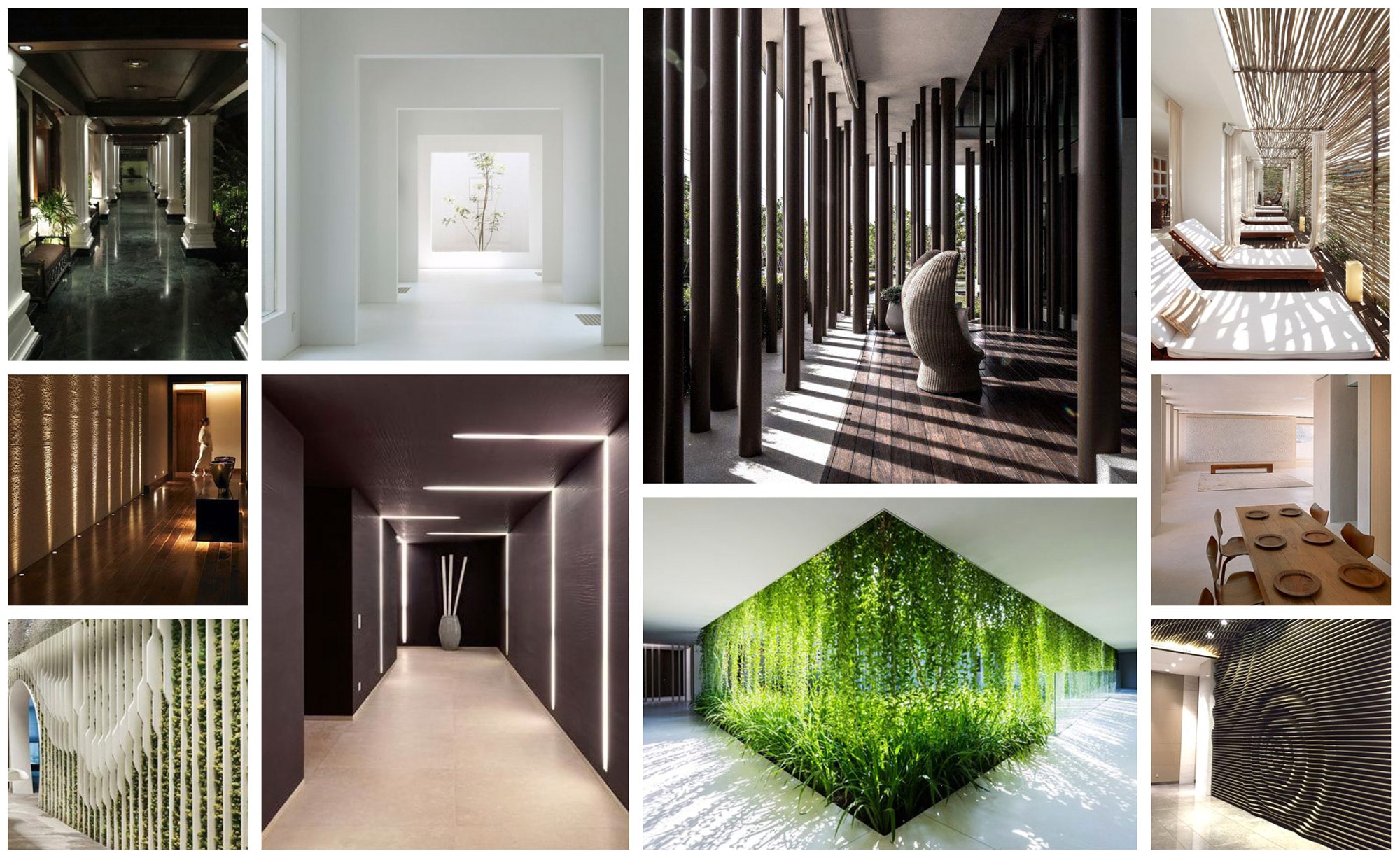
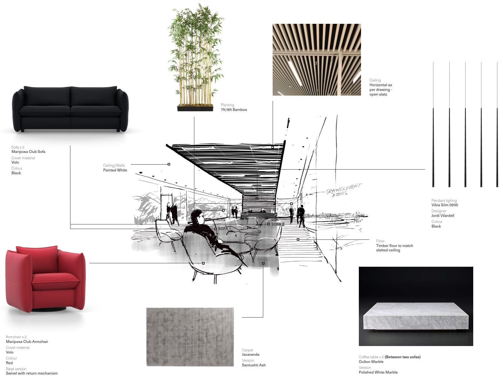
We worked very closely with Sutton Young (SY), a creative design consultancy. The team at SY has provided us with sketches, mood boards and high-level guidelines for the majority of the images and was closely involved in discussions with AXA IM and the overall delivery. For the interior fit-out concepts, we have worked with inputs from EDGE and DesignLSM.
WORKFLOW
We delivered 13 images in total over the period of ca. 5 months. Every image began with discussing and aligning on the creative brief with AXA IM and SY, based on which we took forth two or three possible stories (sketches) for each image. Internally we have worked in teams of 4-5 people for each image, with the teams jointly coming up with the different stories. After the most fitting story was selected, one artist proceeded with the image until the final result, with feedback from AXA IM and SY at each important milestone. To save the Client’s time, the majority of the feedback and design discussions took place online, with the support of WtR’s various digital tools. Personal meetings were organized in connection to the few major project milestones.
22 Bishopsgate Images delivered
THE LOBBY
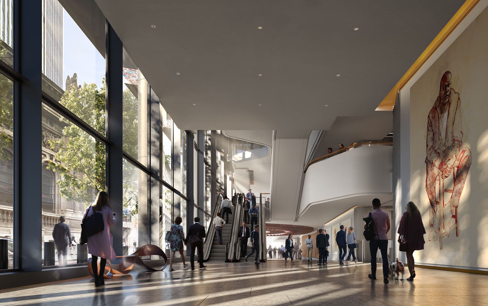
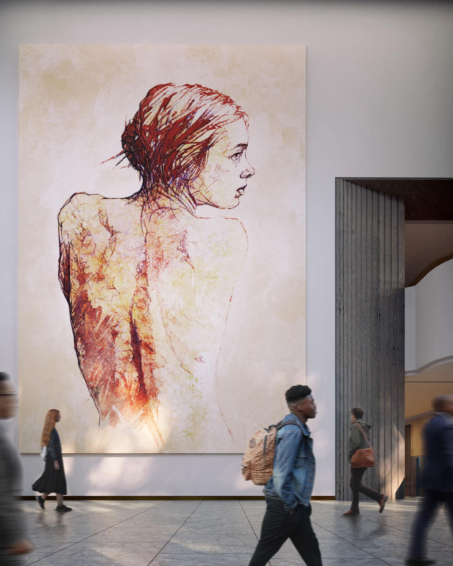
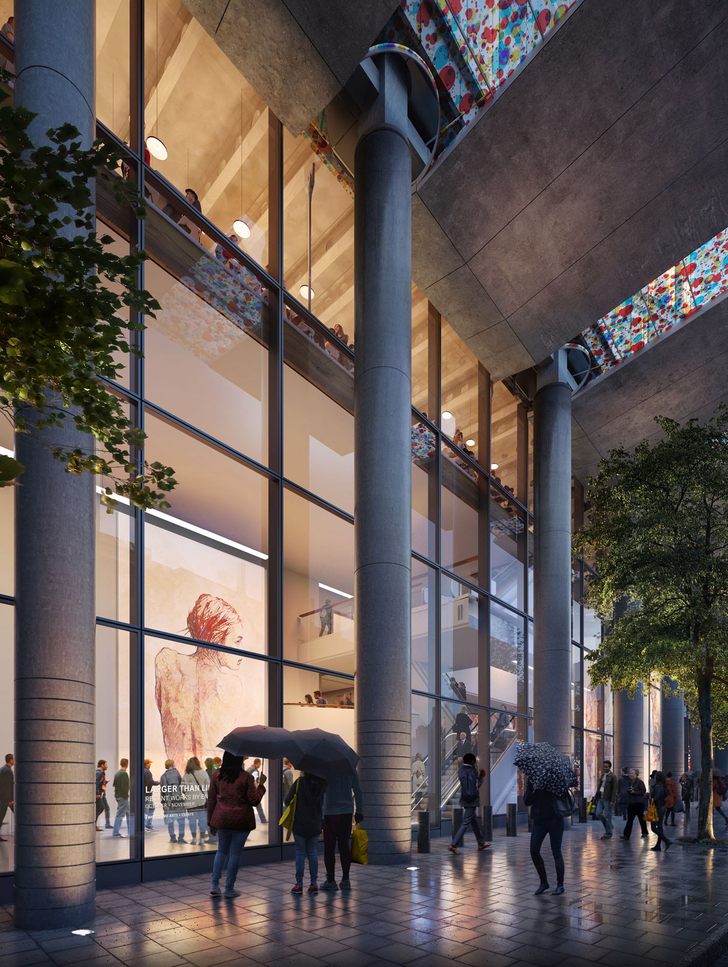
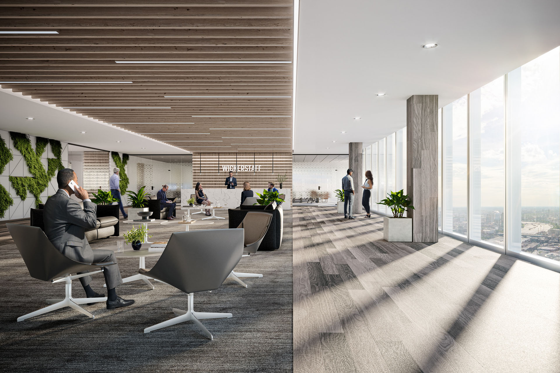
The Lobby is a large, light, inviting space providing a warm and impressive welcome. With its changing art exhibitions, modern technologies and friendly concierge team, it is an extension of the culture and energy of the City. Our emphasis in the images has been on the art and its ability to enthuse the visitors and help them disconnect for a minute from their busy days.
THE MARKET
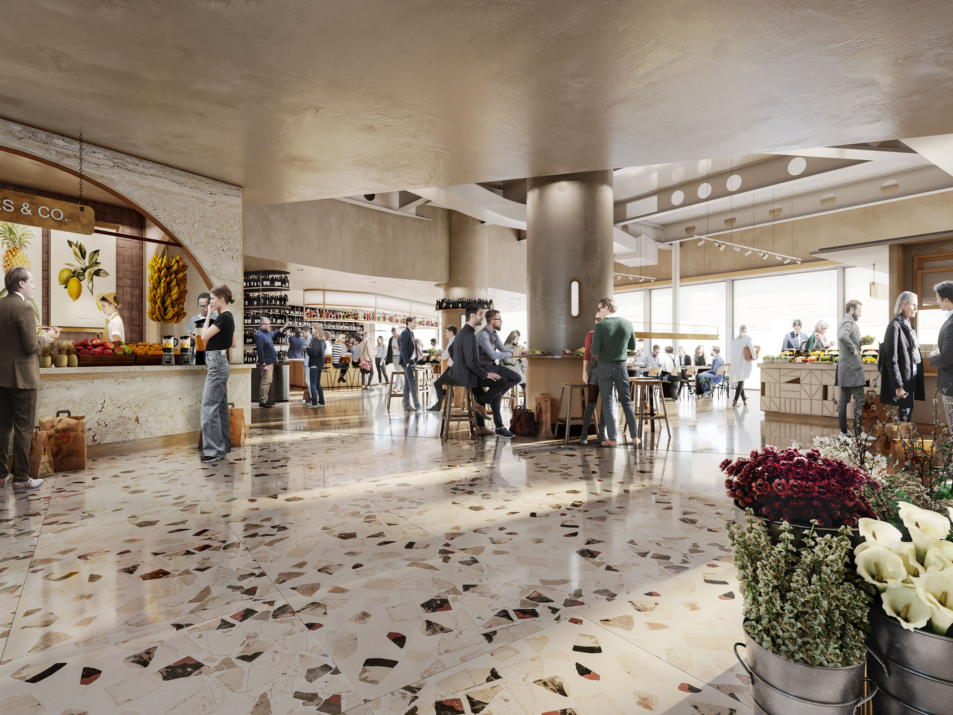
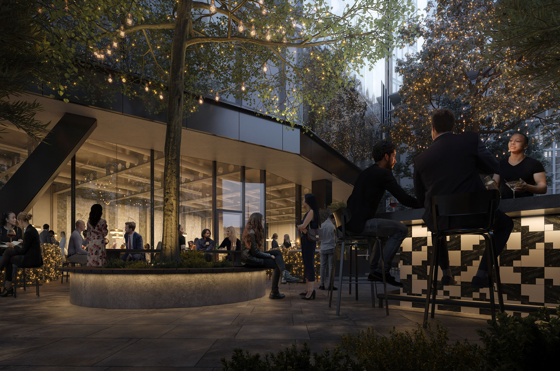
The Market is located on Level 2 and contains 20,000 square feet of quality food options and dining atmosphere. With various open kitchens, fresh food kiosks, a restaurant, and a terrace bar, there is an option to suit everyone’s taste.
THE EXCHANGE
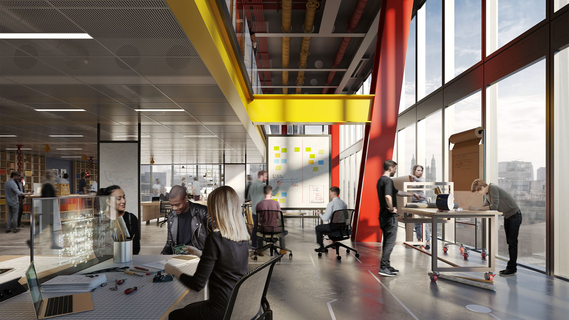
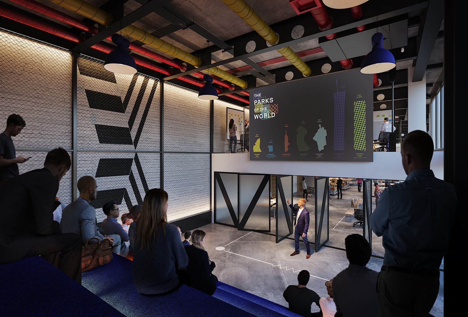
Located on Level 7, The Exchange is the place for people to meet, collaborate, innovate and capitalize in any way they like on the 12,000 people-strong community working in the building. Our focus was on the co-working area and the auditorium, emphasizing the flexibility and innovative buzz of the area.
THE RETREAT
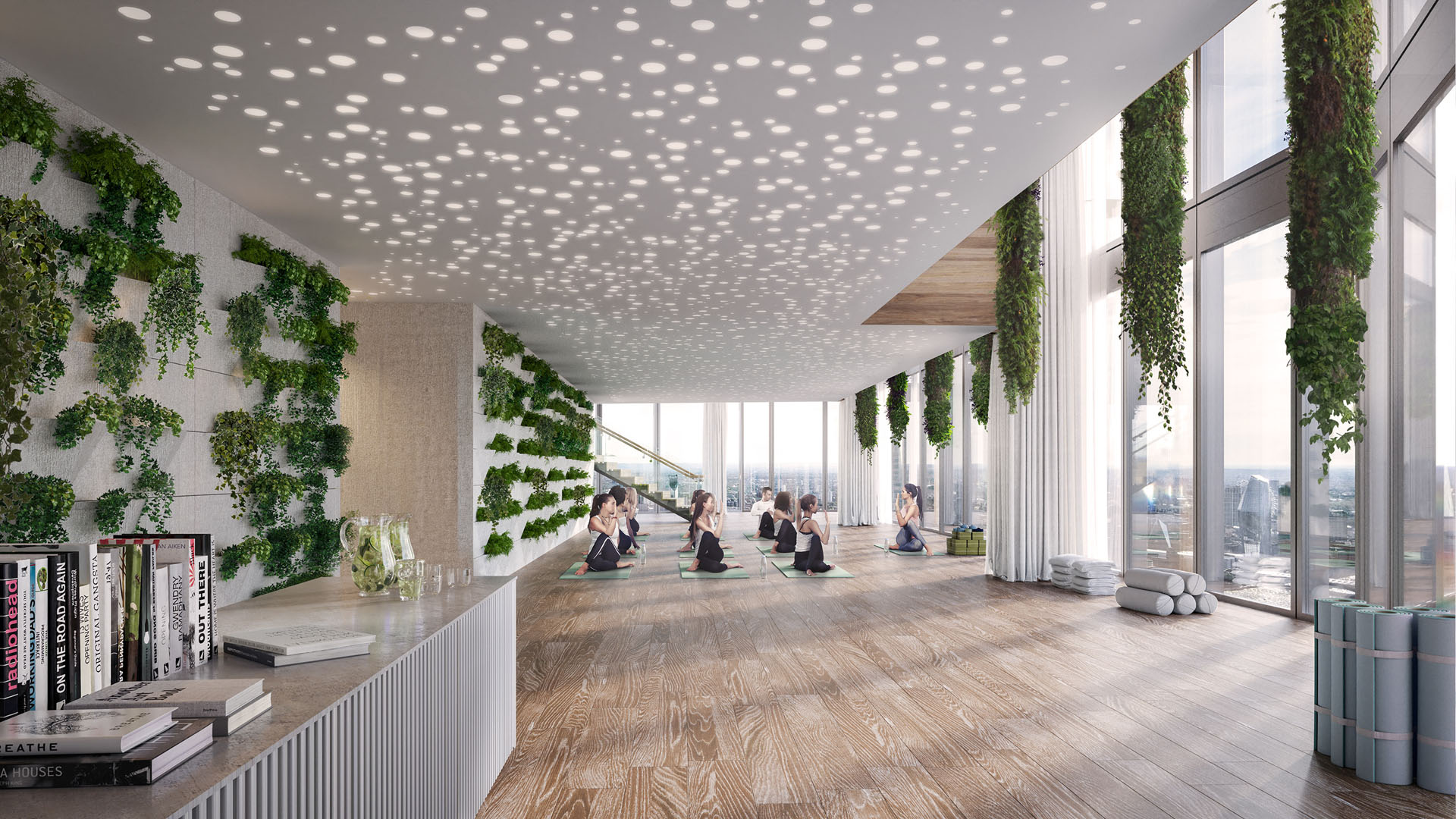
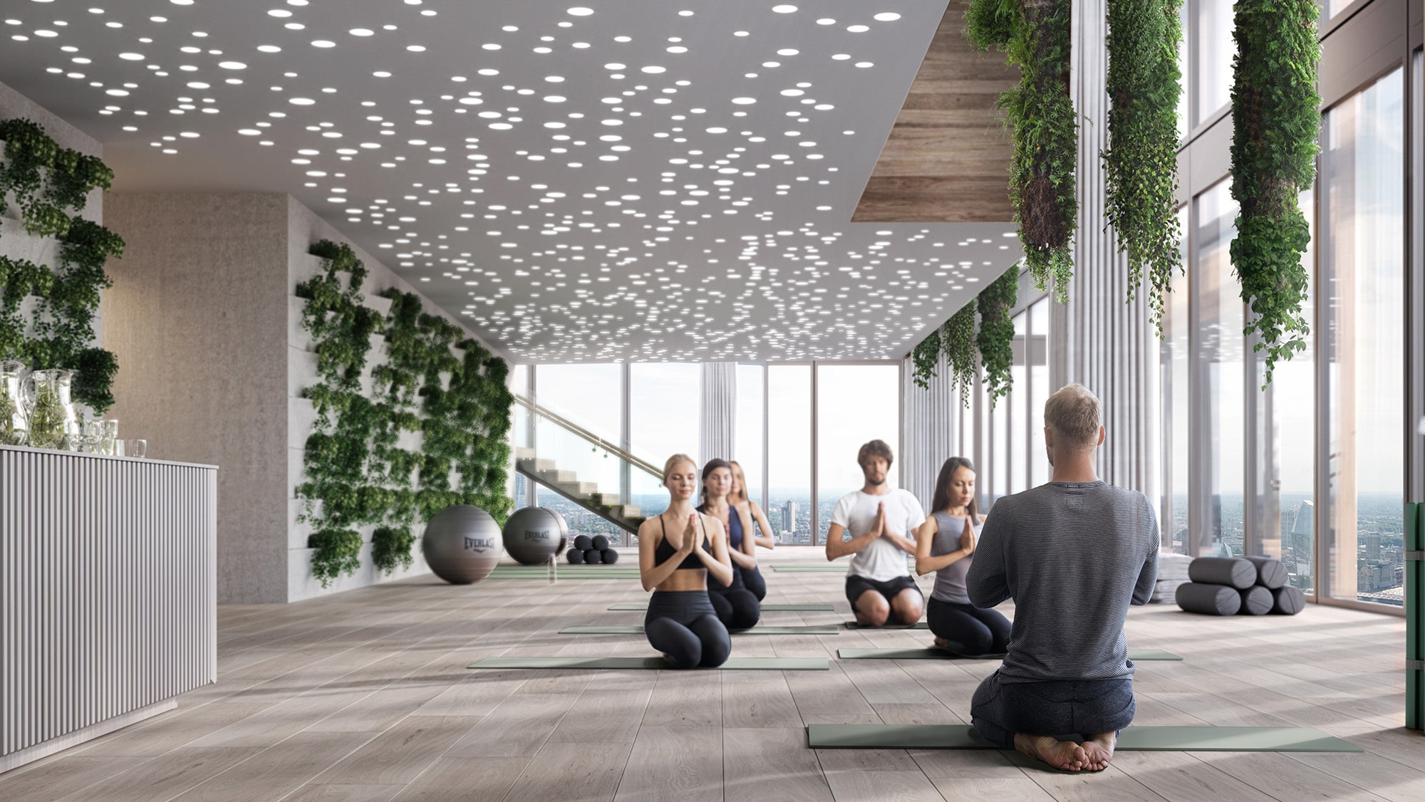
The Retreat is located on Level 41, with impressive views of London. It is a place to relax, unwind and recharge, be it during the day or after a tough day at work. Our goal was to convey the calm and soothing atmosphere of the space, where people can attend a yoga or meditation class, therapy or simply disconnect and take a break.
THE CLUB
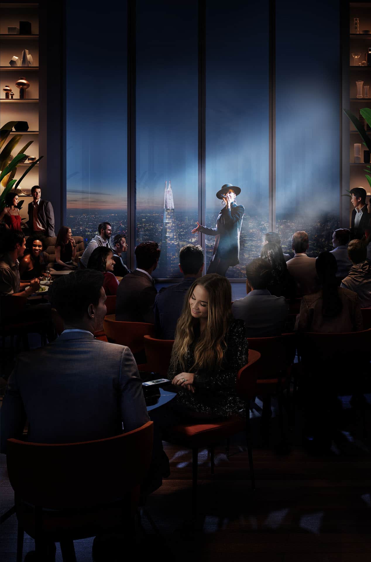
Situated on Level 57, The Club is the special event space of the building. Containing a lounge, bar, screening room and performance space, all with amazing views of London, it was designed to serve as a space for social and business gatherings both during the day and at night.
THE VIEWING GALLERY
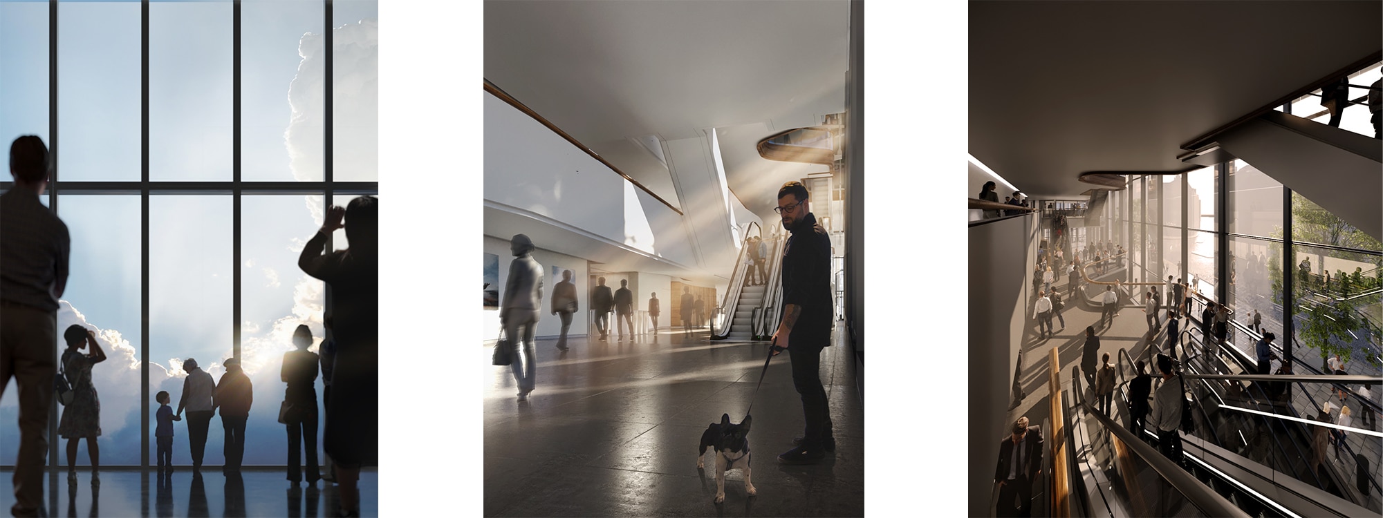
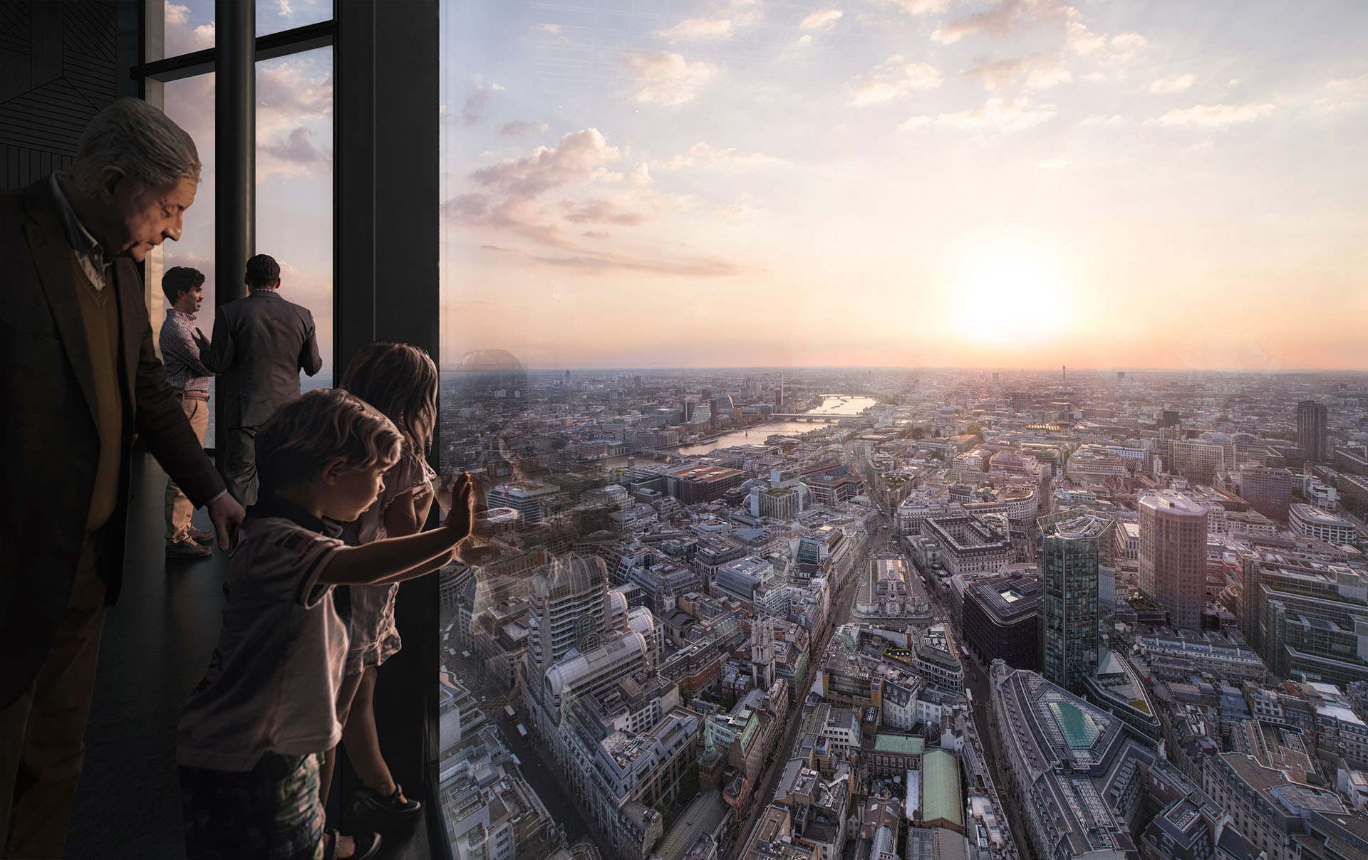
The Viewing Gallery is located at the very top part of the building. It is a space that anybody can enter through a separate entrance, to enjoy the best views of London (free of charge) or eat in its highest restaurant. It is somewhere where you can take your (grand)children for a Saturday afternoon.
OFFICE FLOORS
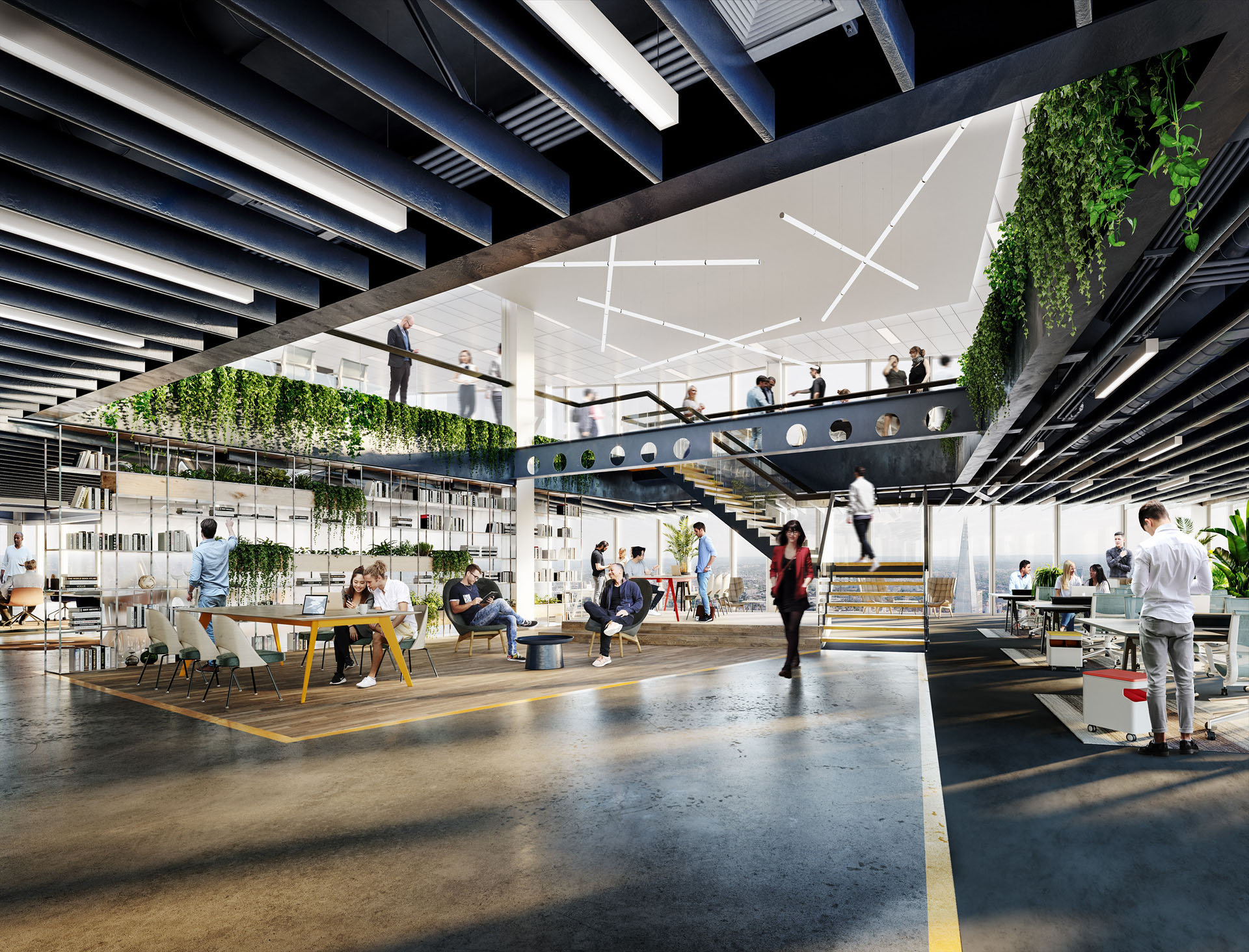
Each floor offers 21-27,000 sq ft of office space and can be adjusted to suit a variety of working styles and layouts – in full alignment with the needs of the respective tenant, as well as the latest trends and advancements in the area of technology, collaboration, and well-being. Our aim was to show two very different and distinct uses of the office floor.
EXTERIOR
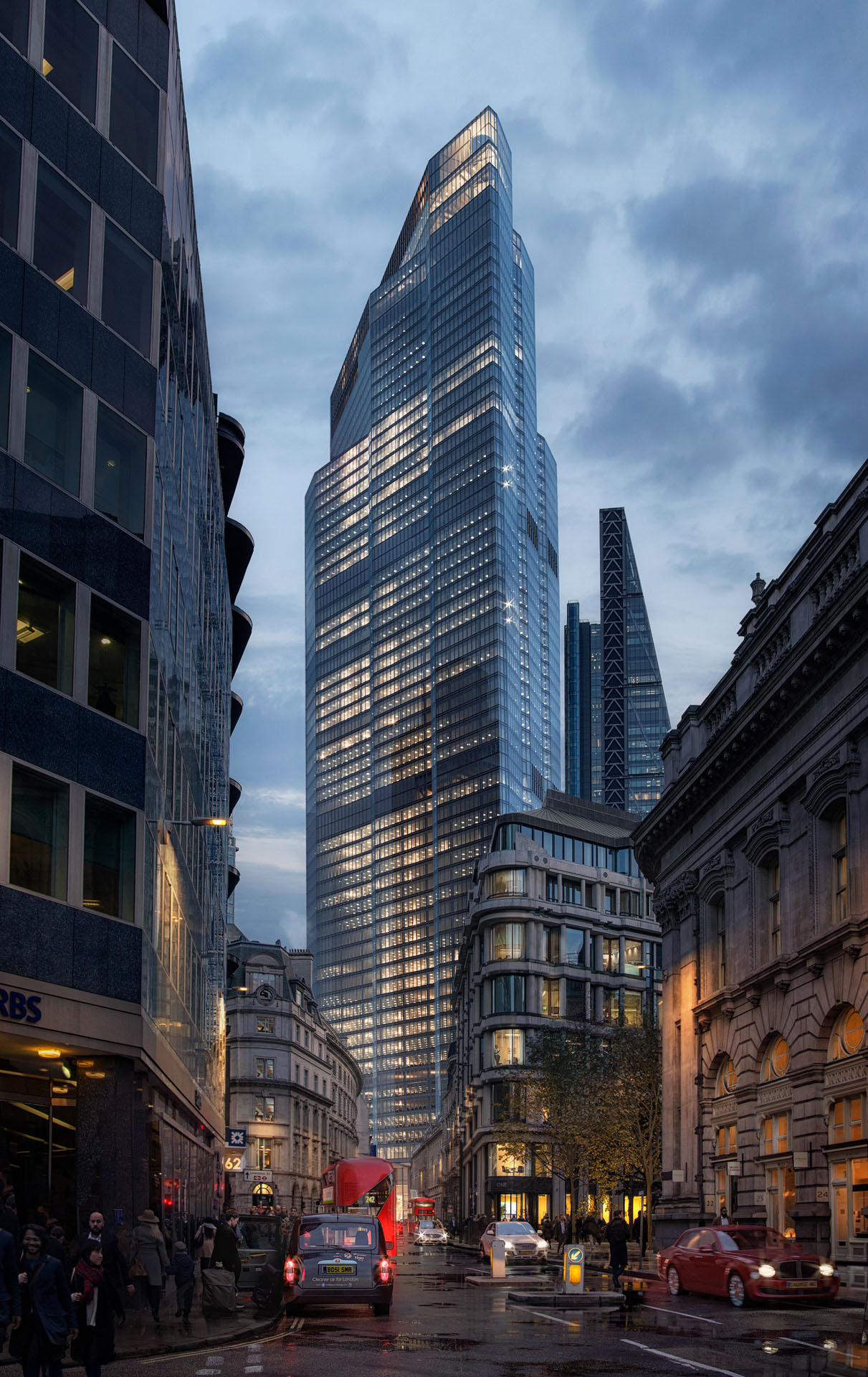
On top of the set of interior images, we have delivered one exterior image as well – a street-level view from Threadneedle Street. The end result is a moody image with a distinct London feel, showing the connection between the “old” and the “new” and showcasing the new dominant of the City in the best possible way.
THE RESULT
The collaboration and team effort among the several agencies have been very productive. We managed to deliver all views in line with AXA IM’s timeline and to a high level of satisfaction. The human connection, particularly visible in the public spaces, is what characterizes the project and where the WtR touch is most visible. The materials produced have been used in the printed brochure, as well as on the website and other digital channels.
22 Bishopsgate is an extremely high-profile development and as such has numerous stakeholders each with their own thoughts and ideas. WtR contended with all the many requests well and in an extremely timely fashion. – Charlie Byrt, Sutton Young.


