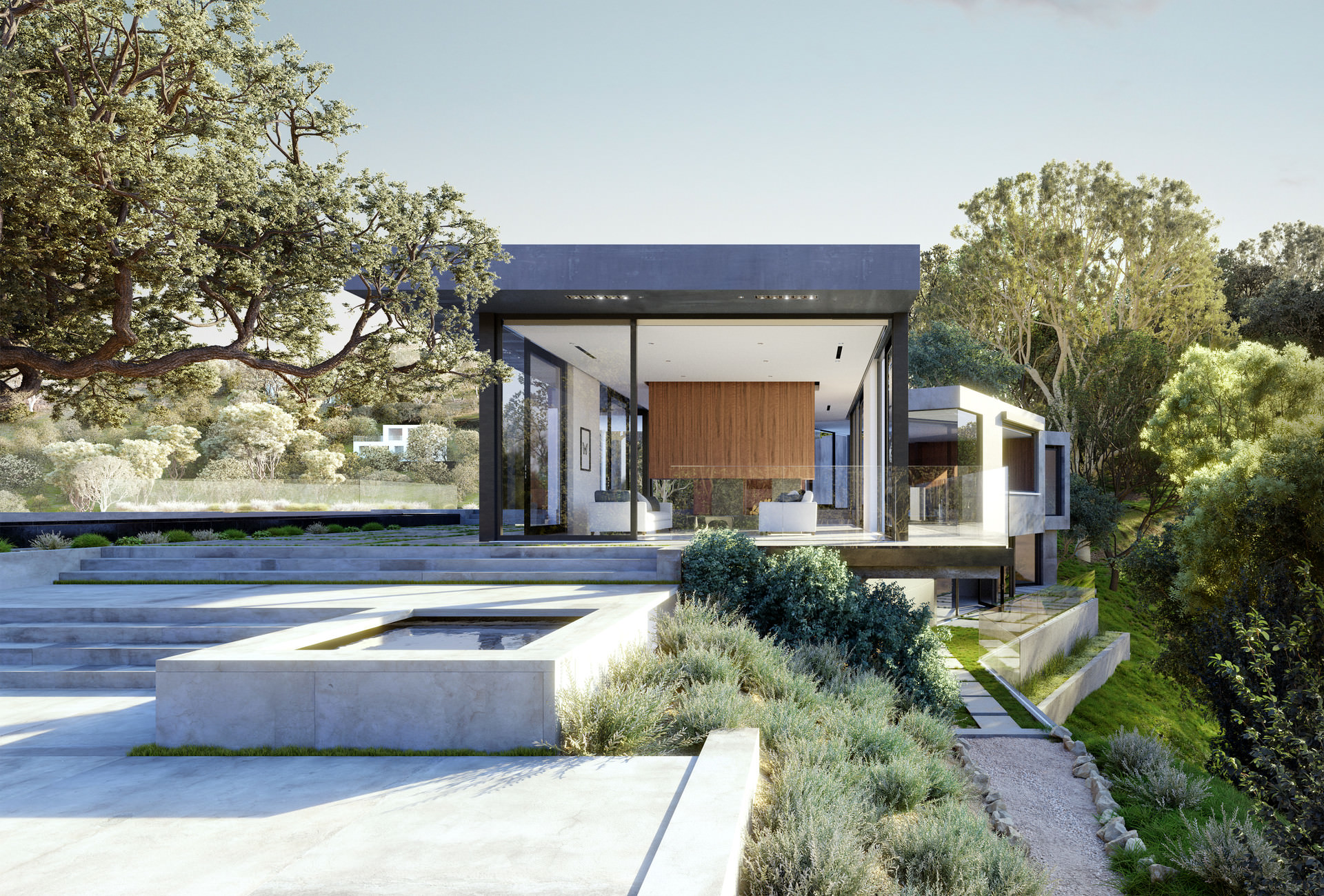
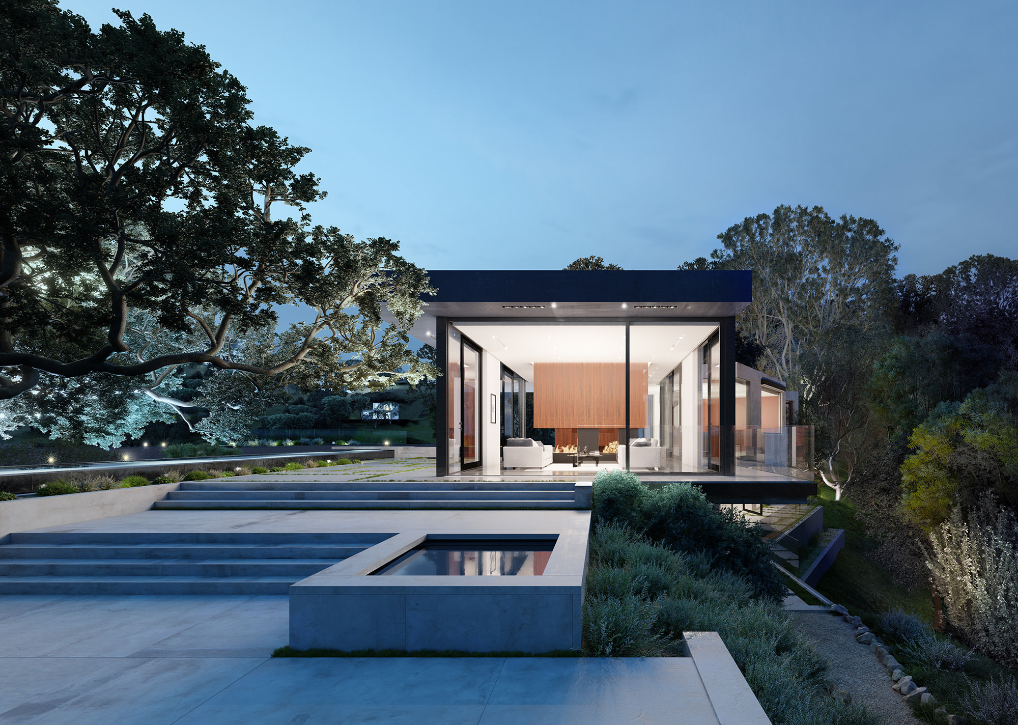
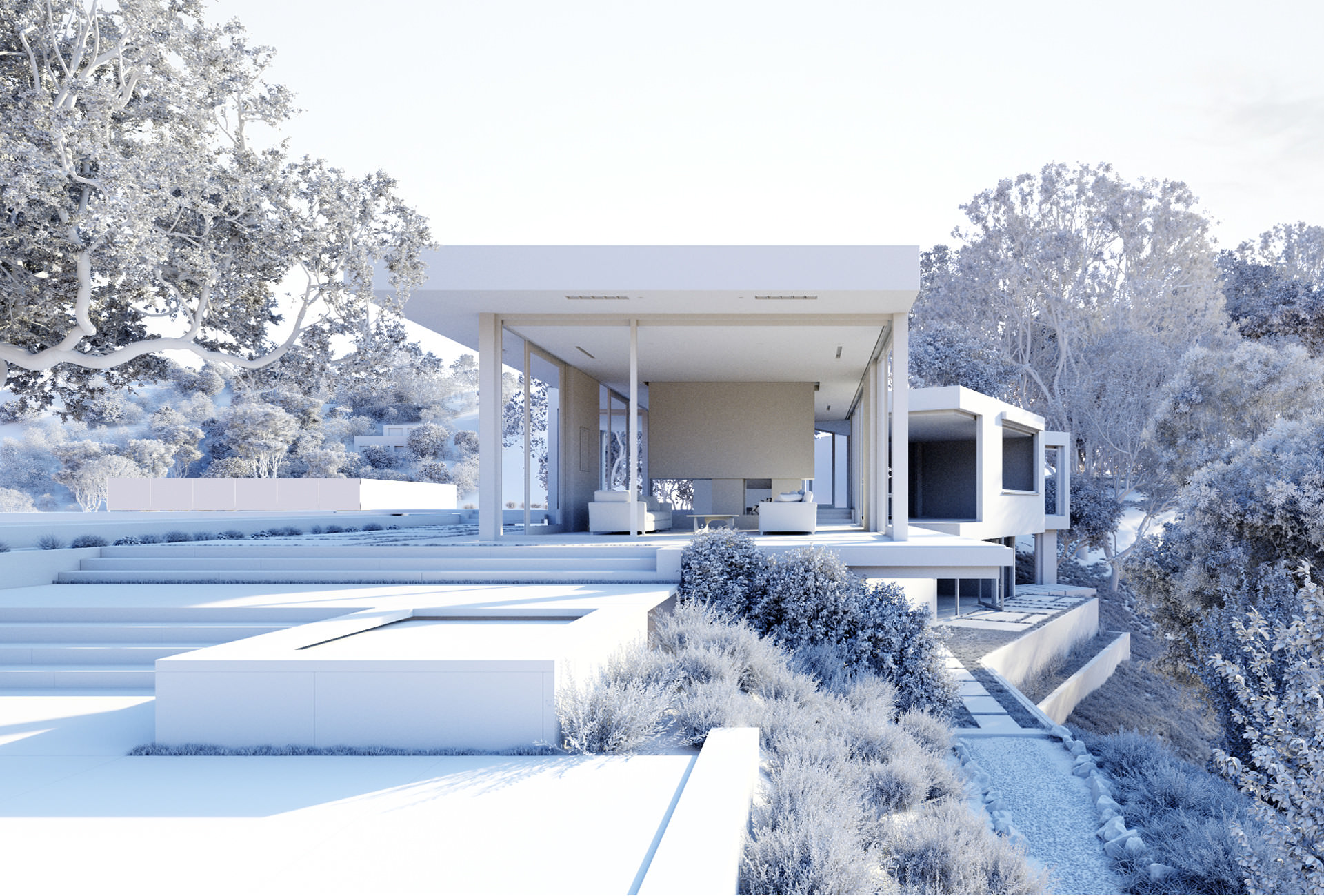
Parkveien #3
I have finished the 3rd piece of my container city personal project. This time I completely demolished my street 🙂
Comments are very welcome.
Best,
Tamas
Also, here is a short breakdown video about the process:


Access the Best Articles about Architectural Visualization. Learn about all aspects of crafting images that tell stories.
Making Of's Case Studies WorkflowsShare your work and get immediate appreciation through discussion, feedback, and a possible nomination for the…
A weekly experiment, exploring the creative minds in Architectural Visualization and more. Find out what makes us all tick and push the limits.
Listen Now! Subscribe on iTunesOut with the old and in with the new! In Converted, I’m asking you to take an in-depth look at existing architecture near you or one you love worldwide and introduce something new.
See Entries & Join! About ConvertedI have finished the 3rd piece of my container city personal project. This time I completely demolished my street 🙂
Comments are very welcome.
Best,
Tamas
Also, here is a short breakdown video about the process:
After a long and rewarding six-year tenure at Hayes Davidson until September 2016, I spent some very fun hands-on time working with my friends at The Boundary for a few weeks at the tail end of 2016. Naturally, some interesting conversations started to happen regarding architecture, design, photography and the CG industry.
The conversation organically led to differences in how an individual who is heavily involved in the design of a building and its ‘key’ parts perceives the scheme versus a separate and independent photographer or visualiser. Creator vs observer.
Enter the ‘Carey House’, a project originally both designed and visualized by Henry Goss and a unique opportunity to start a little experiment and have an independent observer/photographer/visualiser ‘remix’ the Carey House with fresh eyes.
The Boundary kindly gave me their Carey House Scene, which is available on The Boundary Store for you all, and the work began.
The only elements that were retained from the original scene were the general house model (barring some minor design changes) and the general landscape mesh as a start, everything else was modeled, forest packed, rendered and photoshopped independently in order to compare notes in the end.
Please enjoy the image set we produced at arsvisualis and let me know your thoughts below!
Hi all.
This is a project located at the Chilean patagonia, the concept of the images was to create a mimesis between the natural context and the glaciar form of the project design, with an atmosphere inspired for the loneliness of the place.
Hope you like it.
The main purpose of the project other than to showcase my skills was to test Corona Renderer and its limits. I used the Alpha version of Corona for Cinema 4D here. The furniture models are mostly from design connected. The background was also modeled by me.
First shot of the upcoming project, it’s a training project, I found a photo of the very interesting house a and tried to reproduce it. Almost everything I modeled in Blender just furniture is purchased. Rendered in Cycles and post process is done in Photoshop.
Check out the MAKING OF Oak Pass!


Hi All,
Such a long time since I posted anything. So here is my latest personal project called “Bright Future in a Bright World”.
The idea of the image came from a road trip in Denmark. I was amazed of the beautiful landscape and wheat fields right next to the motorway. After that I decided to recreate that mood with a hint of retro futurism to add some extra meaning…
Video: https://www.youtube.com/watch?v=LcER9FVmN88
Hope you like it 🙂