Bauhaus at Dessau Visualization by Bertrand Benoit
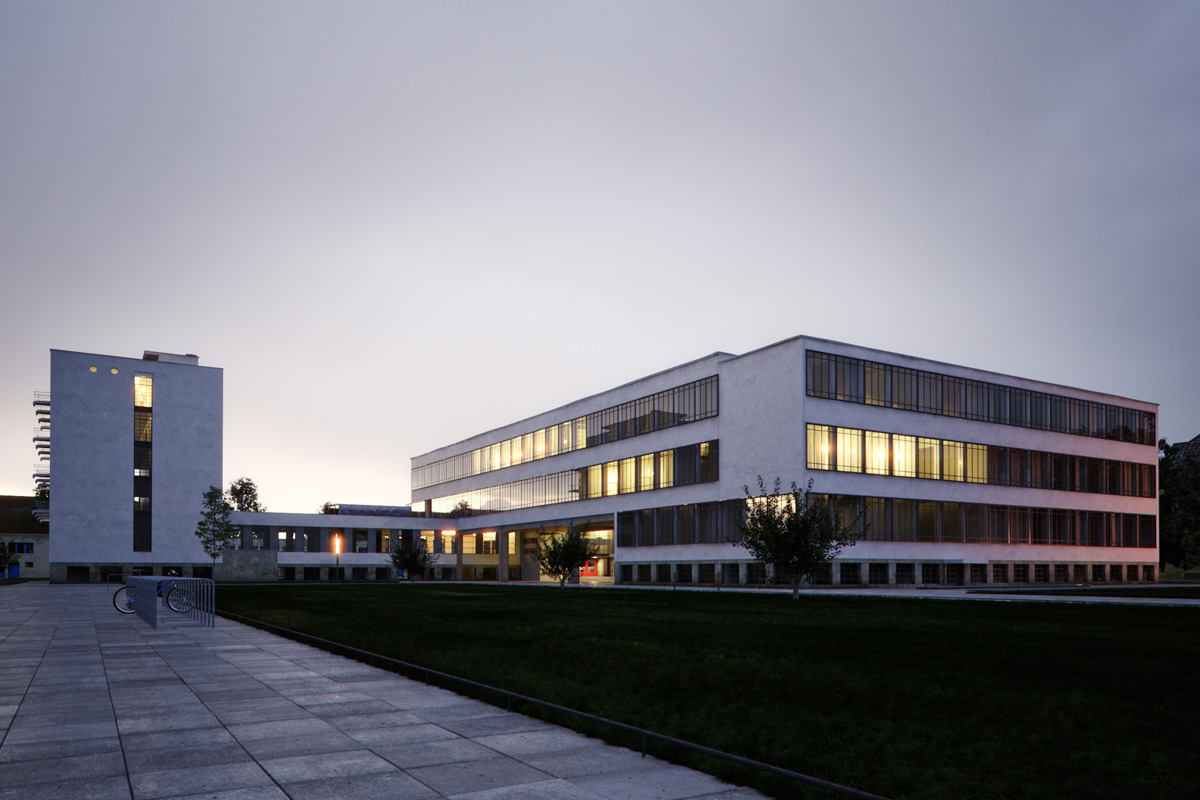
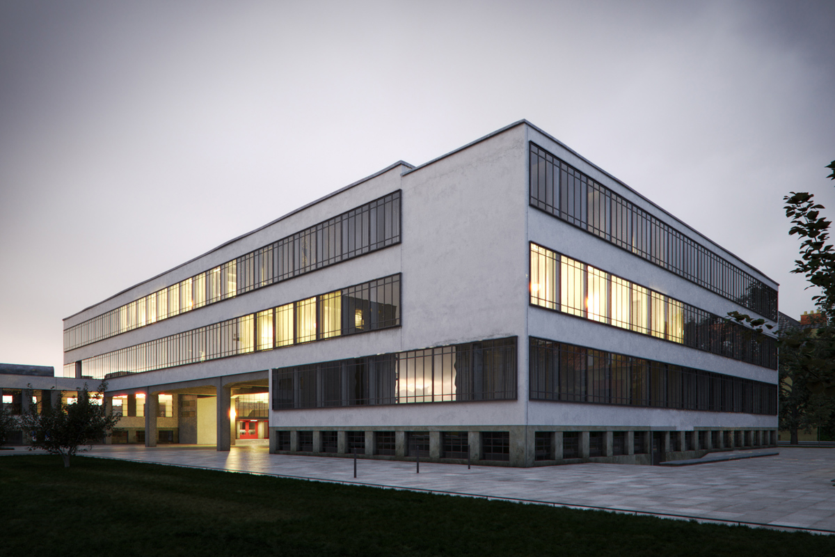
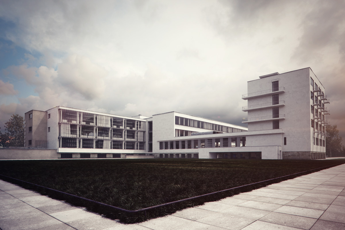
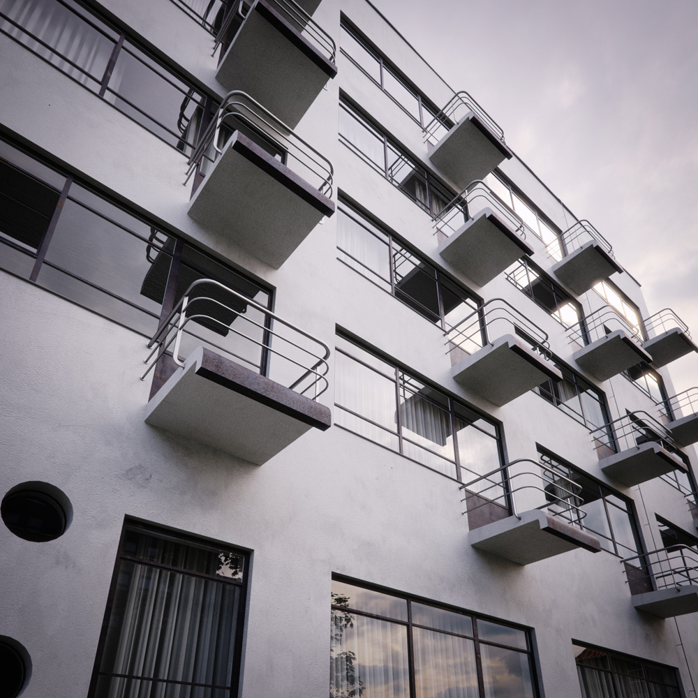
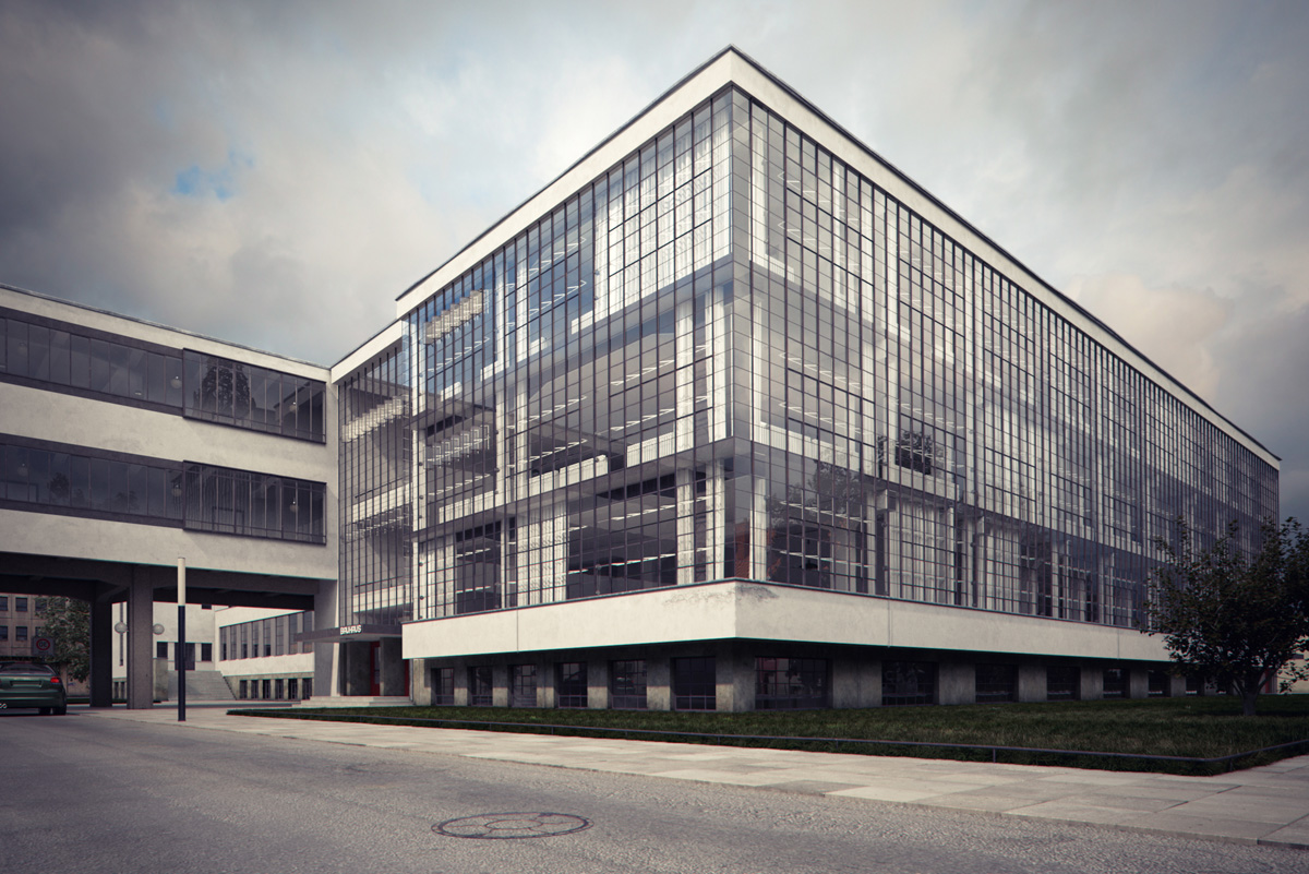
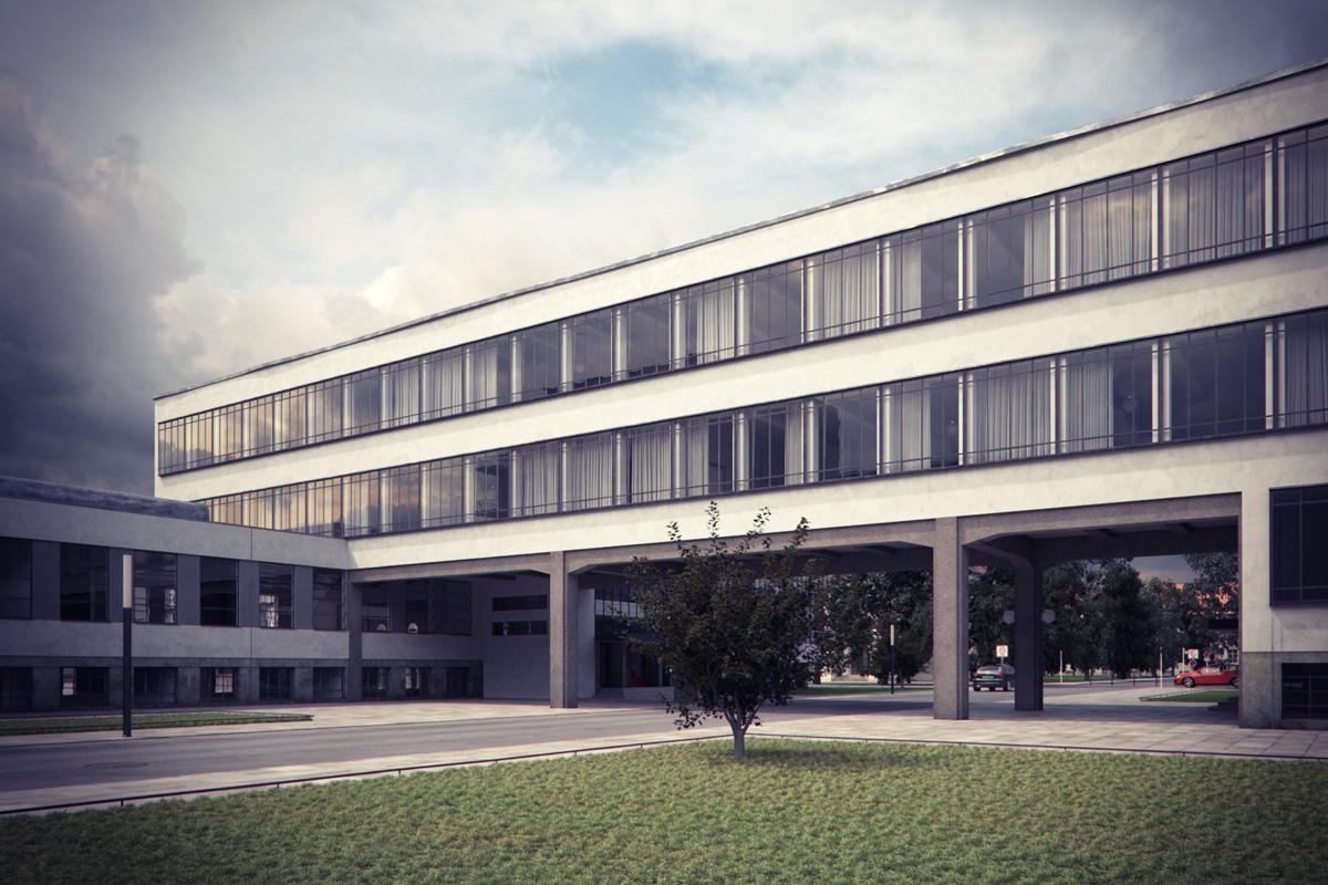
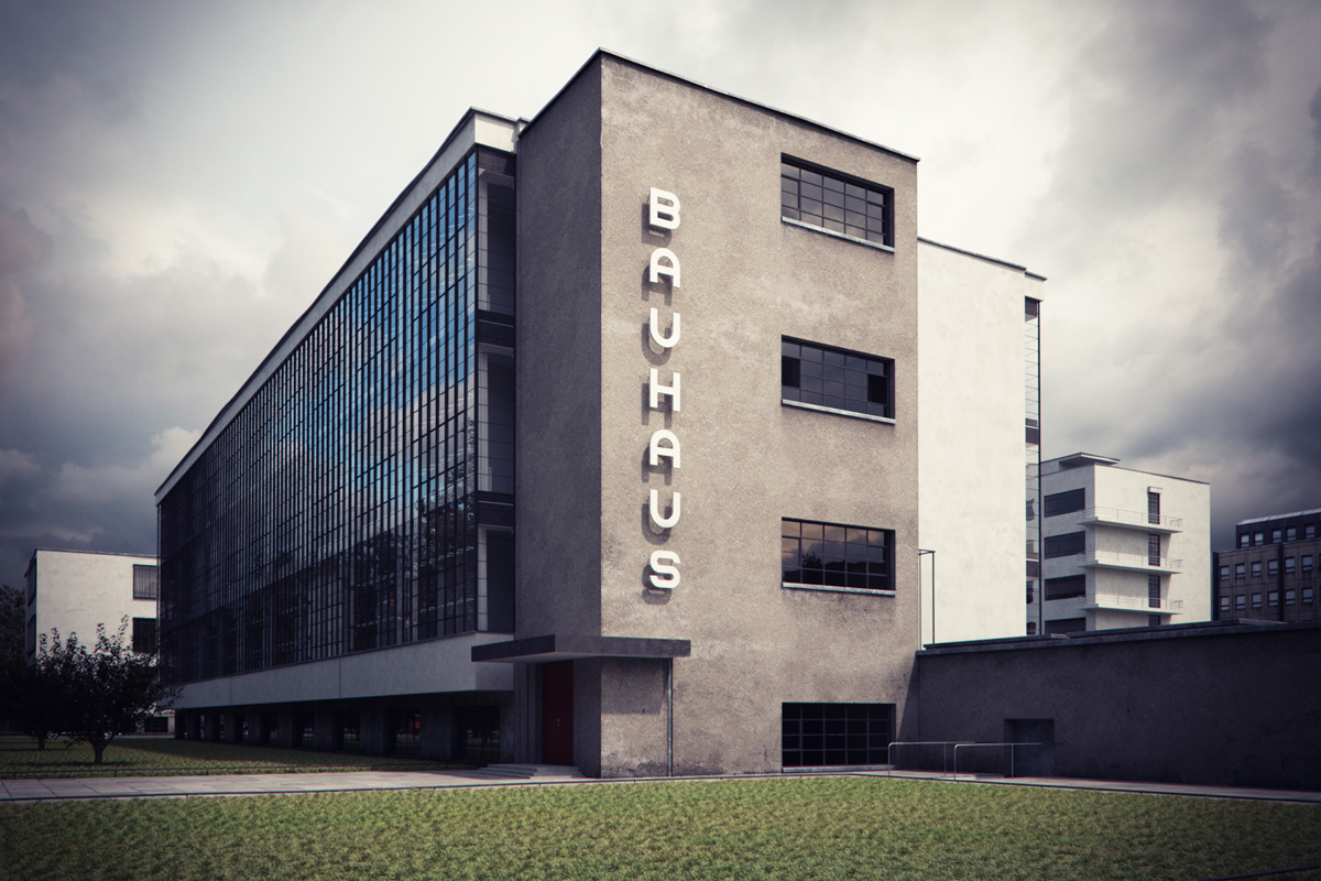
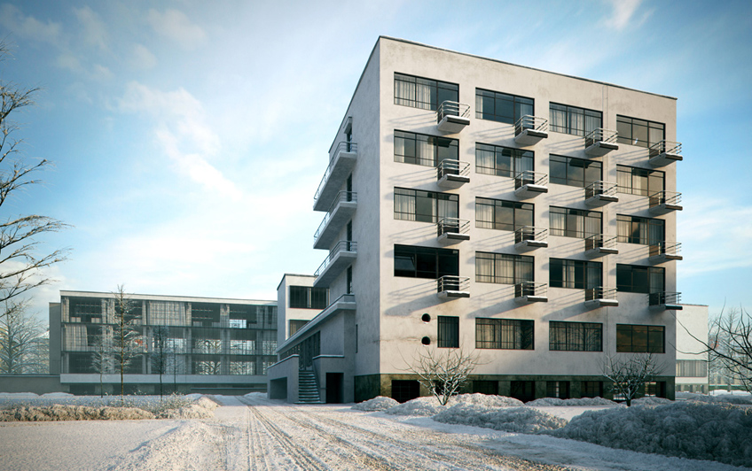
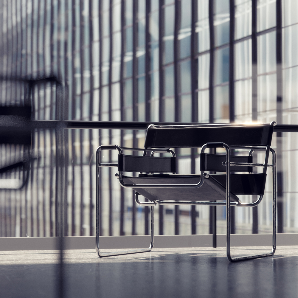
A magnificent virtual remake by Bertrand Benoit of the Bauhaus School at Dessau by Walter Gropius. I especially like the winter snow image and the interior detail shot of the Wassily chair with the glass curtain wall as out of focus background.
What do you think about this remake by Bertrand vs. the original?
Check out Bertrand’s forum thread too – Bauhaus Dessau



Amazing shots as always! Bertrand always rising the bar 🙂
Regards,
Diogo
wow!
Outstanding work.. I wonder how the winter snow on ground was made.. and the lighting too.. care to answer? Thank you 🙂
Hey San,
There is good link to a tutorial that was posted by ronen a while back that shows how the snow could be made. see link http://www.evermotion.org/tutorials/show/7960/making-of-kumu-art-museum-of-estonia
Also i think ther is a plugin that exists that drops snow onto a 3ds max model. Peter guthrie post about it here http://www.peterguthrie.net/blog/2010/10/snow/
Hope this helps
I used a few different techniques for the snow, including those Travis mentioned, and will post more details here pretty soon.
Does Bertrand ever take a break?! My head is spinning trying to pinpoint any difference between real and unreal!! AHHH!!!
Thanks travis and BB3 .. creating snow on trees using snowflow is a nightmare.. I never get it to work even after so many tries so far… Kamu art post only explains dusk settings on lighting.. I am looking for day light settings.. 🙂
Regarding the ground snow Bertrand Benoit made.. I am not sure how he painted displacement map. (if he did) It would be interesting to know the details 🙂
Thanks again for your replies guys 😉
Excellent work as usual
Nicely done Bertrand, the dusk shots from the square definitely winning along with the winter shot. Only the bike stands on the left looks a bit too dense and the pavement grabs your attention away from the subject a bit too much. Leads the perspective towards the side building which doesn’t have too many details.
Maybe If you have only grass in the foreground with a couple of trees hanging in would bring out more from the main building which looks great.
The closeup is winning as well, I would only shift the camera to the left a little bit keeping the target fixed and take it with a wider lens. It would exaggerate the shapes of this building I think which could help to make the image more dynamic.
And well, the snow version is hitting. I’m sure there’s so many people wants to make a snowy project but it’s pretty rare to find any in the desert haha… tho I know this isn’t in any place like that.
Cools stuff keep up the good work!
@ Bertrand:
Not only your renderings won many hearts, your generous contribution to CG Communities would not be forgotten. 🙂
You are a truly good Artist.
Thank you a lot.
Back to the topic:
its very interesting, i really like the renderings better.
details are much more elegant in these images, i am not sure if drawings are 100 percent accurate, or the difference is because of Bertrand magic touch?
This rocks! I’d REALLY like to see more making of’s by mr. Benoit 🙂 (hint hint)
wow. its great work.