0
930
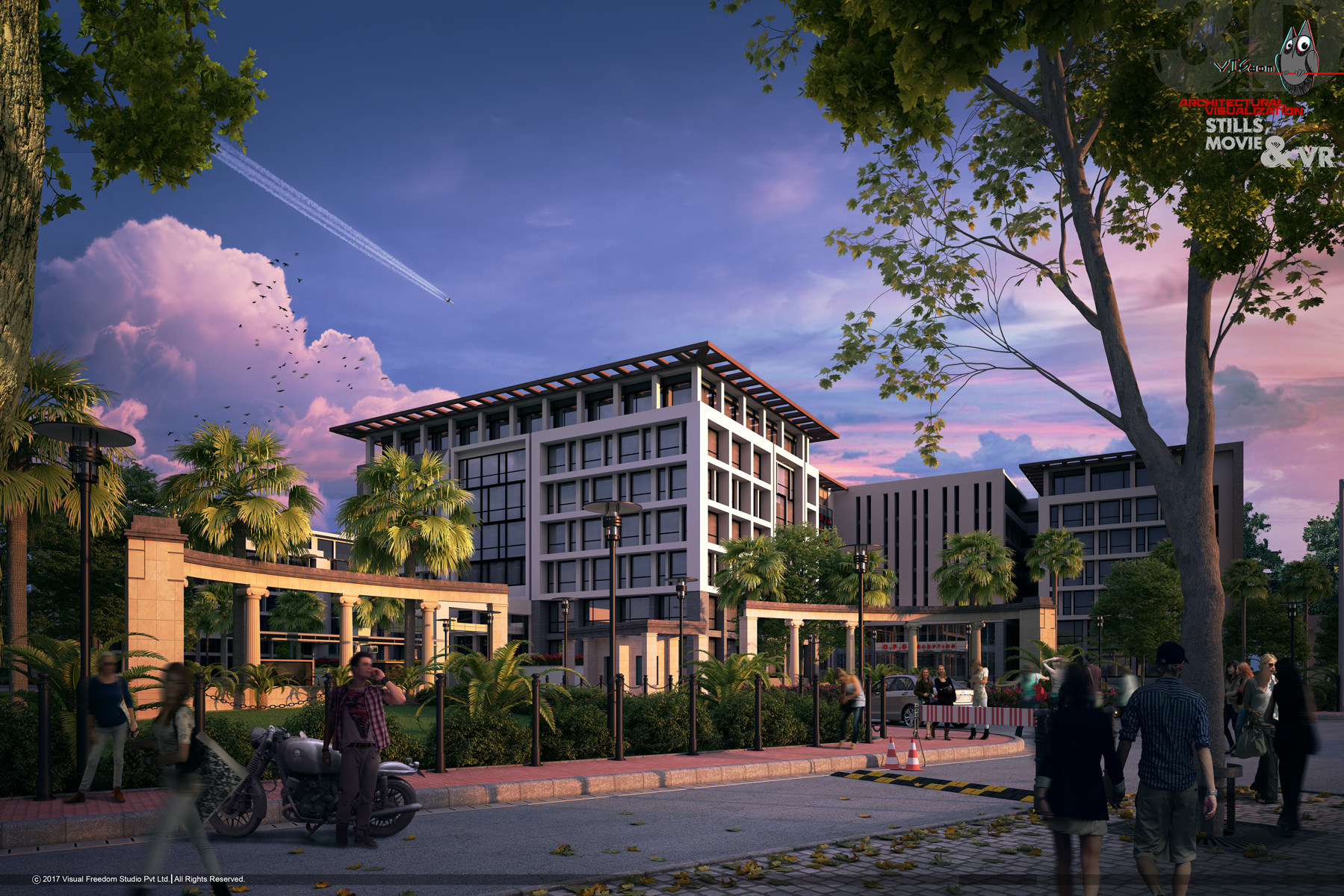
Medical collage (MAMU)
A view of the library block from the pool side
0
857
Auditorium (M.A.M.U.)
auditorium view
0
940
Auditorium
view of the auditoroum in the medical collage campus
0
1777
medical collage and hospital
the entrance
0
1159
medical collage / hospital
view of the library block from the pool
0
1342
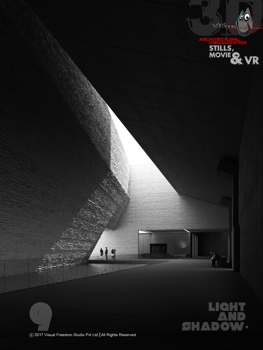
Light & Shadow - 9
9th one in a series of 10
0
1152
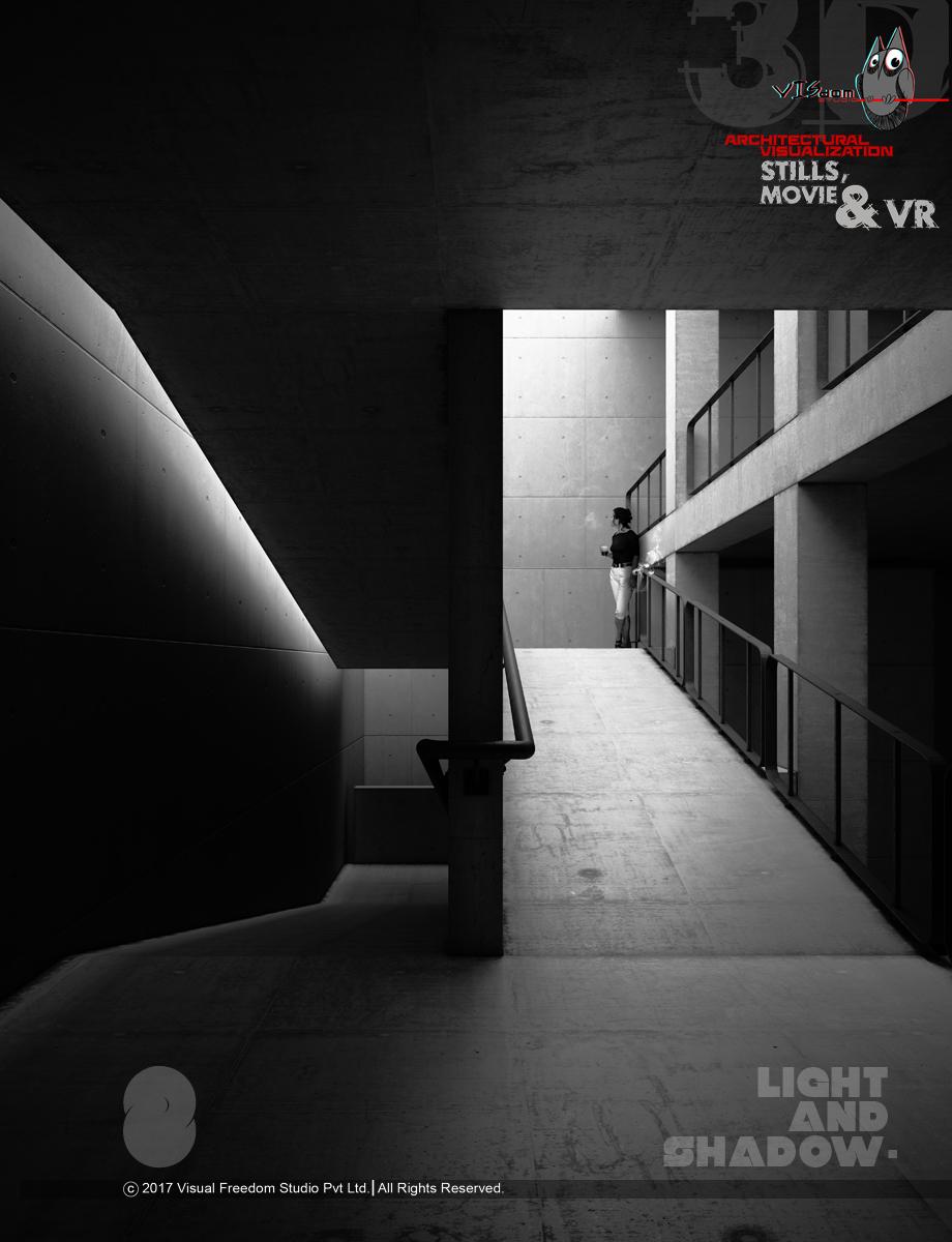
Light & Shadow - 8
the 8th one in a series of 10
0
942
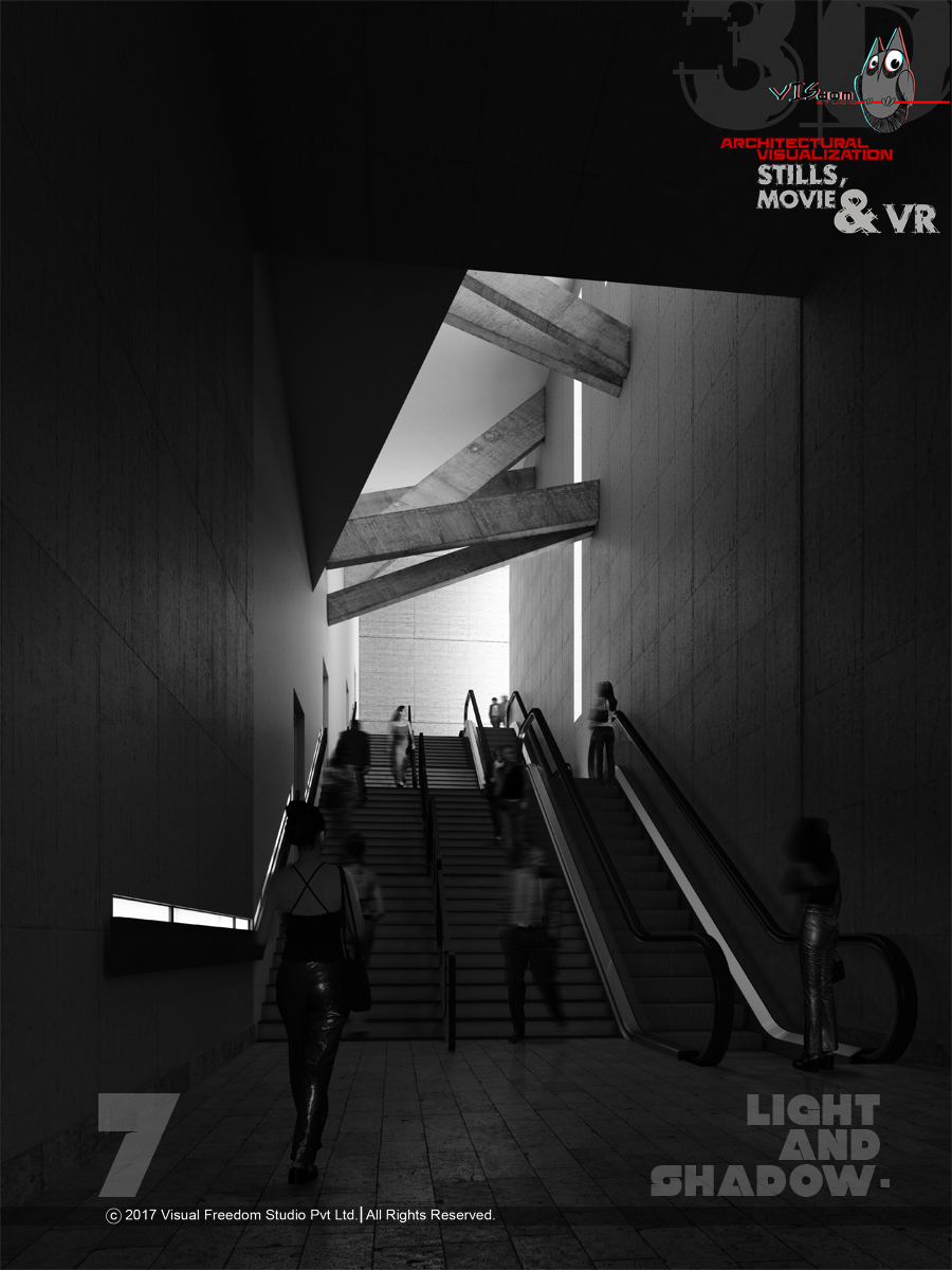
light & shadow - 7
the 7th one in theseries of 10
0
1032
light & shadow -7
the 7th one in the series of 10
0
1083
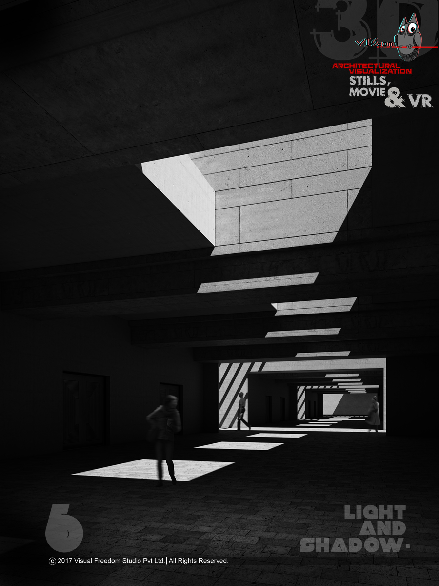
the sixth one in a series of 10
the sixth one
0
1687
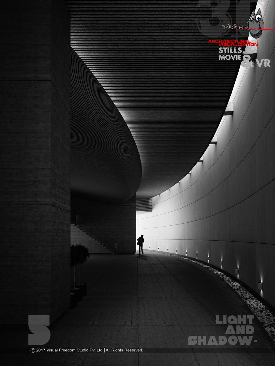
Light & Shadow - 5
the fifth one
0
1015
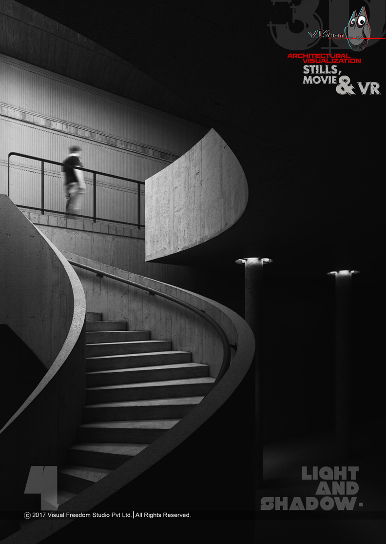
light & shadow -4
the fourth one in the series
A view of the library block from the pool side.
Studio: Visual freedom studio
Personal/Commissioned: Commissioned
Location:
an auditorium in the campus of medical college. We love doing evening light setup with saturated colors.
Studio: visual freedom studio
Personal/Commissioned: Commissioned
Location:
We did this view of the auditorium for our client, initially we were doing a day view but to provide the building a mood and sense of activity we went for an evening view. we like saturated and bold colors, we don’t mind even, going for certain exaggeration (through colors).
Studio: Visual freedom studio
Personal/Commissioned: Commissioned
Location:
the first view we developed in a series of 4 with an evening light setup. We love thick and bold and saturated colors.
Studio: visual freedom studio
Personal/Commissioned: Commissioned
Location:
We had to highlight this pool, with lots of activity going on in front, the mood was again slightly towards evening but not with so much saturation in colors.
Studio: visual freedom studio
Personal/Commissioned: Commissioned
Location:
We created these 10 visuals to explore light and shadow in architecture.
We wanted to give them a artistic dimension and photographic look. and we also wanted to do
simple perspectives with bare minimum objects.
Initially we wanted to make a calendar out of it but we ended up creating architectural posters.
Studio: visual freedom studio
Personal/Commissioned: Personal
Location:
We created these 10 visuals to explore light and shadow in architecture.
We wanted to give them a artistic dimension and photographic look. and we also wanted to do
simple perspectives with bare minimum objects.
Initially we wanted to make a calendar out of it but we ended up creating architectural posters.
Studio: visdom studio
Personal/Commissioned: Personal
Location:
We created these 10 visuals to explore light and shadow in architecture.
We wanted to give them a artistic dimension and photographic look. and we also wanted to do
simple perspectives with bare minimum objects.
Initially we wanted to make a calendar out of it but we ended up creating architectural posters.
Studio: visual freedom studio
Personal/Commissioned: Personal
Location:
We created these 10 visuals to explore light and shadow in architecture.
We wanted to give them a artistic dimension and photographic look. and we also wanted to do
simple perspectives with bare minimum objects.
Initially we wanted to make a calendar out of it but we ended up creating architectural posters.
Studio: visdom
Personal/Commissioned: Personal
Location:
We created these 10 visuals to explore light and shadow in architecture.
We wanted to give them a artistic dimension and photographic look. and we also wanted to do
simple perspectives with bare minimum objects.
Initially we wanted to make a calendar out of it but we ended up creating architectural posters.
Studio: visual freedom studio
Personal/Commissioned: Personal
Location:
End of content
No more pages to load


