Nefeli Kallianou
1
Posts
0
Mentioned
0
Followers
1
Following
0
Challenges
0
Awards
O r a n g e g i c.
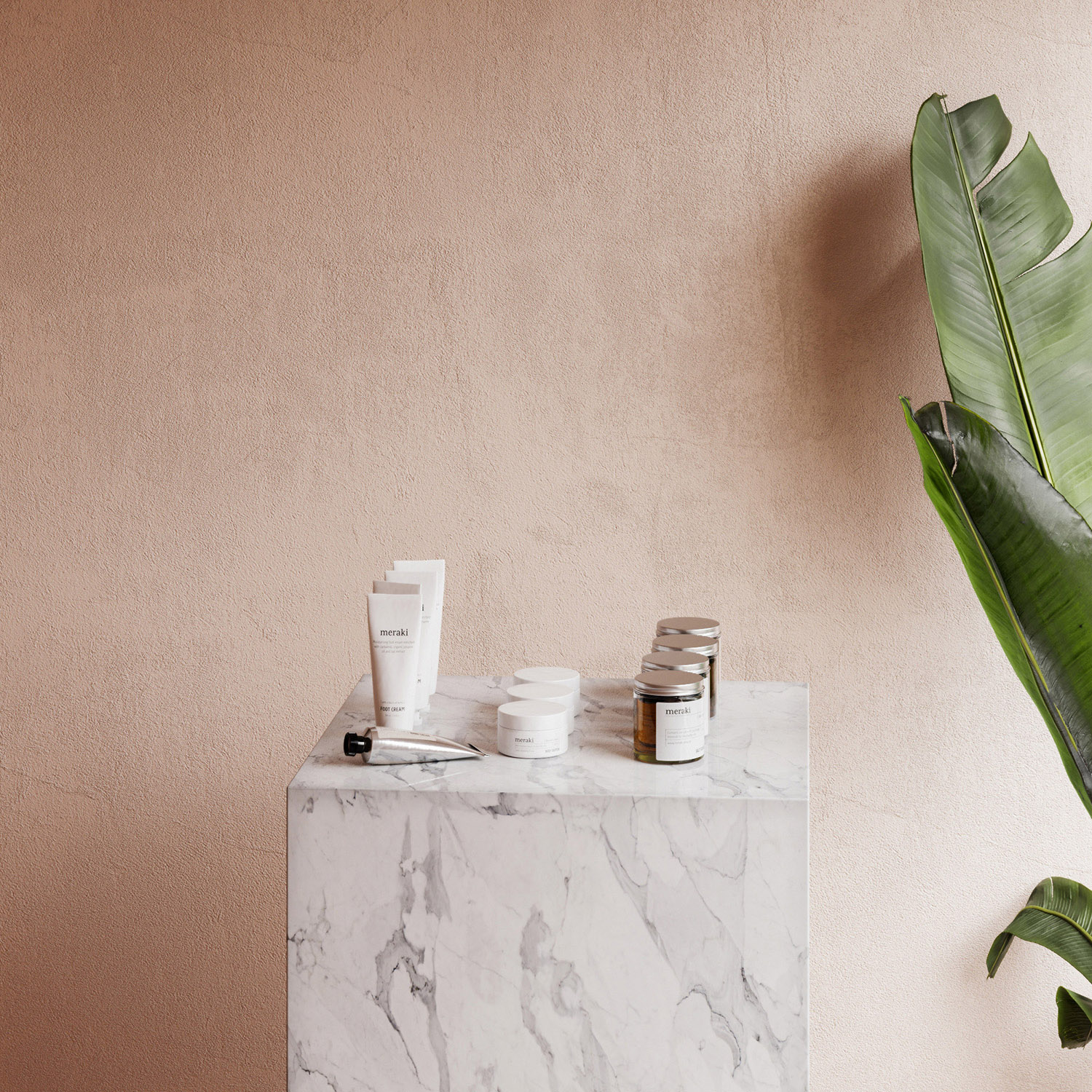
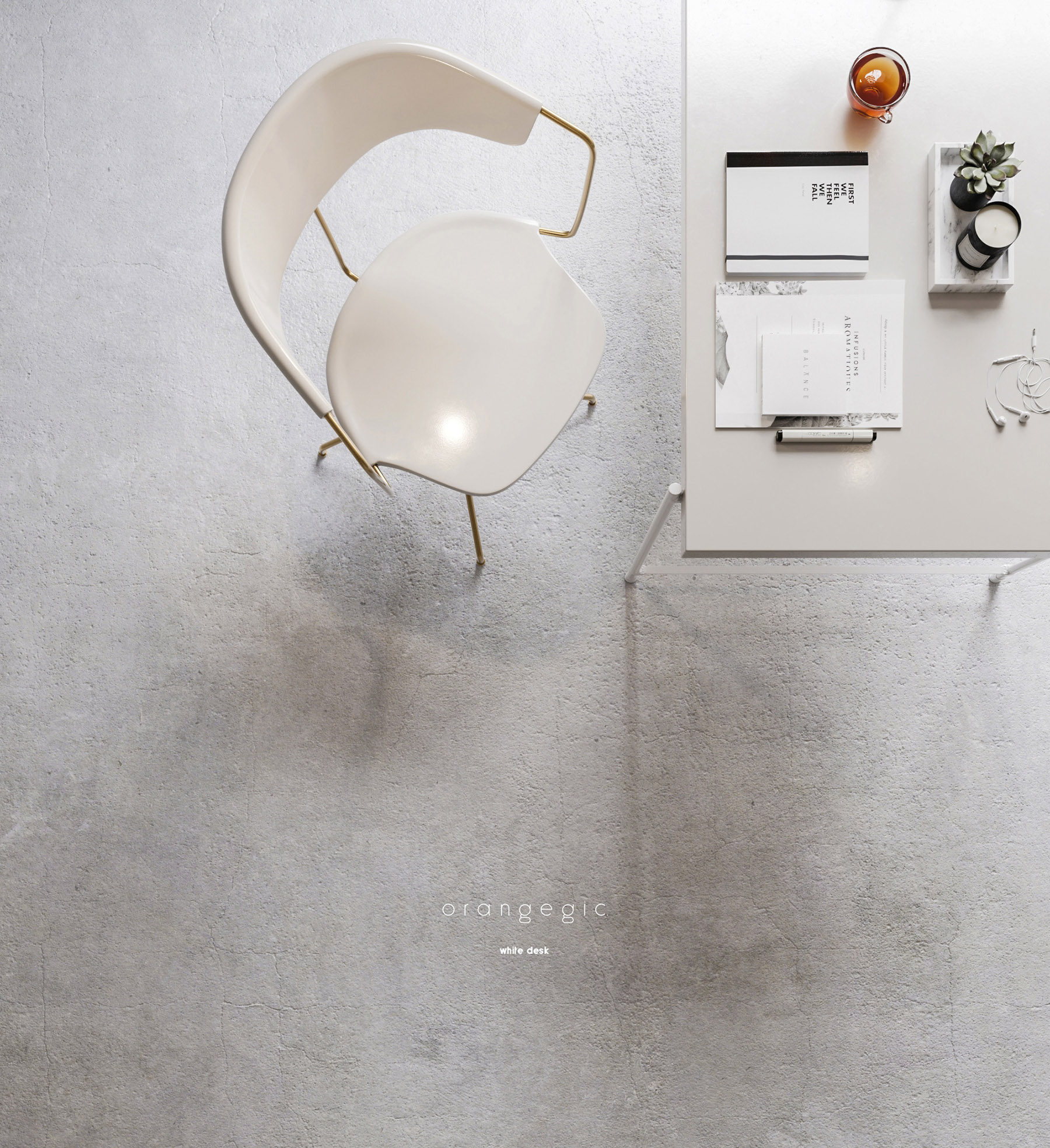
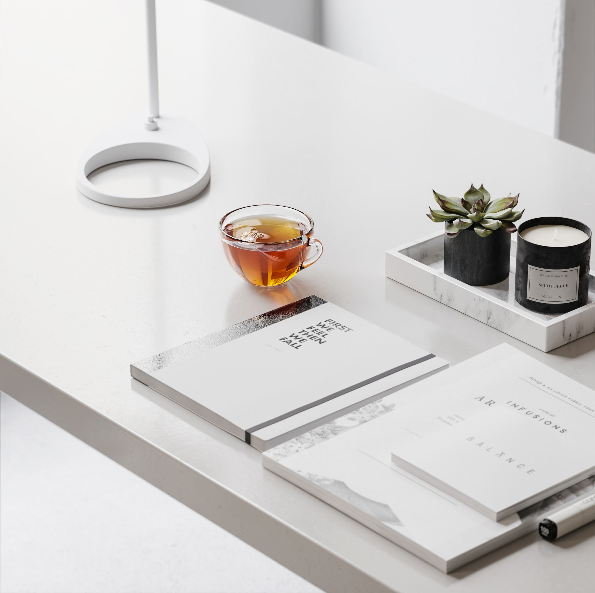
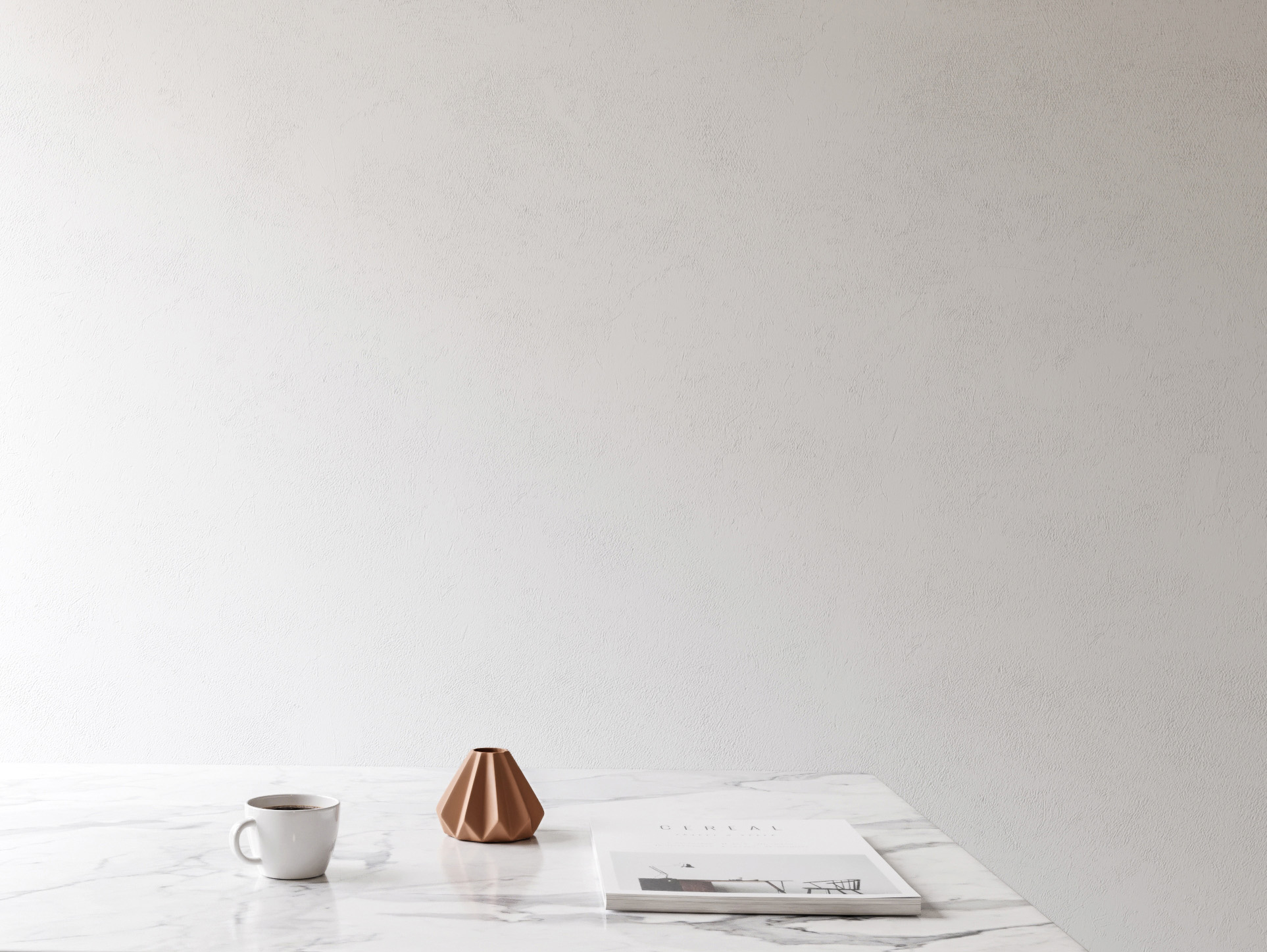
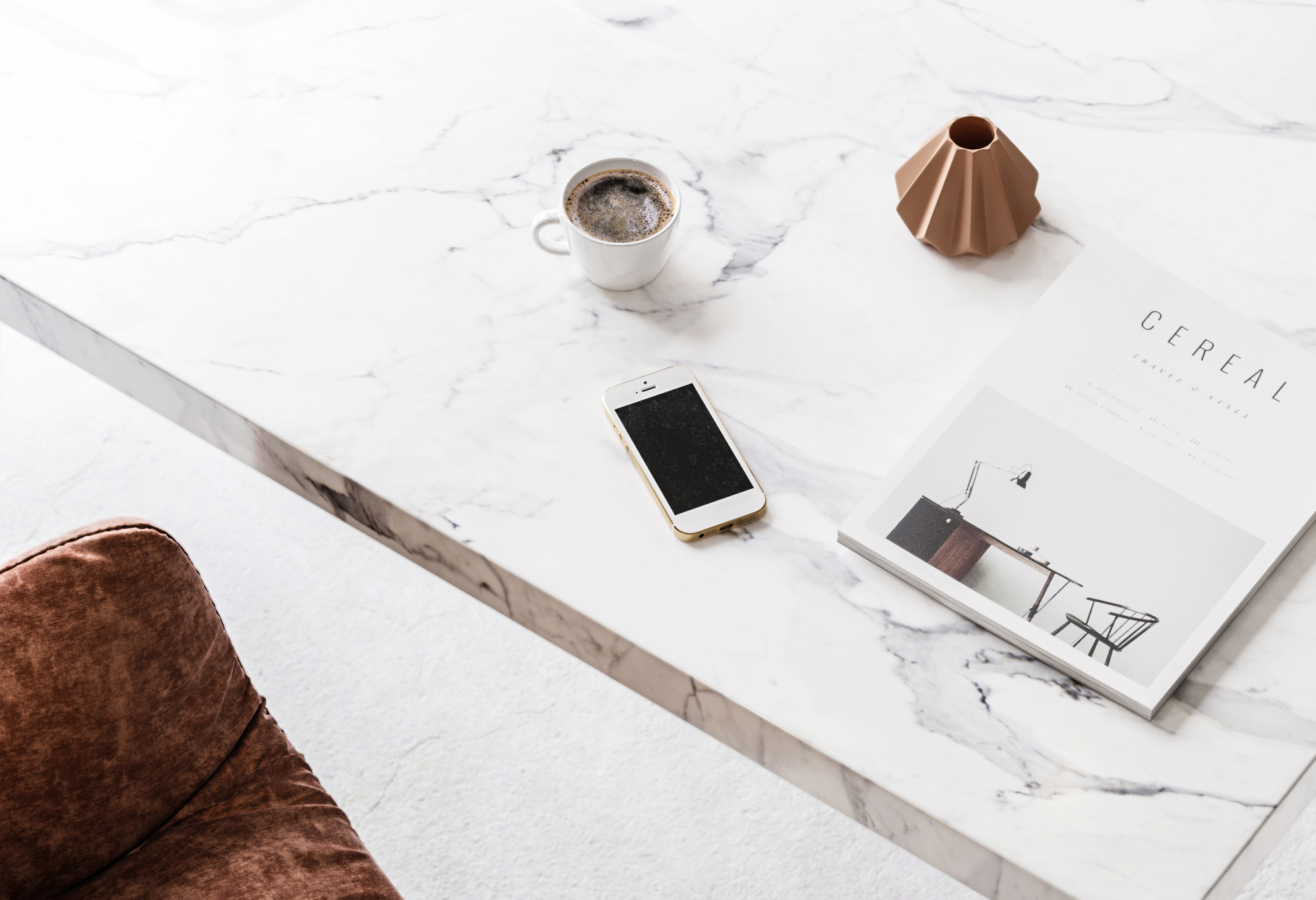
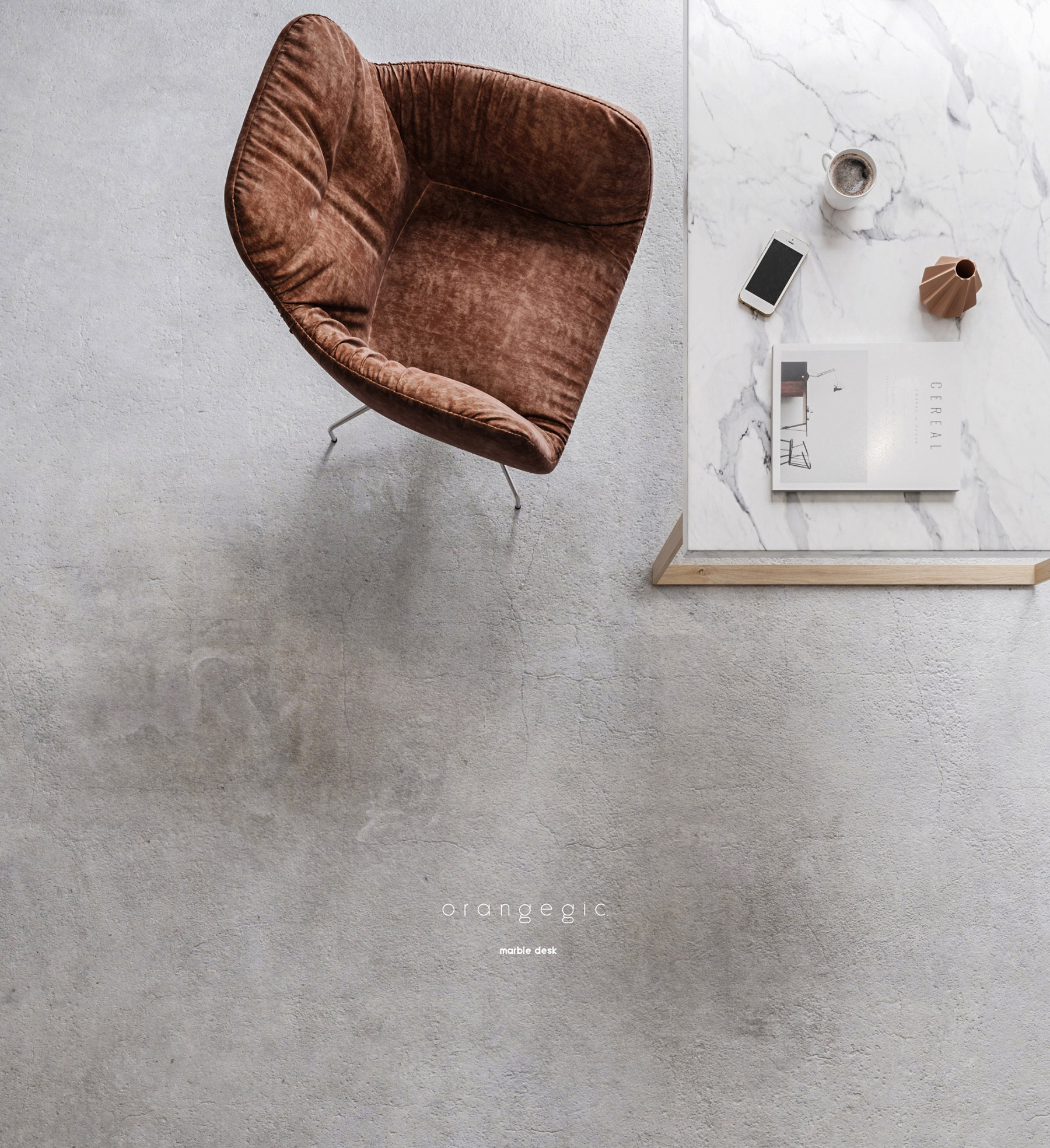
This is my last project i created with my colleague John Ninos . The initial concept of the following images was to create a retail store for print advertisment. Having finished with our commercial part we got to develop our project a step further.
Read more →O r a n g e g i c.
Nefeli Kallianou
October 31, 2017 / in 3dsmax, Corona Renderer / by Nefeli KallianouARCHITECTURAL SCOPE
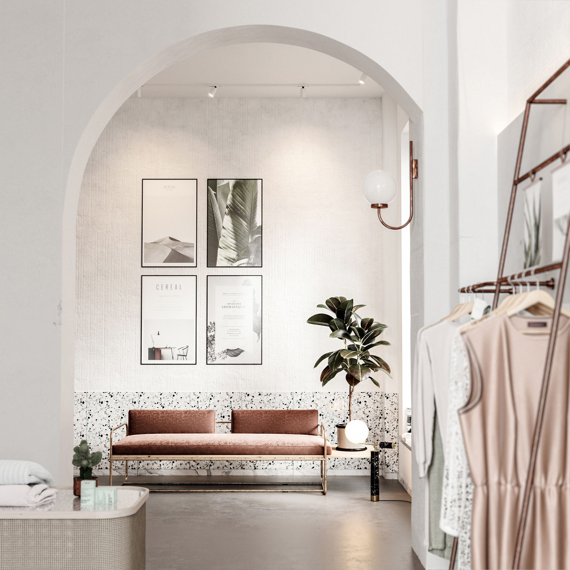
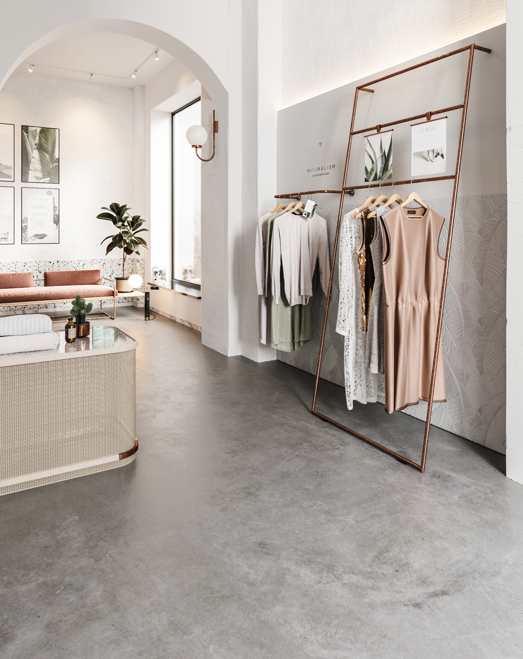
The composition of Orangegic includes two main areas a public and a private one. The main retail area consists of various ambiences such as clothing rails, stands and a lounge area.While the private one is an innovative, collaborative, impactful working environment.
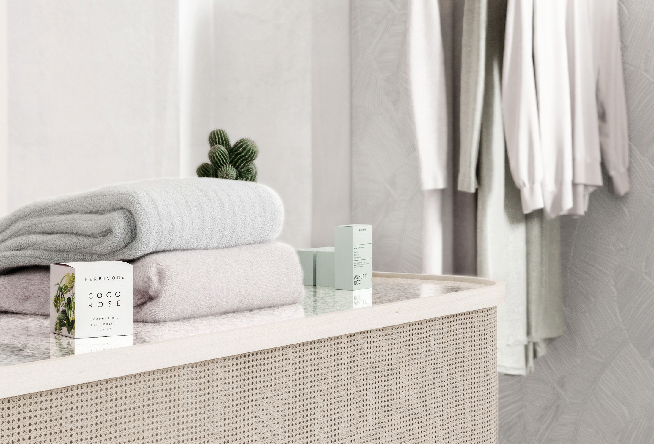
Within an old industrial shell, we developed a new clothing boutique store. Our preference in this project was a gentille, sharp and warm design of a store inspired and motivated of the orange color pallette and clean lines. We tried getting away with a fine tuning between the retaining white bounding walls, the original concrete structure pillars and the clean plasterboards. On the lighting section we aimed on making a white cloudy overcast enviromental condition and enchance a cozy atmosphere with some hanging spotlights that floods the interior with warmish light.
DESIGN FIELD
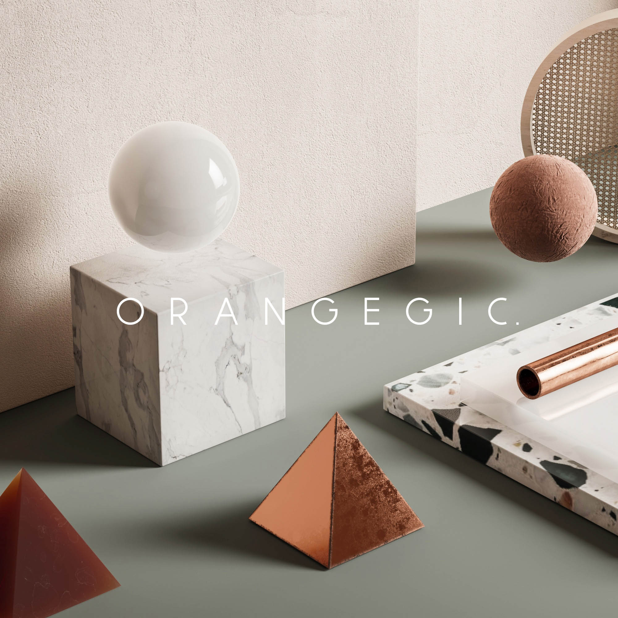
The desire to bring some warm touches that would be involved to the general structure of the store guided our design decisions about combination of materials and the composition of surfaces. Taking advantage of the old shell we implement some metallic finishes such us copper and brass which incorporation with velvet’s soft structure produced high contrast and depth in a natural state. Among the materials chosen, coper and velvet predominate due to their rich dark orange-browny colours. Our goal of a more sophisticated orientation underpinned of the Thonet’s seatweaving woven pattern on the wall hanging panels and the booths.
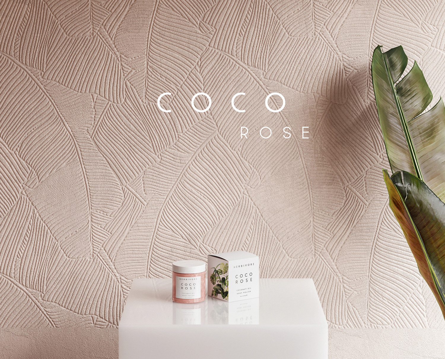
A pattern of palm tree’s leaves was embossed in a plasterboard and some shades of green, cement and white marble was added in the space.
CGI TECHNICAL ASPECTS
Corona Scatter. Having tried before the multiscatter plug in, this time we wanted to give a try to Corona’s native scatter for the distribution of some hairs over the knits to achieve wool softness.
Deformed Edges. To achieve the deformation on the “old shell” of the building we used the deformed edges script by Branko Zivkovic that we found out on Jakub’s Cech first manifest.
Damaged Pillars. We used some damaged textures found on textures.com and we implement them on our pillars with Arrimus 3d techincs.
Studio: Bronxes Studio
Personal/Commissioned: Commissioned
Location:
End of content
No more pages to load


