A Village House by Studio Aiko
Great work, again, by Israeli based Studio Aiko. Check out the Village House animation they created not long ago… And stay clear of the garden gnomes!
What otherwise might have pass as just one more very good animation (it is good), got a real kicking twist with those gnomes and fitting soundtrack! what do they want?
The video…
Here are some screen captures from the video too…


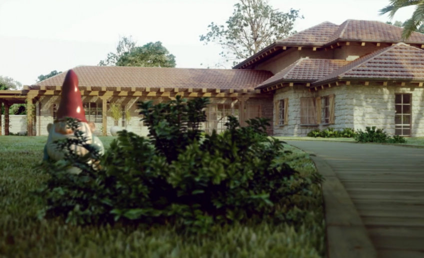
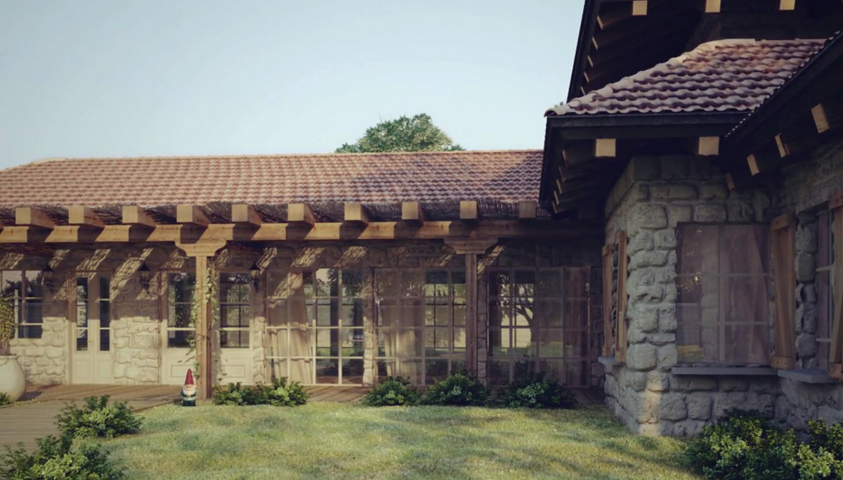
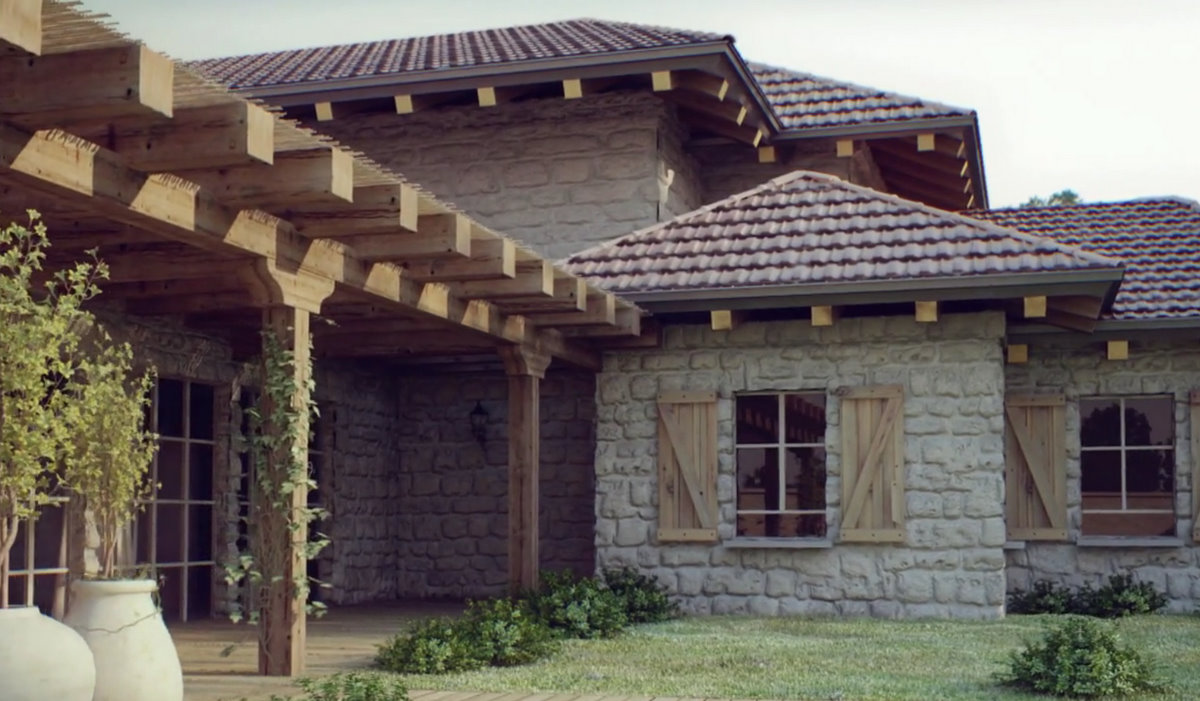
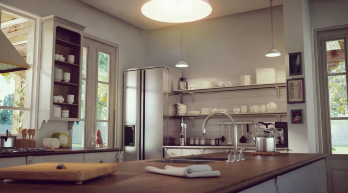
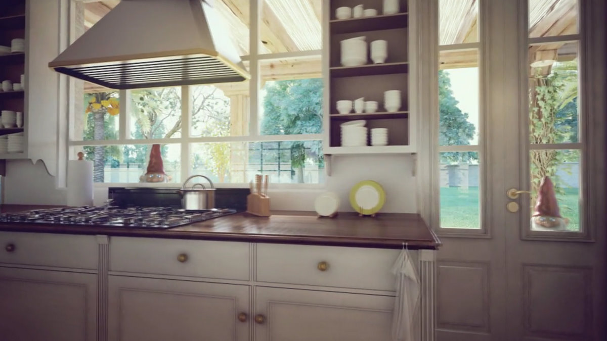
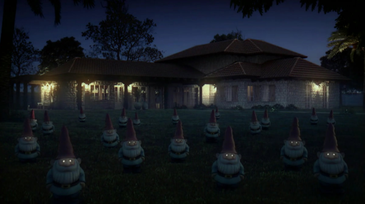
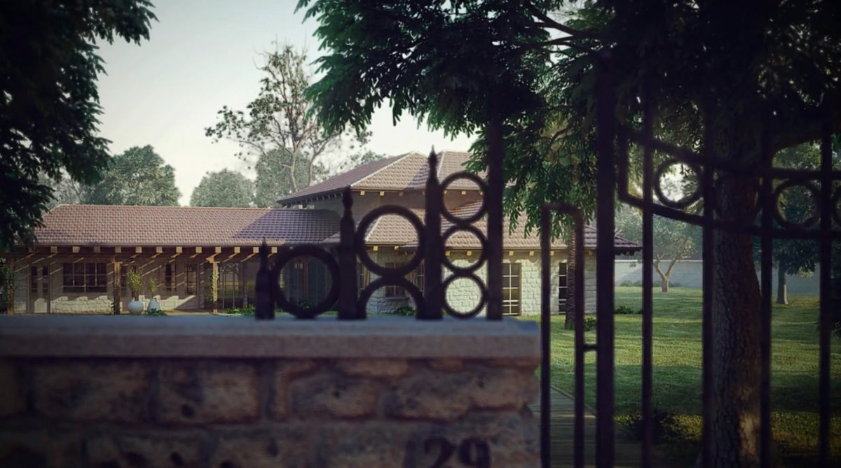
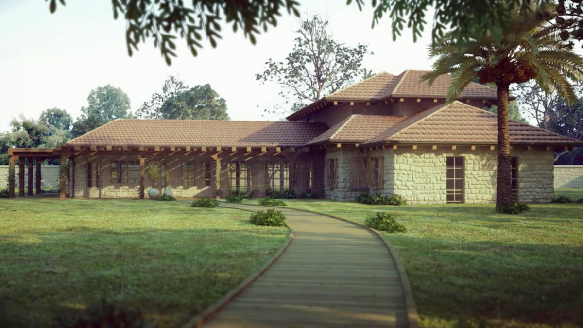
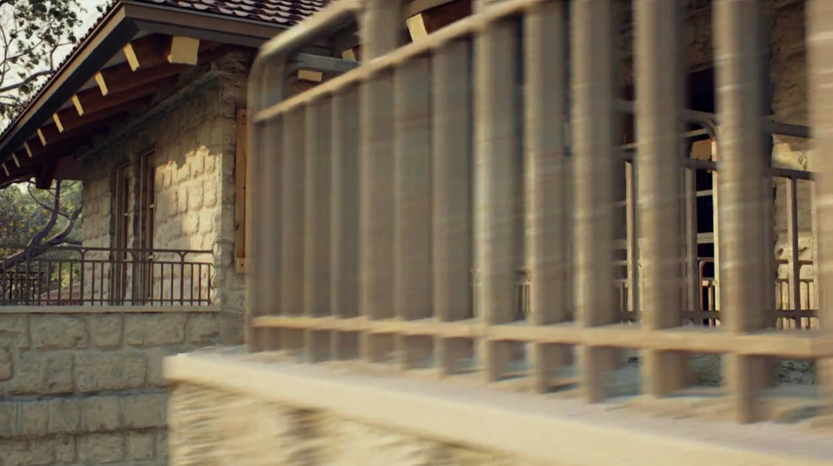
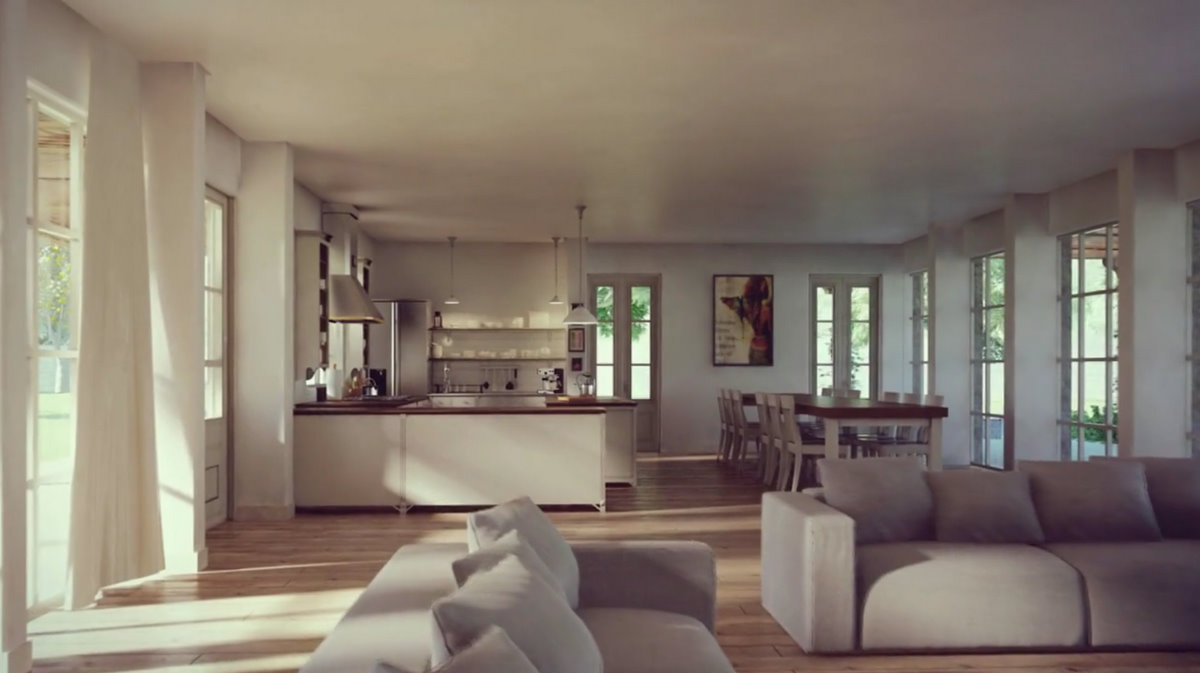
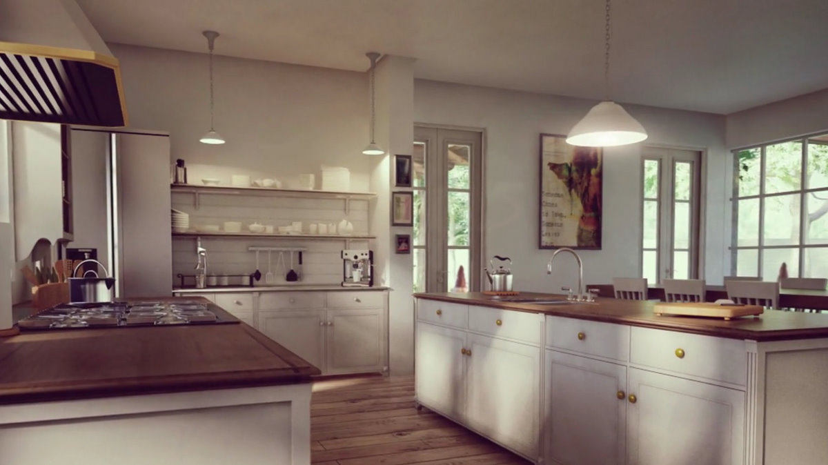
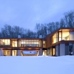

WOW! I love it, very original and top quality. Those eyes blinking gnomes are funny, but the end scares me.
Stuning Work!
super!!! which render engine used?
Hmmm, something about the outdoor scale seems odd, like the house is only 50cm tall. And the tiled roof looks flat.
But kudos for using the gnomes – I’m not sure it will sell the house though (jeez, I do sound like a grumpy toad).
A best animation but a bad building…
Studio Aiko! the real thing..
Check out studio aiko new website with lot’s of new stuff (update today 26.01.11) at: http://www.studio-aiko.com
lovely work aiko….i’m just tripped about everything. Can’t say much for the gnomes but i love it. Gives a level of fun to the building.
@ LOME : its been posted for your pleasure. You criticise, and with constructive comments. If its bad, tell ’em how to make it better. If they’re your friends, and possibly just pulling their legs, do that privately. This is a public post. Cheerio.
Lome refereed to the building design as bad, not the actual animation done by Aiko… I can relate to that actually.
This type of architecture is not “my cup of tea” though you could be a little softer then calling it BAD 🙂
As someone coming from the architecture world I can tell you that any architect seeing something he doesn’t like will call it even worse… we take it personally sometimes too… LOL
I choose to interpret Lome’s “bad” as meaning the way the house is represented in the animation. If you look at image 3, the roof is flat, the corner of the walls on the first floor has what looks like texture problems (the black holes). The reflection in the windows looks odd as well, as does the end of the supporting timber.
And doesn’t this happen to us all, when there’s a tight budget, short deadlines and what not 🙂
Oh, my God! They’re getting organized! LOL…
Seriously, a great piece of work. I love the personal touches Studio Aiko do in their animations. Staring gnomes, popping chandeliers… Just Awesome!
Top notch render/animation. No flicker whatsoever. One thing I find odd though. Roof ridges are not parallel. Is it suppose to look like that?
Music sounds chilling. And the gnomes too.