Making of Cutipol House by Marcus Dallmann
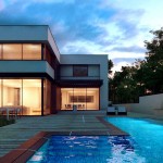
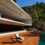
Following the forum spotlight made about the work of forum member Marcus Dallmann (Troubs), He now kindly shares the process of making his Cutipol House renders. Done while sick and cold outside, hoping for being in a sunny better place, this is the result of 2 days work with some great insights about the workflow. Enjoy!
Marcus, known also as Troubs on the forums, Is a 3D Artist currently living and working in Berlin. His main tools of the trade are 3D Studio Max, VRay & Photoshop. Visit his personal blog to see more of his work – polythetic.blogspot.com
Introduction
First of all, Thanks for the opportunity to do this making of. Those of you whove read the thread in the forums might already know, the background of this project was that I stayed at home with a heavy cold. It was freezing (-10°C) and the sky outside was heavy grey that day.
I always wanted to do a scene from one of my books Book Of Houses published at Evergreen GmbH Cologne, where the sky is a saturated blue and the sun plays its role, so sick of staying in bed, this was the day. As I wanted to have a fast outcome I really rushed in some places. Due to this fact this might be more of a how not to do it in some areas.
I was in a kind of stew after Ronen asked for this making of, knowing how much I messed around with this project. I was thinking of redoing parts of it but decided to keep it as is… since this is part of our business. We have to deal with tight deadlines, and all the client is asking for are pretty pictures, the way that leads to those doesnt matter. Of course, this just applies to the case when you work alone. When you work in a production environment the way matters for sure as other people might need to work with your files. But that’s a whole other story.
My timeframe for these shots was 2 days, pretty tight for a personal project, which leads me to my first kind of advice. If you are on a tight deadline try to think like a magician. A magician always tries to distract the audience from what is really happening on the stage. If he wants to disperse a card in his left hand, hes waving wildly with his right one to distract the audience from the left. The better the magician, the less waving, but that’s the way it works.
Applied to our case this means, if you dont have the time to make every single bit of your project 100% perfect, try to concentrate on just one part, but do it to 150%. This leaves space for other parts to be left at maybe 80% done. Choose parts that can stand to be the center of attention and that are able to distract the audience from weaker parts. My waving hand in this case is the pool deck and its texture. The weaker parts are missing interiors, more details in modeling and the not so thought-out vegetation.
Modeling
All the modeling took place inside 3ds max. Heres how the whole scene looks from above.
The House itself started, as often, with a simple box. I cut it according to the desired window opening several times and extruded the opening back inwards. I then detached the extruded polygon and connected the top and bottom edge six times to get the outlines for the windows. From there it was just selecting the needed edges and in editable poly mode I created shapes out of them that were then sweeped with the sweep modifier. To name these I needed the window frame, the separating concrete column and the guide rail for the blinds that are recessed into the ceiling.
As you might notice, these windows or doors wont work in reality, theres the fixed frame missing and the doors itself arent separated so you cant open them.
Its hard to get out to the pool deck this way but since I was sick I couldnt do that anyway.
Next was the pool deck, which started as a box too. I cut the pool out and extruded back inside. I selected the surrounding edges and again created shapes out of them to deal as a base for the floor generator by cg-source.com. I wont go into detail here since this useful script is mentioned in many other great tutorials here at Ronen’s place.
You can see the settings below.
As an addition I used the surrounding edges of the pool again to create shapes for the overflow that were sweeped too.
The small water puddles in front of the chair are just a plane placed onto the decks surface that was, in editable poly mode, pushed into it using the paint deformation brush.
I usually spend a lot of time painting masks to be used in MultiScatter, to place the vegetation as exactly as possible. But not this time. I just built a rough environment out of three different tweaked planes and used those as the distribution object. One MultiScatter was used to distribute the trees, and another for the greens on the ground. I could have used only one MultiScatter instance, but I found it to be more tedious to find the right values for the different probabilities. These are the plants I used, all are from iTrees made by the makers of MultiScatter – www.rendering.ru
The chair in the front was modeled using splines for the legs that were made renderable. For the cotton part I detached segments out of them, extruded and shelled them and converted to editable poly to tweak them a bit further. The spots are basic poly modeling too and the chair with the rest for the feet in front of the window is from Evermotion.
Thats it for the modeling part. Heres how all POVs look in the viewport.
Texturing
This usually is the most fun part together with lighting, at least for me.
Mapping -> Painting -> Test Render -> Painting -> Test Render -> Tweaking -> Moving Sun -> Test render-> Painting…
I love it! Its the moment where the world you created starts breathing.
As mentioned the pool decks texture was my main point of interest, so lets start with that. The base for the MultiTexture looks like this…
I derived 8 different textures out of it to be used inside the MultiTexture map. When creating floors with the floor generator the script first creates the geometry and then applies a single planar mapping on every element within the floor object and rotates them randomly. Afterwards it flattens the mapping into the floor object. Since I wanted to keep this initial mapping (which natively uses map channel 01) I had to use an additional planar mapping with map channel set to 02, but this time for the whole object (since I didnt want to paint the darker parts towards the edges of the plates on every single texture). I rendered out a uv-template, took it into Photoshop and arranged, scaled and moved the dirt textures I previously downloaded from cgtextures.com
Those maps I combined inside of a composite map, where the MultiTexture had map channel 01 and the texture for the darker edges had map channel 02, blended together with 50% via multiply.
The rest was just plugging a desaturated version of this map into reflection, reflection glossiness and bump.
To get some further details I applied VRay Displacement, using the same map. I had to be careful with this, because knowing that just planar mapping was applied to the floor object (which has volume and depth) I was pretty sure, the edges in the tilted gaps would tear apart using to high settings. But the question was how much they would do. Using low settings I could use this flaw to my advantage, assuming gaps usually carry more dirt than the rest of the plate. Of course, this will just work up to a certain resolution, but for mine, that was planned to be 2.5k it just worked like charm. Like Bob Ross would say – There are no mistakes while painting, we just create happy little accidents.
The same technique concerning the texture work was used for the house. Two different mappings, a box mapping for the base texture (map channel 01) and an additional planar mapping (map channel 02) for the dirt. This two were combined via composite map, but this time with 40% set to darker to keep it subtle.
The glass material is a simple VRay shader with black (0,0,0) in diffuse and white (255,255,255) in reflect and refract. I ticked reflect on backside to have subtle double reflections using two planes (double glazing) for the windows. Additionally, I added a subtle noise set to 1.5 for the strength and 180 for the size.
However, the reflections I got were insufficient for my taste. That’s why I added a plane in front of the window and applied a light material with an image of a view to a big lake viewing down the hill loaded into a VRayCompTexture set to multiply. Several test renderings were needed to find the final position for the plane but at the end it worked out.
The last noteworthy material might be the one for the overflow of the pool. Its a basic VRay metal shader with a mid grey color for the diffuse and a gradient ramp in the reflection slot. You can see the settings below.
Lighting
Pretty basic actually. I used a VRay Sun together with a VRay DomeLight loaded with a HDR. For placing the VRaySun according to the sun’s position inside the HDR I recommend Peter Guthries great video tutorial about doing the exact same thing – http://www.peterguthrie.net/blog/2010/04/vraysun-and-sky-tutorial/
Additionally hes showing how to wire the suns position to the rotation of the HDR to rotate both at the same time, very handy when flexibility is needed for the light-direction.
All shots have been rendered using VRay’s Physical Camera. The DOF for Cam06 is rendered in camera, the DOF for Cam03 was applied in post.
Rendering
Like for the whole project my render settings had to be appropriately low to suit my timeframe. I used irradiance map and light cache for the GI. With the settings shown below I managed to keep the render times pretty low. For the wanted resolution varying between 2k for the portraits and 2.5k for the landscape, I needed about an hour each on a single core i7 920. Certainly, the shot with the in camera rendered DOF needed a bit longer, but lowering the global subdivs multiplier to 0.8 or even 0.6 (cant remember exactly) kept that pretty straight too.
Postwork
Good old Photoshop was used for that, but other than applying a curve to enhance the contrast and some additional color correction on the plants there was not much to do. I added a sky and glowed it a bit over the trees edge by blurring a copied layer of the sky, setting it to screen blend mode and moving this layer to the top of the post. As a last step I eliminated some spots in the plastering, I didnt like, using the clone stamp tool. See the before and after below.
Here are all three final shots together again…
Thats it I guess. I hope theres something in this tutorial you might use to your advantage. If theres anything left, dont hesitate to ask.
Thanks for your interest.
cheers,
Marcus.
Marcus’s Cutipol House Forum Thread.
You are welcome to comment on this article and ask questions using the comment box below!


Very cool tutorial
Great work and thanks for sharing. Learned new stuff!
lovely….just lovely….i particularly like the trick of the wet area on the tiles….nice going Marcus
very nice tutorial! thanks for sharing!
Good work and good tutorial, snx! But I have to say that 3d models of Poplar tree, Acacia and Pines are not iTrees – this is HQ Plants from http://www.3dmentor.ru
I use HQ Plants in my work and like it.
thanks everybody, much appreciated,i’m glad that you like it.
Alex,this might be due to the fact that they once were one and the same. The collection might have been purchased before separation, but for sure through rendering.ru.
really good work, thanks for sharing the tutorial. how did you made the glass reflection look ‘wavy’? I always try to achieve that kind of reflection when rendering a full-glass skyscraper
Thank you Bayu…It’s nothing more than a noise for the bump…I mentioned it in the part about texturing, have a look again at pic. 21.
Nice tutorial. Thanks, May I know if u kept the sun intensity to default values?
I would also like to ask how come VRayLightMaterial displayed in your viewport. mine always shows white :/ Thank you 🙂
Thanks San, yes the sun is kept to default values, except i set the shadow subdivs to 8…
For the lightmtl., i noticed that too in other scenes. Never managed to track this down to the cause, sometimes it does show, sometimes it doesn’t. It’s scene dependent but i can’t isolate a reason for this. Guess i had luck this time, preparing the making of 😉
Yeah.. even vraydirt shows in black when i apply it to object.. dont know whats the problem…
Your floor material is complex.. I need to read it few time to understand it i think 😛
Very nice making of 🙂 Thanks again for your time.. those images looks photo real 🙂
@San, about the vraylightmtl showing in the viewport, you have to enable the “Show Standard Map in Viewport” icon when you are IN the bitmap editing settings in the material editor, not the one in the Vraylightmtl settings (this one must be disabled), then it must be shown in the viewport.
And for the vraydirt showing black, to avoid this disable the same setting (Show Standard Map in Viewport)in the vraydirt editor setting.
Hope it helps!
Daniel.. Thats a very useful information. I will try it soon.. Thank you very much 🙂 You Rock ^_^
Hi Marcus, excelent work.
Did you use linear workflow or just color mapped with reinhard?
Thanks for sharing and keep inspiring us with your work.
Yes Daniel, but sometimes this problem still occurs, even if you use your well described workflow, at least inside a light material.
Thanks Diego, well, let’s call it some kind of a LWF. The preferences are set to 2.2 for in- and output.
I dont quite get how you’ve done the floor. In floor generator you make a plane then use teh script and it generates a floor from that plane. Do you apply the textures to the generated floor?
Hi Toby,
please follow the link Ronen posted in his editor’s note to the best available source about using the floor generator, made by Bertrand Benoit…
Find it here – http://www.ronenbekerman.com/using-floor-generator-script-by-bertrand-benoit/
Hi, Marcus.
I am not much into the techie side of rendering, but I can appreciate what you did here. It’s a cool tutorial for those who wants to broaden their design skills. I know a number of our rendering team members would love to dissect what you did here with you, if they have the time that is.
As for me, I am cool with looking at the finished renderings and admiring how realistic they appear. You have great stuff here, Marcus. Wouldn’t mind dropping by again sometime. 🙂
Hi marcus
Thanks for the great tutorial.
i noticed that your post produced image is much better in contrast than the actual render especially the Glass doors onto the left. they are much darker in color and also have a vintage/purplish tone to it. Can u explain how you contrast ur image in pshop. a little bit more info on the post production process ?
Cheers
thanks kim and 3dsmaxed 🙂
i customized the curves for the different channels seperately.
in the curves adjustments you can select every channel via the dropdown. rgb is default, but you can select red, green and blue. all i did is to customize the curve for the blues. i pushed the blues in the darker parts of the immage (the windows/shadows).
you can have a similar effect using color balance as an adjustmentlayer…in color balance you can choose different colorshifts for highlights,midtones and shadows. just push the slider for the shadows against blue. afterwards you can paint masks for these layers, if you want this effect to appear just on certain parts.
Awesome render! I wonder if you can elaborate a little bit more on how to use sweep modifier to make the overflow object.
i did a quick screen capture for you 😉
it’s a bit different from the project, but easier to follow as there’s no need for additional polymodelling
get it here:
http://vimeo.com/25810469
hope this helps
I LIKE YOUR WORK ^_^