Peter Guthrie’s Kilburn Vale Visualizations
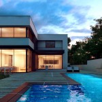
I just have to share these amazing architecture visualizations by Peter Guthrie – Representing some of his best work. The design is by Gianni Botsford Architects and SketchUP was the modeling tool of choice. I use SketchUP 99% of the time for all modeling, and Peter strives to get most of it done inside SketchUP too, texturing too… the rest is good old 3dsmax & VRay. Remarkable design and visuals! enjoy.
I love how he showcases the facade shading system in intervals. Presenting that in a slideshow does a great job explaining the facade with no need of animation. Visit Peter’s blog to see his post about this work – kilburn vale / gianni botsford architects
And join the conversation on the forum thread he opened – Kilburn Vale / GBA


These are outstanding. When I first time found these through twiter post by Peter I couldn’t realise that these are not photos. His style is so protographic that You can not define it by simply naming his work – visusalisation..it’s way beyond!
glimpse
Peter is a master of this art.. 🙂
These are amazing. What I admire the most about Peter is his subtlety. I mentioned on Peter’s blog that a training video from him would sell really well, but you can’t video-train good taste.
Congrats!
I love the sun light coming in!!! great work
Already commented on these in a couple of places. Just to say it again: Outstading work! There’s something very special about Peter’s light that make his images instantly recognizable. That and the photographer’s eye
waiting for more photos :)))
Nicely done! Great attention to detail and lighting. I really enjoy viewing your work. I too tend to model almost everything in SketchUp. When it come to furniture though some of it has to be done in max.
Hi Peter,
Really Great shots… like Julius Schulmann… 😉
Congrats!!!
As usually perfect renders. But architecture imho is looking weird in such a lovely place. like an UFO in the center of Trafalgar Square. And BTW all this 60’s only exposed concrete + wooden planks says just about limited imagination, nothing to do with The Third Millenium architecture. Can’t find any great thing in that, but what naturally represent it. Empty cubic spaces concrete and planks… Which are tones around, specially last days… Down on my kneels in front of Great master Peter, but still hoping to see one day something more then…concrete and planks.
very good job!