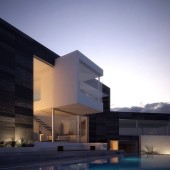
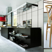
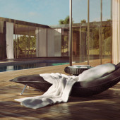
Making of HOVER “Lake House” by Benjamin Brosdau
The first of the HOVER Challenge making-of articles is here! Done by the Grand Prize Winner, Benjamin will describe the process of creating his ‘Lake House’ scene. I hope you’ll enjoy this article, learn from it and share your thoughts by commenting at the bottom of this article’s page.
Benjamin participated in the HOVER Challenge, winning the Grand Prize Award for his entry. Benjamin is 31 years old CG artist working at Purerender as Technical Director. Benjamin is one of the dominant Maxwell Render users and has a great portfolio of images made with it. he also offers many items that he made for sale on turbosquid.
You might want to open Benjamin’s HOVER Challenge wip thread along side as you follow this article.
The first step, in any type of viz work, should always be to gather as much reference images and inspiration as possible. Before you create the first polygon you should already have at least a direction and thought about what it is that you’re trying to achieve. The specifics will be determined and further solidified during the creation process but the base has to be laid out before you dive in.
That goes very much so for projects with multiple shots like the Hover challenge for example, but it does also apply to any smaller scale project, even to single pieces of furniture.
Although a modeling kit was being provided, I decided against using it trying to create something of my own instead. My main reference for the hovering element was the “ViLA NM” by Amsterdam’s UN Studio. Naturally it had to undergo many changes to accommodate for the planned increases in dimensions and proportions.
Starting The Process
I do most of my early sketches in 3D as well; I rarely sketch on paper or Photoshop. I really try to lie down the foundations and measurements until I achieve the desired look and feel for the space. This usually takes a few days where I try different approaches, move walls around, increases heights, think about a rhythm between lengths and heights etc. I am in fact also planning the positioning of the cameras at this stage.
Working in 3D is great because you can enjoy complete freedom of choice and if a wall is stopping you from getting that one shot, simply move it away!
It’s of course not possible to plan everything in great detail at this stage; things are bound to change with proper lighting and materials, but it definitely pays off to spend a good amount of time at this stage.
Modeling / Texturing
The modeling phase could be divided into 3 separate parts:
- Architectural elements
- Environment
- Furniture/props
Everything has been modeled in 3ds max in conjunction with Mudbox, an additional tool was the now almost indispensable Floor Generator 3ds max script.
Architecture
The architectural elements (like walls, windows, floors, etc…) were really straightforward and used simple poly-modeling methods and took the least amount of the time to finish them.
I took care that everything was modeled in proper dimension (I prefer to model in cm units) so all the elements like doors, furniture, lights, etc… would look natural and realistic.
Environment
The environment carrying the foliage was again very simple polygon surfaces with a rough tessellation and some hills / valleys made with soft selection or similar tools.
A different beast entirely was the cliff surface which was a mix of sculpted and extracted displacement maps together with procedural displacements for the finer structure. Below is a small breakdown of the steps involved.
Fig. 1 shows the lowpoly mesh that was imported back from Mudbox at subdivision level 2 (25k poly count). I started from a very lowpoly model in 3dsmax that just carried the rough volume, UV coordinates and an even mesh flow. The high resolution mesh in Mudbox came in at around 7M poly’s at the export sub division level of 2.
it cannot carry all the small sculpted details but all large proportions and massing are present. It also makes for smooth handling back in 3ds max. I also extracted normal, displacement and ambient occlusion maps at 4k resolution each from the high poly mesh.
Fig. 2 shows the effect of only the normal map in place. It already adds a great amount of detail and is very fast to render.
Fig. 3 shows the same normal map mixed with bercon procedural noise.
Fig. 4 shows displacement, normal and bump map applied.
Finally in Fig. 5 the earlier displacement map was multiplied using a composite map with the painted texture bump map. The diffuse and bump map were painted @ 8k resolution in Photoshop using reference images from cgtextures. The baked AO and normal maps were a great aid in knowing where to put appropriate texture sheets according to sculpted surface details. Mixing the texture bump map with the displacement map ensures that visible stone cracks in the diffuse texture will also be represented as a real geometric crack during rendering.
Vegetation
The vegetation was added with multiscatter. The models are from the Mentor Plants Collection. They work great for medium and far distance shots, in close-ups they’ll reveal their ugly face by showing low polygon outlines and missing leaf connections. It is of benefit to have the general volumes and shapes of the surface already in the mesh as opposed to displace the whole thing from a coarse mesh, since you get away with smaller displacement heights (20cm in this case) and it makes the placement of objects that interact with the displaced object that much easier. It’s more difficult to place proxies and stuff like that on a surface that’s only being generated at render time.
Furniture
The creation of the furniture models took by far the greatest amount of time. I wanted to use mainly leather, metal and wooden materials for the furniture so creating believable folds and textures was crucial to sell the look. I used Mudbox for all the sculpting process, the base models were done inside 3ds max and the unwrapping process was finished there too.
This armchair might serve as an example for the general workflow…
As you can see, even the base model already captures the shape and feel of the final design pretty well. I tend to spend a large amount of time inside 3ds max to get the shape done, to avoid having to re-topo the whole piece again because of large changes made in Mudbox or bad mesh flow.
The unwrapping was done with this polygon density; wherever possible the seams should be placed in parts where they would lie anyway because of the different parts on the piece of furniture. Stretching should be kept to a minimum to prevent ugly texture distortions. In this case I used multiple planar projections some of which has been stitched back together and relaxed a little.
This step HAS TO BE DONE RIGHT since all further texture and sculpting works depend highly on proper UV’s. There are many ways nowadays to create UV’s (Unfold 3D, UVlayout, to just name a few) and the layout of your UV’s might also depend on how you would like to paint your texture.
I prefer to work within Photoshop so I need to avoid disjointed UV’s as much as possible. If you are painting in Mudbox as well as sculpting, you can paint across seams more easily so it might be less of an issue.
The sculpting itself was again straightforward and involved using a loads of custom “Fold” brushes often created from photographs and textures found on cgtextures. The work inside Mudbox is generally spread across several layers each with increasing mesh density and smaller details.
The diffuse texture was again created from a variety of different photos, erasing any light and reflection properties that might have been present in the original file. Usually I derive a bump, reflection and glossiness map from the diffuse texture to drive the respective properties of the VRay Material.
When talking about materials it’s safe to say that I use no material without reflection and many properties are controlled by textures. Using plain numerical values produce mathematical looking unrealistic results; a texture in the reflection glossiness slot can do wonders.
Lighting
The presentation images for the furniture where all done using a single dome light with a HDR file for the illumination and reflection properties, so there really is not much to talk about here, very much standard.
I planned the exterior image to have a dusk / blue hour type of light situation whereas I changed my initial concept of sunset for the interior to a bright daylight one during the creation process.
The lighting for the exterior is again very simple…
A dome light with a plain bluish color and a target direct light with an orange / pinkish cast at low intensity were all that was needed in terms of exterior lights. The house was lit from inside with VRay Sphere Lights having a strong warm tint. An additional effect was having some lights hitting the facade. Those were done using VRay IES Lights. There are no fill lights, hidden lights, bounce lights, etc… whatsoever.
The interior is simpler still, using the standard physical sky / sun system together with a large HDR as an reflection / refraction override.
The other shots, while not topic of this making of, are all using similar approaches… meaning a HDR and / or a sky / sun system. All lights always cast ray traced shadows (no “store to irradiance map”).
I can furthermore add that I always use the physical cam inside VRay and that the color mapping is either set to Linear or Reinhardt.
Rendering
All renderings were done on a single core i7 980X, render times ranged between 5-10h for the final images. Effects like DOF were rendered in camera. I primarily used a combination of irradiance map and light cache concerning the GI part. Using brute force might have yielded slightly better results, but it was too slow, especially for the interiors.
For the organization of render passes and matte elements I used the PSD Manager plugin since it allows for a sophisticated arranging of all rendered elements inside a .PSD file and is a good way to organize your renderings.
Since I had quite a few different lighting schemes for my shots, each camera / POV was rendered from a different scene. I also changed shaders and geometry slightly from camera to camera to better suit my needs. Another benefit is that I could hide elements from the scene that would not be visible anyway thus speeding up the rendering and simplifying the work. Naturally you’ll want to wait until the latest possible moment to split your scene to avoid having to do things twice (or even more often) in different scenes.
Postwork
All files were saved as 16bit .PSD files which allows for a much greater flexibility compared to an 8bit file. Postwork includes all kinds of color corrections masked with masks that have either been rendered out or just by using simple brushstrokes. Also glows, background images and sometimes pieces of vegetation were added in post. I additionally like to apply or overlay dirtmaps, stains, cracks and the likes to add variations to the surfaces for a greater visual complexity and a more natural, worn look.
Well, I guess that’s it so far, I hope someone found this making of useful!
Benjamin’s HOVER Challenge thread
You are welcome to comment on this article and ask questions using the comment box below!


that was a great read..
I really appreciate the way you texture objects…
you really put the effort into the textures…
Thank you
THX a lot for your tutorial. I got to tell you: great work!! I love the furniture.
It is a nice insight on the techniques. Like difficult math problems, once explained they are simple. You “only” have to get there by yourself.
Very nice work! Really well done!
Very nice tutorial …
may i ask if one of you could reccomend a tutorial for such highly detailed furniture parts like the seams in the cushions or anything like that ?
That would be really really helpful …
thanks in advance … Floriano
Excellent work, I followed this thread closely.
A detailed tutorial on modelling/texturing that chair you have shown the wires for would make excellent reading 😉
Hey Ben, love checking out your stuff.
Wondering if you could find the time to do a tutorial on how to produce a piece of furniture from start to finish?
I’m always impressed by how realistic you manage to get all the fabrics and surfaces to look.
Thanks mate
PS: The silver cushion looks way cool.
Hey Ben. What about this carpet you wanted to tell us about?
Great tutorial, but you didn’t mention carpet.