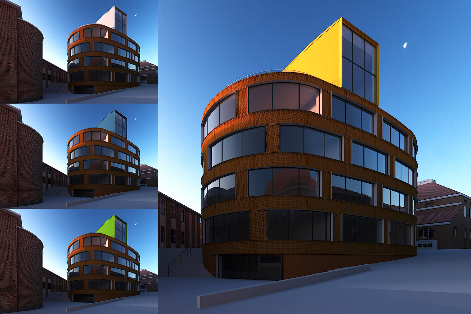
Well, even though i really like the corten cladding, it feels quite visually heavy. So i though to take advantage of the volumes/ forms that we have for the building.
The building has two distinctive forms and i thought i could explore with the top form and try and come up with an interesting contrast.
So here i got to play around with just plain colors and try to come up with a combination of contrast that felt desirable for me.
I felt that the yellow contrast works well for me because it’s closer to the red corten in the color graph and also brings an interesting warmth to the whole image.


