Studio: MR.P STUDIOS
Designer / Architect: Exterior - MONK MACKENZIE - Interior - bureaux.co.nz/
Client: http://lepconstruction.co.nz/
Personal / Commissioned: Commissioned Project
Location: Auckland, New Zealand New Zealand
The Making of Edition
Since we posted this showcase, we also published the making-of Edition in Parnell on Ronen’s Blog.
Concept / Mood
In an oversaturated property market, where there are many great render studios creating lovely images, we felt this project warranted a different formula. When I talk of formulas, I am referring to the standard late afternoon/sunset shots or if a client is feeling ‘crazy’ they will run with 1 or 2 dusk shots to compliment the suite of everlasting sunshine for the remaining 20 shots. Let’s not forget that it is always sunshine and smiles in the 3D world of architectural visualization!
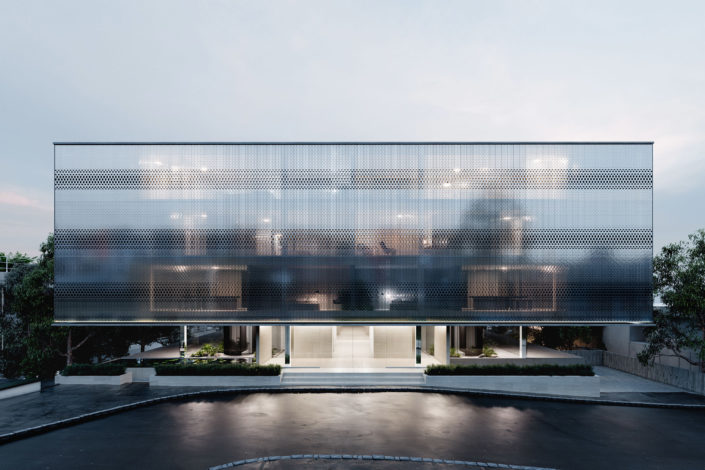
Auckland is known for its cloudy skies and rainy days, especially at this time of year (Winter). We like to keep real-world values, it gives a place a true sense of locality. Like all good restaurants, keep it seasonal where possible, don’t be afraid of rain or cloud. Our studio is really pushing clients to think about the time of year and locality when generating an overall mood for projects.
Everyone in the studio is a big fan of Iwan Baan’s work as a photographer, his super soft blue grade for dusk or silver white days really float our boats. We felt his tone and grade to his photographs would suit the Auckland mood perfectly. With this inspiration we presented a mood board to our client of the direction we wanted to take the images and to our surprise, they jumped straight on board.
Composition / Lighting
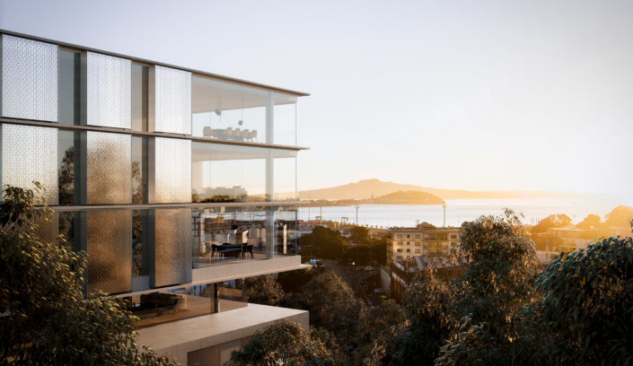
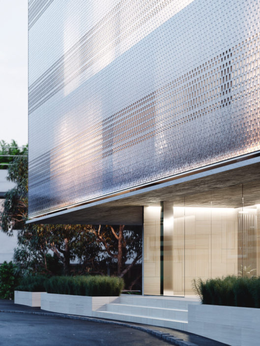
The facade of the building is made up of thousands of handmade glass bricks from Italy. This was a really important/expensive design feature to highlight, to do this we knew the shot had to be a silver dusk. We needed to play up the reflective qualities in the brick whilst still being able to see pockets of interior light within, giving the facade an ethereal quality. The ethereal quality of the facade was amplified further by elevating the camera position, this helped us make the cantilevered upper 3 floors float above the podium entrance/reception below, something the architects were keen for us to demonstrate.
New Workflow
This was the first set of images that our studio had used Corona for the entire project, normally we mix between V-Ray, OctaneRender and Corona Renderer.
We also grew all of the plants in GrowFX and made custom shaders using Megascans. Railcone was also used for the glass bricks, curbs, and some hard landscape elements.


