Scanning Materials with your Smartphone
Photogrammetry is the thing for material creation these days and today we’ll see how to use a smartphone camera to capture a material. This time using the new scan filters in Substance Designer 6. With these, it’s possible to transform a smartphone into a material scanner. Follow Anthony Salvi, a Creative Technologist at Allegorithmic as he describes the process.
Here is the type of result we will achieve in this blog post :
First of all, it’s important to find the right balance between quality and cost. For the cost part, we will use a cardboard box, a stack of sheet of tracing paper and an LED light for our lighting setup. For the image capture, we want to look at using the best process possible, so for our tests, we used an iPhone 6s and iPhone 7 as our camera with the Adobe Lightroom mobile app.
This app allows you to capture in RAW (uncompressed) format on iOS and Android. Adobe Lightroom also has some very nice features such as full manual shooting and High Dynamic Range modes. However, you can find other apps like ProCam on the App Store or Camerafv5 for Android.
With Substance Designer 6, we have a new filter named Multi-angle to Normal that has 8 possible inputs. To use the filter, we have to produce 8 images at 45° around our material.
To understand the image capture process, we can imagine our material on a much larger scale. Let’s imagine our material is at the scale of a mountain. At this size, our light can represent the sun. If the sun turns around the mountain, we can see the shape of the shadows cast in black. These shapes represent the indirect information about the relief of the mountain itself. If we combine enough information, at least 4 images (using 8 for a better result), the algorithm can calculate the relief.
The process is simple. We just need to turn the light 8 times at the same distance around our material.
Gear
To help us, we can draw a circle on our sheet with our 8 angles. You can download our template at this link.
To improve our chart, we can switch the color to black to reduce the lighting bounces from our LED light onto our material sample. Then we add some shapes (square, triangle, moon, star etc.) at the 8 angles, which are useful in post-process. These shapes are used by the photomerge process in Adobe Photoshop. They help Photoshop to produce a quick and accurate merging.
Finally, we draw a 10cm by 10cm square at the center to cut a hole for our opacity shoot.
Next, we will setup the scanbox. The box is as simple as possible, but it’s very important to retain the ability to capture the opacity of a material. To capture opacity, we will use a square hole (10cm x 10cm) at the center of the box and a stack of 6 sheets of tracing paper to diffuse the light through the material, plus a last sheet on top of the chart, as you can see in these image below:
Don’t forget a hole to put the LED light inside the box as well.
To finish our setup and to reduce the cost, we used a simple cardboard tube with a foam core plate to create a stand for our smartphone. To maximize the final frame, the stand size is calibrated to the size of the box. We added a black paper sheet to remove all potential color bounces coming from the cylinder. Finally, the smartphone is attached with 4 pieces of tape.
Here is the final setup with the scanbox and the stand. The stand is not as stable as a tripod and so it needs to be held in hand.
During the capture, it’s always a good idea to neutralize the color shift coming from the lighting. By nature, all lights have a color tint with some tints stronger than others. For example, a candle is red, a tungsten bulb is orange, the sky is blue. To neutralize this color and keep color consistency, a ColorChecker is required. Basically, it’s a reference, with a gray scale printed and calibrated.
The goal in post-production is to adjust the gray color captured and keep it as a pure gray. You can find more info about this product here and here.
The LED is designed by Manfrotto and produces a well-balanced daylight.
This is our toolbox:
- A cardboard box with a multi-angle chart
- A cardboard stand
- A LED light + tripod + string
- A ColorChecker
- A microfiber cloth
The photo shoot
Our goal will be to capture 2 materials: a leather and a complex fabric. We need to make sure that the only light visible on our material is coming from our LED light. If not, the shadow cast can be wrong and the post-processing in Substance Designer will produce an erroneous computation. So, just close the windows or curtains to darken the room and eliminate as much ambient light as possible and turn on your LED light on. Next, we place our material on the box.
Be sure the material is not covering the little shapes (square, triangle, moon, star, or whatever you’re using). Then, clean your sample, as dust or hair will often fall onto our material. The most important thing is to not move the material sample during the shooting! If the material moved, the photo-merge cannot be done correctly.

A string is attached to the LED light. We use a simple knot on the string as a metering guide between our LED light and the chart points around the circle on the box.
The most important angle is the altitude. See the graph below:
If the angle is too low, the shadow casting could be too long and we stand to lose some information in these shadow areas. The result will be an erroneous normal map computation with a flat result in the darker areas.
The trick is to find an angle to preserve information and provide enough shadowing for a good result.
Now it’s time to work on our camera. Start to clean your lens. Often our smartphone isn’t really clean. It takes 5 seconds to clean the lens with a microfiber cloth.
With Adobe Lightroom mobile you can use the PRO mode and manually set up your shot or use the HDR mode. Both deliver good results.
In the PRO mode, turn the flash off, activate the DNG format, set the ISO as low as possible (25 to 100) and set the White Balance to Daylight. To avoid motion blur in your image, keep a speed around 1/50 sec and adapt your ISO to get a good exposure.
You will find more and tutorials on using Adobe Lightroom for mobile here.
Another option is to use the HDR mode and activate the Save Uncompressed Original option. In this configuration, you have both, the original dng file and the “HDR” dng computed.
It can be helpful to add the grid and the level on screen for framing the shot. You can also add a timer for 5 seconds to act as a remote trigger for capturing the image. This will provide a more stable result as manually touching the shutter button on the camera can inadvertently add a shake, which can produce a blurrier image.
If you have an Adobe Creative Cloud account you can import your images into your Adobe Lightroom Desktop library.
Here is a tutorial on importing content.
Once everything is set, it’s time to capture the material. Set the LED lighting power to maximum. Make sure you have enough battery power (smartphone and LED light) and that the LED light doesn’t become too hot. During the shoot, it’s important to keep the same framing as much as possible. However, don’t panic if your pictures are not perfectly aligned. It’s more important to keep all of the shapes (square, triangle, moon, star etc.) on the chart visible in the images.
Now we can shoot a reference with our ColorChecker under the same LED light.
After we take the 8 material shots and 1 color reference image, we can shoot three more pictures. One for the color, one for the new white balance and one for the opacity (for the fabric).
For the color, we need soft and diffuse lighting. In our case, we used the indirect light coming from a window and bounced in an aluminum paper sheet. It’s not perfect, but it’s a good base. Of course, we have more options for this lighting, but this was the simplest in our case.
Don’t forget to shoot a new ColorChecker to set the color correction in post production.
For opacity, open the curtains in the room and setup the LED light inside the box. With the LED light at a low power, we have enough backlight for capturing opacity.
For a better light diffusion, you can add white paper on the inside and have the light centered in the middle of the scanbox: a foam core plate with a hole works well.
Now we have our 8 angles, 1 color, 1 opacity and 2 ColorChecker images. Next, we import our images in Adobe Lightroom Desktop. With Adobe Creative Cloud activated, all images are in our hard drive.
In our case, we used the “HDR” dng files, but as we explained, the dng files from the PRO mode deliver a good result as well. For the ColorChecker images, we keep the regular dng file.
Let’s select the ColorChecker image for the LED light and use the White Balance tool.
Then, we have to set the parameters Whites, Blacks, and Clarity at 0 and finally copy and paste the values of the parameters to the 8 angle images.
We can repeat this process for the ColorChecker image in daylight and apply the new value on our color and opacity images. Also, set the parameters Whites, Blacks and Clarity at 0.
For the opacity image, we can use the gradient tool in Lightroom to reduce the vignette effect.
For the last step, we exported all of the images as TIFF 16bit using the Adobe 1998 ICC profile.
Our phone stand was simple and cheap but not very efficient. However, this isn’t a problem. Using the photomerge feature in Adobe Photoshop, it’s possible to merge and align the images. Just load your pictures in photomerge and uncheck the Blend Images Together option.
After that, add a solid black layer at the bottom of the layer stack and crop your image on a square and resize it to 4096 pixels.
Finally export your layer stack in a new individual TIFF file with the remove layers option.
Creating the seamless material in Substance Designer
For the leather material, we created a new Substance using the Physically Based (Metallic/Roughness) template set to 4096×4096 in size. Then we linked our pictures to our project.
The first node we used was the Multi Crop. It’s useful to select which area of the image we want to target for our material. This crop can be critical when the tiling is difficult. But with the procedural approach, you can easily test different crops for a better tiling. After that, we used the Multi Color Equalizer to clean our images and finally a Multi-Angle to Normal node to generate the normal map.
We can add our color image and just copy paste our Multi Crop node and set the input Count to 1.
With the Color Equalizer node we can balance the light and dark values to produce a better color map for our material.
Now it’s time for the tiling part. With the new Smart Auto Tile node, you can quickly create a seamless material. Don’t hesitate to move, rotate and transform your pattern to get the best result possible.
For more information, you can find a tutorial here.
The new Color Match node is perfect for changing the color of our leather while retaining all the details. It gives you an endless variety of colors options with the benefit of mixing with the initial color captured data.
The Specular Level can be vital to achieving realistic results. With the Metallic/Roughness definition, when the Metallic is set to 0, the material is understood to be a dielectric and the reflectance value at the Fresnel zero angle or f0 is set to 4% reflective. This works for most common dielectric materials, but some dielectrics can have a different Index of Refraction or IOR. The Specular Level can be used to override the default 4% value used in the metallic/roughness definition. Here, we have a leather and we can use the Specular Level to set a custom level for the leather material.
To drive this channel, just add a new Output node and set the usage and identifier to specularLevel. Then adjust the value by using a Uniform Color node in Grayscale Mode. A value of 60 is a good start for a leather.
For the Height map, we used the node Normal to Height HQ and set the quality to High.
At last, we worked on the Roughness and used the Height map to drive 2 values between the bumps.
The easier part is for the Metallic channel. Just add a Uniform Color node, set on Grayscale and at 0.
After these few steps, finally, here is the complete graph.
Our leather sample was pretty matte, and after some tests we found
Creating the fabric material
The process is quite similar, with the same Specular Level output set at 60, except we have the opacity channel.
the good values for our leather and voilà 🙂
Using a Color Equalizer and a Color to Mask node, we can have good control over the opacity mask for our material. We then just need to add an Output node with the Usage and Identifier set to opacity.
One caveat with the Smart Auto Tile is that there is not an opacity input. To work around this, we can plug the opacity in the Height input and use the Height output for our opacity channel.
As with the leather, we can use the Color Match node to easily transform our scanned material into a hybrid material with multiple color options.
But of course, we can use our color image as well 🙂
And at the end, the complete graph:
Conclusion
At the end of this process, we have 2 hybrid materials, scanned with our smartphone and ready to use in a PBR pipeline. All Substances and images are available at this link.
Don’t hesitate to play with material settings and explore the scanning process. Next time you need some material references, grab your smartphone, build your own scanbox and have fun with Substance Designer 6!
One more thing
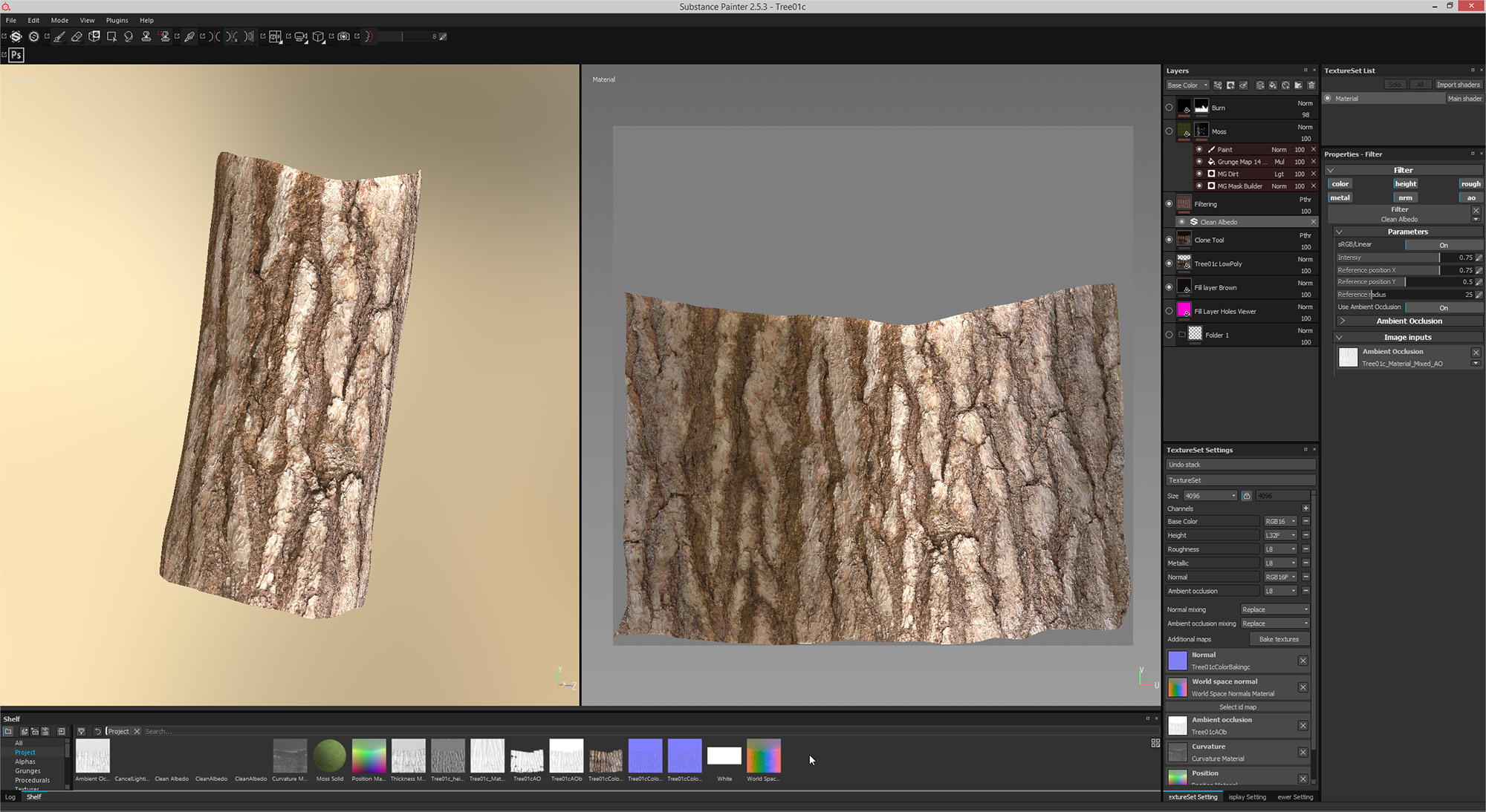
In a previous blog post about photogrammetry, we showed a specific use case. However, now with Substance Designer 6, it’s easy to convert our photogrammetry maps in a single tiling material.
Photogrammetry is really fun, but it means your material is dependent on your object. Maybe you would like something more versatile. Fortunately, with Substance Designer 6, it’s easy to convert our photogrammetry maps in a single tiling material. After this step, your material will be usable on any mesh.
The job was done in 3 simple steps:
- Crop the good area in our map exported from Substance Painter.
- Make it tile with the Smart Auto tile node.
- Balance the color with the Color Match node to erase/smooth the color variations.
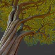
And now, we can apply this texture on a simple cylinder and view our bark 🙂
You can find the Substance file and images here.
As you can see, you have multiple usages for these new scanning nodes in Substance Designer 6.
We hope you will find this one interesting and that it gives you more ideas on what you can achieve with Substance Designer 6!
Posted originally on Allegorithmic’s Blog as YOUR SMARTPHONE IS A MATERIAL SCANNER





Nice copy and paste