Making of GH House Norwegian lake shore by Bertrand Benoit
The last of the GH House Challenge making-of articles is here! Done by the Grand Prize Winner, Bertrand will describe the process of creating his ‘Norwegian lake shore’ theme for the GH House. You will find 2 additional mini tutorials in the how-to section and linked from within this article describing the use of the Floor Generator script and the rain drop creation process in more detail. I hope you’ll enjoy this article, learn from it and share your thoughts by commenting at the bottom of this article’s page.
And stay tuned for news about Architectural Visualization Challenge II very soon. You can also start taking part at forming the challenge by voting at this first related poll
Author : Bertrand Benoit
Bertrand participated in the GH House Challenge, winning the Grand Prize Award for his entry. In this article, He describe the process of working on his images. Check out his blog at – http://bbb3viz.com/
Bertrand’s Challenge Thread : GH House – Norwegian lake shore
The Concept
My first step when approaching the challenge was to think hard and as precisely as possible about the concept and to look for solid reference material I could always get back to throughout the creation process. The idea, not a very original one as it turned out, was to move the house from its Middle-Eastern context to Scandinavia – more specifically to a windswept Norwegian lake shore. The concept was partly motivated by the desire to try my hand at realistic rock formations, something I had not done before.
Getting my House in Order
Since the house model was provided – and since everyone models differently, using their own conventions – I began by tweaking and re-arranging the model in a way that made it more familiar to work with. This ensured things would remain organized and manageable as the scene became complex.
One initial step was to go over the geometry and separate it into objects corresponding roughly with the materials I was going to use. As a proxy for the materials, I first assigned a color to each of these parts to help visualize the outcome and make sure it worked.
The second step was to create selection groups and layers for each of these segments of the house in order to facilitate mass editing of their materials.
On Geometry
I did some relatively extensive re-modeling too, trying both to adapt the house to its new context (the wood shutters and the swimming pool made no sense for dark and gloomy Scandinavia) and adding detail in the areas that I might use for close-ups. I also wanted to give it a bit of a personal touch to differentiate it from other entries.
These added details ranged from handrails to fireplaces. I also double-glazed all the window panes – this may sound like overkill, but this results in beautifully realistic double-reflections when rendering.
I opted to model the hardwood parquet floor (and the deck outside) instead of using textures. For this, I used a great free 3ds Max script called Floor Generator. Coupled with the Multi Texture plugin, it makes creating hyper-realistic floors a breeze. Not only do these show no visible tiling, but they can be seen at very close-range, giving you a lot more options when picking your POV. I use these scripts all the time, not just for parquets but for paving and cladding. This is one of those simple tools that really take your archviz to the next level.
For more detail about the use of these scripts, check out the how-to use Floor Generator Script article.
Lighting
When working, I tend to spend most of my time on lighting and material creation. For the exterior shot, I wanted to re-create a northern sunset feel, with a strong blue ambient light and a faded pink sunlight.
For this I used a blueish dusk HDR sky for the ambient color and a direct light (instead of a VRaySun) for the sun, so as to better control its color. In the end, however, I strayed quite far from this original concept, which can happen when a project takes a life of its own.
Materials
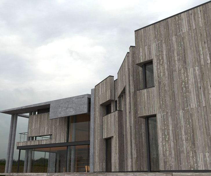
The concept called for a mixture of timber and concrete. Although I initially used commercial textures to sketch things out, I almost always tend to switch to my own textures as I go along.
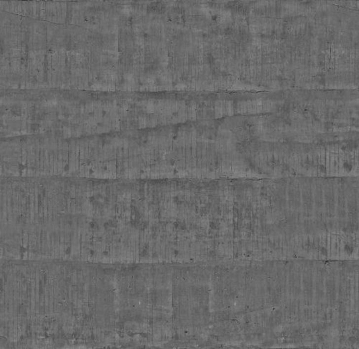
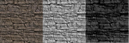
The timber map above was made from photos of old wood collected on CGTextures and assembled into a map with diffuse, bump, specular and glossiness components. The concrete texture below was made from my own photos.
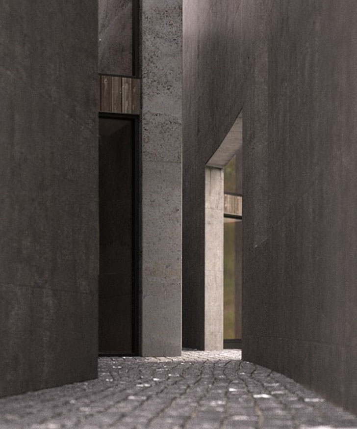
The cobblestone for the exterior was made from a 3D model of a floor, from which I extracted a displacement map. You can refer to my how-to Create 2d Displacement Maps from 3d Models article for more detail about this process.
Typically, my scenes contain vast numbers of materials (always VRay materials). All of them are different, but as a rule, I almost always use the diffuse, reflection, glossiness and bump slots since nearly every surface in real life has a degree of reflectivity. This, sometimes very subtle, reflectivity and glossiness can really make a difference in how materials catch the light under certain angles. Most of my materials also include a fresnel falloff. Of course, the drawback of such mats, with detailed, unfiltered textures and glossy reflections, are longer render times.
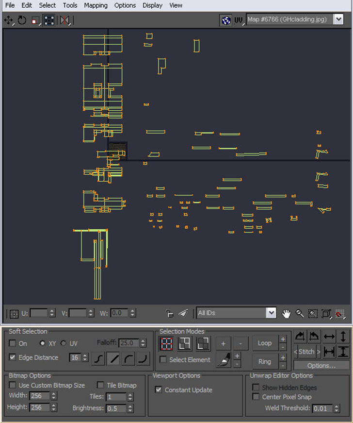
Instead of using standard UV projection methods for the timber, concrete and other materials, I opted to unwrap the meshes in order to get the texture maps to wrap realistically around edges.
In the case of the concrete, I used several sets of UV coordinates. One of them was used to overlay a dirt map over the concrete texture and create dirty rain drippings at the top of walls (remember, wet climate).
I always give my window materials, an often neglected aspect of archviz, special care. First, as I mentioned, I tend to model the double glazing in order to create double reflections. I then apply a noise map in the bump slot of the glass material to simulate the slight curvature of window panes, which are never flat. But this is not enough. In order to prevent the curvature of a window from neatly transitioning to the next (as though they were one solid glass object), I randomly assign material IDs to the glass panes. I then link these ID’s to as many versions of the noise map as there are ID’s, each with a different Phase. You can also add a bulge map – a bitmap or a radial gradient on top of the noise map to simulate the deformation undergone by the window panes because of pressure differences between interior and exterior.
The Landscape
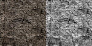
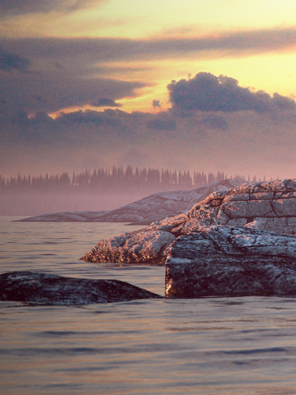
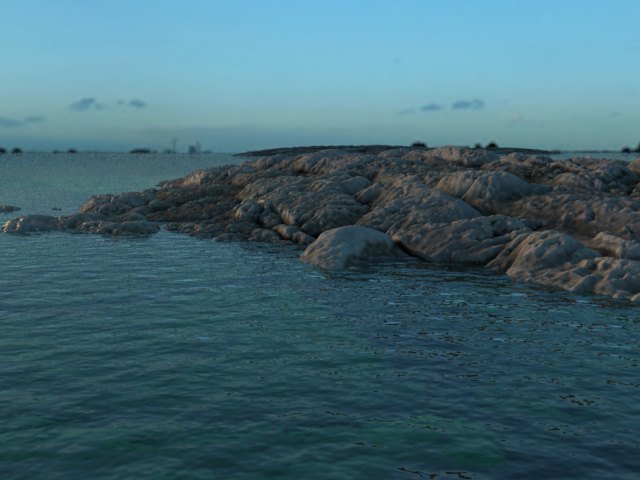
One of the most satisfying aspects of this challenge was to create the rock elements. What I discovered was that it’s all in the texture, specifically the displacement texture. I began by creating several nicely tiling, decent-sized rock texture maps by using photos from CGTextures. I made sure to apply the same color correction to them so that they would blend nicely in the image, like geological cousins.
Each diffuse map was used to generate a specular and a displacement map. There are several tools that can do that, including CrazyBump and Pixplant and I would be at a pain to say which is the best.
The final rock material was a VrayBlendMaterial mixing a wet-rock (darker, more reflective, high-gloss) and a dry-rock (more diffuse, lighter) material. I used a black-and-white map as a mask to mix the two ensuring that only the bottom parts of the rock looked wet.
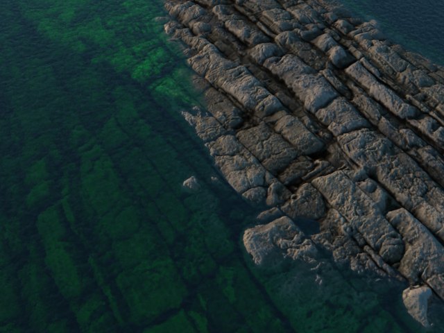
Having settled on the displacement settings during tests (see above), I moved to modeling the promontory on which the house would be perched. Although I began with soft, flowing forms, I soon realized the rocks were more believable if the mesh was coarse and angular.
For the displacement, I used a VRay 2D displacement modifier (faster and less memory-hungry than 3D displacement). I eventually modeled a big portion of landscape, including a road and approach to the house, which I ended up not showing in the final exterior render.
For the lake surface, I used a 3D displacement modifier as I needed to mix a bitmap and a procedural noise map to create a non-tiling surface (the 2D modifier does not read procedural maps). The water material included a blueish fog color and a relatively strong reflection falloff.
The Vegetation
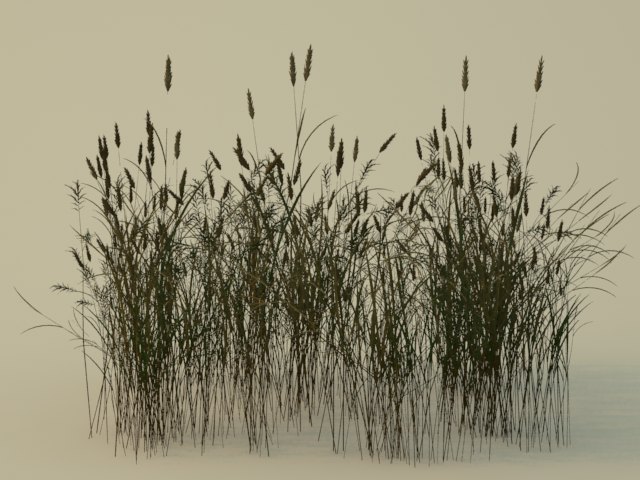
For the trees, I used an XFrog conifer collection from Greenworks as shown below.
Not the most detailed trees but satisfyingly poly-light. I also used an Evermotion tree for close-ups. The smaller vegetation (grass, bushes, weeds…) was modeled by hand and converted to VRay proxies.
For distribution I used both the commercial VrayScatter plugin (to cover vast areas of grass) and the free AdvancedPainter script whenever I needed precise positioning of weed, trees or boulders.
Props
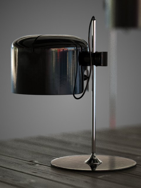
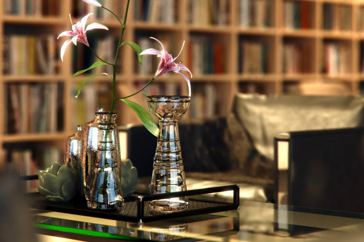
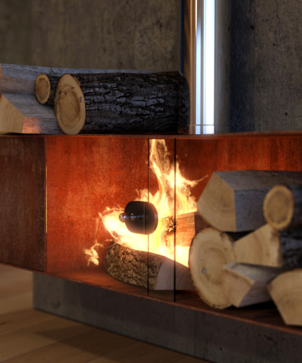
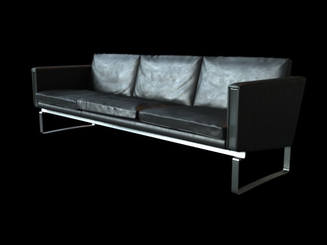
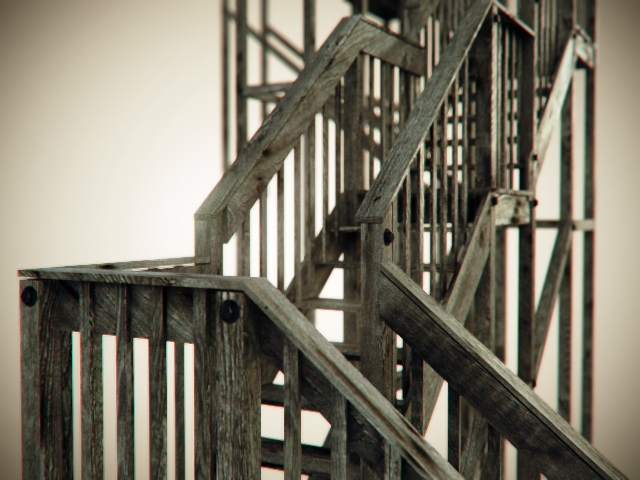
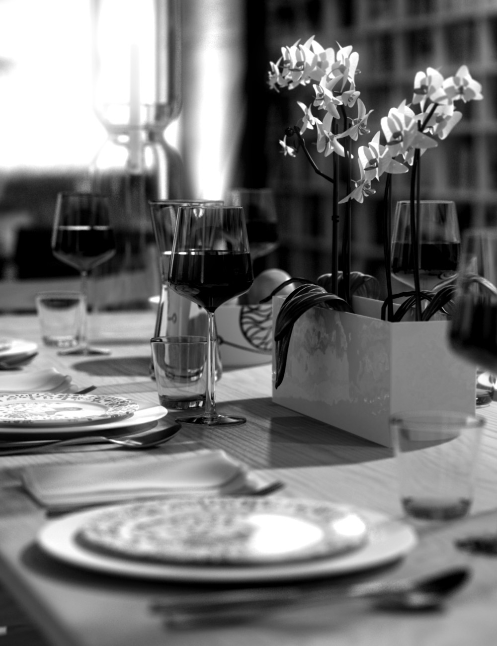
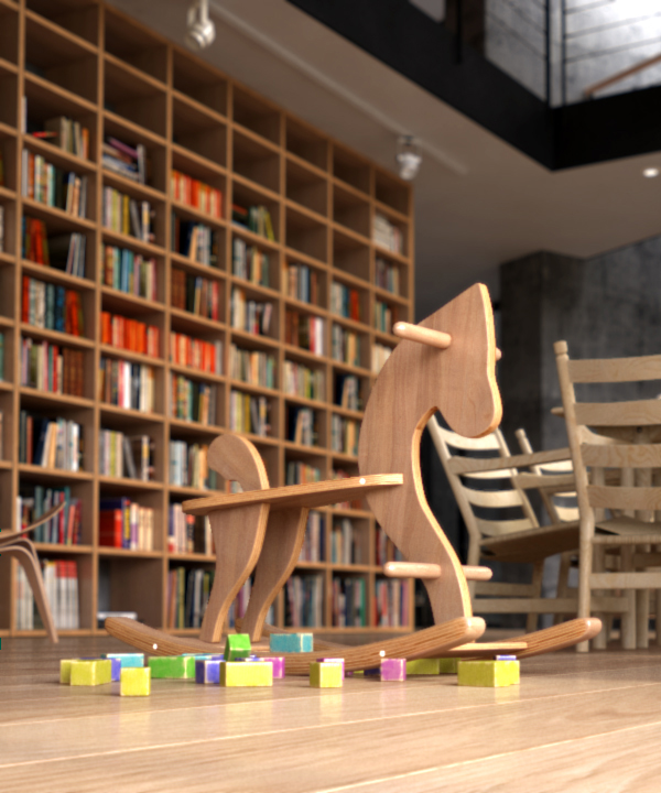
I generally model all my props myself and I had great fun creating accessories for this project. These included furniture, lighting elements, decorative elements, toys, a log fire complete with simulated fire, some larger architectural elements, etc.
here are images of some of those props…
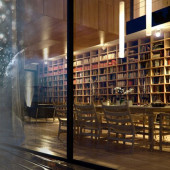
No prop, however, was as ambitious as the huge bookshelves, which includes dozens of unique, high-poly book meshes and which I think ended up giving a lot of its character to the final interior image. This was an immense pain to model and texture but I think it was worth it.
Final POV’s and Renders
The most agonizing moment came when I had to decide which of my darlings I would kill. With two images required, it was clear that my final images would not include all my models, props, materials and lighting ideas.
The victims included a lot of the furniture I had made, the fireplace, the second floor rooms, an overcast-day lighting scheme I really liked, and the entire approach to the house, including the road…
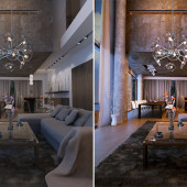
In the end, I settled on two very different scenarios… A sunset shot for the exterior taken with a 200mm lens and very much focused on the house and a night situation for the interior, done by combining VrayIES lights and a dusk blue HDR map.
I later decided to shoot the interior from the exterior with a wide angle, which allowed me to play with reflections on the glass and create something of a left-to-right gradient from the cold blue of the exterior to the warm yellows and oranges of the interior. On a side note, after struggling to find a decent POV for this, I ended up placing my camera behind a concrete wall and using a clip plane to make the wall disappear. So the shot is not one that would have been possible in real life!
At this stage and because of RAM and render-time issues, I split the scene in two. One included the entire landscape and a simplified, low-poly version of the furnishing while the other included a simpler landscape and much more detailed furnishing. All common elements (mainly the house and garden) were dropped into a Max Container to ensure any changes applied to them would propagate to both scenes.
Last-minute touches for the exterior included a lot of tweaking of the rock displacement, sea material, lighting and sky. I decided very late to add an after-the-rain element to the interior to further emphasize the cold-outside/warm-inside duality. For the deck, I used hand-painted reflectivity and specular maps to create the wet material.
For the rain drops on the window, I first created the scene in 3D, scattering hundreds of low-poly water-drop meshes onto a plane using the AdvancedPainter script. I then rendered a ZDepth pass of the scene through an orthographic camera essentially turning this little setup into a bump/displacement map. All that was left was to make the map horizontally tileable and apply it to my basic windows glass material.
For more detail about the process of creating the rain drops, check out the how-to create 3D Water Drops article.
For both images, I rendered in passes (beauty pass, ZDepth, reflections, fog, ID…) in order to retain maximum control over the final images at the composting stage. Effects such as depth of field (lens blur), color correction, glows, glares and a little chromatic aberration were all done in post.
This is it! I hope you enjoyed reading as much as I did writing it.
You are welcome to comment on this article and ask questions using the comment box below!










You did such a great work!!! Your Knowledge is amazing! Congrats 🙂
Wow, perfection is evident and thanks for sharing; going to check out the water drop tutorial too. You obviously have amazing skills – your Ponce house is one of my favourites, keep up the great work.
an inspiration!
Huge work, you didn’t miss any detail, and a very good tutorial, I’ve learned a lot with it.
Very nice work! Always learning here.
Thanks for the kind feedbacks, guys. Glad if this can be of any use.
No words needed, it’s always joy to learn from the best..
This is amazing, you need to make some kind of book for this project, the quality of all those renderings is amazing!
I’m still speechless! Very informative and inspiring, with you it looks so simple and yet it is not very easy 😉 You’re the Best
Nice stuffs, i really like it.
Very masterful my friend, very masterful, You are a good goal to aspire to surpas, I look forward to the enxt competition that you will be participating again.
Masterful for sure 🙂 and I can share with you all now that you will see Bertrand in the next Challenge acting as Judge along side with me…
I’m pretty sure he will also do his version to be an example to us all much like before (Just no prizes for him this time :-))
Great work! please tell me how you have made the amazing cylindrical lamps in the interior shot! thanks…
Great Man.. You Deserves More Than This…!! All The Best For Your Future works.. Keep Rocking.. )
At least i can Proudly say “We are using the Same Software” ;D
And Dont Frgt Peter.. Wishing Him The same In this occasion..
That’s wonderful , like past. Can I ask to post Render setting of this Project ?!
Thanks
Thank you for sharing this. I’m inspired.
i have several questions but first of all i have to say: AWESOME WORK AND EXELLENT PROJECT….
hope you, Bertrand, or Ronen can help me:
1. how did you do to manage such many objects for book shelves? and how did you do to scatter the books inside the shelves?
2. exellent and beautifull interior lighting.. how did you do achieve the ”neon tube” effect at the tube lights hanging above the stairway?
3. as i can see, all is done as high poly (at least for interior shoots), but, did you make a low poly version of interior objects to render exterior image or did you render exterior image with all of the interior high poly objects/components?
4. same as above, did you hide the cliffts and exterior elements for interior renders and interior close ups??
Thanks a lot for your help and i wish some day to reach the high level of quality you have..
He was crazy good since start.. I loved this tut when I saw it.
Complètement fou! Comme toujours…
CRAZY, as usual…
well…. he deserves to be called the king 🙂 awesome work