15 Renwick Case Study by MARCH
The 15 Renwick visuals by MARCH captured my attention the moment I stumbled upon them. The different approach to architectural visualization is pretty clear and being interested to know more about how they approached this project and executed it, I contacted Kevin Cimini at MARCH with the aim of learning more and sharing it all with you here. Today I’m happy to post this case study of the Renwick 15 project. Enjoy!
First and foremost, MARCH would like to thank Ronen for featuring our 15 Renwick project on his blog. We’ve been fans and followers of this site now for years and it’s great to finally connect with him and everyone else in the community. It’s inspirational to see what you all create and it’s awesome that Ronen keeps the conversation interesting.
Introduction
From the beginning there was the idea that this marketing campaign should be different. A bold new addition to a neighborhood rich with history set the stage for something memorable. Early branding and marketing ideas revolved around the site’s historical ties and the building’s strong modernist form juxtaposed against more playful European-inspired interiors. Working off these initial concepts, MARCH was inspired to envision the building through a recreation of the site’s past.
The narrative MARCH formulated was a time mashup that interlaced the history of Hudson Square (formerly west Soho in Manhattan) with a page from its newest chapter, 15 Renwick. A modern building set in a historically fictionalized urban landscape; historically fashioned figures occupying modern interiors. This idea set the identity theme for the remainder of the campaign. Anachronistic and neo-Victorian in nature, what materialized was a new take on traditional real estate renderings.
Each space was framed, lit and styled with a unique story in mind. All environments and lifestyle elements were created entirely in 3D leaving only the characters as photo-composites.
The Case Study…
Below you will find a breakdown of all the strategies, techniques and productions that went into making this project a reality.
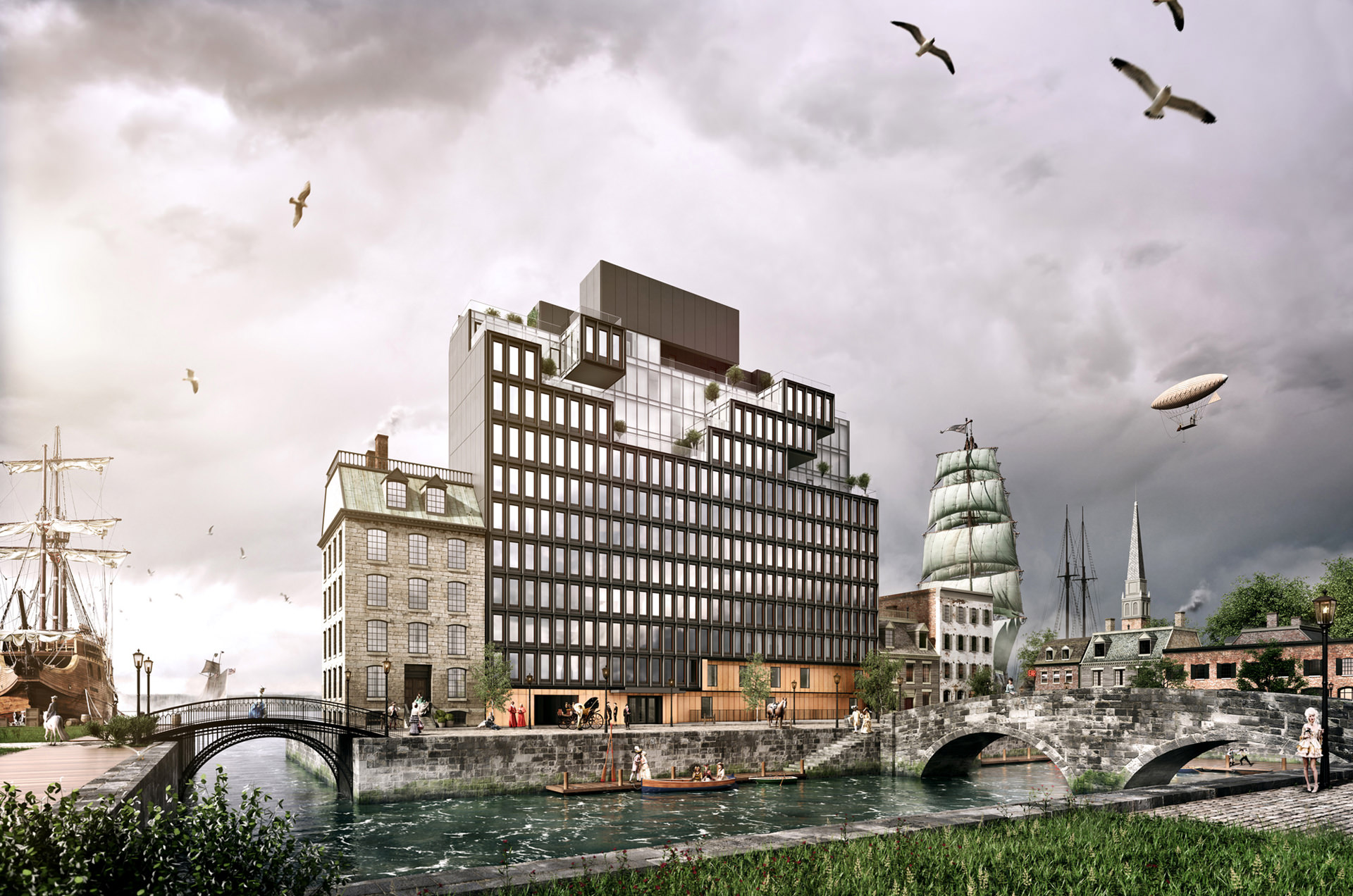
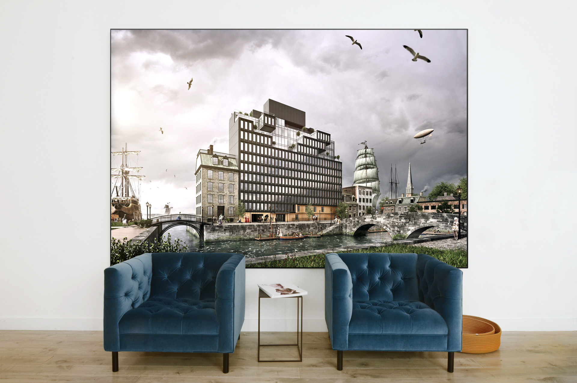
Rendering is free from the constraints of the physical world and therefore should push beyond mere representation. 15 Renwick finds itself nestled into a west Soho neighborhood of a reinvented past. A Dutch-styled canal connects leisure boats to the adjacent Hudson River; the neon glow from the Ear Inn (a nearby landmark and one of NYC’s oldest bars) bridges intersecting streets of early Federal style townhouses; and a personal airship navigates the sky between seafaring sails and church steeples. Site traces from the past 400 years define the character of a time-warped Hudson Square. By leveraging artistic license and designing the digital set entirely in 3D, MARCH composed this fanciful hero shot as the primary branded image for the building.
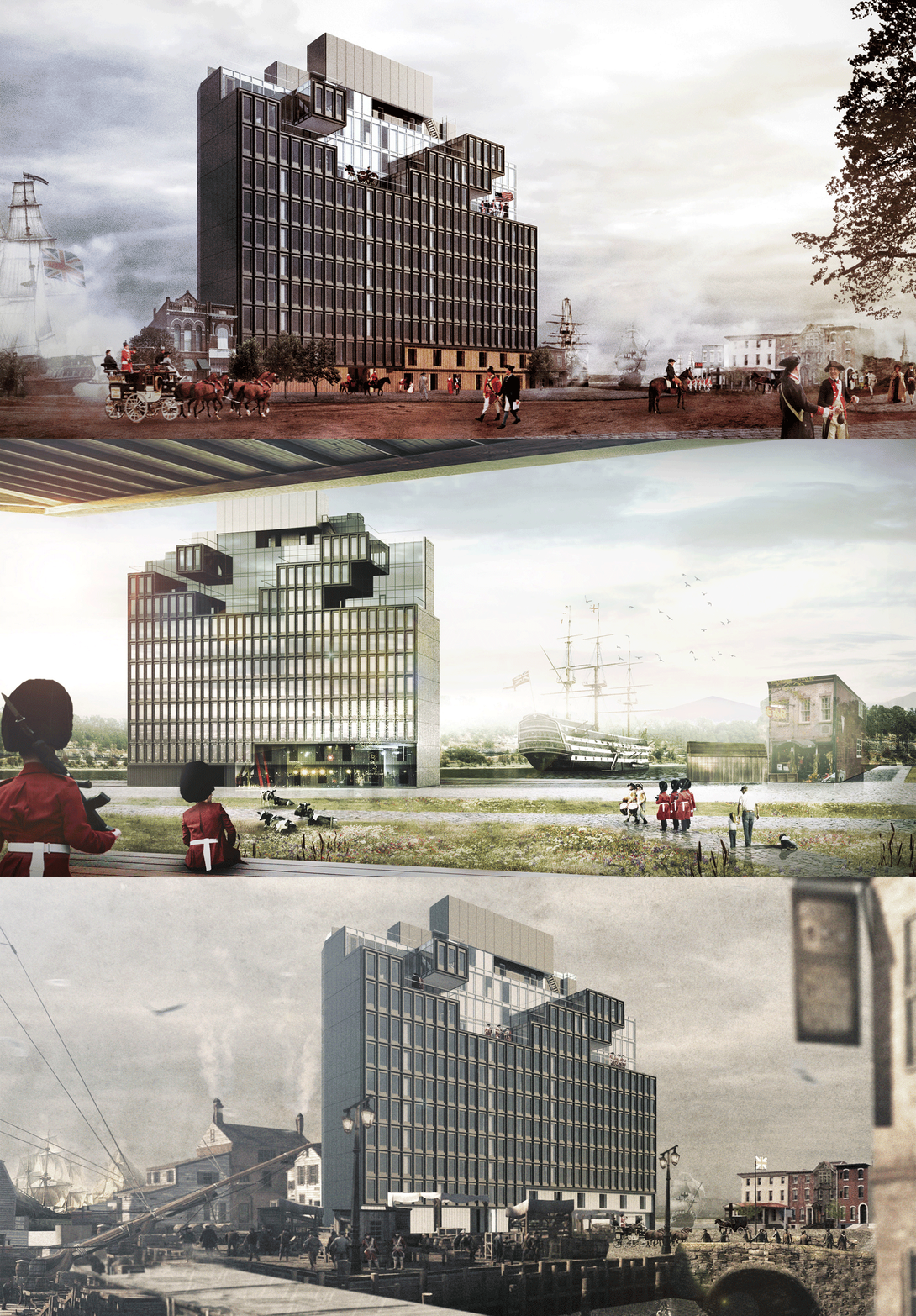
As part of an initial ideation exercise, MARCH artists envisioned what the hero context could be through matte painting concept studies. Time manipulation, Anglo/Euro crossover, daily activities, the built environment, atmosphere, treatment and composition were highlighted as variables at play. The final image materialized around a collection of our favorite moments from within these early visions.
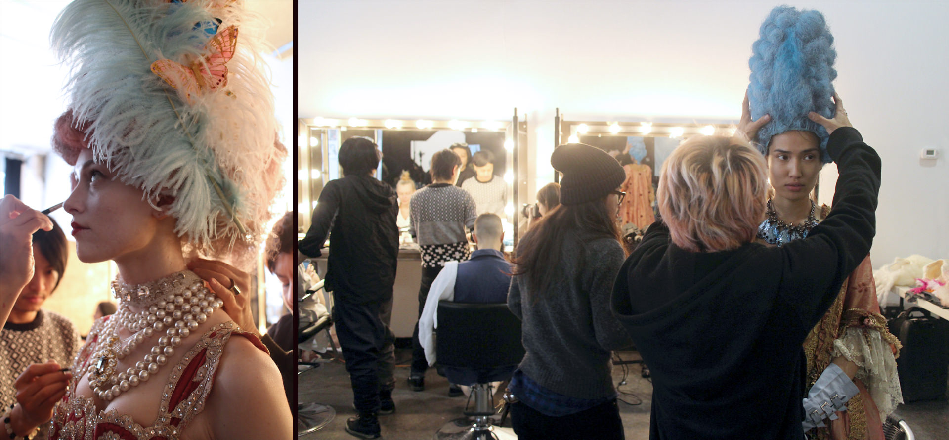
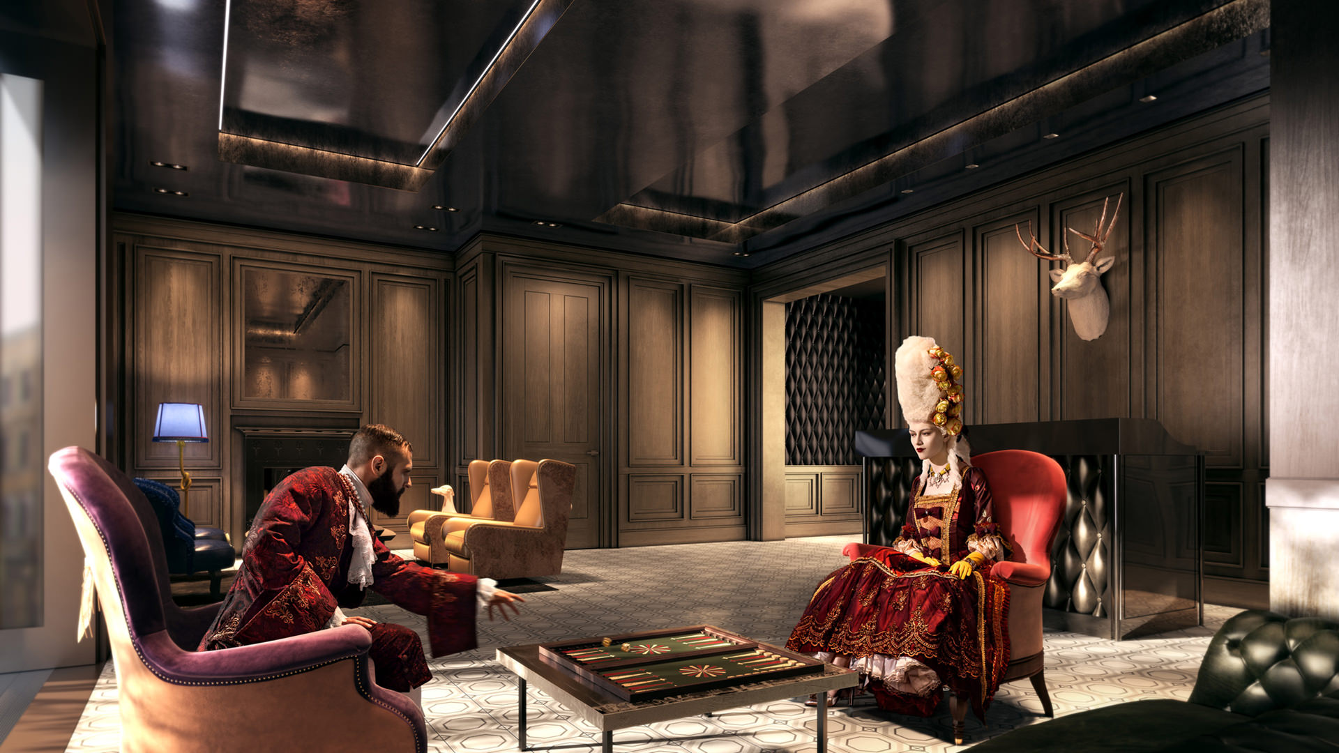
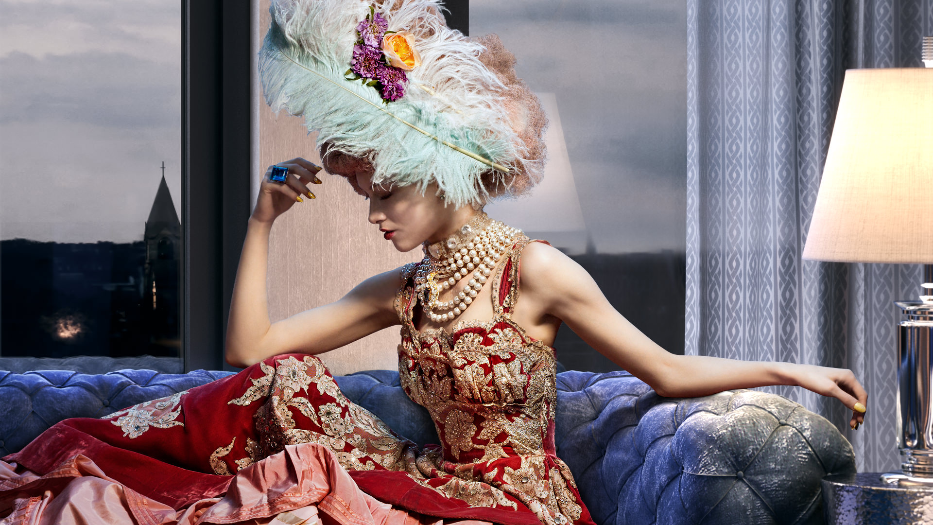
Stemming from the time mashup idea, a set of characters emerged as a fictional cast of Renwick residents. Each persona developed around a juxtaposed blend of old world styles and contemporary trends. Since the building is located adjacent to Soho’s retail district and the marketing campaign is targeted at an edgier demographic, the overall look was designed to be more fashion editorial in nature.
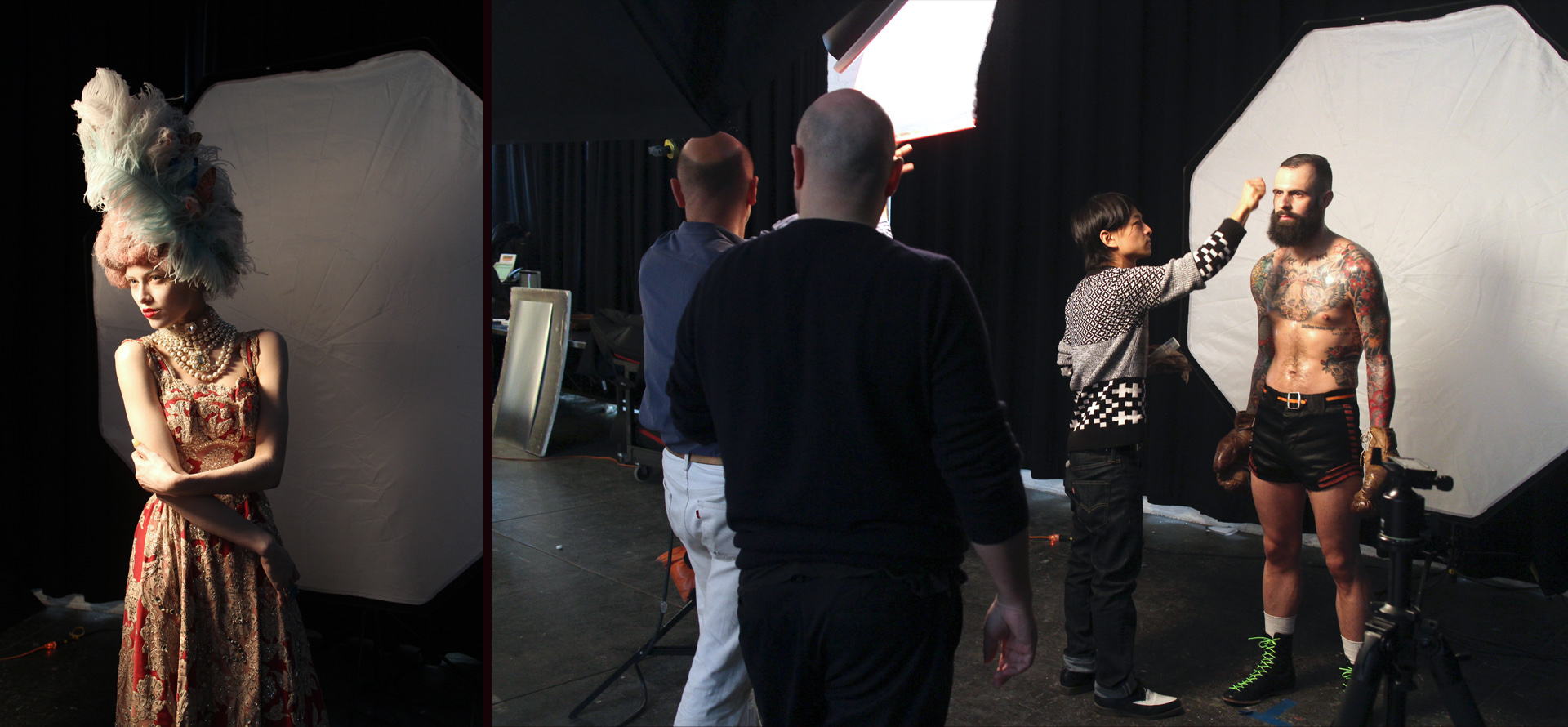
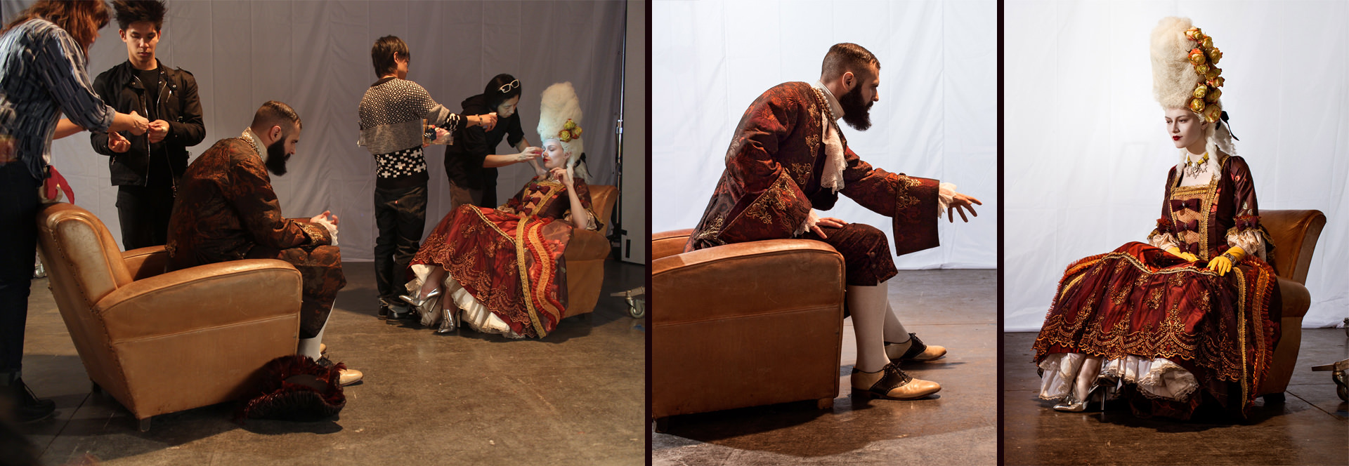
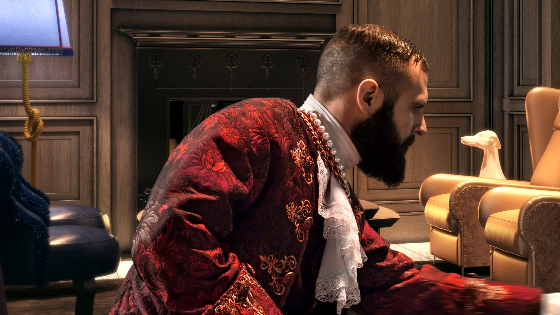
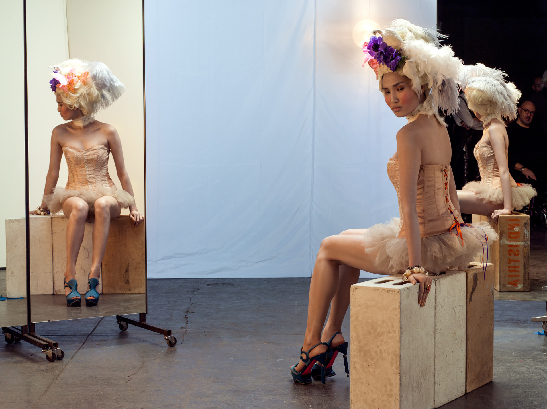
Model photography by Henry Leutwyler. MARCH provided creative and technical direction for “green screen” setups staged for live action integration.
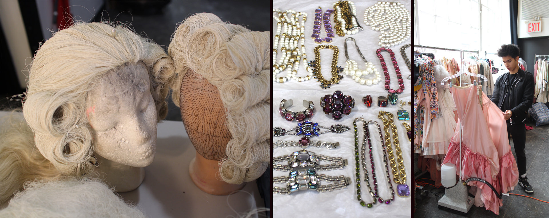
The imaginary idea ballooned into a real production. Makeup artists along with hair, wardrobe and prop stylists were brought on to help with the fashioning of the characters.
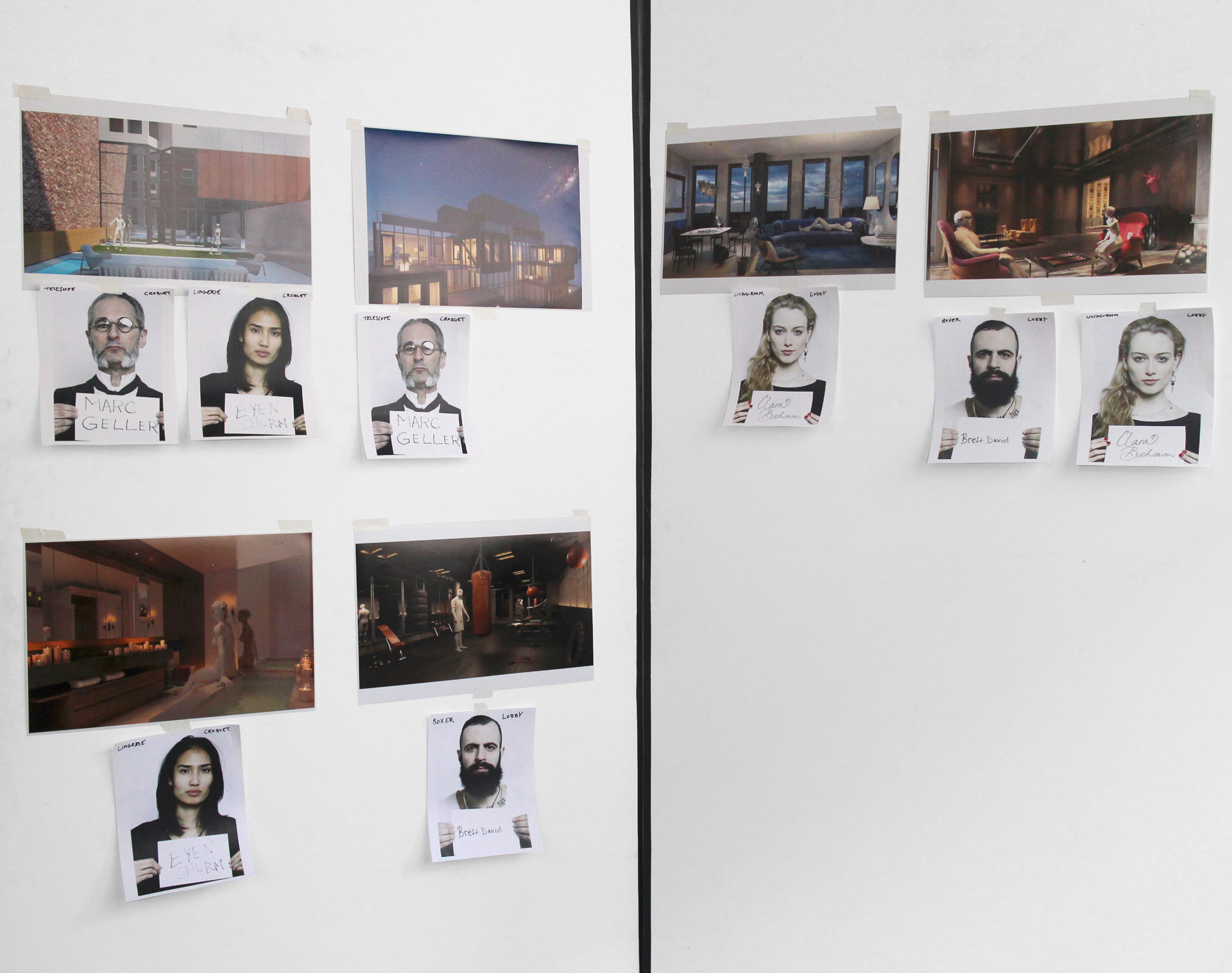
After narrowing in on a shot list, loose narratives were created with the unique spaces in mind. In a playful manner and in keeping with the past/present theme, character scenarios were staged around timeless activities set against contemporary backdrops. Models with signature features were cast to pair well with the individual environments and storylines.
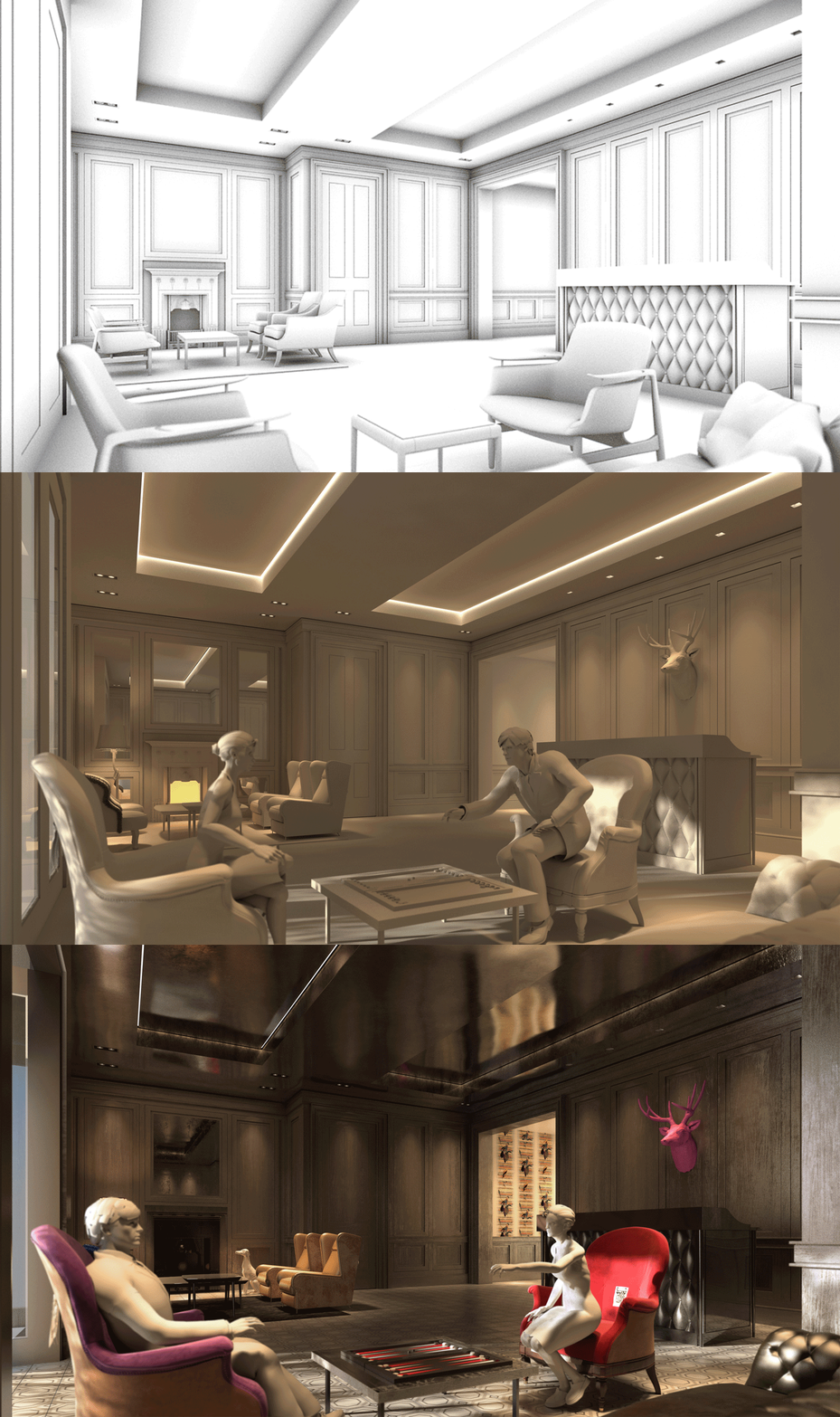
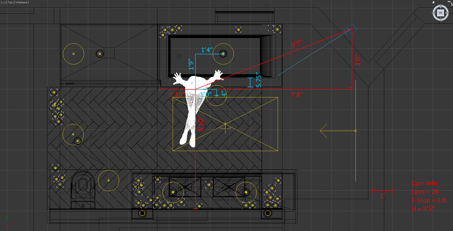
Prior to the photo shoot, each scene went through a series of camera, lighting and material studies. Narrative development and positioning was achieved by posing rigged 3D models in as stand-ins for the eventual talent.
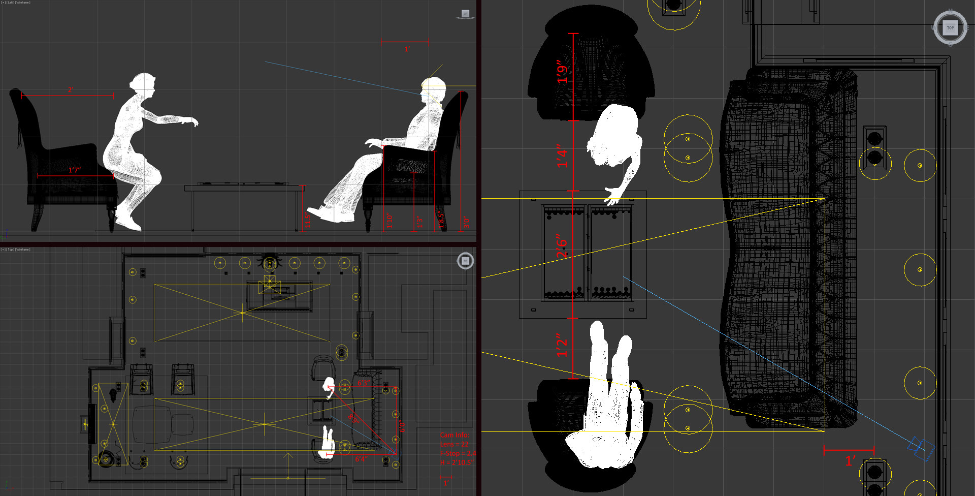
To properly stage the characters for integration, the virtual camera’s height & lens information, the furniture arrangement, the placement of the models and light locations, intensities and color temperatures were recorded. Dimensioned maps were brought to the photo shoot along with progress renderings to convey both technical and artistic setups to the different teams involved.
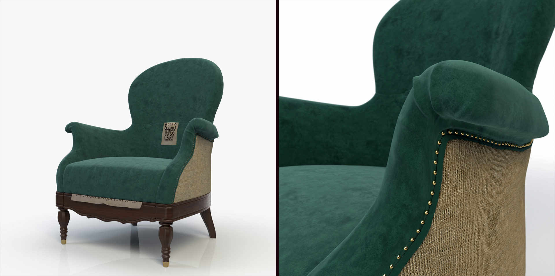
Specialized furniture and props were custom modeled and textured in 3D. Although there are several great online purchase sites, we find that one-offs and personalized pieces really help to differentiate one’s work. Baxter furniture received a lot of play since it similarly blends traditional and contemporary styles – classic forms in stylish colors with unconventional detailing. Interested in the craft of image-making and invested in a full in-frame approach, we place a lot of value on building high quality meshes and rich shader development. You can purchase the Ona Armchair by Baxter.
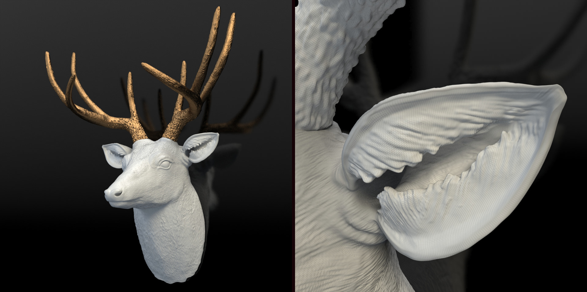
Organic modeling is typically done through sub-d methods with additional sculpting in Mudbox. You can purchase the Faux Taxidermy – Deer.
The images were rendered at 8,000 pixels and higher to output as large (6 to 9 foot wide) prints. Each “Detail Crop” shown in this making-of is a 1920px region of the final, full-res image. Rendering at this size required attention to detail even in the background areas and meant that everything had to be developed around a scalable, parametric workflow.
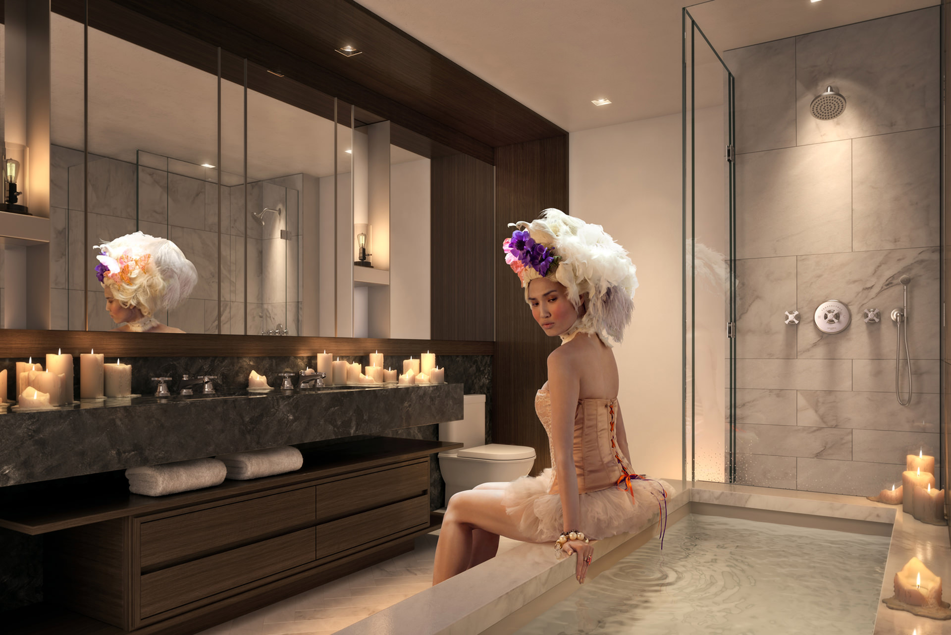
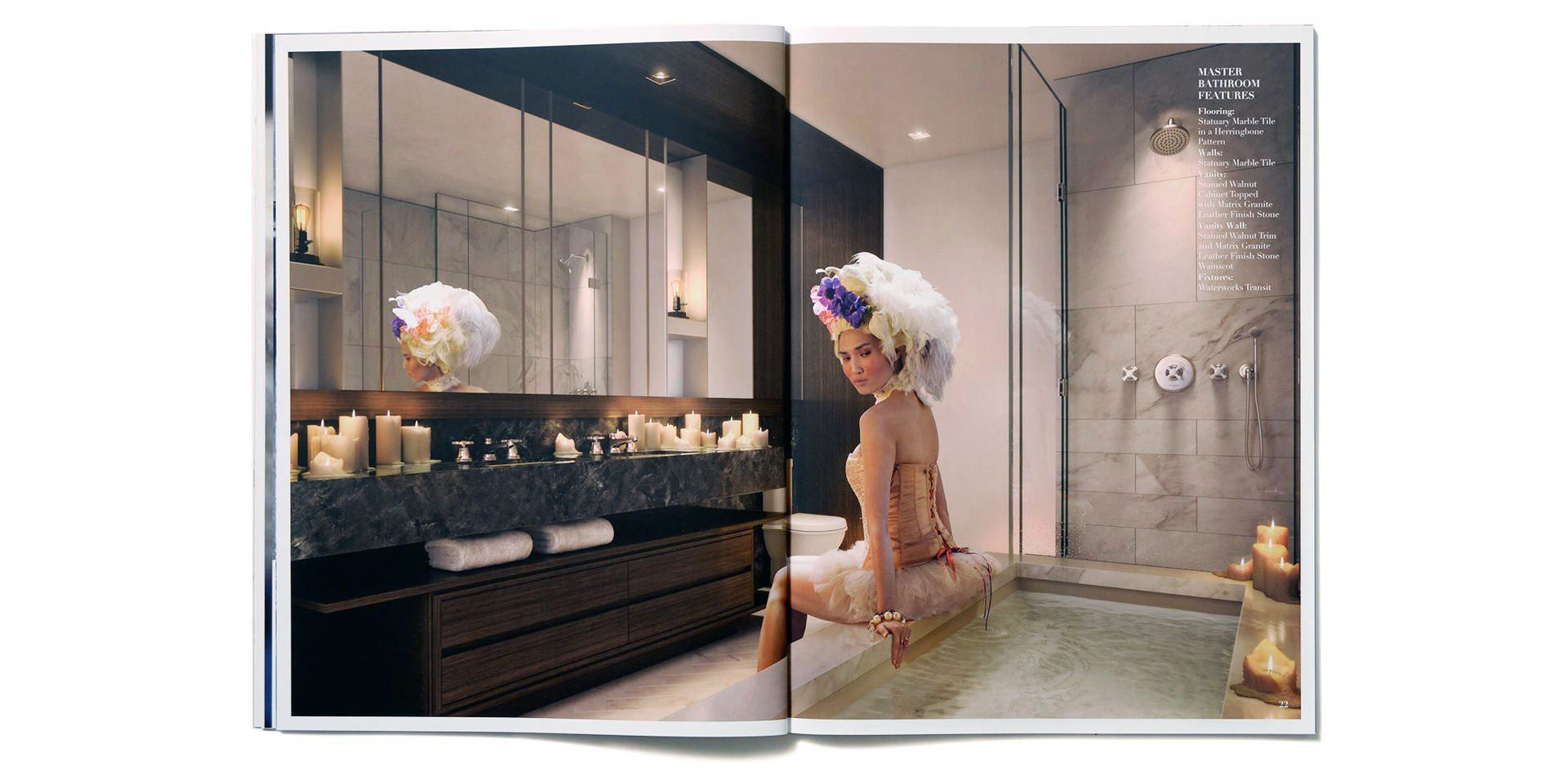
Each image provided it’s own unique challenges. For example the image above had to take into consideration the reflection of the character in the mirror, shower, and the water.
Each image came with its own unique challenges. When staging without a bathtub, we were able to make do with a few random wooden crates from around the set. Aside from orientation and lighting, previsualization is also a key component for understanding reflection needs. During the photo shoot, mirrored panels were angled into position to account for reflective surfaces within the digital model – in this case, the vanity mirror on the left and the shower glass on the right.
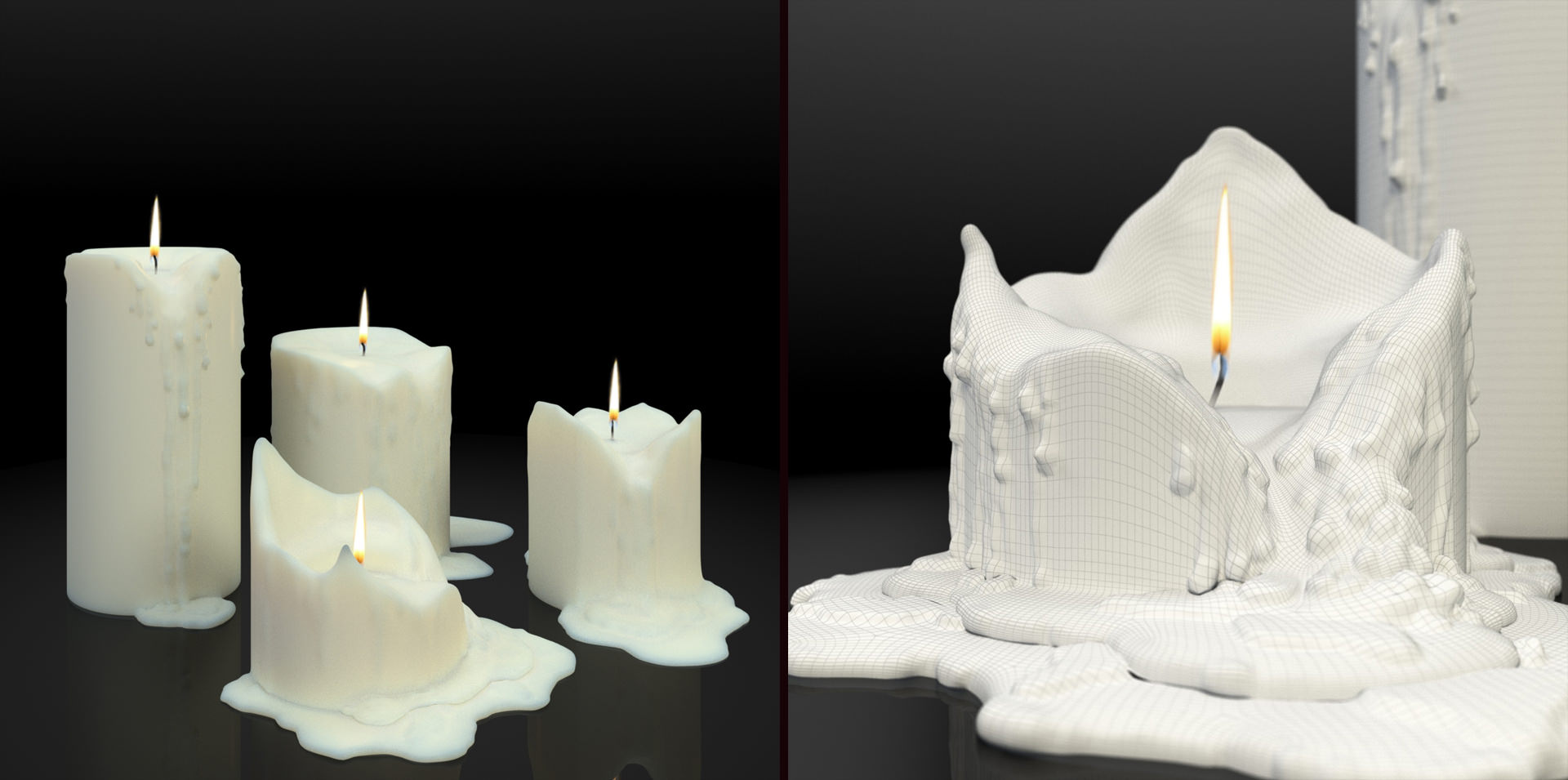
30+ melting, dripping candles helped to set the bath scene’s ambiance.
Mood is our first consideration since it affects every decision that follows. From a narrative perspective, we conceptually approach images as if they are frames from a film – frozen moments from within a larger story. The scene above suggests the aftermath of an intense encounter. A concerned posture, a discarded blanket, spilled wine, chocolate wrappers, a disheveled rug and a departing blimp clue the event; color, lighting and atmosphere convey the tone.
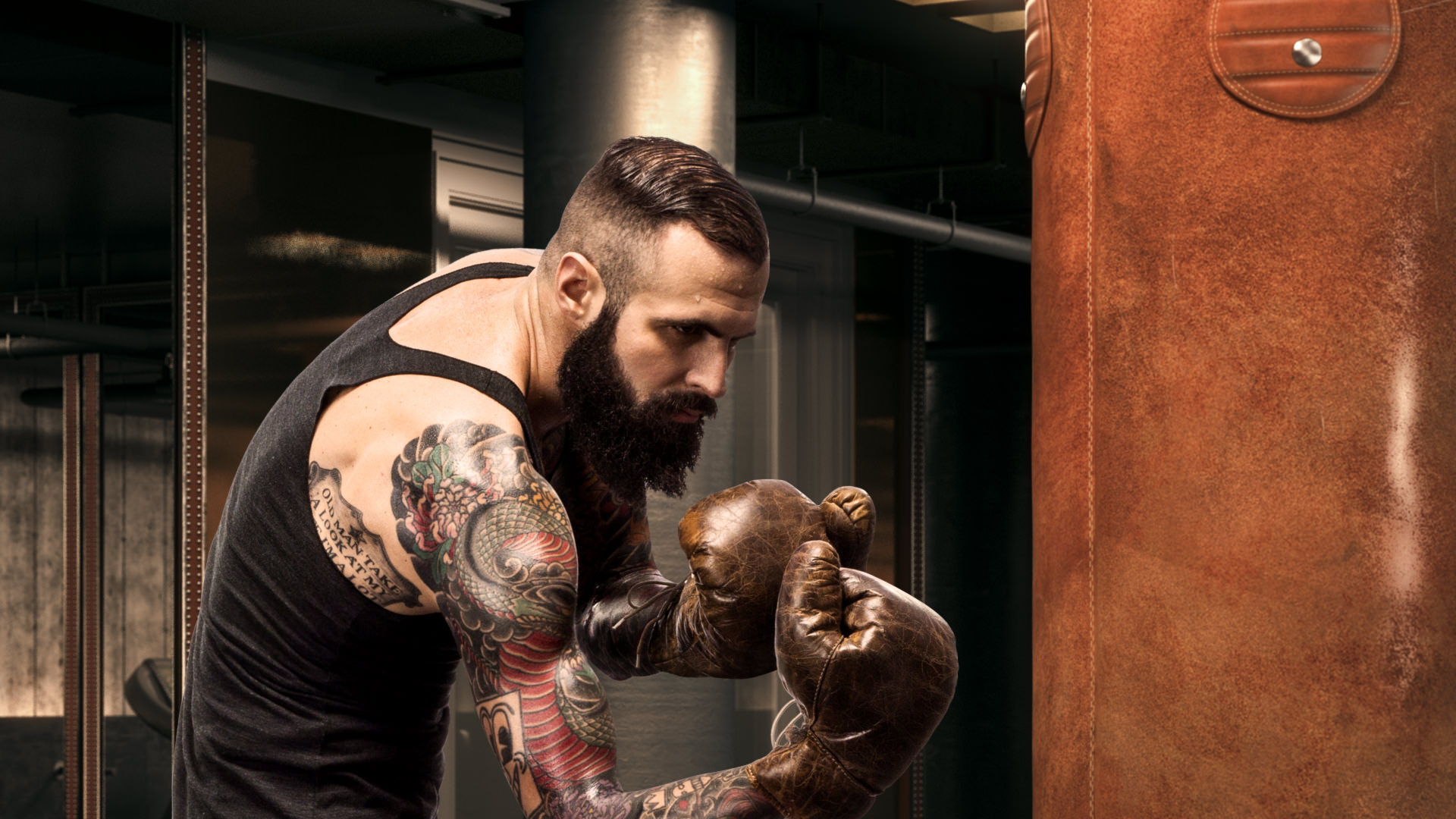
The luxury fitness room evolved into a tactile, gritty-chic boxing club and the boxer emerged as the hallmark character of the campaign. Early century sporting attire, vintage gloves and a classic fighting stance are offset by tattooed sleeves and a throwback beard. The reflection of his back in the mirror behind him and his left side in the far mirror at the end of the room were captured “in action” as seen in the shoot photo above (right).
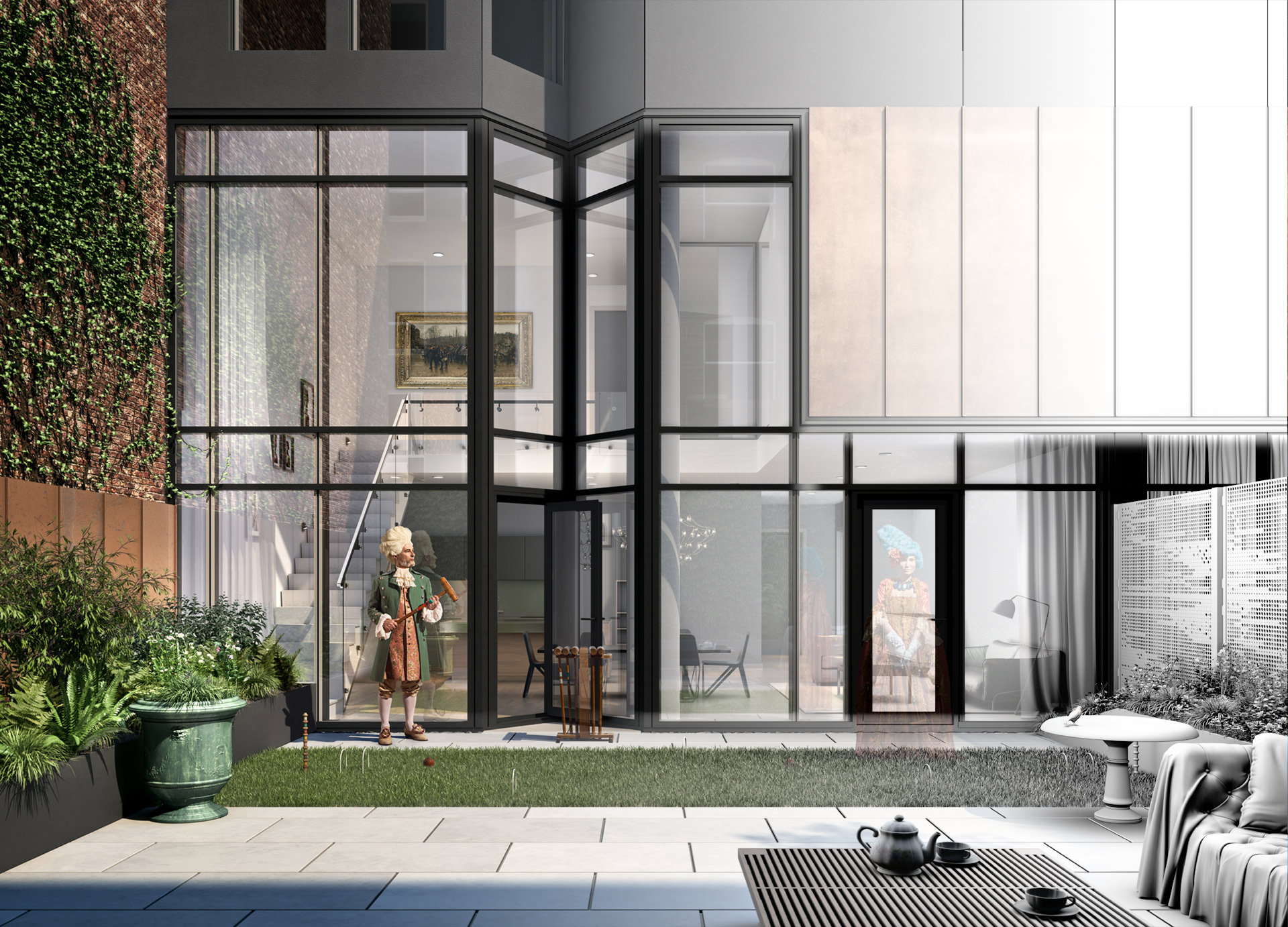
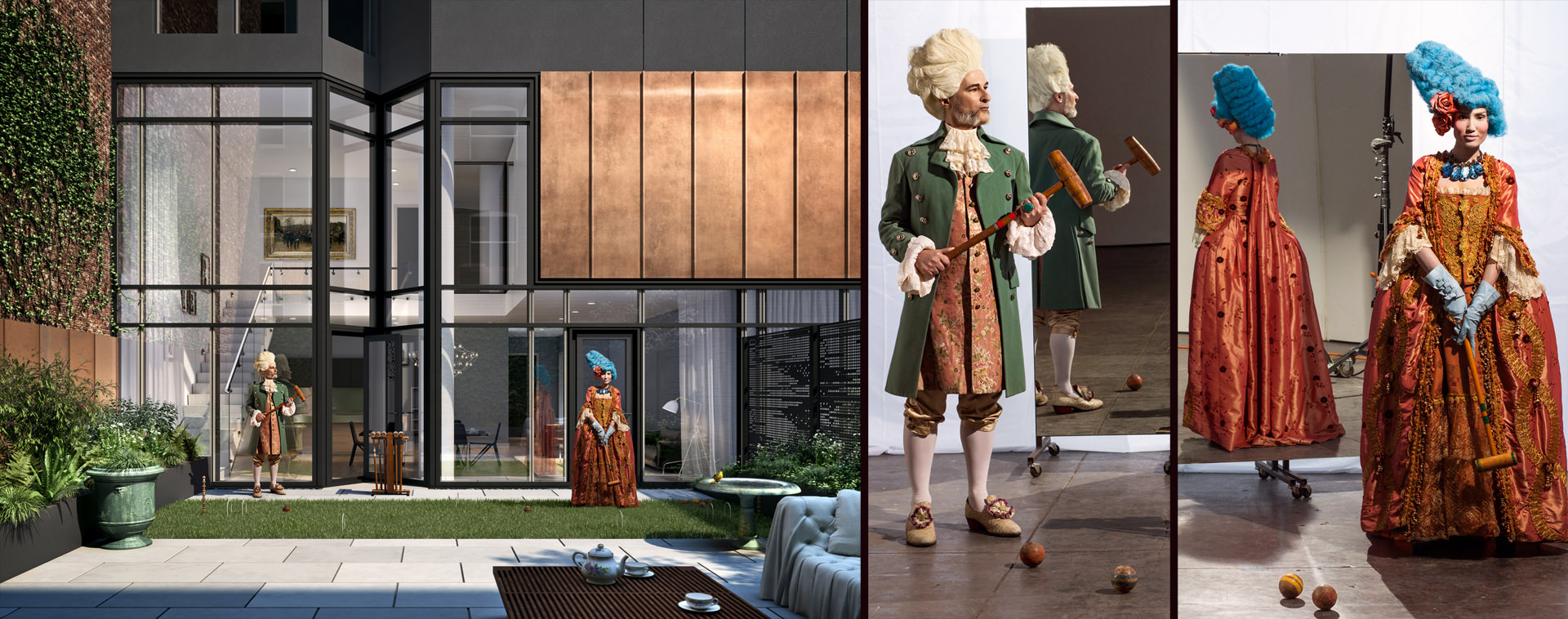
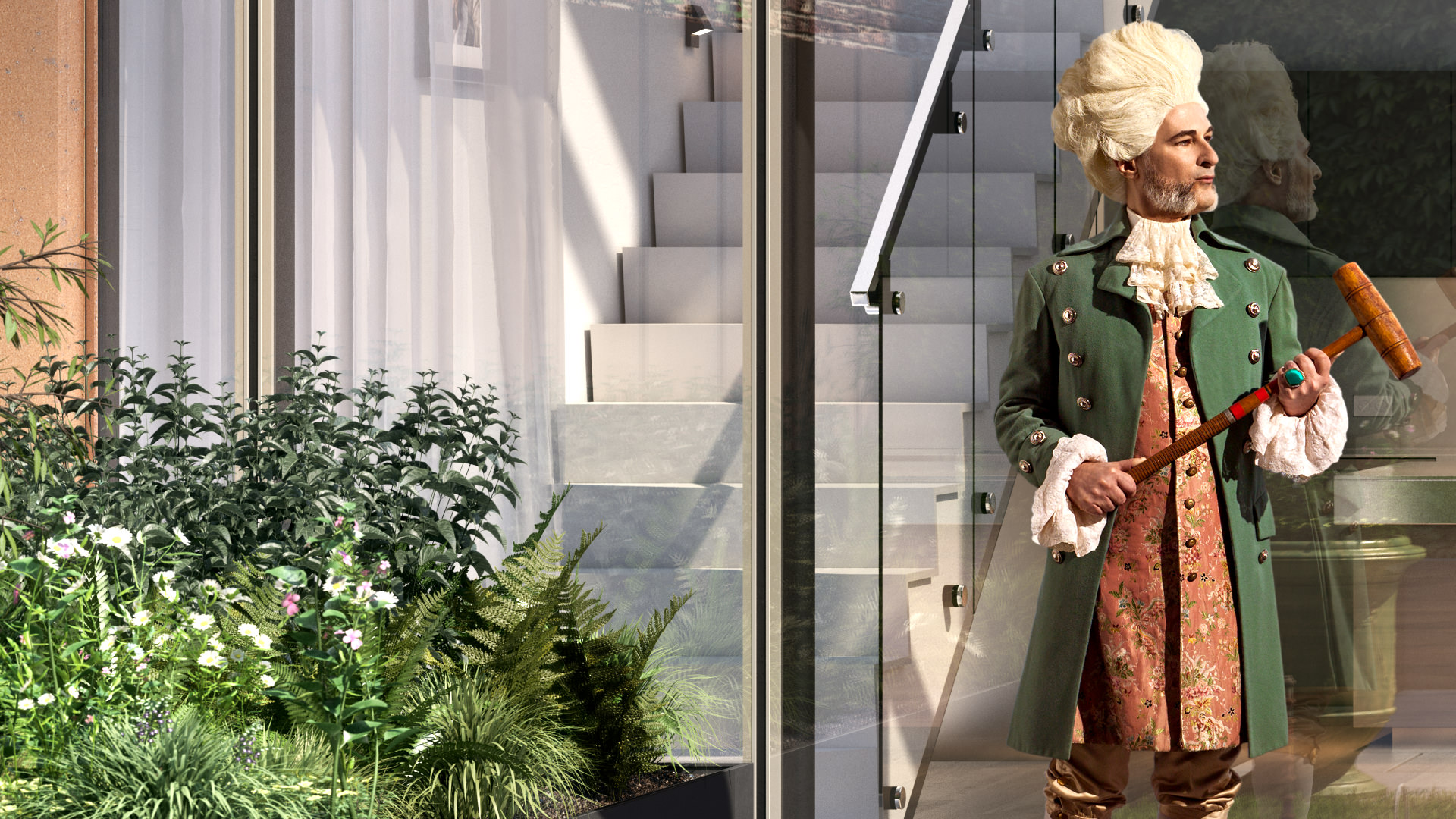
The couple who own the duplex unit with the private terrace enjoy playing croquet in the afternoon. The characters, their reflections, the mallets, the balls and the stand were photographed on set while the center pegs and the hoops were constructed in 3D and made to look vintage to match. A French urn, an English tea set, an aged copper bird bath, a tufted outdoor sofa and art in gilded frames are set in contrast to an otherwise modern building and interior.
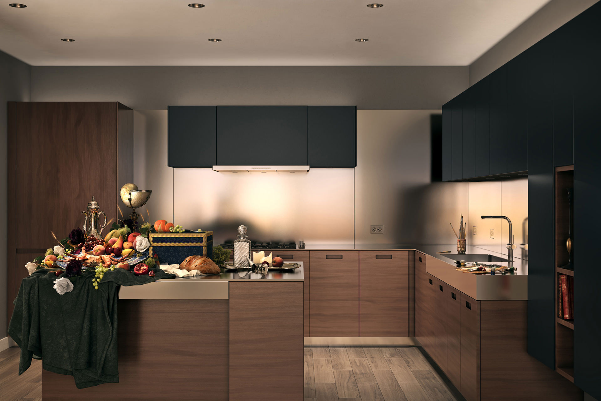
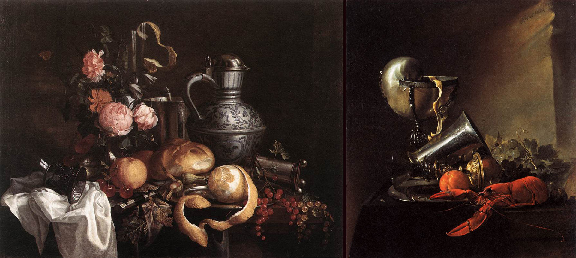
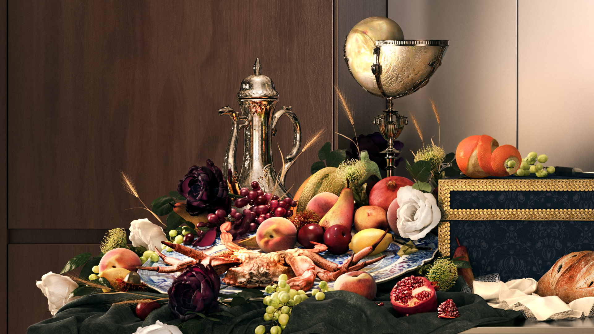
The kitchen is the only interior shot where a figure is not shown but rather implied. The go-to “bowl of fruit” so common in real estate renderings has been replaced by a Renaissance painting still life ensemble. In essence, the still life has become the character from the past. Additionally, paint tubes, brushes and a palette are at the sink to suggest that the viewer is the painter establishing the setup from behind the lens.
A few calling-cards from still life art of the 1600’s were incorporated into MARCH’s 3D arrangement as an homage. A cooked crustacean, a halved pomegranate, an unpeeled orange, a mollusk serving bowl, a porcelain platter, a dimpled glass chalice and embossed pewterware were selected as the subject matter of our cornucopia.
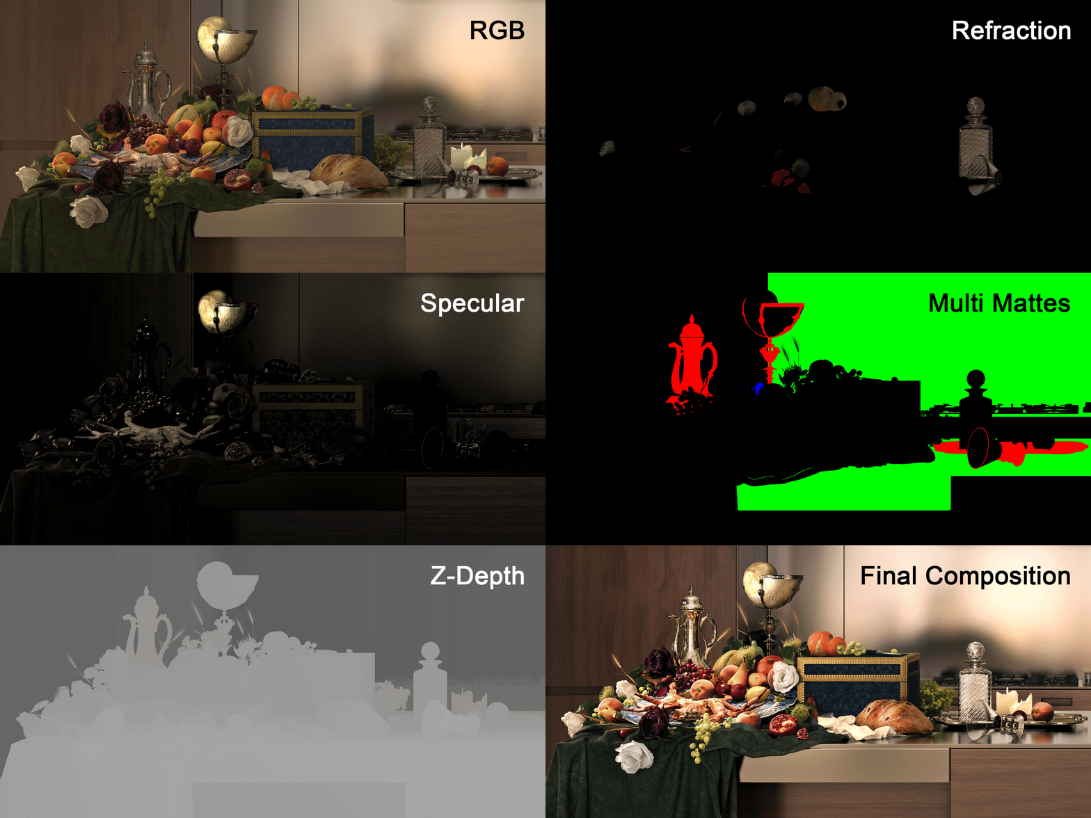
The entirety of the still life arrangement was created in 3D which allowed us complete freedom with object selection, composition and materiality. The image above shows a collection of some of the different render elements used during post-production.
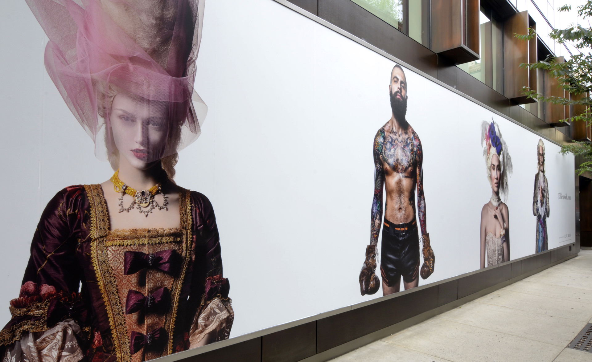
Portraits of the 15 Renwick characters began popping up on billboards around NYC. To the casual passerby, the striking and obscure stand-alone figures looked like fashion advertisements. In the high-end real estate market, however, the fictional characters had become so connected to the the visual identity of building that they ended up becoming marketing icons for the project.
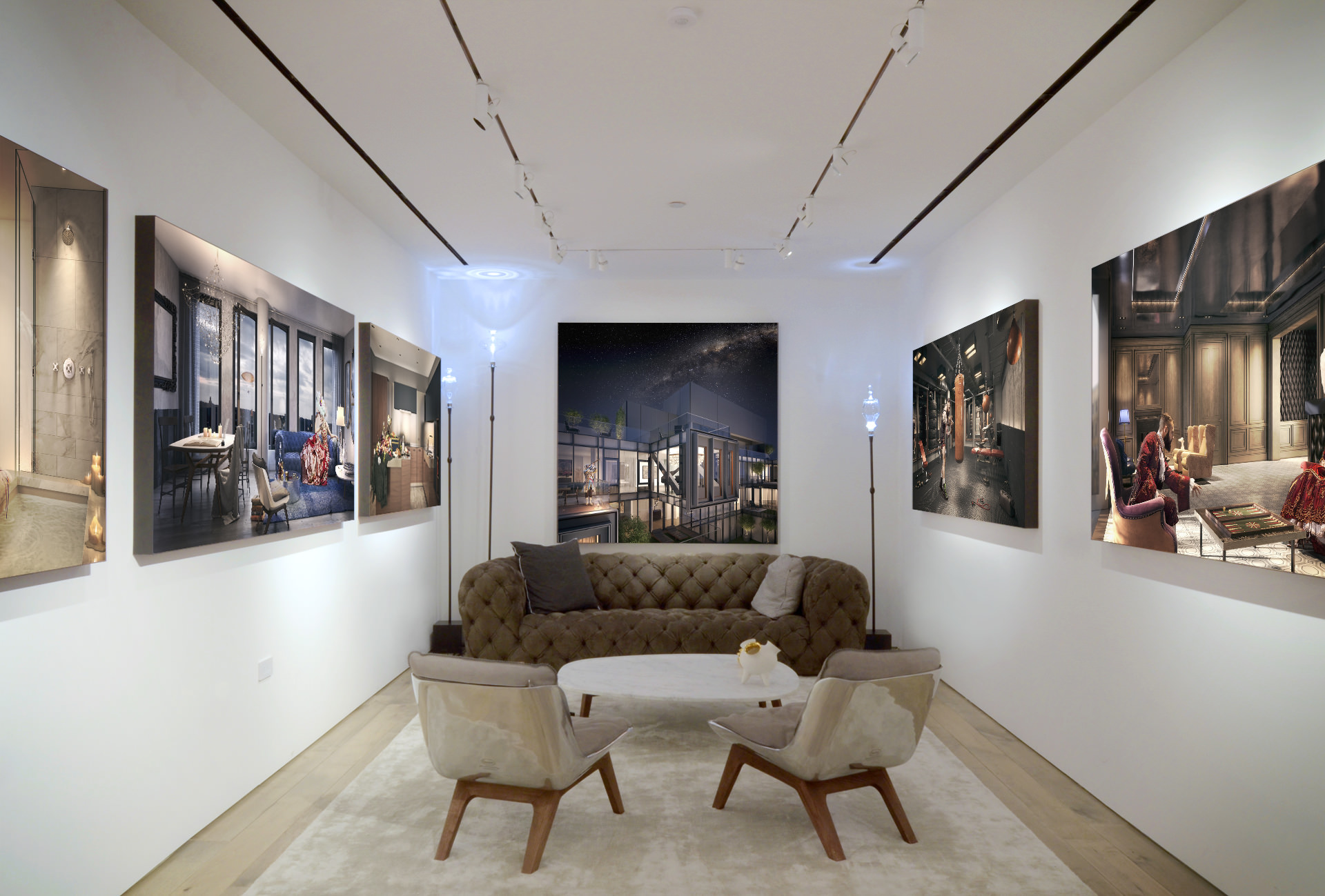
An art gallery was created as part of the design concept behind the sales office. MARCH imagery was printed on canvas and displayed as large “paintings” in an anti-digital, salon-like setting. Presenting the rendered materials in a classic manner and treating the artwork through a more traditional medium felt natural to the content and the campaign.
The Hero was printed 9 feet wide and is the first thing visitors encounter upon entering the lobby.
So, that`s it.
Here are all the parties involved in this project :
Images + Art Direction : MARCH
Developer : IGI-USA
Sales & Marketing : CORE
Architecture : ODA
Branding & Graphic Design : IF Studio

MARCH is a design and consulting firm focused on digital environments. We create art around the unbuilt and approach still and moving image making from a conceptual perspective.
MARCH collaborates with leading brands, agencies, architects, artists, stylists, developers and marketing firms. We couple digital prototyping with advanced imaging to create virtual architecture for an array of applications.
Be sure to visit MARCH’s Behance Portfilio







Not that I like the concept (it’s bit too kitsch for me), but great execution and quite cool in-depth making of.
One of the more memorable articles I’ve seen recently on web
Thanks for sharing , that’s truly amazing work here !!
I actually find the entire “Kitsch” approach to be more captivating a concept than simply great well shot stock of average humans looking pretty in their “respective” shots. Agree with Juraj Talcik on this being a VERY good article from 2015. Overall this is just inspiring! great work.