Making of ‘Trinity Bureau’
Beauty and The Bit have been present pretty steady in recent forum spotlights, featuring great looking visuals with a unique look and lots of emotive quality to them. Creating urban environments and visualizing office building and towers specifically is something I’m dealing with right now and so talking with them about the work they did on the ‘Trinity Bureau’ project was very interesting and even more so this behind the scenes article they made for us all. Enjoy!
Author : Beauty and The Bit
Beauty and The Bit is a young visualization studio based in Madrid (Spain) and founded by Victor Bonafonte, architect and CG Artist.
Introduction
First of all, we want to thank Ronen for supporting Beauty and The Bit and for letting us share some insights about this image with you.
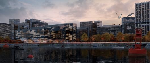
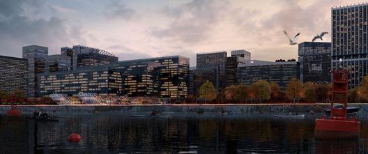
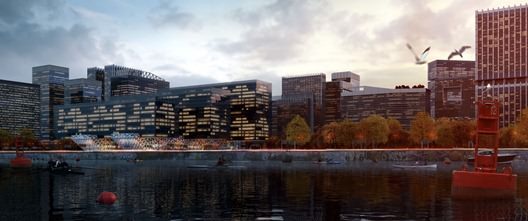
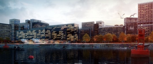
Trinity Bureau was born as a visualization for an architecture competition. The subject was an office building with three cores interconnected between them. The proposal would be located in a high-rise area by the sea. Our client demanded a vision of the complex in which we could see the relationship between the offices and the environment. We decided to create an image which was a mix between the fast city life and the calm provided by the sea shore by sunset.
Modeling
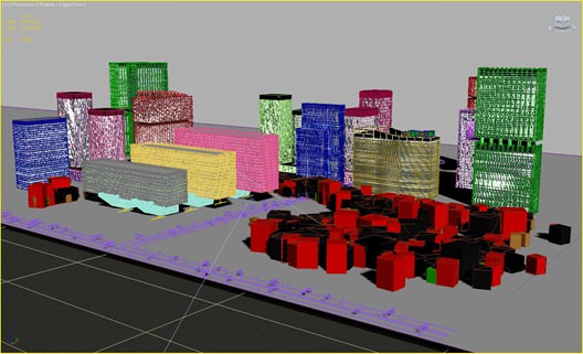
For some strange internal reasons that have nothing to do with masochism we decided to model all the buildings!
After that decision was made we provided ourselves with insane amounts of coffee and there we went!
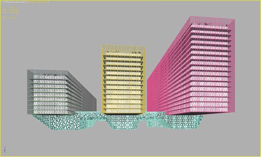
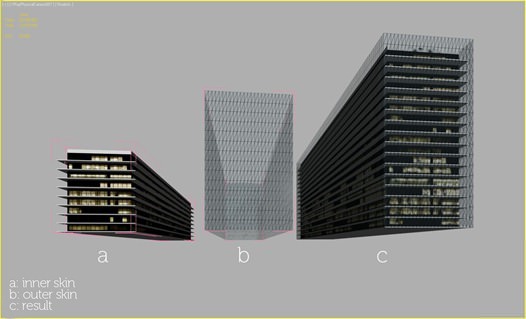
The modeling phase was repetitive but really easy. Nothing here but starting up from basic shapes as boxes and lots of Edit-Poly modifiers for the environment buildings. Straight and simple. You can see the main building below
The main three cores of the building were modeled in 2 steps. there was an inner skin in which we placed the windows´ textures and an external skin with a glass material for providing the reflections of the surroundings.
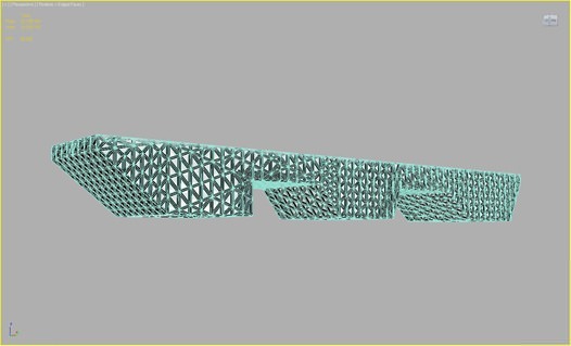
The base of the building was made with the same procedure but we added a Subdivide modifier for giving it that spider-web look.
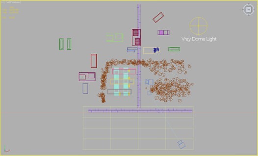
The trees in the scene are custom-built with Onyx. We made four or five variations and scattered all around as V-Ray Proxies for memory optimization. We wanted to give them an autumn look that fitted best with the general mood of the image.
Lighting
We made some tests with lighting because for us is one of the most important aspects of an image.
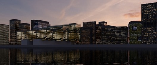
We pursued a strong and magical dusky mood. The lighting system is just an HDRI placed on a V-Ray Dome light just as the mighty Ronen Bekerman and Peter Guthrie explained in their fantastic HDRI tutorials.
The dome light had 64 subdivisions for a smoother result. We decided not to link it with a V-Ray sun because we didn’t want to emphasize shadows too much due to the nature of the mood we wanted to recreate.
We also had some VRay planes in the base of the building for making the web-like shape stand out.
We had pretty standard camera settings with just a tweak in the custom balance.
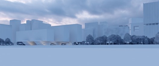
Here´s the basic lighting
Another earlier version that was OK but too obscure for our approach
Texturing
Here are the most relevant textures used in the image
Windows
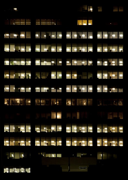
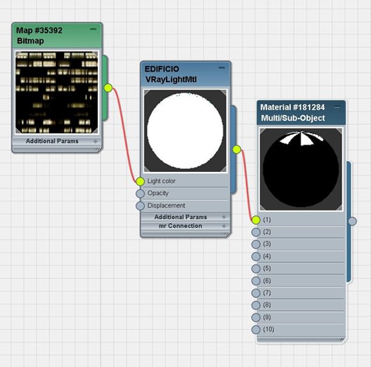
For the windows we used VRay light materials with high-rise buildings images from the super-awesome texture site CGTextures. We tweaked the images in Photoshop and placed them in the light color node of the VRay light material.
We set the multiplier of the light to 25. This was for the inner skin of the building. Below is the texture image
And the material node
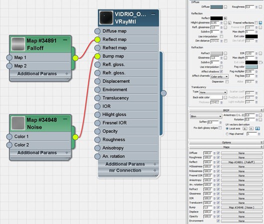
The outer skin was a common glass preset with a little noise in the bump slot just to give that feel of imperfection in the reflections.
Concrete
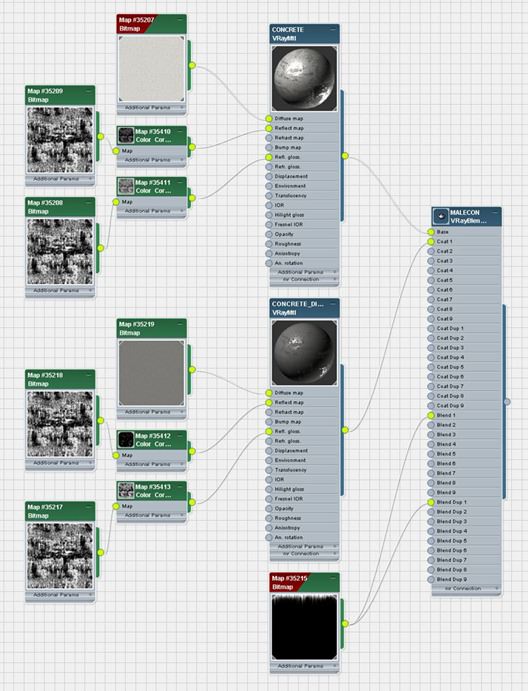
We added some dirty leaks to the concrete as it´s an old material exposed to the sea and pollution of the entourage. We achieved this with a VRay Blend material in which we had a clean concrete material and a dirty concrete (which was a lowered RGB Level and less reflective) version of the first one.
The blend between these two materials was made with a custom leak Photoshop mask.
Water
Water was really important as we wanted to give it a look similar to the water you can find in a dock – deep, thick and a little dirty.
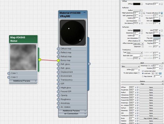
We used a really simple preset with a little blue fog color and a noise map in the bump slot to simulate the waves.
The water is made out of a simple plane with NO modifiers such as Ripple, Wave and those kind of things. We believe this workflow is easier and you can achieve a realistic effect with less rendering times. Less is more some might say
Post (?) Production
Yes, we decided to name this section this way because in Beauty and The Bit we spend massive hours in the phase which is normally called post-production.
For us (as it can be easily seen in our work) this is one of the most important parts of the process and where we set these images alive providing them with a soul of its own. This is the part where the image is really created by the most reliable and powerful rendering engine
Photoshop and your common sense.
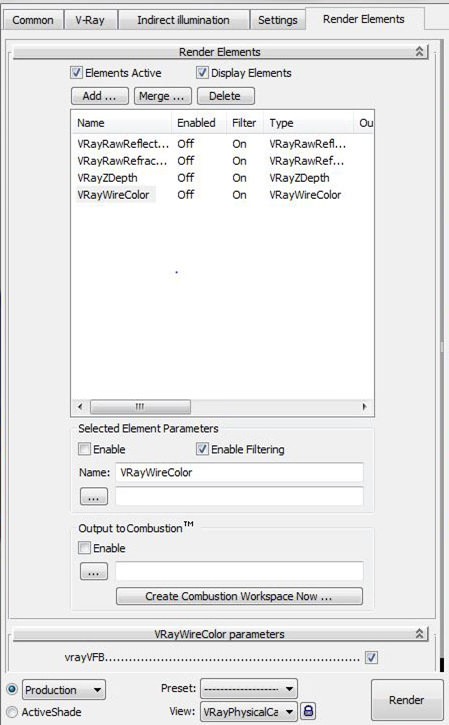
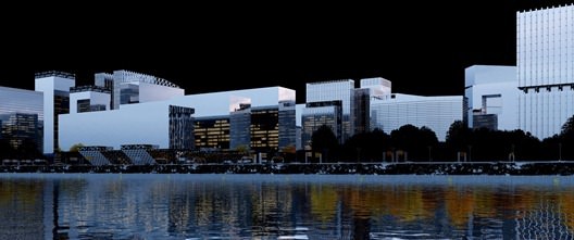
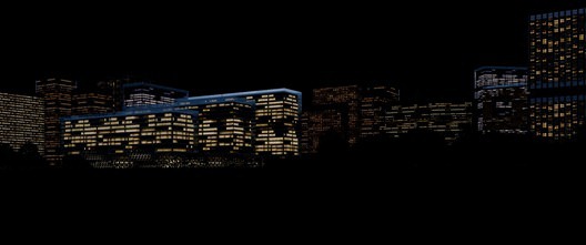
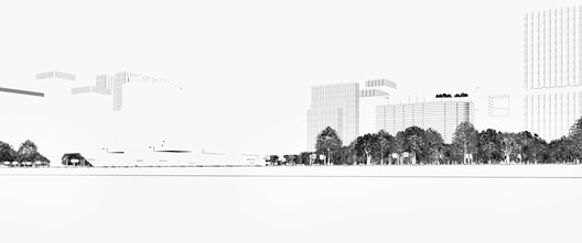
We ALWAYS choose several Render elements for the Production stage as shown below
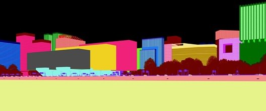
The MOST important one is the Wire Color which allows you to easily pick what you want in the image in a flawless & quick way.
Apart from that we always include a VRay Raw Reflection & Refraction for enhancing reflective and refractive materials.
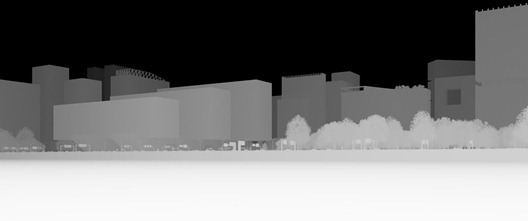
We also add some Extra Tex loaded with a dirt texture for getting more dirty corners and some ZDepth Channel for lens-blurring (offers a good result vs. time expended) and creating fog effects.
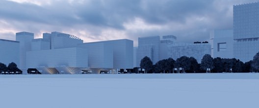
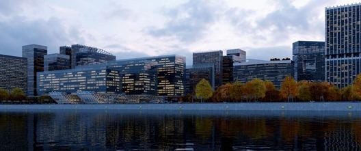
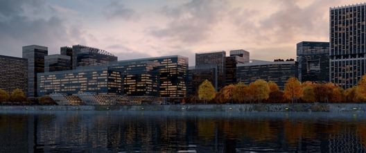
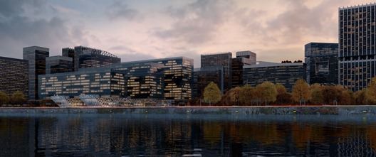
These are the base elements for the Production stage. It would be extremely long to explain all the actions taken in Photoshop, but nearly all of them are based in masking, color correcting, curves, etc. so well show you several breakdowns of the production process:
0. Wire Render.
1. Beauty Pass (original Render).
2. Color corrections & Graffiti paintings added in overlay or screen mode.
3. Highlighting Main Building, creating light streaks, road signs
4. Adding a little life to it, creating a space between the buildings with the ZDepth channel, emphasizing the reflections with the V-Ray Raw Reflection channel and getting rid of those concrete wall creepy lights.
5. Make the people blend with the water and float (but not too much ) with some color correction, reflections and curves.
6. We´re almost done ladies and gentlemen
so we make some curves and color correction again for a crisper image and we get the final result.
Well, we sincerely thank you for your time. For us it´s been very exciting and weve learned a lot, which is the most important thing. We hope some of these workflows could help you out with your images and we feel happy to share some advice with all of you.
Good Karma and stay cool!
Beauty and The Bit Team










Comments are closed.