Making of CityLIFE’s ‘Metabolic City’ by Jean-Marc Emy
The first of the CityLIFE Challenge making-of articles is here! Done by the Grand Prize Winner, Jean-Marc Emy will describe the process of creating his Metabolic City scene which is rooted deeply within the concepts of the Japanese Metabolic architecture stream and relies heavily on 2d post production techniques. I hope youll enjoy this article, learn from it and share your thoughts by commenting at the bottom of this articles page.
Author: Jean-Marc Emy
Jean-Marc EMY is a graphic artist with experience in book and magazine publishing, broadcasting and video games and architectural illustration. He also teaches at the Bordeaux School of Architecture in the field of Art and Techniques of Representation.
Introduction
I would like to share some insight about my illustration workflow for the CityLIFE challenge. As my work is more NPR oriented this presentation will focus on composition and post process.
Architectural inspiration
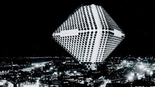
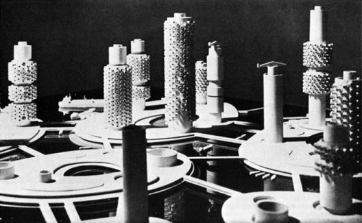
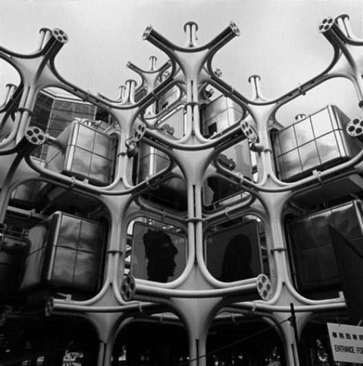
When the competition began I had just bought a book by Rem Koolhaas about an architectural movement which I’m fond of : the Japan Metabolism. From 50’s to the 70’s, with a great trust in technology, Metabolist architects developed innovative, prospective and utopian solutions for urban expansion and housing needs. One of their favorite was to develop systematic (mega) structures which can receive, for a temporary use, factory-made modular elements. A big part of their projects were not built but those which were built became symbolic pieces of architecture, with the Osaka World Expo 70 as a climax. So the idea was to use some pieces taken from those projects, built or inbuilt, in a collage-like composition, a tribute to the Metabolists works.
I have selected three projects :
Ekuan Kenji‘s Dwelling City
Kikutake Kiyonori‘s Submarine City
Kurokawa Kisho‘s Takara pavilion.
The reason why I have selected these projects are in relation to their shape (graphic and simple – cube, cylinder and tetrahedron), as well as their scalability from a single optimized capsule, to a huge and monumental dwelling building.
Graphical inspirations
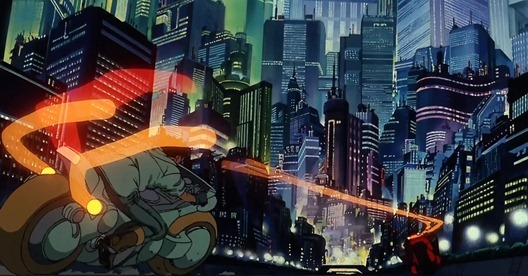
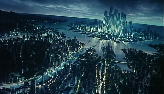
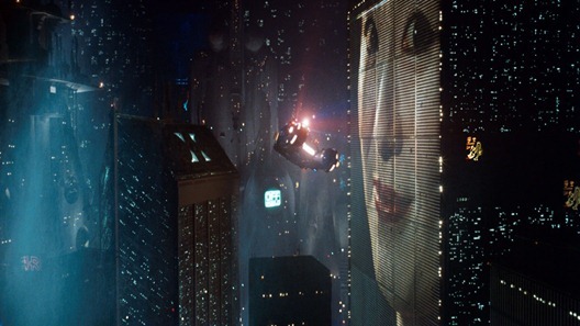
My main influences and graphical inspirations came from comics. Even though it’s not directly linked to archviz, there is a strong culture of city representation in these kind of works. The same for Japanese anime perhaps as a legacy of 19th century Ukiyoe (see more on Wikipedia Ukiyo-e). From Akira to Ghost in the shell or Tekkon Kinkurito, the city is both the subject and the environment. And of course those two urban imaginarys are merged in Syd Meads designs for Blade Runner.
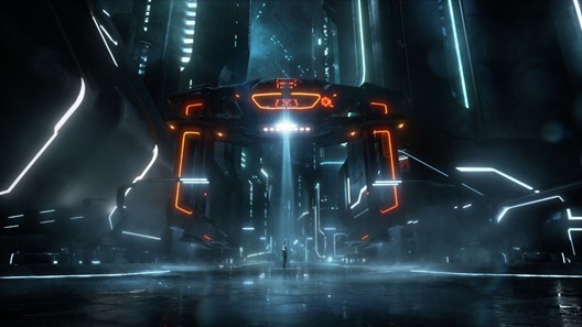
I’m also fascinated with work by concept artists. To use two French references, I would like to quote people like Sparth or Vyle (especially for his work on Tron Legacy) from Steamboat Studio. Beyond their excellent drawing skills, I think that their ability to captivate us and to bring us into their universe in a single image, is strongly related to their mastery talent in composition. Arguably all these influences portray a feeling of space dramatization.
For these reasons I’m more interested by NPR archviz works as those of Luxigon, D&W or even Dennis Allain, in a more traditional style.
The Sketch
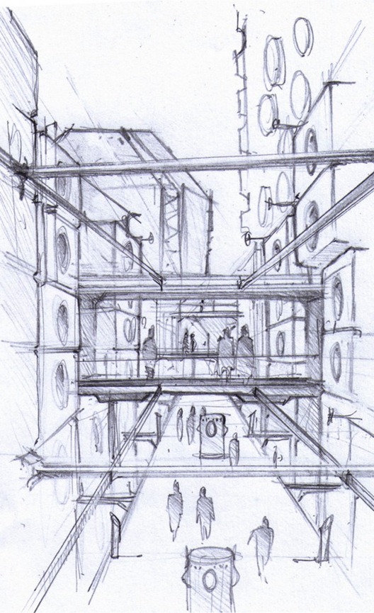
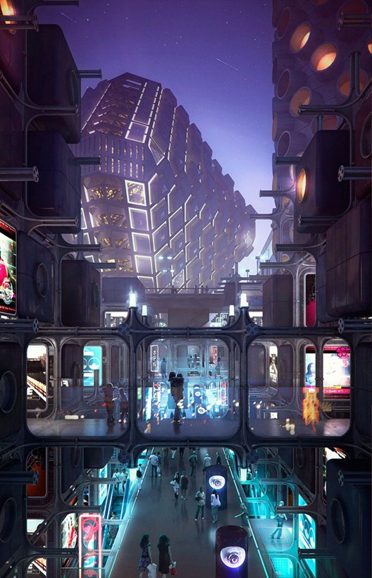
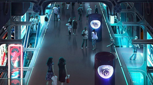
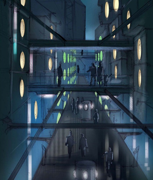
I believe its important to begin with analyzing the composition. The first image is a standard of the city : heights and traffic (even if it is pedestrian one!). It is layout in a classical composition : a vertical format to put emphasis on this idea of height, built as a central perspective, organized into clearly definite foreground, middle ground and background.
These three plans coincide with the scales of the projects. The scale’s variation between the foreground capsule, human sized space and the background’s monumental shape, is quite specific to cityscape. Arguably, it’s both the purpose and the means of this particular image. To make the object’s scale easily readable and understandable does really impact on perspective’s dynamic.
There are several elements that allow the viewer to visually delve into the image, defining what can be called a visual path. Colors, lines, direction, all these elements are intertwined and are of significant importance. Because the initial view goes immediately to high contrast areas, it is necessary to think in term of the shapes and values. The way building’s profile is read against the sky, or the way light can dematerialize or cut a volume are good examples.
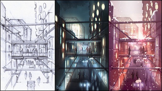
It assists greatly to express it in the first sketch and it will be refined later. It is a good idea to start with small thumbnail sketch made of shapes, afterwards come the values to add depth in complement to linear perspective. For more accurate reflection about composition I suggest you take a look at Fheng Zhu‘s works and tutorials.
To summarize this idea of a visual path for the first image, the foreground on both sides filled with dark values guide the eyes of the viewer through the vertical axis of the image. The pedestrian flow on the low platform level enlightened from underside, the rhythm of those “lighting information terminal” lead the eye towards the center of the image where people standing on the footbridge against the light draw the attention. Their glance subsequently lead us towards the Dwelling City building (the tetrahedron).
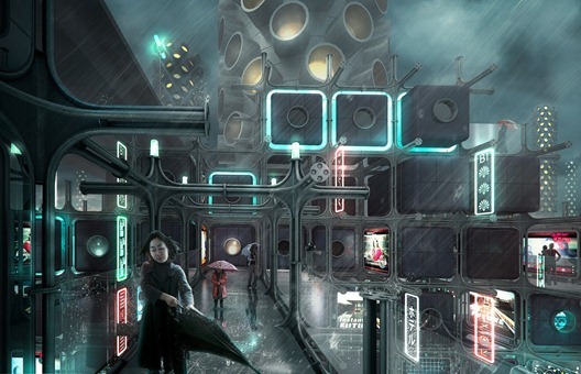
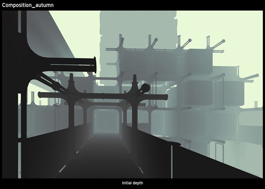
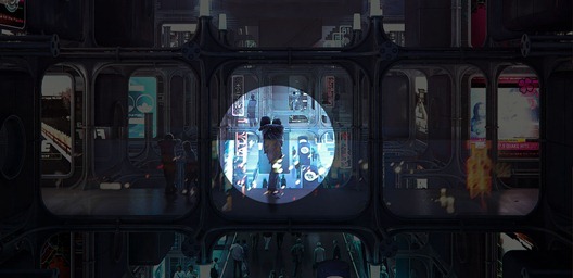
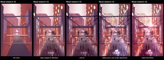
For the second view, the approach is different because the choice of the viewpoint is the result of the model exploration. And the model itself is the result of the first image composition. I decided to have a frontal viewpoint and not axial, to switch to a horizontal layout rather than vertical and having a viewpoint from the footbridge and not toward it… I believe it is an attractive link between the two images.
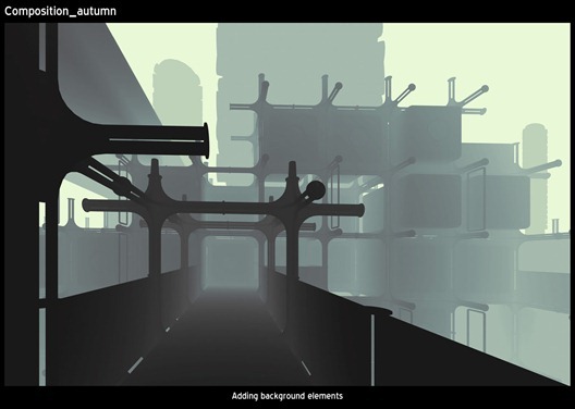
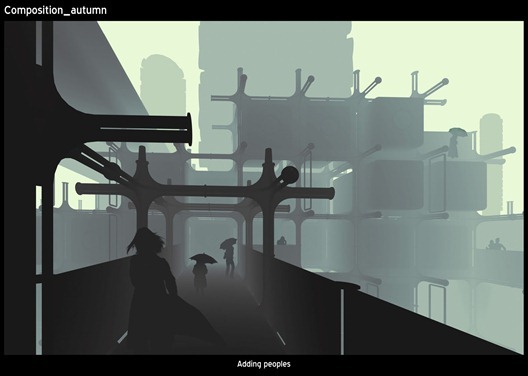
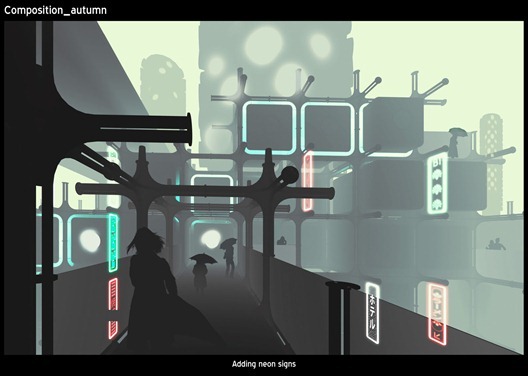
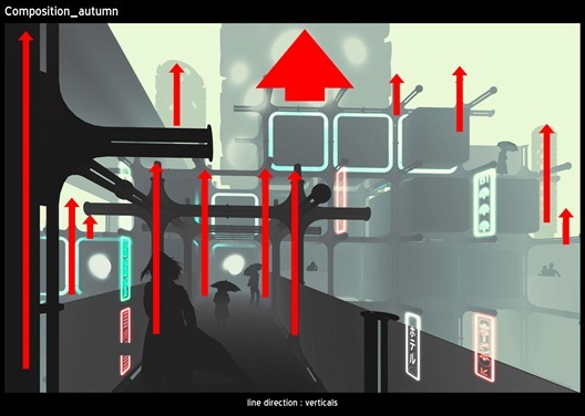
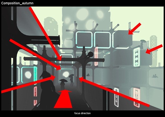
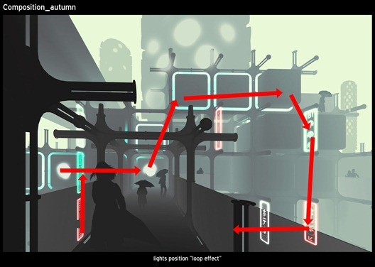
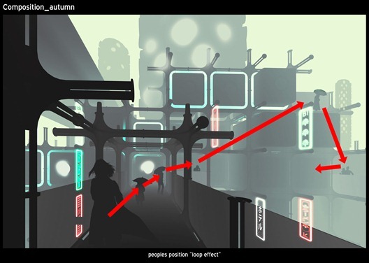
There wasn’t a strong depth as in the first view, neither a real point on which to focus. So I added a few towers to create a background and a foreground moving people to give more dynamic and produce a tension with the cylinder tower. Lighting, neon signs, and people are positioning in a way to create a kind of loop in order to keep the attention.
Here is the composition breakdown / highlights as I referred to them above
People
As the title of the challenge was CityLIFE, I desired to put on city-dwellers. In archviz images, people are placed to figure the scale and their activities should fit to the purpose of the image, even if it is just walking, enjoying the place, or showing us where is accessible and where is out-of-bounds. And of course, the way they dress must be consistent with the mood of the scene.
It is necessary however, to take notice that they also work as a part of the composition their gestures, dynamic or static, even the direction they look at, has to do with the main composition.
As an example in the first image it was important to have the mother and children standing on the footbridge, enjoying the sight, looking toward the same direction as the viewer.
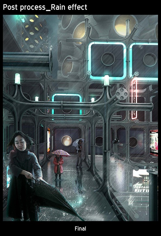
And in the second view the wife is coming in our direction, as if you were crossing her, help to create a dynamic effect that allow the viewer to plunge into the image. At the moment of positioning people, I aim to avoid hiding strategic parts of the image or creating tangency and alignment effects that could consequently confuse the perspective.
Mood Lighting
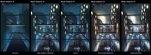
At this stage I have line art and flat values and it is a question of finding a color scheme related to the moods I would like to explore. In these particular images I endeavored to render the atmosphere of Japanese cities, where floating light signs give to the air a kind of thickness, especially in summer when the sun sets early. Because there isn’t any vegetation in the image, the feeling of season had to be suggested by the sky and enhanced by the reflection on the buildings.
After experienced different moods for the sketches, I finally chose a summer evening at sunset with warm tones, orange and blue complementary colors for the first image, and for the second a rainy autumn day with cold tones, green and cyan low saturated.
Once you have chosen a color palette you can easily play with camaïeu or with complementary color to blend or to contrast elements. Furthermore, the colors contribute to the depth of the image: distant objects take atmospheric tones and create less contrasts. At the opposite the strongest values are found in the foreground. This connection between colors, lights and weather does really spark emotions. For this kind of exploration I think that MIR pieces are really impressive and Japanese anime are also extremely interesting for their unexpected use of color.
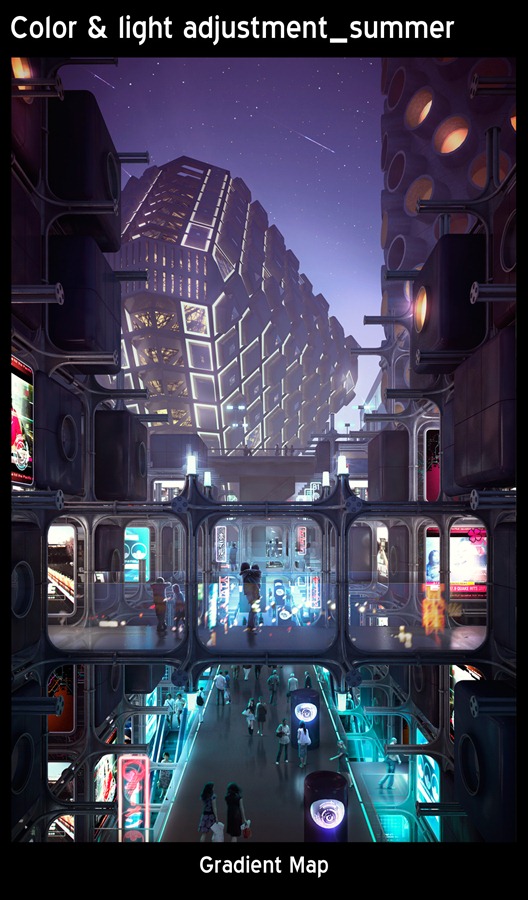
There are many ways to correct and control tones and colors using Photoshop. In order to achieved this, I use many gradient map adjustment layers, with different blending mode. I try to create gradients libraries from images or photos of which I like moods so I can quickly get nice color scheme applied before getting in more refined steps. Arguably one can deduce that the results depend on image contrast and of course on the gradient itself. To blend specific elements in the image by using color, I apply a simple color overlay on the layer. I pick the color corresponding to the depth and then play with opacity. It works very well on cut-out people or background elements.
Sketch files layer organization
The black and white art line is put on the stack in multiply blend mode, above the flat colors and values layers and below the colors and lights correction one, which can therefore affect the line.
The 3D Model
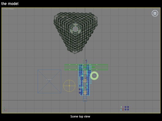
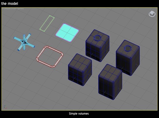
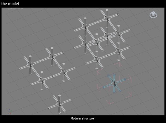
The model was built on a 320×320 cm grid structure, defined by the capsule and its framework‘s size. I started by creating two rows of chamfer box array so I could easily match the viewpoint of the sketch. Once this was completed, I proceeded to combine both sides of the street with the framework inspired from the Takara Pavilion.
As the result was rather heavy and repetitive, I’ve deleted some capsules to create holes in the pattern and to obtain a more interesting skyline. Basic capsules volumes were then randomly replaced by a more detailed and assorted set, thanks to the Object Replacer script by Neil Blevins.
The distribution of the screen-like panels, also helps to add some variations to this repetitive pattern.
For the footbridge I finally decided to use the same framework than for the capsule. The unfinished extrusion became lights or vertical neon supports. They are also used as a connection to the pedestrian platform.
I am also greatly inspired by Metabolist works to design the information terminal volumes of the low platform level and the streetlights of the highway.
Arguably it is evident that the Submarine City Tower and the Dwelling city should have been more detailed, especially the Dwelling building which looks like a rough draft.
Finally nothing particular for modification, all elements are quite simple volumes that belong to the same architectural vocabulary.
I don’t use plugin to position people in my scene, but rather cylinder of human size. I place them as soon as I’m looking for interesting viewpoint because as I explained previously, they work as a part of the entire composition.
Light Setup
I am used to rendering my scene with VRay. I usually start with a dome light using an HDRI (from Peter Guthrie of course!) and a VRaySun. However, for these almost dusky scenes I didn’t need sharp shadows but a soft key light as the stronger source of light has to come from neon and screen panels.
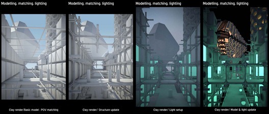
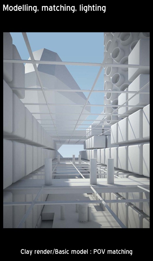
I therefore decided to maintain only the dome light. As I had the cylinder shape tower on the right, I positioned the light source in the top left hand corner in order to illuminate it. The first test renders are made with a unique light grey material, using the clayrender option of Solidrocks, and thereafter followed the screen like panels material to check light result.
Materials
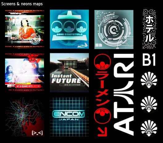
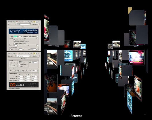
For the screen panels there is a VRayLightMtl. I have created several maps for this, and have also used images from the Osaka Expo 70. Those maps are randomly assigned to the screen panel thanks to the MultiTextureMap.
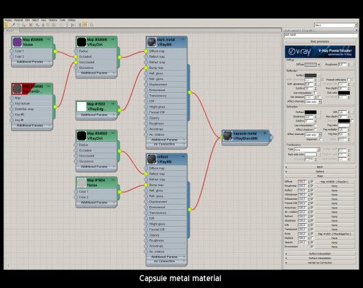
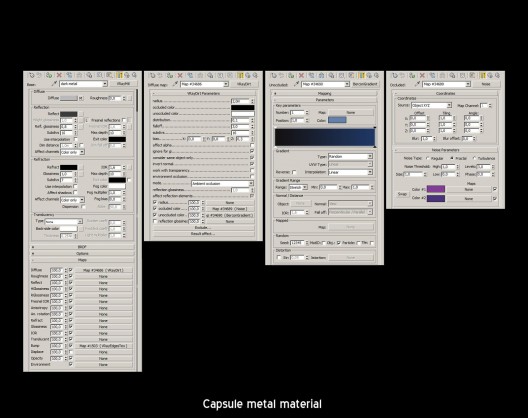
I was seeking for a dark metal material for the capsules to produce subtle reflections while keeping the scene full of shadows. I placed a BerconGradientMap in the diffuse channel to create a slight color variation for each object.
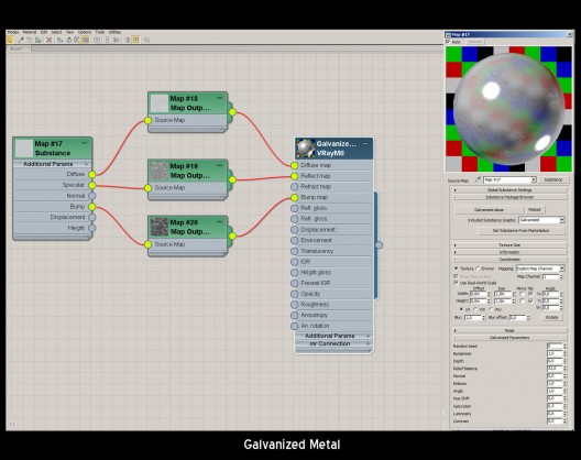
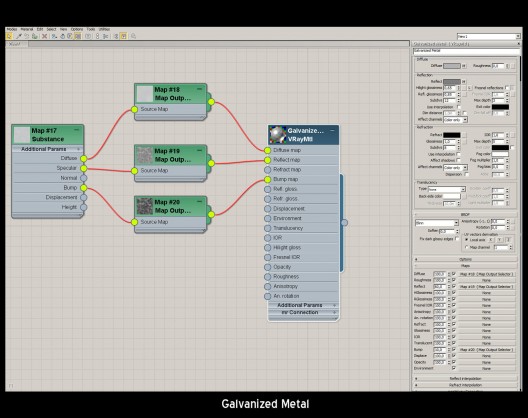
The galvanized metal of the framework is made from a substance material. Only a few setting were made in the base material to generate diffuse and reflection maps.
Render Setup
Materials and camera excluded, render setup is done with SolidRocks from my friend Jérôme Prevost. Because I do a lot of post-process work that will clearly affect the image, I don’t use or work with a high quality setup.
Render Passes
I use V-Ray render elements in post production to enhance the image especially for reflections. I also add Ambient Occlusion as an VRayExtraTexMap to add an effect dirt or details. Depending on the object’s scale a few more AO pass can be used with different settings.
Due to the fact that I aim to use non-destructive method in Photoshop, I utilize many adjustment layers with clipping mask, that is selection. This explains why I manipulate VRay render elements to generate selection passes. VRayWireColor for quick selection, VRayMtlID for MultiSubMat, Refraction and Reflection Filter, VRayZDepth of course and sometimes Falloffs…
Objects selection passes are made with Rendermask.
Post process work
Render elements
I would like to begin with analyzing the layer organization: I have a group of VRay passes loaded in my files via “load files into stacks”. Sometime I place these elements as smart objects, it could be useful when updating the render but any change on the size and dimension of the image makes this option crippling. I try to keep as many elements separated out as possible to allow changes and updates, but I must admit that when there are too much layers it can become quite uncomfortable.
My classical workflow in Photoshop consist in the following group arrangement (first here is at the bottom of the stack) :
- Background
- Main render
- Enhance refraction
- Enhance reflection
- People
- Vegetation
- Foreground
- Lights and Colors adjustments
- Final effects
Depending on the project other specific groups could be added. In this particular case :
- lighting and rain effects.
Lighting effect
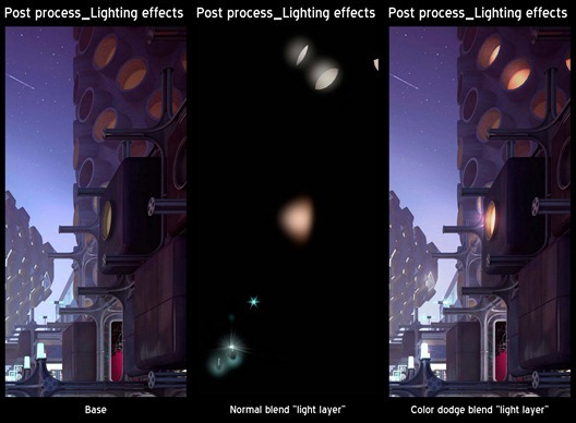
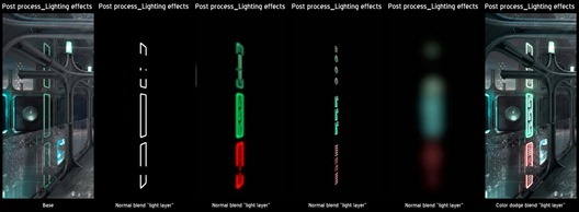
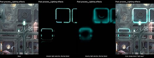
To add these effects I create what I call light layer, fill with black in color dodge blend mode. Commonly I have two layers : one for the flare, the brightest area, draw with a hard brush in cold and low saturated color and the second for the glow paint with a soft brush and a warm saturated color. Paint those effect on a black layer allow you to see exactly the shapes of light area.
It’s a nice and practical manner way to “switch on the light” of the image, just be careful not to use too much overlapping layers of this kind because this effect depend on what is below So any changes, especially regarding values, could affect the final result.
Rain effect
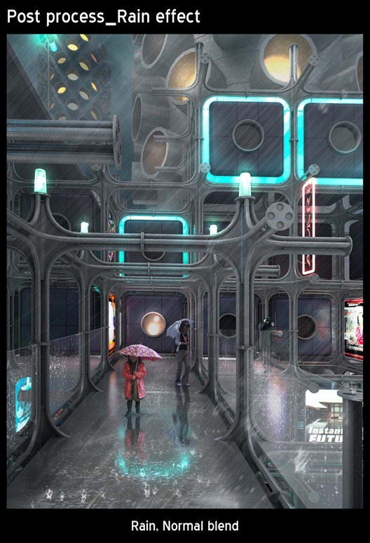
To create the rain I used three different elements
The rain itself is made with a scattered brush, adding motion blur and distortion. Combining 3 sizes of brush in 3 layers with different opacity give some depth to the rain.
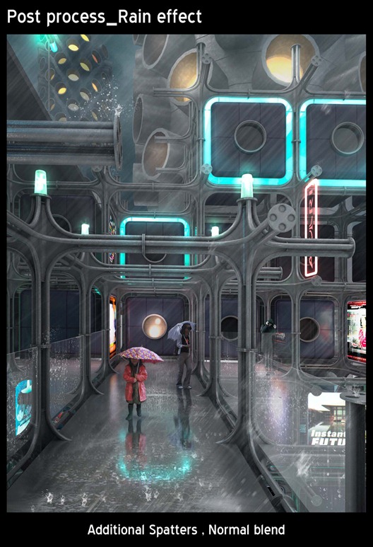
The rainy ground effect is a mix of photos blend with VRayReflection passes. I also added people and lights reflections with a certain distortion.
The rain drops and spatters are made with custom brushes. You can download tons of spatter-like brushes on the Internet but one can also create their own. In this case I found a photo of drop, clean the area I needed and created the brush. After using settings to add scatter and size variations I applied it both on floor, glass and in small touches on some striking elements in the image, especially in foreground.
Lights and colors adjustment
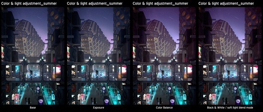
Most of those corrections which affect color grading and contrast settings are made via adjustment layers. The first thing is to modify contrast via black and white or exposure adjustment layer in this case combined with Z depth passes as a clipping mask.
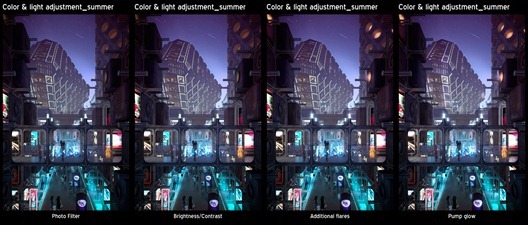
Once you have a good balance of lights and values it’s easier to work on color variation and saturation. As I stated previously, in order to do this I use a lot gradient maps, but also photo filter, selective color, curve. At this stage the image is a material to experiment with and sometimes it can lead you into an unexpected direction.
However, it is important to keep in mind that most of these adjustments are made in respect to the first sketch intention, especially for the depth and lighting whereby both create contrasted areas.
Final effects
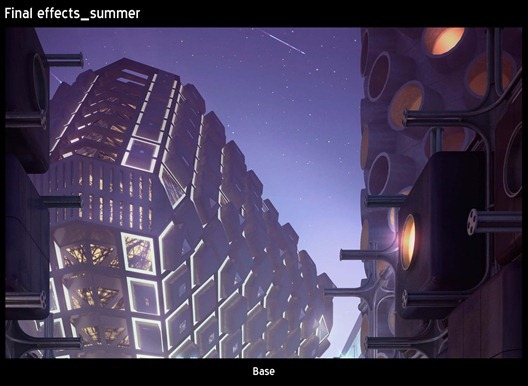
As a final refining step, I have a bunch of filters which combine together to give stylish results. The main purpose here, is to give the image a kind of graphic unity, to enhance smooth integration of all elements and a more personal finish. All those effects are applied after a copy merge layer, the pasted result can eventually be turn into smart layer (then filters applied became smart filters which are easily manipulated at any time).
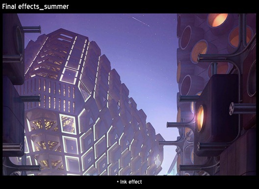
I am used to adding some comics-like ink effect. There are several ways to proceed here. In 3dsmax with VRayToon, or in Photoshop with filters as trace contours, grain, poster edges, photocopy etc
Each one give slightly different results that depends of the contrast and smoothness / sharpness of the image they are applied on. More often than not, the image must be tweaked before obtaining positive results.
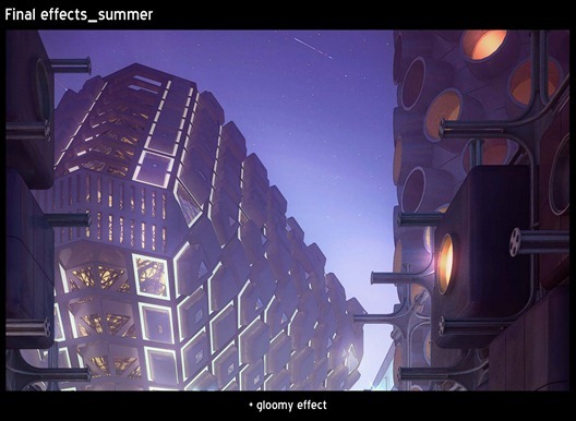
I also use gloomy or pump light effects with huge Gaussian blur applied on whether colorized version of the image in hard light blend mode or de-saturated version in linear dodge blend mode.
For night time illustration with a lot of flares and reflections, chromatic aberration effect can give interesting results. This is produced via lens correction filter or moving by a few pixel one of the RGB channel.
Once I’m satisfied with a set of adjustment or mixed effects I aim to store them in actions, which is an interesting way to optimize workflow. Third-party filters as Red Giant Photo looks could give nice results and allow to create customized libraries effects.
Summary
I hope this presentation will have enlightened the way I made these illustrations. I also hope it could help you in your job, in one way or another. If you have any questions I’ll be happy to answer… simply comment below.
Links, references and inspiration.
Books :
- Project Japan. Metabolism Talks Rem Koolhaas & Hans Ulrich Obrist, Taschen, 2011, ISBN 978-3-8365-2508-4
Movies :
- Tekkon Kinkreet, dir. Michel Arias, 2006
- Akira, dir. Katsuhiro Otomo, 1988
- Ghost in the shell, dir.Mamoru Oshii inspired from Masamune Shirô, 1995
- Blade Runner, dir.Ridley Scott, inspired from Philip K. Dick, 1982
Concept artist :
- http://vyle-art.blogspot.com/
- http://sparthconstruct.blogspot.com/
- http://www.steambotstudios.com/
- http://sydmead.com
- http://www.fengzhudesign.com/













It looks soo huge in the renders But you made it Look soo Simple 🙂 Great Work 🙂
And I thank @ronen for getting these Challenges 🙂 waiting for the Upcoming challenges this year 🙂
Add reference images to the Material section just now… should be much more clear.
added 😉
Enjoyed that, Nice work!
Very nice Making-of !
this making of was GLORIOUS.thanks!
just a scene from sci-fi movie 😉
thanks everybody!
great images! great making of! congrats!!
hi i was wondering how do you make the effect of night in the people, i mean, i know you desaturate a bit and put a blue color over. but i mean the light effect, like if there was a light hiting the people in one side and in the other, how do you achive it??
@guayabeiro Hi, most of the time I duplicate my “people layer” and put it in linear dodge add blend mode. Then I add a mask to this layer, hidding all, then I can paint the contour of the character where the light is suppose to hit. You can play with opacity or level adjustment to increase this effect.
it’s amazing to see some of the great metabolist concepts come to life. I like the fact that (at least from my perspective) you don’t interpret them neither as utopian or distopian. As for the graphics, beautiful!
Blow away by the quality & thought of your work, astonishing! And to share it like this is both humble and open. With regards to the software used to model your scene, before v-ray and finishing in Photoshop. Was the package 3ds max? It would be wonderful if you could point me in the direction the package, so to i can explore it and develop my ability to create and convey environments. Many thanks.
Best wishes,
fantastic work – thanks for the detailed processes