Hello,
During the past few days I have spent a lot of hours figuring out how to make the transition of the greenery from the ground to the skyscrapers smoothly.
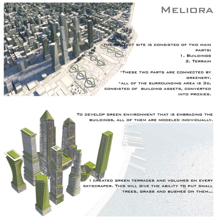
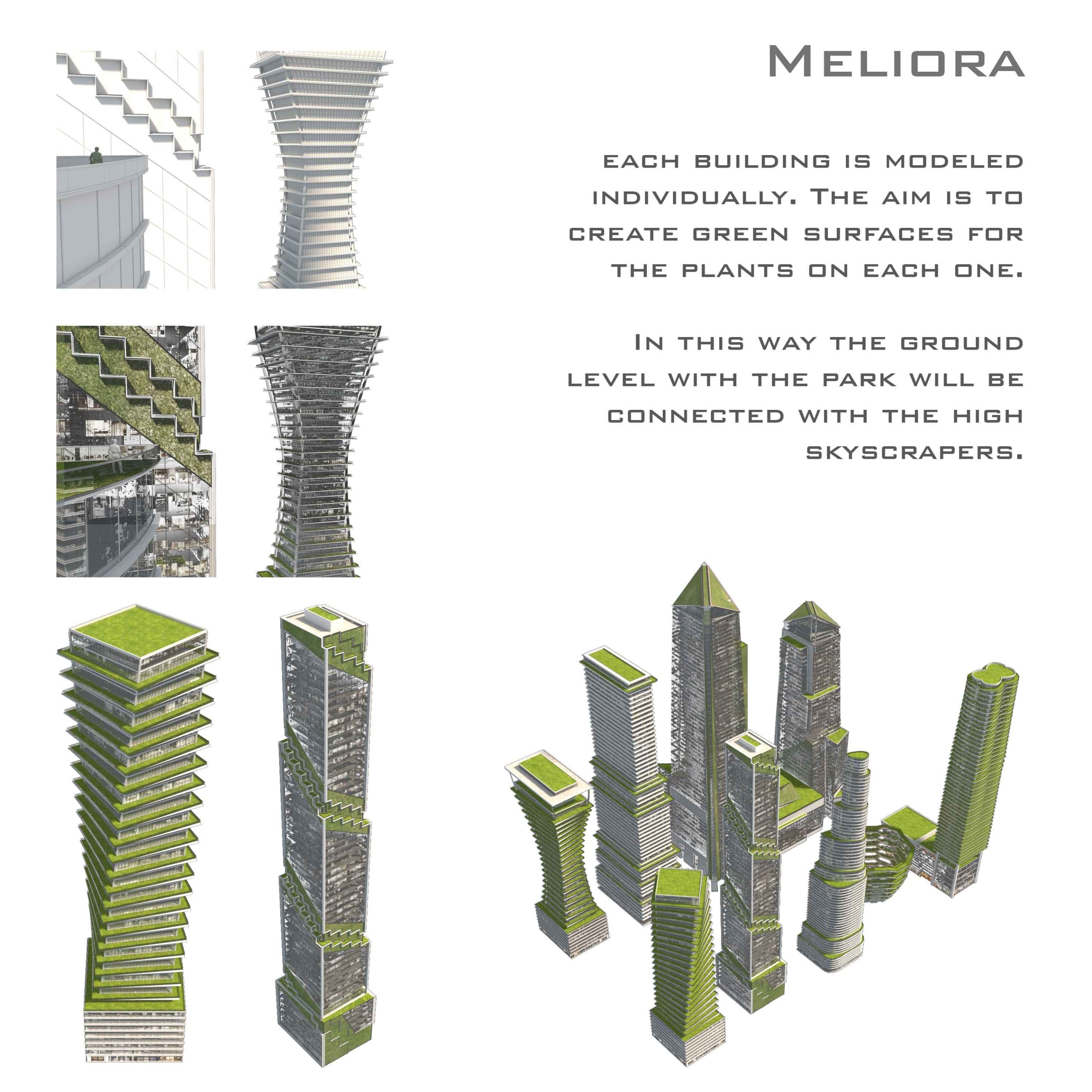
I begun remodeling the basic geometry volumes that was provided for us in the starting pack. I followed some of the following methods during the process. Each skyscraper was remodeled and has gained green surfaces where grass, bushes and small trees are going to be placed. The average depth of the surfaces is around 3-4 metres, with slabs around 1 meter. My research regarding other buildings that are already built in that way showed that this is enough for the greenery. I kept the original silhouette of the skyscrapers, their height and size. By connecting and chamfering the edges I created the elevations with the slabs and the glazing.
The background is completely created in 3D, using several clusters of building assets. I converted the surrounding building into proxies in advance to save memory and to make the process faster during the time.
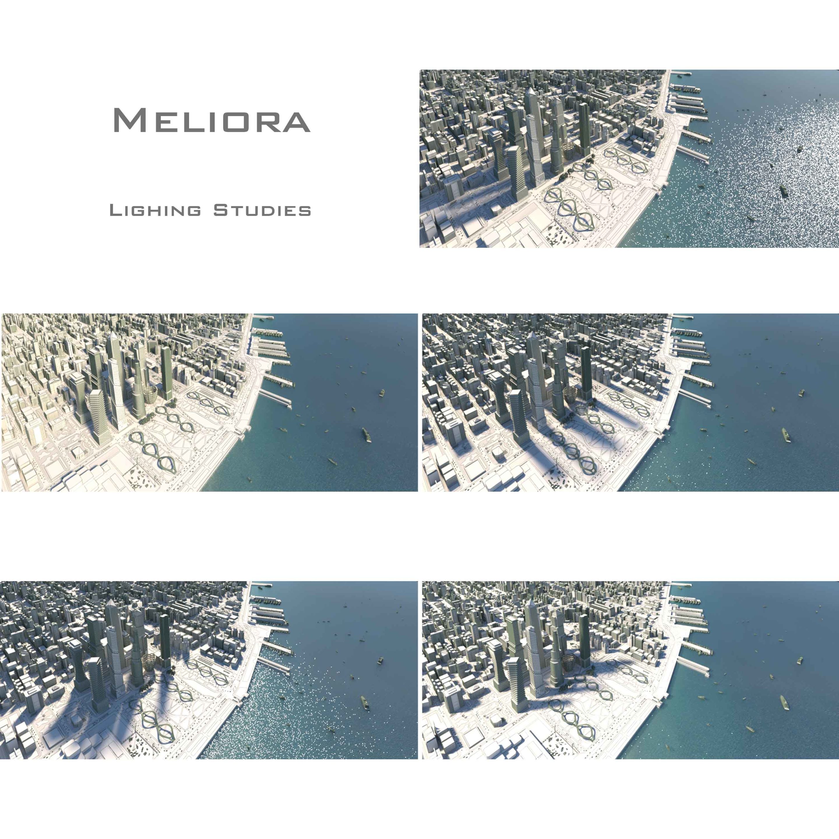
When I was ready with the geometry of the buildings, the terrain and the surrounding area i begun testing the best appropriate lightning for this aerial view. I will aim to choose the one that is not throwing shadows on the park development infront of the skyscrapers. It is one of the leading elements of this project.
Thank you for taking your time. I hope that soon will be able to post updates on the other two images for the project.
Bests,
Stefan


Wow… thats such a massive view . How big is the file ? Will you blur the neighboring buildings or will they be textured and detailed?
Really looking forward to the final render. Amazing view
I like the way you presented your project as well as the concept. It slightly reminds me shots from movies and videogames about extinction of humanity, where buildings are taken by greenery

Actually I recall two references that I bookmarked on Archdaily, maybe you’ll find them helpful. I like them because of sharp shadows, high sun and just a bit of haziness.
I really admire you for the scale of the project.
I’m looking forward to seeing updates from you.
Hello,
I have just managed to render a clay preview for the second image of the project. I have applied VrayEdgesTex diffuse map to make the main volumes stand out. The main reason to create this semi-aerial proposal is to illustrate the balanced silhouette that Hudson Yards volumes own.
All of the buildings are remodeled completely, holding on to my concept of green development of the site. The original shapes of the main volumes were preserved.
Illustrating the project site from a large distance can show how the updates that we make corresponds to the context.
Stefan
Hello everyone,
I have just managed to update my first image for the competition, the aerial view.
The aim is to show how the project site corresponds with the surrounding area of the city.
You can zoom for details.
Looking forward for your thoughts.
Best,
Stefan
Hi guys,
I have just finished the latest update on the second view for my project. I am sharing my work in progress with you. Now I will manage my time to proceed with the third image, because time starts tiking away very fast.
I am looking forward for your thoughts.
Best,