432 Park Avenue
432 Park Avenue, NYC’s soon to be the tallest residential tower (also in the western hemisphere) just hit the 50% milestone in last month, reaching a height of 700 feet. Emmy-award-winning branding and creative agency DBOX is in charge of branding and creative for this project designed by architect Rafael Viñoly, and you should have a look at it if you didn’t already. Where can you see the film they made for it you ask? well… that is truly a million-dollar question!
Architecture : Rafael Viñoly Architects.
Branding & Creative : DBOX for CIM Group & Macklowe Properties.
Photography : Richard Berenholtz.
First, the early exteriors :
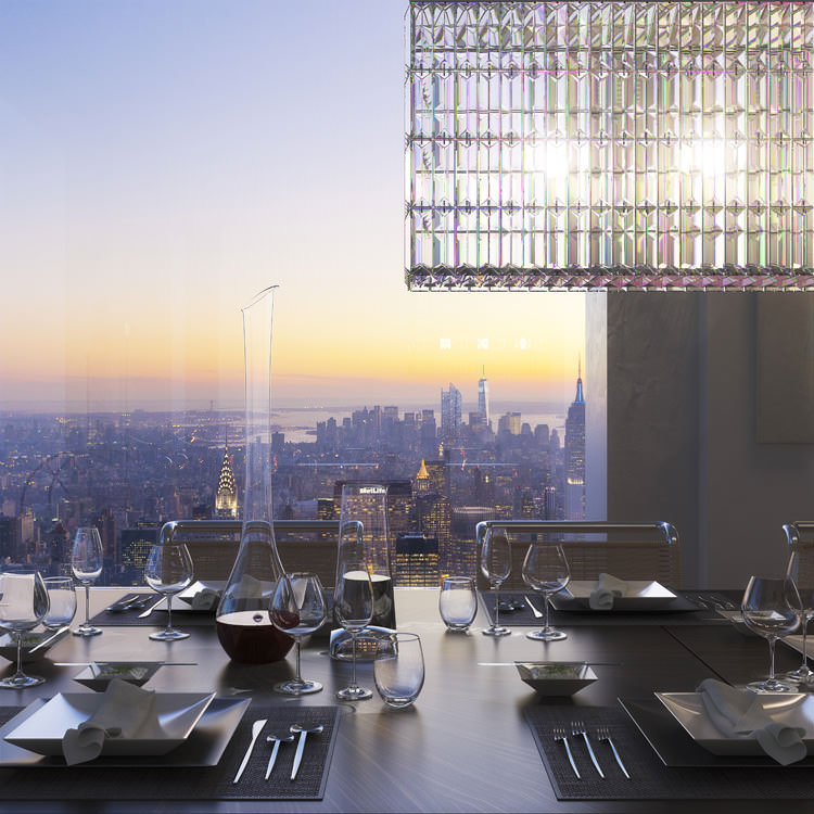
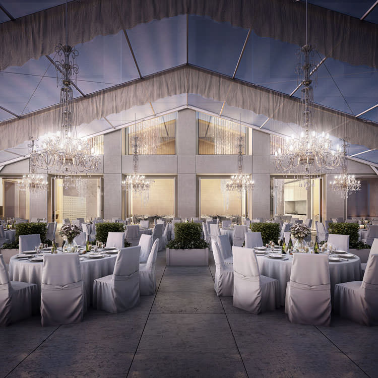
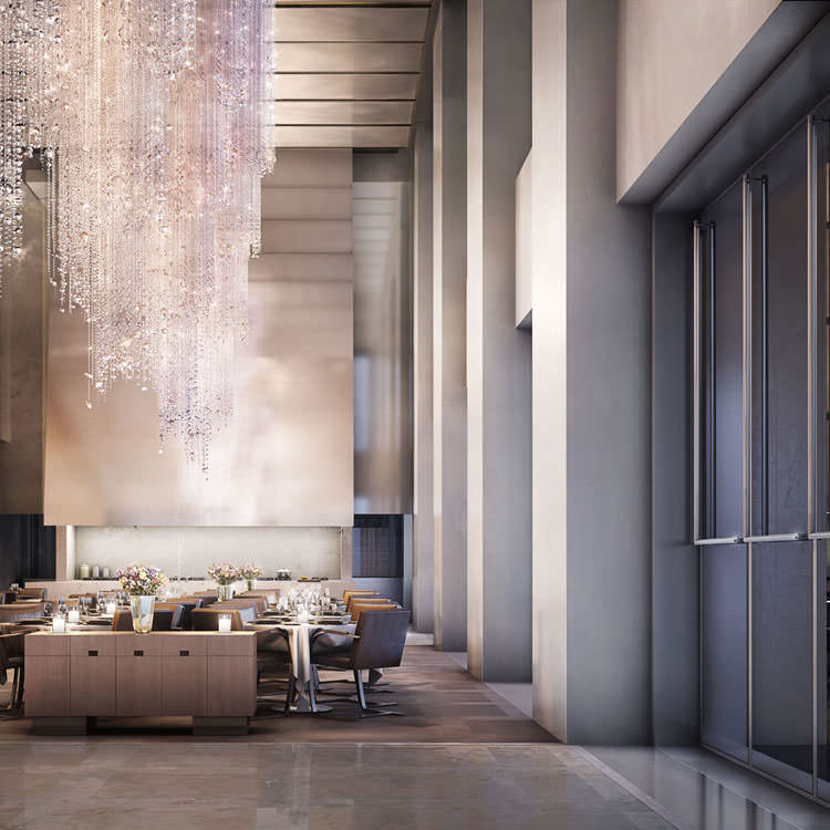
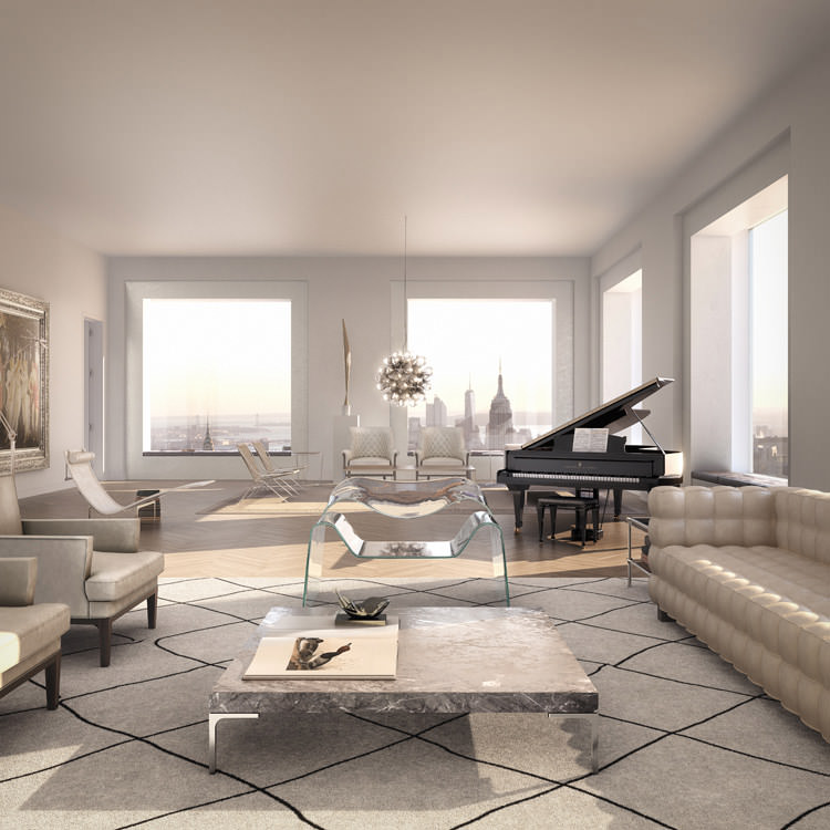
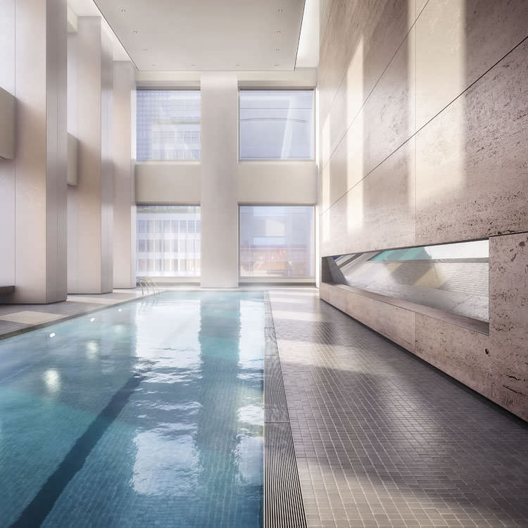
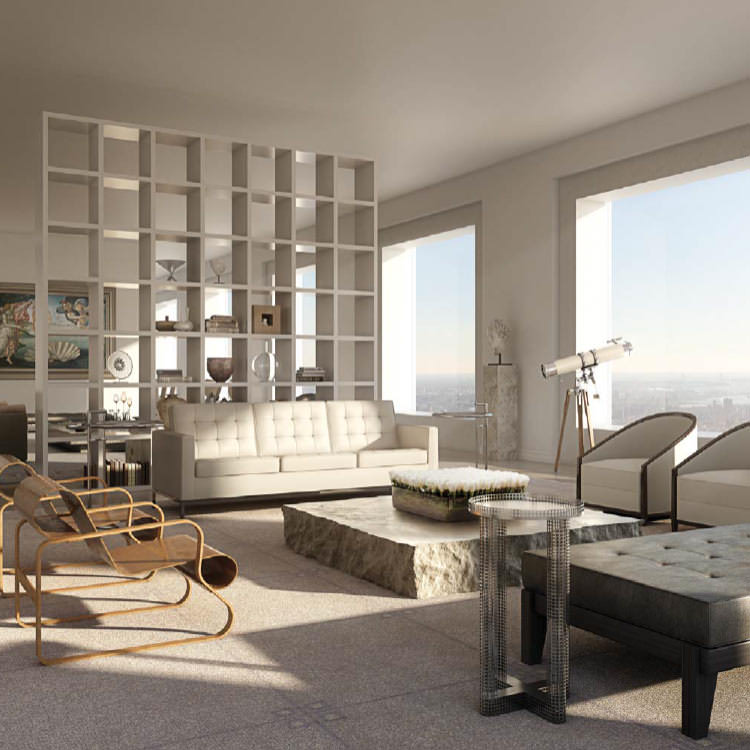
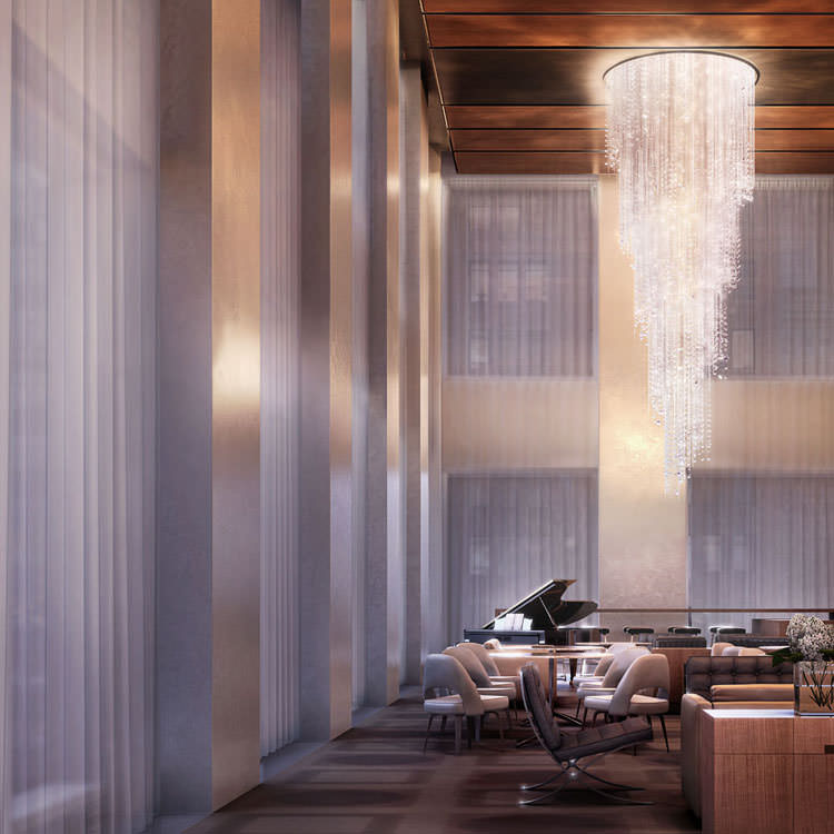
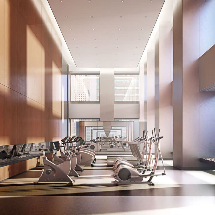
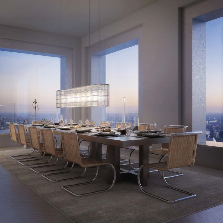
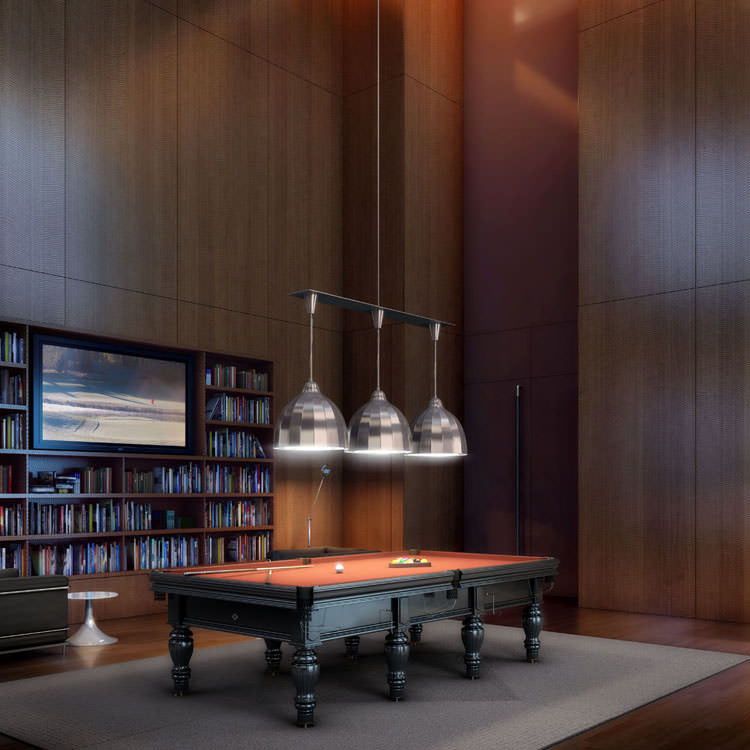
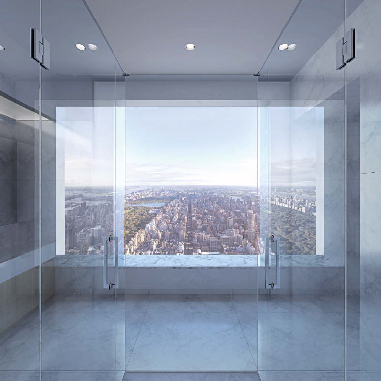
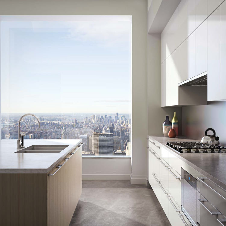
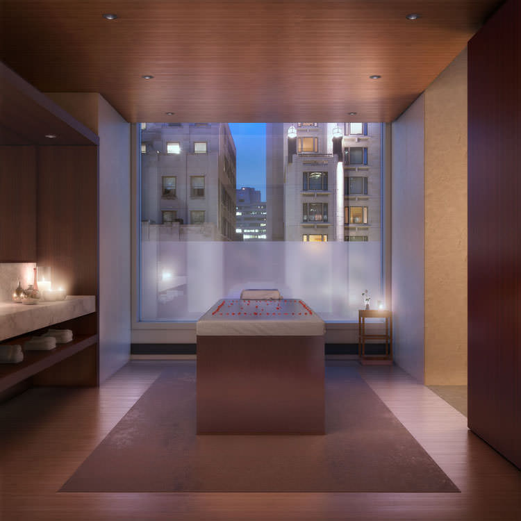
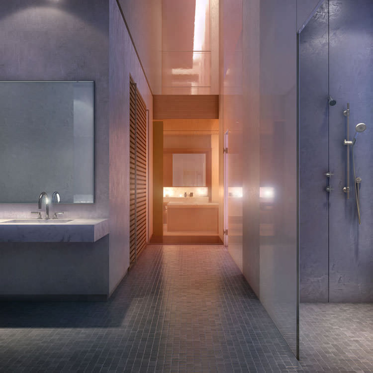
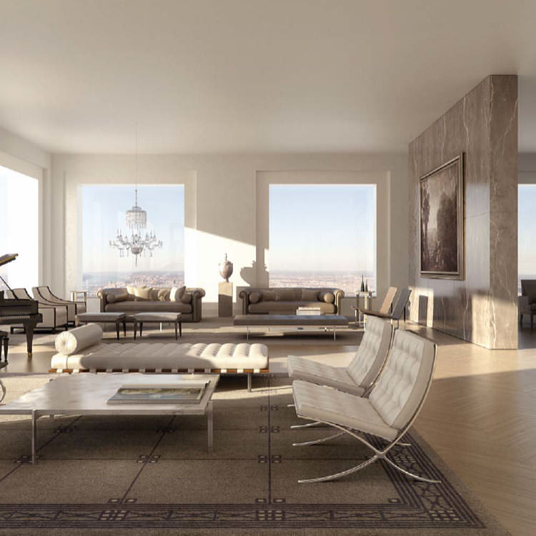
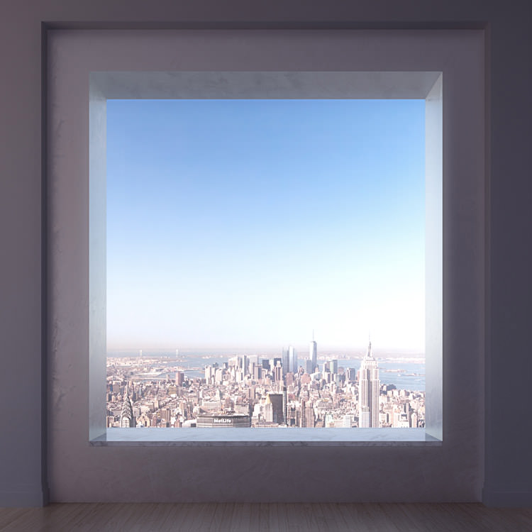
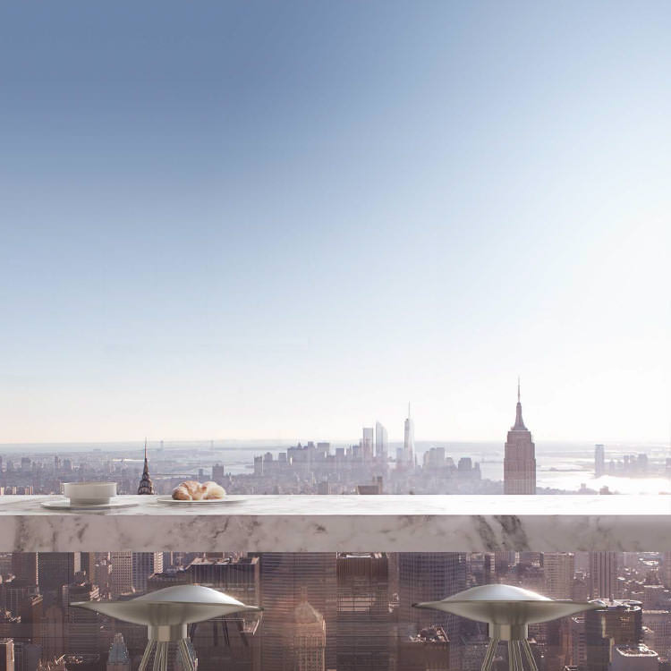
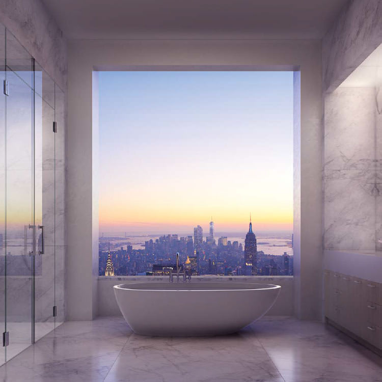
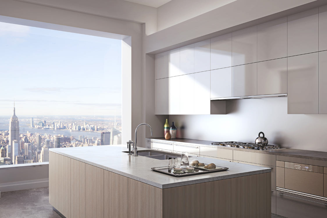
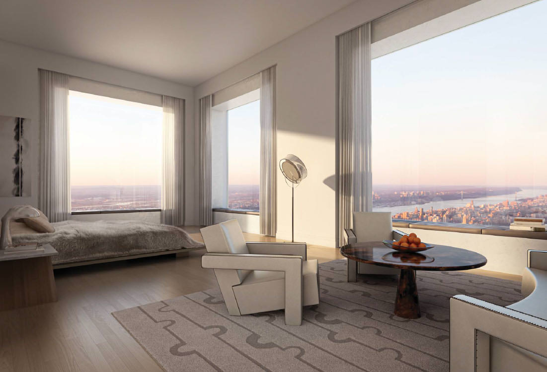
And the interiors that came in later :
For more information about the film, check out this article on the New York Times – Selling Park Avenue Condos at $250,000 a Minute
Here’s the Vanity Fair spot made about this tower :
This building went into my Architectural Visualization boards on Pinterest. I invite you to follow me and see what other great things I’ve curated there for some time now.
P.S.
Would you like to work on projects like this one?
DBOX are looking to fill positions in both their London and Miami offices.



Video: Architect Rafael Viñoly talks about 432 Park Avenue, New YorkRead more at http://www.wallpaper.com/architecture/video-architect-rafael-violy-talks-about-432-park-avenue-new-york/6537
I am not quite moved by those images…but would like to see this video.
But the pricetag surely interests me :- )
All of them? or would you divide Exterior from the Interior?
I think the work by dbox is at their usual high quality level. The absense of any kind of people is a bit weird – would have like to see some figures in at least some of the shots…
It’s the architecture that bothers me; the scale is really out of place; which isn’t helped by the relentless square windows. 🙂
Scott Struik You might have liked to see some people, but the billionaire buying an apartment there might not 😉 Those square windows are BIG, and obviously the view from them is the big focus and maybe they just wanted to keep it all clear and open up the views…
Anyone buying in is going to redo the interiors so why bother vs. putting the strengths on top?
There is also the film – which is the main thing… so we only see a small glimpse of it all.
RB
ronenbekerman I hear what you’re saying but the people could have been slightly blurred /in-motion so that they remain nondescript. That being said I usually find people distracting in arch viz work – even when done well, lol.
I get that the view is the main focus, I just don’t think that from a design standpoint the square form is working. Purely my view, of course (pun intended). It tends to be a modulation that’s very bizarre in a building of this height.