34 Prince St. Case Study by MARCH
MARCH are no strangers to the blog, with two articles already posted and among my favorite ones – 15 Renwick & 12 Warren Case Studies. Today I’m happy to post yet another fantastic Case Study for their recently released work on 34 Prince Street, a development located in the former St. Patrick’s Cathedral School in the heart of Nolita, NYC. Interesting seeing the visualization over time approach. Enjoy!
First off, and as always, thanks to Ronen for doing all that he does to make this blog awesome while keeping us all informed, inspired and connected. Secondly, we hope everyone is enjoying a nice, creative summer and reading this from a laptop on a beach…
34 Prince St. is a development located in the former St. Patrick’s Cathedral School in the heart of Nolita, NYC. A beautiful, historic structure anchoring the corner of Mott St. and Prince St., the repurposed building will be carried into the future with a new chapter written by its residents.
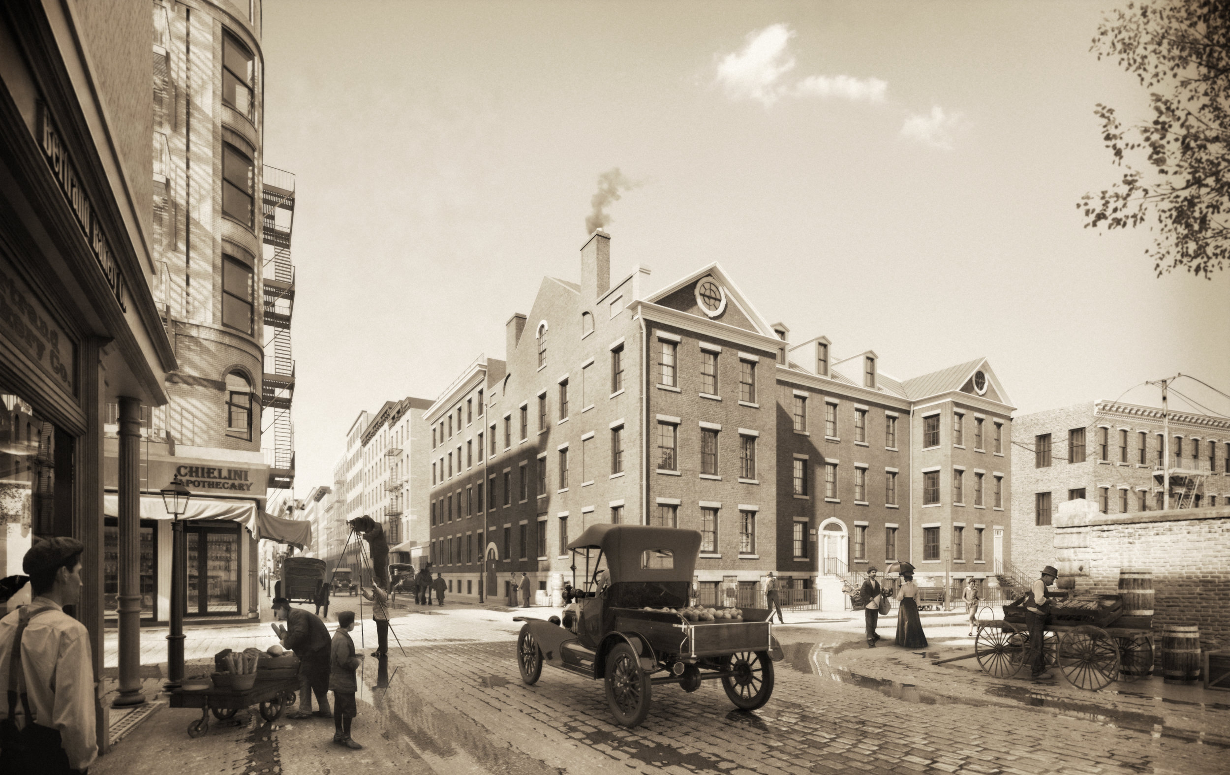
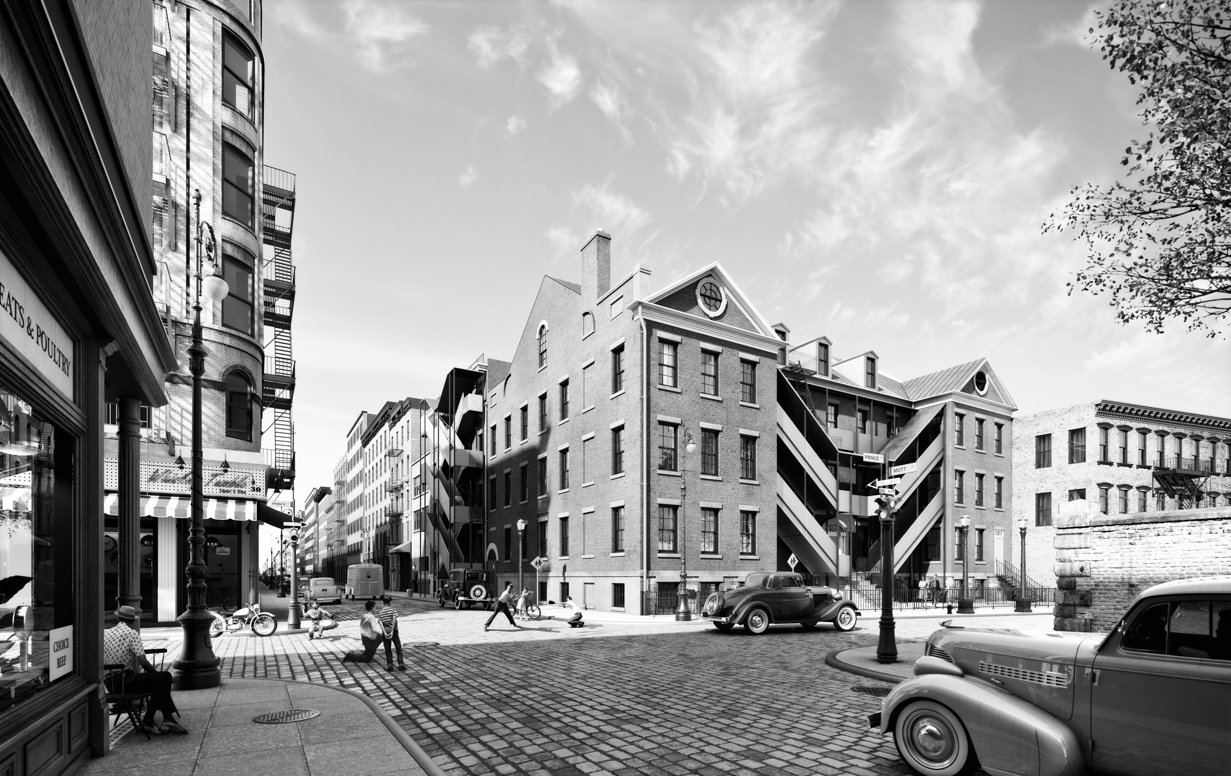
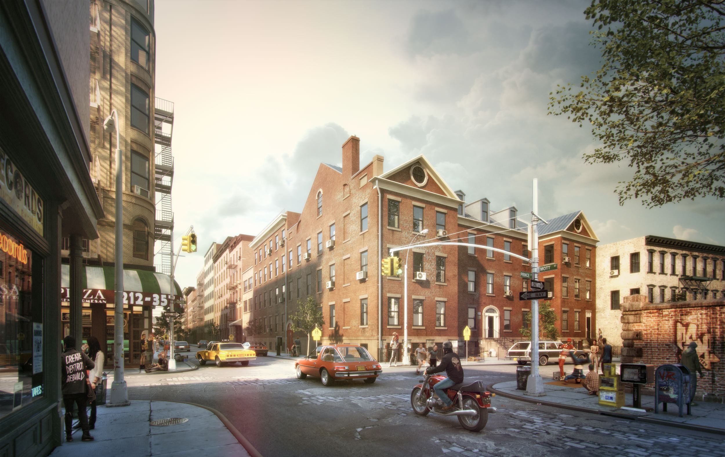
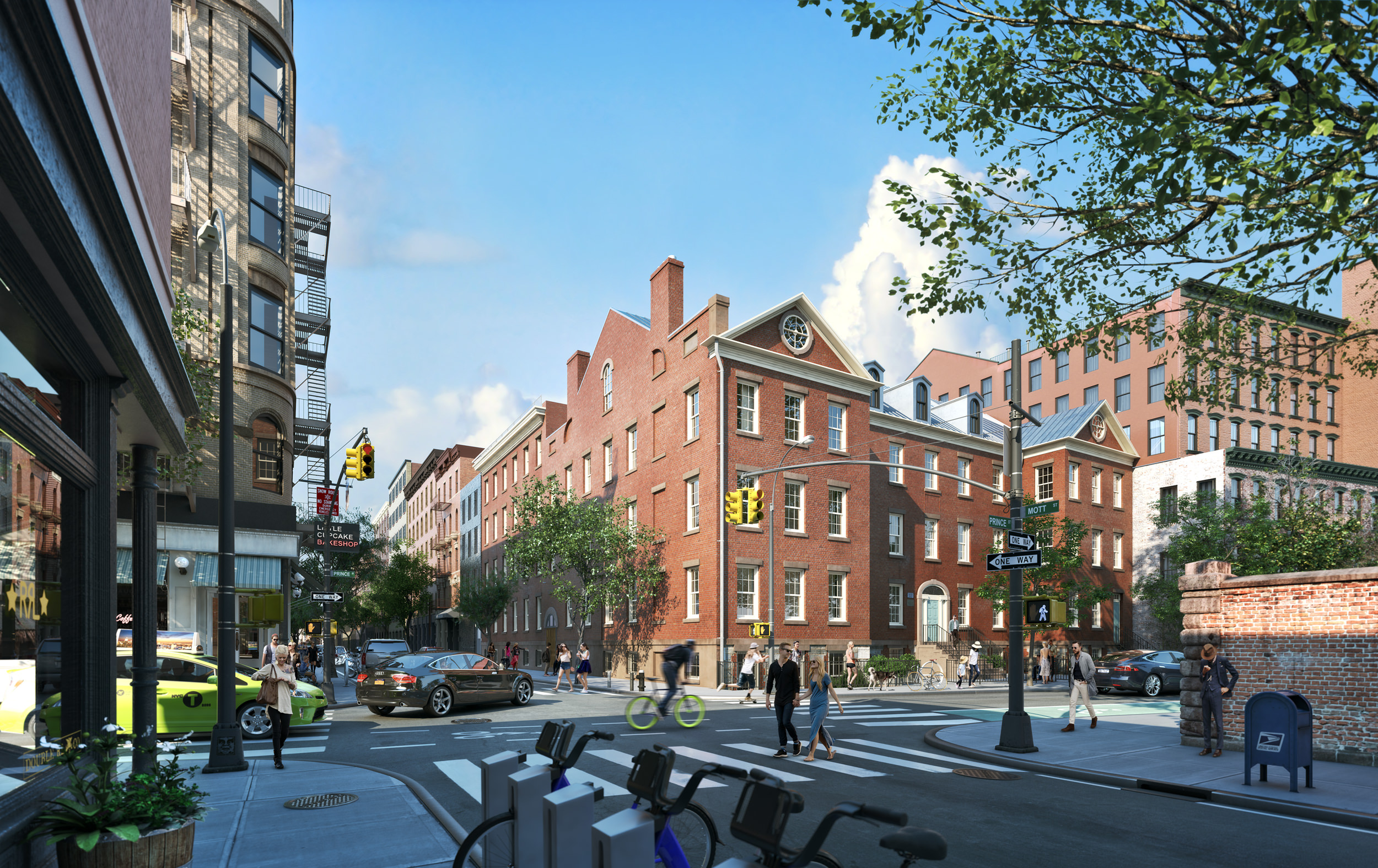
MARCH created a snapshot of the building and its context throughout its history to give a sense of weight and place to the project. Much of the neighborhood has changed over the past century but 34 Prince remains. Context buildings, storefronts, lifestyle, fashion, transportation, infrastructure, vegetation and photographic treatments were researched and developed around fictional narratives for each time period.

34 Prince St. | Historical References for 34 Prince (Credit Left-Right: 1900s-Archdioces Archives, 1940s-NYC Tax Photo, 1980s-MCNY Collection, Present-MARCH)
The site as it has evolved over the past 120 years. Note the collapse of one of the chimneys (to be restored during the current renovation) and the addition and removal of massive fire escapes.

34 Prince St. | Historical References for 34 Prince (Credit Left-Right: 1900s-LittlebighistoryNewYork, 1940s-Chicapoquita, 1980s-Flickrhivemind, Present-Inhabitat)
A significant amount of time was spent researching historical neighborhood photos with an emphasis on these specific decades. Of particular interest to us were street life, transportation, retail, infrastructure, greenery (or lack thereof) and fashion. Another obvious consideration was how the color and quality of the film has evolved over the years.
- The 1900s: flat, grainy, sepia toned;
- The 1940s: high contrast, crisp, black and white;
- The 1980s: saturated, soft, dreamy; Present: clear, natural, high res.
Achieving these characteristics and the right look and feel became the major challenge of post-production.
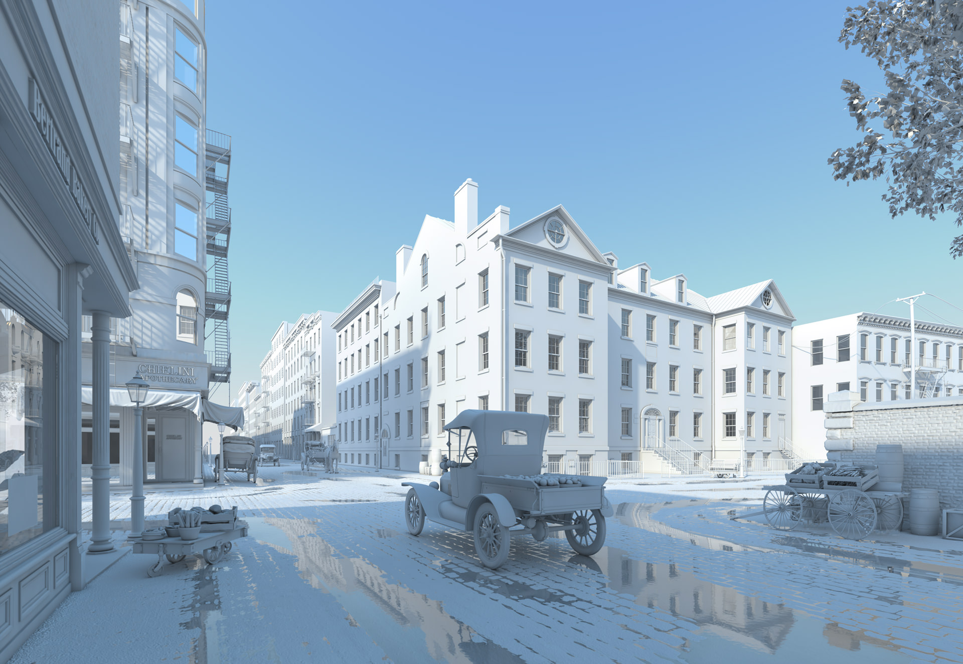
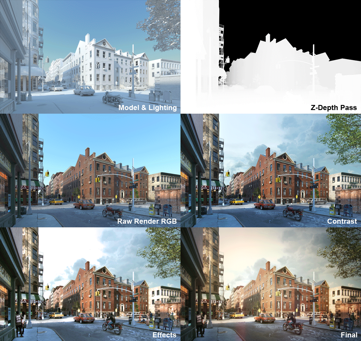
With the exception of people, the entire environments were developed in 3D. This was done for artistic freedom and to provide a level of continuity between all scenes. This image is rendered without textures to highlight the extent of modeling required to achieve the final product.
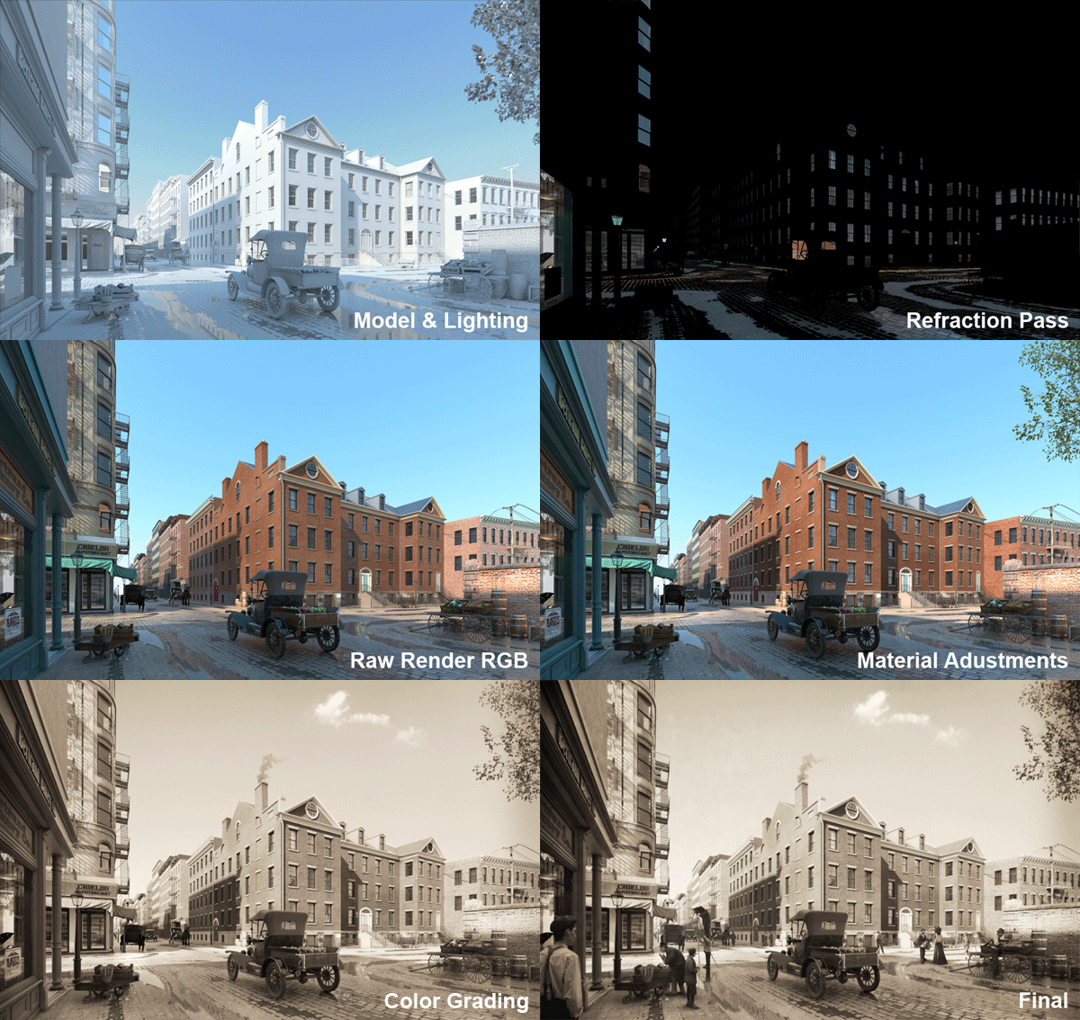
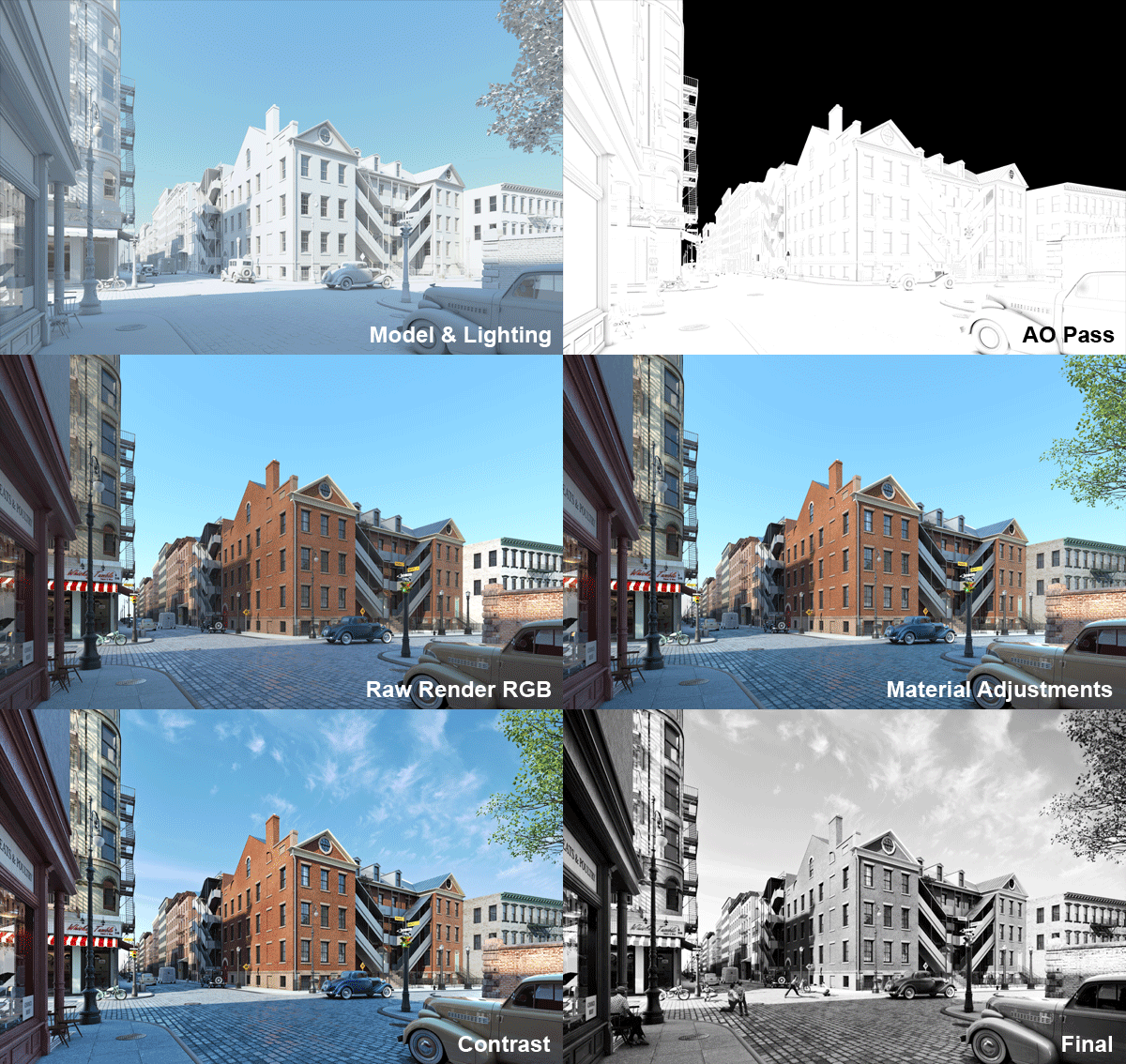
The raw rendering includes a series of additional passes that are used to help refine or adjust different parameters of the final image. Above is a selection of passes used and various stages of the post-production process – all compositing was done in After Effects.
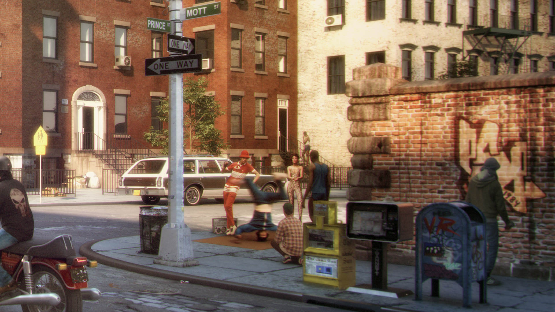
The final images were produced at 5,000 pixels wide. The above crop zooms in on some of the subtle (and often humorous) story lines we tried to embed in every image. At full resolution, the details become much more apparent. Film grain was intentionally layered in to give this 1900s image an archival quality.
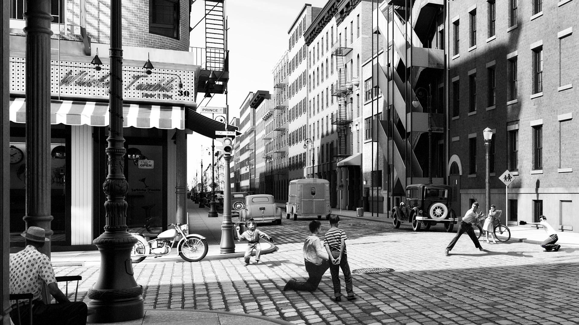
In the image above you can clearly see the degree to which street elements, infrastructure, and signage have changed over the years.
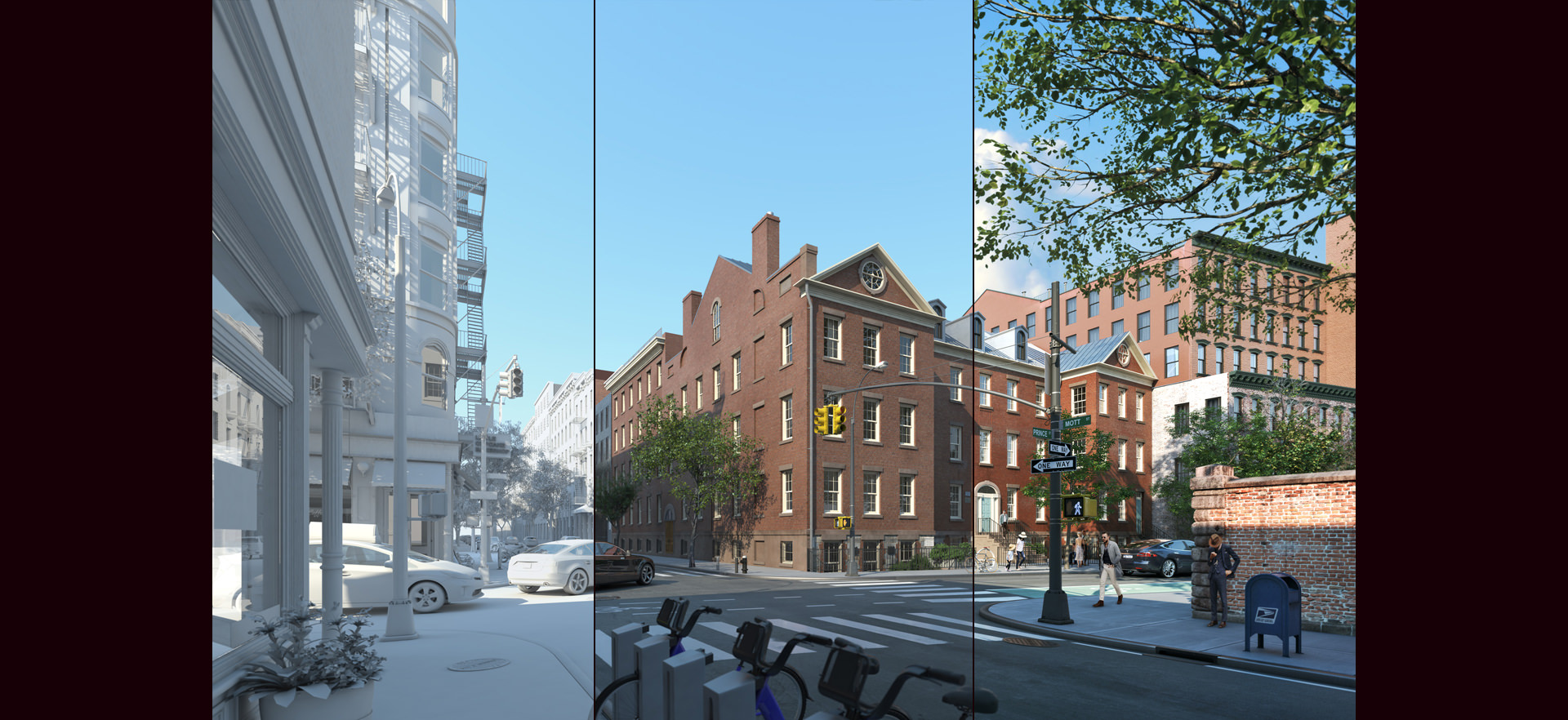
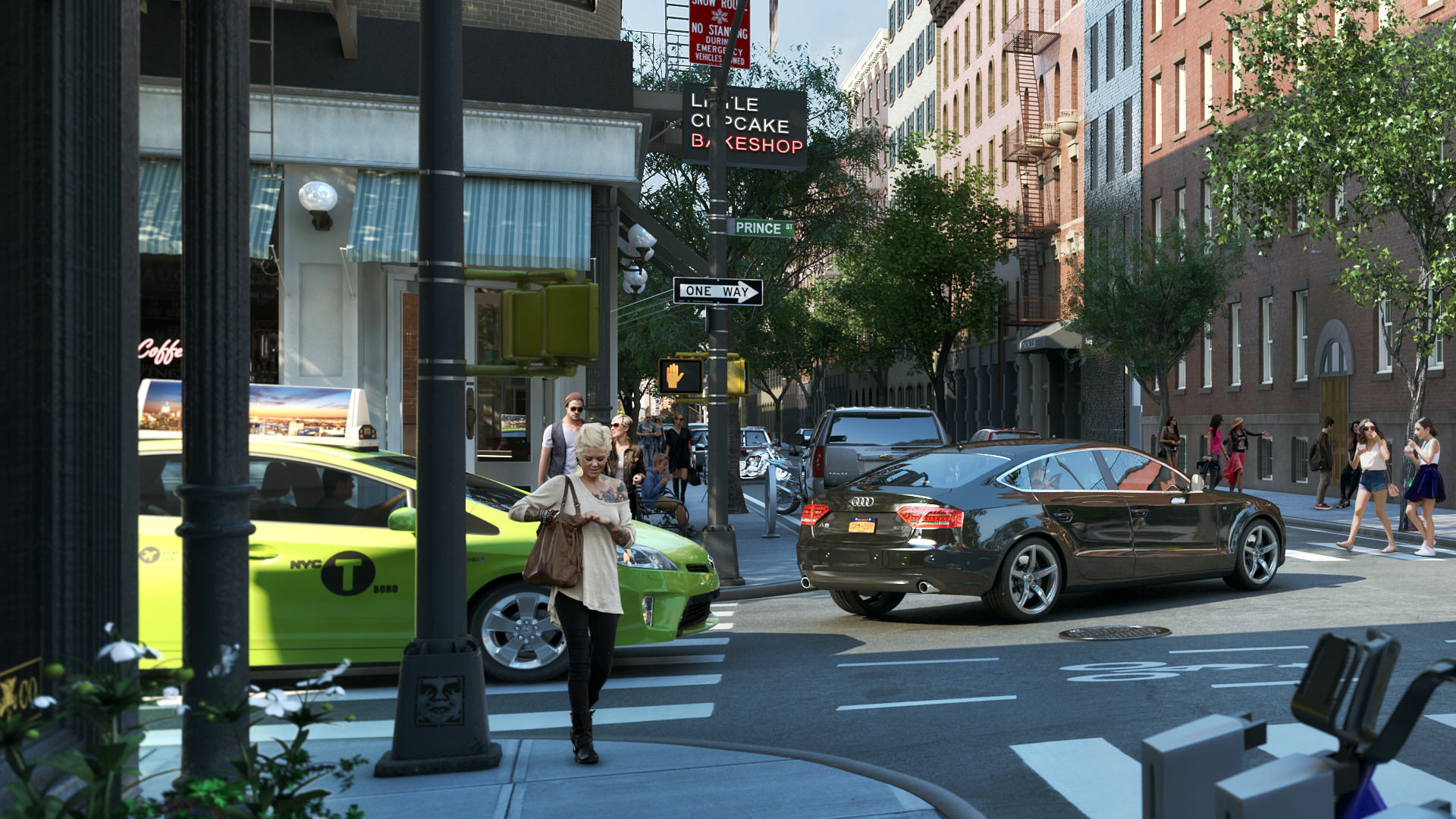
The same is showcased for the 1980s and 2020s below.
To view more of our work :
THANKS!











LOVED IT! Absolutely enjoyable, an amazing job by MARCHMADE
Thanks @diegovelazquezcamacho:disqus MARCH always hit the spot with these ones 😉
Crazy amount of details and then think about doing it 3-4 times…. Great job guys!!! They just got a new Follower 😉