‘The Museum’ / Maxwell Render Challenge Winners Announced
Im happy to announce that the Winners of The Museum / Maxwell Render Challenge have been Selected!
I would like to thank all the challengers and guests for taking part in this event, and to Next Limit for helping in making this great challenge possible.
Big thanks to fellow judges Adam Hotovy, Peter Stulz, Lasse Rode, Dave Morris and the Next Limit Team for dedicating their time and professional expertise not only for the final judgment but also supporting my efforts during the challenge from day one.
Stay tuned for the Making-Of articles by the winners that will be posted in the coming weeks.
The Challenge Sponsors
Next Limit Technologies, Designconnected and 3D World Magazine.
Challenge Mission
Ill remind you that the challengers had to showcase the New National Gallery and its surroundings during an event of their choice. This challenge made a stronger connection between the Virtual Photography and Real Photography worlds then previous challenges, trying to take advantage of what Maxwell Render has to offer. I hope you all enjoyed this event and learned from it as much as I did.
Judging Criteria
The entries were judged according to overall accepted standards of architectural visualization, including and in no particular order: composition; 3d modeling; lighting; materials and textures, concept (original approach), addressing the unique design of the Neue Nationalgalerie, technical skill, emotive value and participation in WIP threads.
Jury Insider
Being a challenge with focus on the Photo-real I invited Adam Hotovy from Vyonyx so he can offer some perspective on things. Help the process be more balanced.
Adam Hotovy
First, I would like to thank Ronen for the opportunity to be one of the judges in this extremely interesting competition. It is an honor for me. I am coming from a background where impression, story and the aura of the image are more important than the execution of the materials, sharpness of the textures and correct IOR of the materials. So my point of view could be slightly different from the other judges.
To judge this competition correctly (if there is something like that), I had to adjust my point of view and mix my personal preferences with the criteria of the competition. I spent some time discussing the process of judging and images with some of my colleagues and all that went into the final decisions as you will see down below.
I do find it very important to say that In general, I realized that many challengers had sometimes better images which they didn’t submit as their finals. And I am afraid to say, that those bad decisions did cost them “points” in the final selection.
Other than balancing things out a bit, a Photographers eye was needed. You cant really judge a Photo-real challenge without an experienced architectural photographer and following Peter Guthries advice, I invited Dave Morris to the rescue.
Dave Morris
First off, thanks a million to Ronen for inviting me to be part of this! It’s a new exercise for me, and I’ve found it fascinating. Though I do have some experience in 3D visualization at college and in practice, it’s now been years since I hit that render button, and today I know more about visualizing architecture in the physical world with my camera.
I did not address matters of modeling, materials, rendering and so forth, but rather regarded the entries as photos of architecture. The subject is fascinating, and the shared ground between photography and visualization is one which I think could use more discussion, so thanks again to Ronen for getting us all talking about it!
One of the things I wasn’t expecting when I started photographing architecture was how mundane most of the actual job would be. The most useful tools I’ve purchased have been, in all honesty – A dustpan, brush and a ladder. Dirt and imperfections are clearly things that several people in this competition have pursued as an added layer of realism in their imagery, but for me it’s almost always the case that I need to do tidying and sweeping when I get on site.
I guess we’re approaching the same goal from different ends of the spectrum.
And then of course we have the joys of just where you can actually put your camera, and why you might do so in the first place. Looking at these images, I’ve been reminded of how often I’d like to be able to demolish walls or disobey gravity to get a particular angle, but alas – it’s not possible!
Anyway, the key issue for me in judging visual representations of architecture, whether photographed or rendered, is how those images sell the subject. It’s not enough to show it – they should somehow distill it, reinforce it, and celebrate it.
And now
The Winners
Here are the winners and summaries that reflect the joint feedback of the judging panel. Congratulations to you all!
Grand Prize Winner, Stefan Hirschsteiner
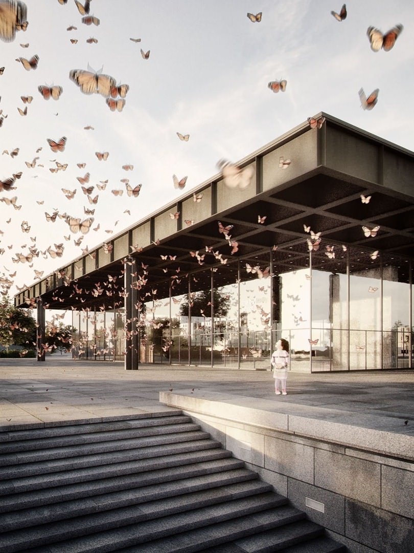
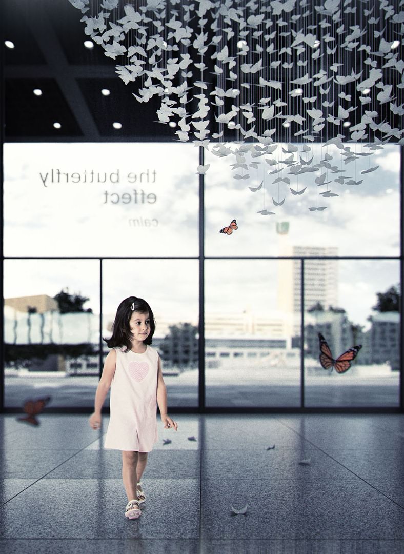
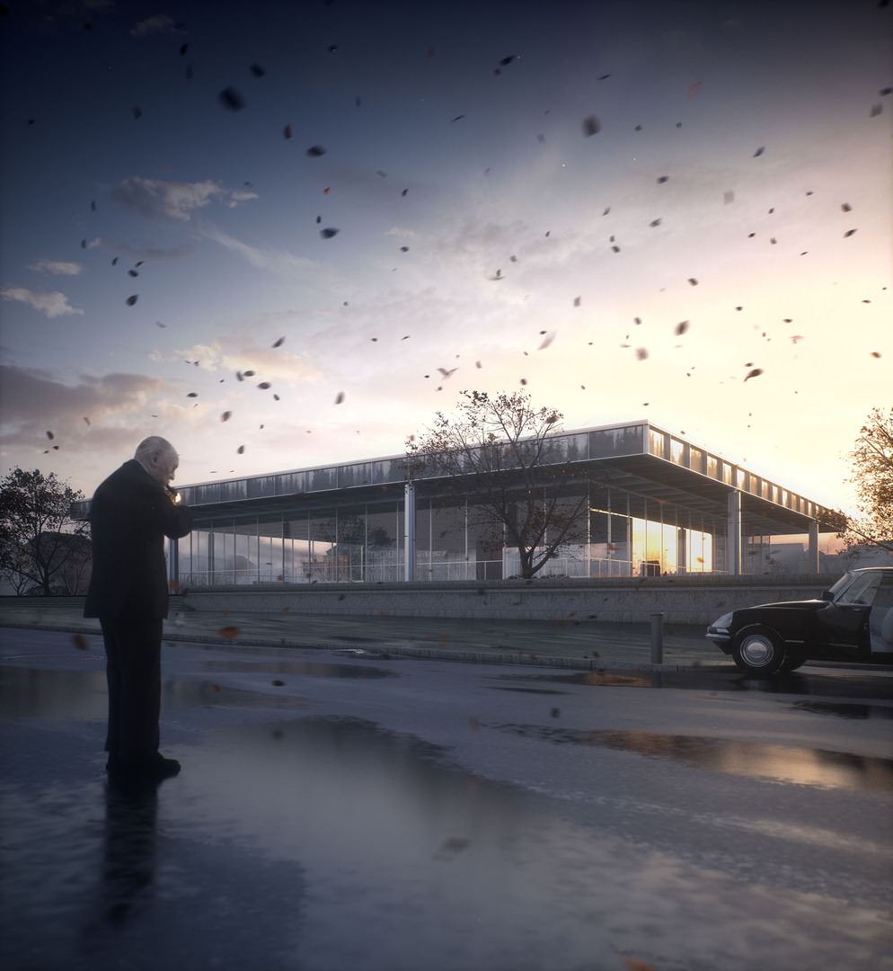
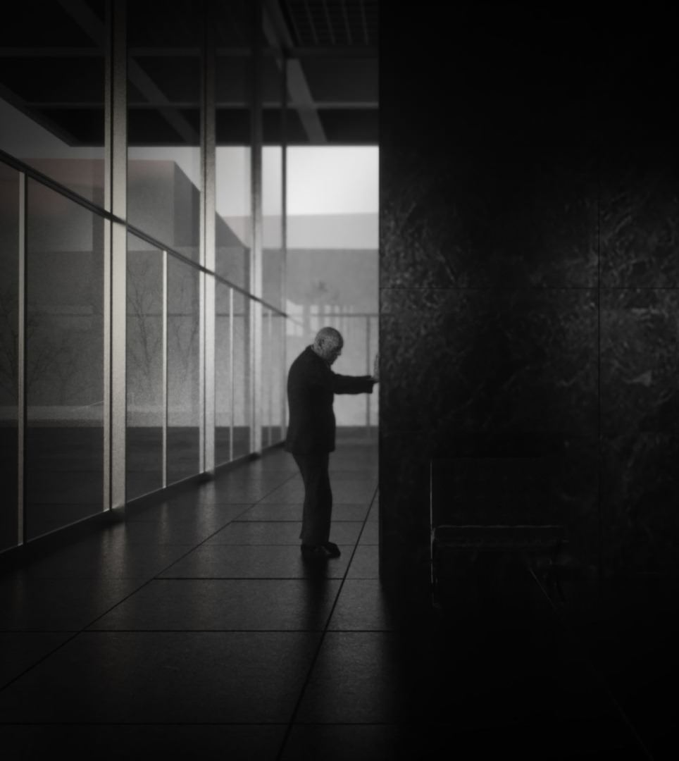
Almost everyone has chosen to include some kind of contrast with the NNG architecture, but Stefans Butterflies excelled at that as an excellent choice of illustrating what modernistic buildings are meant to be A clean slate to be filled with LIFE. Putting the great narrative aside, Stefan entry also showed great composition, textures and color grading.
Admittedly, a bit weaker on the detailing side and going way too low with the Depth of Field in the interior image, it dos not detract from this being the Grand Prize Winner of this challenge and probably the most emotive entry too.
Stefan will get these prizes
- A pick between a Canon 5D Mark III or a Nikon D800.
- Maxwell Render LIFE TIME License.
- Designconnected LIFE TIME Voucher*
- 3D World Magazine Yearly Subscription.
* A 200 EURO Voucher each month for life time. That is 2,400 EURO of value per year! Credits not used during the month are not transferred.
1st Runner Up, Bertrand Benoit
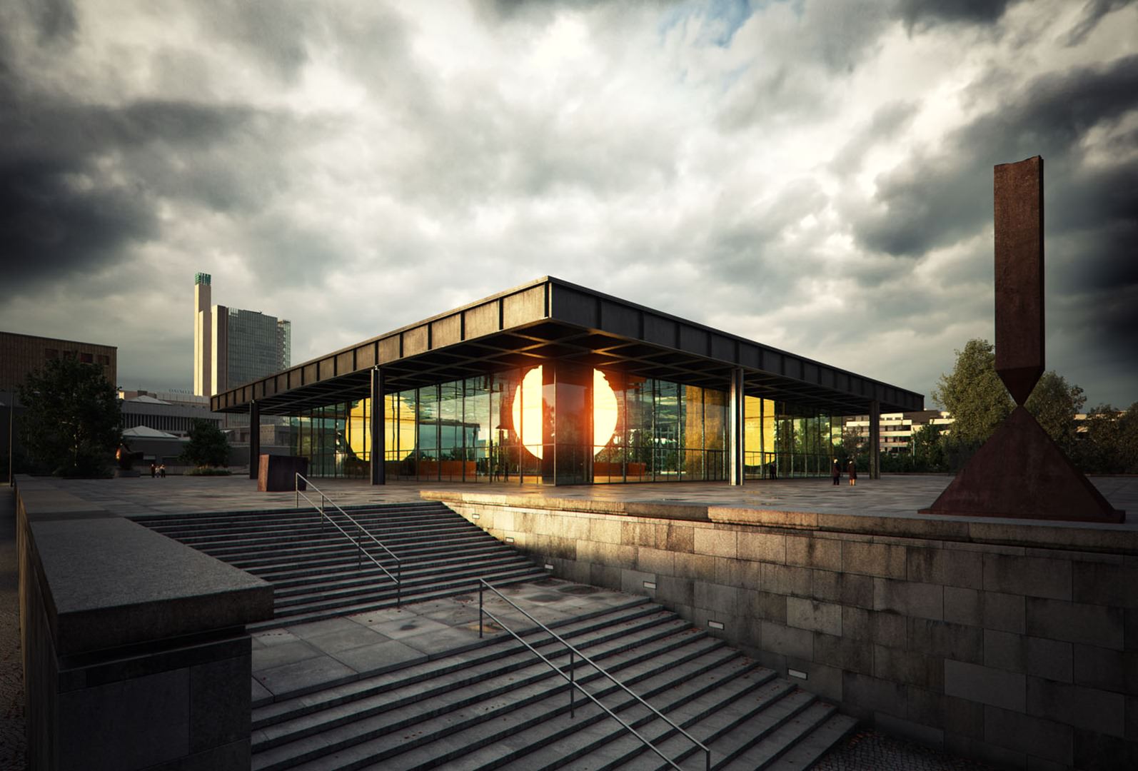
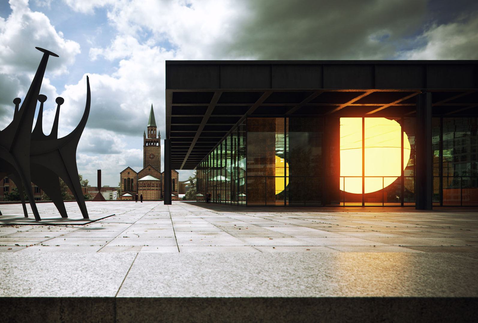
Bertrands attention to details is well known and keeps getting better seeing what he has done here attempting a full 3d modeled environment with an amazing texturing work, most evident in the staircase of the first image. His environment is utterly convincing and his work is perfect technical-wise.
The Weather Project concept was also a strong one, but what was badly missing in the final images were the people. The viewpoints selected are far from the exhibit, and the composition could have been worked a bit better with less vignetting shifting things too much towards the dark and gloomy side surrounding the sun. The connection between the display and those experiencing it, as evident in the Olafur Eliasson references is absent. and so is perhaps the connection to us while viewing the images, beyond the technical aspect of it.
Bertrand will get these prizes
- The New iPad.
- Maxwell Render LIFE TIME License.
- Designconnected 600 EURO Voucher.
- 3D World Magazine Yearly Subscription.
2nd Runner Up, Jamie Holmes
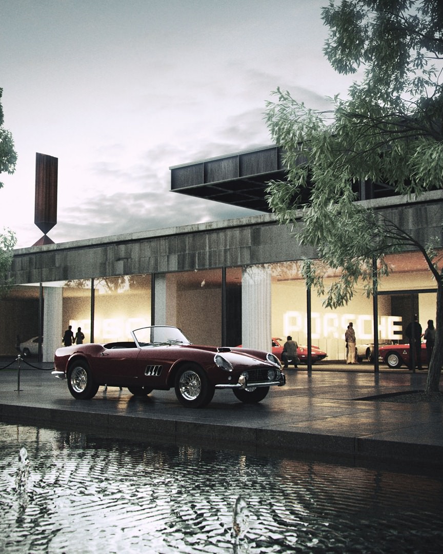
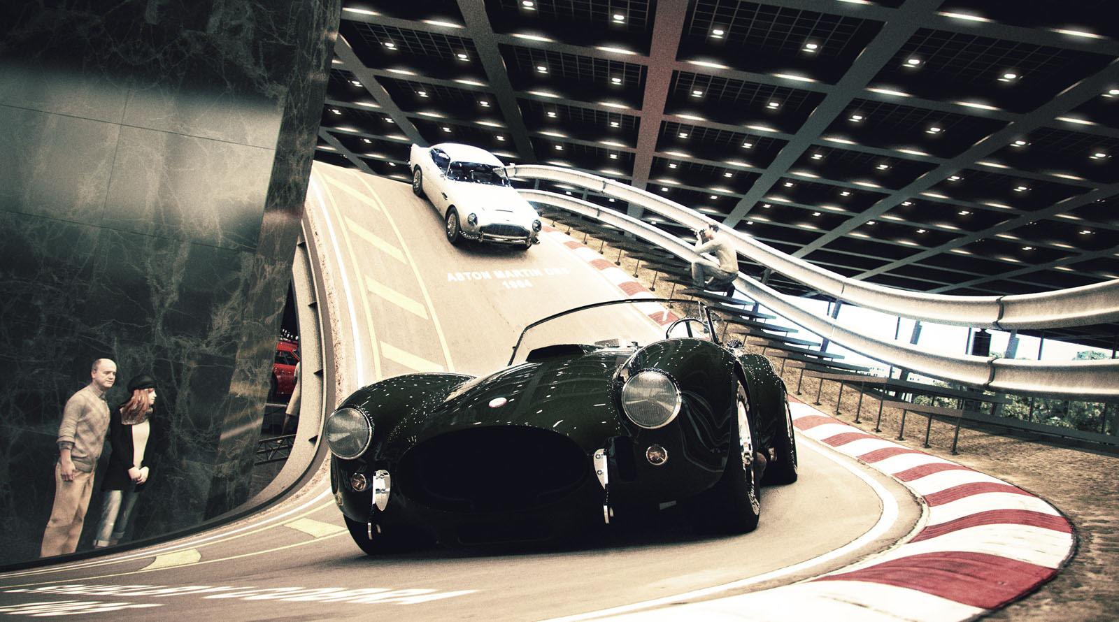
Jaime has put a lot of work into this, and it shows. Both in final and in his WIPs. He picked an unusual but very exciting idea for an exhibit and once the ignition keys were turned There was no looking back for Jaime. His dedication in getting the modeling, texturing, materials and lights just right and in tune with the motor world era he picked is admirable.
It was also nice to see the lower garden getting some love with Jamies first image which seems absolutely classy and perfect for his concept and for showcasing the NNG in action while the Track in the second image with the chosen composition, slightly overshadows the building.
Jaime will get these prizes
- Maxwell Render LIFE TIME License.
- Designconnected 600 EURO Voucher.
- 3D World Magazine Yearly Subscription.
Honorable Mentions.
Id like to mention two more challengers that took part in this challenge and hade great work submitted.
Each one of them will get a 3D World Magazine Yearly Subscription.
Guillermo M Leal LLaguno
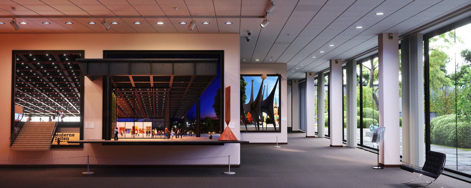
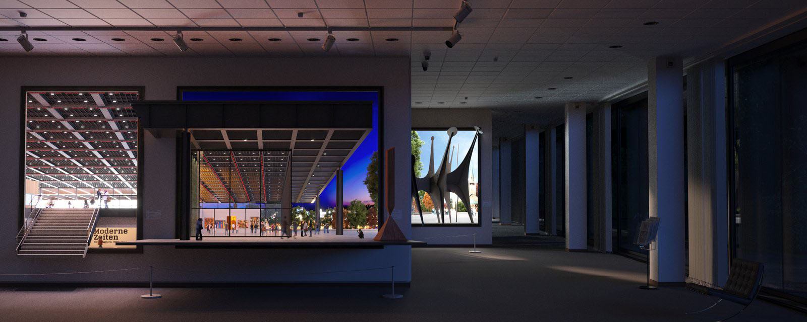
Guillermo is without a doubt, the challenger who took full advantage of what Maxwell Render has to offer. A sophisticated concept The Museum being its own exhibit showing the top floor pavilion in the lower gallery area by day and night at the same time! What might seem like a single viewpoint, is actually four of them.
While he does show people in the exhibit parts, I find them badly missing within the lower gallery itself
Check out the cool applet he made for play with the lights like you can in Maxwell Render Multilight. And also a short animation here too :
Dimitar Dimitrov
Both of Dimitars images are very powerful and emotive with a wonderful winter gloomy mood to them. There was just too much to be done on the technical side for this to rank higher.
That is all for this challenge. It was fun and I look forward to see how the Lumion version of it will end up
You can refresh your memory with all the finalists entries here – ‘The Museum’ / Maxwell Render Challenge 20 Finalists


Comments are closed.