Making of Ratatouille Kitchen
Ben Cooper is not the usual ArchVIZ suspect. Currently working at The Dreamvision Company / Character Matters studio as producer of a new short film using Lightwave as their core 3d application. He was part of the team that created the charming animated short Hooked, and it sure hooked me! Exploring Bens work has led me to his CGSociety lighting challenge entry, which is the subject of this article. Enjoy!
Author : Ben Cooper
Ben Cooper is a lighting artist, compositor and Lightwave 3d generalist. Hes been working in the animation industry for 8 years now and have worked on film and television projects through his career. He was recently part of a team that created the animated short film “Hooked”, for which he had done the lighting, shading and 90% of the compositing.
Hey all,
This image above, for which I did the lighting, shading, texturing and compositing, was created for the CGSociety Lighting Challenge #29 : “Tribute to Pixar”. The 3d model done by Sapna Mondol was provided on the challenge forum page by Dan Konieczka.
And here is the model inside Lightwave before I got started with all else…
I studied the provided set and chose an angle which appealed to me the most. The point of this lighting challenge was to capture the look and feel of the “Ratatouille” film by Pixar. I loved the feeling of warmth that the artists from Pixar captured in the look of the kitchen and did my best to replicate it.
I was very pleased with the result and my render was selected to be hosted in the online gallery for this challenge. It was a lot of fun observing how the film’s surfaces were treated and then replicating the look with my own pipeline.
I use Lightwave 3d as my lighting, shading, texturing and rendering solution. I love the look of an image that you can create with the Lightwave’s native renderer. I find the surfacing tools in Lightwave are very user-friendly and the real-time renderer, VPR, can make tedious time-consuming tasks an absolute breeze.
Lightwave’s Area lights are also a joy to work with, you can get accurate, beautiful shadows with a soft edge fall-off very quickly and it doesn’t affect the render time that much.
As a side note – the other great advantage of Lightwave is that, to my knowledge, if you own a license for one copy, you can have unlimited render node license use, which is an astronomical saving for any studio.
Lighting
When I start a light rig, the first thing I set up are my light sources and how they cast light into the environment that Im working on. So obviously the kitchen environment is an interior and this kitchen in particular is quite big, so there could very well be other lights outside of the shot that will affect it.
After receiving the grayscale model, I needed to do a bit of geometry cleanup on some objects that did not translate too well from Maya to Lightwave. Lightwave does not like polygons that have more than four edges (not quads), something that most Lightwave users are used to and it’s generally just neater to have quads when sending objects to external apps like ZBrush for example.
I decided to set up a lighting solution where I have the lights inside the oven canopies quite prominent, but also a gentle overall illumination achieved by an overhead area light and utilizing Monte Carlo Radiosity for the light bounce.
For animations I would usually use Final Gather, as it calculates faster than Monte Carlo, but Monte Carlo is more accurate, that’s why it takes longer.
Here are my settings use for the global illumination…
The purpose of the lighting challenge was to replicate the look of the Ratatouille film, so I would study my reference images and try to figure out how Pixar achieved the look they did.
When creating the shading setup for the floor, I knew that it was going to need to be reflective, but I wanted to stay away from that ray-traced crisp CG artificial look. I experimented getting the right amount of reflectivity that plays just right with the lighting and also the reflection blur settings, hitting the sweet spot to make the reflections appear more natural.
Materials
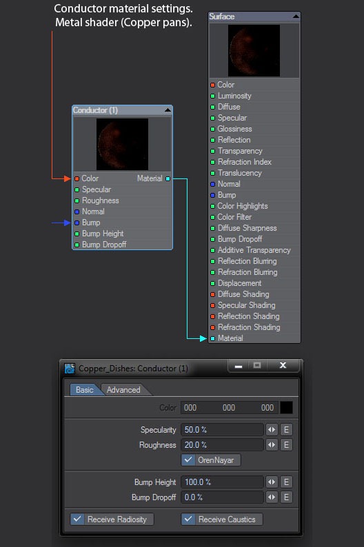
Here we have a screen grab of the Conductor Material. This shader is great for creating metal surfaces.
Once you get to used to setting up the shader, it’s pretty straightforward how to go about it and it makes sense. The two main settings in this shader are Specularity and Roughness. The more specular you make the shader, the more chrome like it becomes with more defined reflections and pronounced specular highlight. The rougher the shader is, the softer the edges of your specular highlight and if you enable the blur reflections setting in the shader and the more Roughness value you put in, the more blurry the reflection.
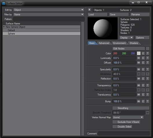
To set up a metal shader using the Conductor material, hit F5 to open the surface editor.
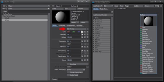
Then we click on the “Edit Nodes” button, which takes us to the Node Editor.
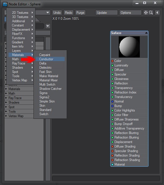
Now we click the “Add Node” Dropdown menu and navigate down towards the Materials tab, there we select the Conductor Material.
Now we connect the Material output of Conductor to the Material input of the Surface.This is obviously the surface that is applied to our object.
For this demonstration we will be adding the shader to a sphere.
If I do a render now, the shader is not behaving like metal yet, as we can see in the image below.
When we go back to the Node Editor, we double-click on the Conductor Material and it opens the settings that we will use to craft our metal.We can see here that the Specularity and Roughness values are sitting on 0%, which is why our shader is not behaving like metal yet. I usually start tweaking a metal around 60% specular and 10% roughness, these are values that I worked out for myself.
And here is the result of the settings
So currently our shader is not looking convincing. the next step we are going to take, is to add a reflection map to the shader.
In the settings of our shader, we click on the Advanced tab, which gives us our reflection settings.
“Mode” gives us a selection of what we want the shader to reflect, like: “Raytracing and Backdrop”, which is everything in the environment and the backdrop image. “Backdrop Only”, “Spherical Map” and “Raytracing and Spherical”.
I’m a big fan of “Raytracing and Spherical”, because a spherical map can definitely help to get a richer looking metal, but raytracing will still allow the actual environment to reflect on the surface. In the Ratatouille Kitchen, I didn’t have anything behind the camera, and that showed in the metal reflections. Upon application of a spherical map, the metals felt like they are sitting in a closed full environment.
For this demonstration we will add a spherical map as the reflection.First we select “Spherical Map” in the dropdown and then set up our reflection image.
So here’s a render of the metal with my default settings. From here, one can really start having fun with the different parameters and experiment until you are happy with your type of metal.
Here’s a render with 5% roughness, we see here that the reflection becomes somewhat clearer.
With this one, the base color of the shader had been changed to a more copper-type look.
Texturing
The texturing was done based on purely observing what textures had been established by Pixar in the film and replicating the look and feel. I used Photoshop for creating all the image maps used in the render.
One thing that I did find challenging was that the lights that I placed in my scene did a great job on the overall lighting, but I wasn’t happy with how they were affecting some of the shaders.
Some metals would still look quite dull because of the angle of the object not getting hit properly by the main lights. The problem was that there was a lack of specular highlight that needed to be addressed. I then added point lights and set them to only cast specular highlight and using Lightwave’s awesome VPR, I was able to place my specular lights and get real time feedback.
For this shot I have set up a camera with a 1280×720 resolution. I utilized the classic reconstruction filter with a 0.5 oversample sample setting, to give the frame a slightly softer appearance, which makes it look more filmic. Lightwave 11 shading sampling is also connected to the anti-aliasing, so to get a nice clean render I used 12x AA.
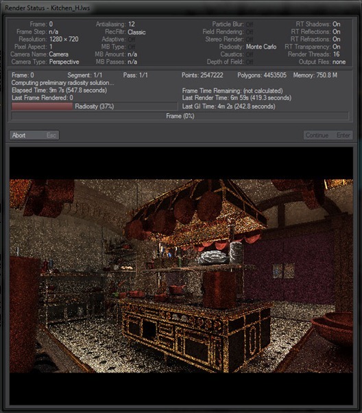
Upon rendering, if you have not cached your GI, Lightwave will first calculate the radiosity and then start with the actual render.
I am very fortunate to have a workstation at our studio that has 32 GB of RAM and a 16 thread processor, this obviously makes my test renders run nice and speedy. My boss, Chris Schoultz, allowed me to use my workstation for this lighting challenge, for which I am very grateful.
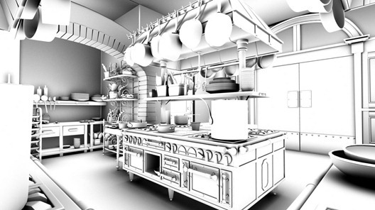
All my lights are set to use raytrace shadows, which make it accurate, but then the Area lights are scaled to get the non-cg shadow-look. I’ve setup my color layer and ambient occlusion layer in two separate scenes, for no particular reason, it was just the way i chose to go about it.
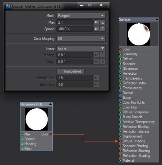
For my ambient occlusion pass, I used Lightwave’s Occlusion II shader. I chose to use a ranged setting of 2m’s for this image, it just felt right to me.
Compositing
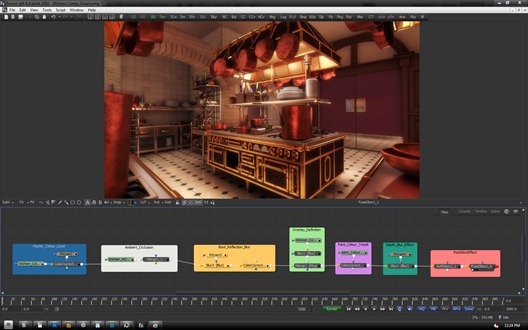
Below we have the composite of my image in Fusion 6.4. I enjoy organizing all my parts of the comp with the underlay tiles, it feels tidy and we have seen in the past when working with team mates that if it is set up in this way, it’s easy to get into someone else’s comp and understand what the person was doing. We had a colleague a while back who fell ill while we were on a job and I was able to jump in and cover for him with great ease, due to how we lay out our comps.
The Master Color section, is where I add the master color render pass. I have also added a color corrector to a small part of a bottle that was getting overly bright. Ambient Occlusion was then added, set to Multiply over the image at a level of 0.5. The bowl that we see camera-right had a very crisp reflection on the worktop that it is standing on, so I decided to blur the reflection in post using a mask with a soft edge added to a blur node.
Next, I added an overlay layer with a 0.3 level of opacity and blurred it a bit, just to enrich the color a bit more. The color of the copper utensils still didn’t feel right to me, so I decided to adjust it using a alpha mask and a color corrector to tweak it.
I had another commercial job starting and had to finish my image so that I could focus on the paying job, so I did a fake depth blur effect in post using a mask and blur node, a lot of care went into creating the mask, I kept experimenting until I found something that I felt happy with.
To achieve a filmic look, I added a combination of glow effects. The first is the Soft Glow node that focuses more around actual highlights, creating a glow effect where a surface has a specular highlight, or gets affected brightly by the light rig. The second glow effect was a FuseGlow node I added which was a softer overall glow effect that was added just to soften the overall image slightly.
And that is it!
Hit me with question in the comment section below, I’ll be happy to answer them the best I can.













Comments are closed.