Making of Mountain Meadow
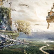
Dominic Maslik shared a beautiful matte painted image on the forums back in May that went under the radar. So to get proper attention I’m publishing today the making of Mountain meadow. Seeing what went on behind the scenes will hopefully spark some discussion and provide some well deserved attention to this piece. Enjoy!
Hello, everyone. First of all, I would like to thank Ronen and you, the blog readers, for the chance to talk about my work. Certainly, this is a new step up for me.
I would also like to thank the 3d artists who inspired me with their creativity to create the “Mountain meadow”.
The architectural part of the “Mountain meadow” was done by the architectural studio “Elforma” and I made the renders which will be discussed. I’ll try to talk about the stages of the work and techniques that I’ve used.
Thanks! and let’s start…
The Purpose
The purpose of the work was to make one quality image which will depict the house in a pure natural environment. I was given a free choice of landscape, weather and composition so for me it was the creativity in its purest form. I began this work with great enthusiasm.
Preparation
Firstly, I select some references which inspired and pointed me on the right path. They included details such as the weather, the landscape and the lightning. Then, for arranging, I did a collage of selected material. this helped me a lot in the work ahead. Special thanks to the people whose works are in this collage.
As the work was mostly made with matte-painting, I also had to pick up the pictures with various elements that motivate me and that I would use in order to further detail the work, such as bushes, trees, grass, rocks, animals or just beautiful elements.
So I formed a certain concept of how the end result should look like.
Modelling
Working on the 3D was about forming shapes, materials and lighting. I didn’t do the surrounding landscape because I was going to use matte-painting later. I needed a house with a good perspective with the right lighting. After a couple of tests I got the most interesting perspective with a good view of console above the entrance.
Lighting
The lightning test should give the main light source behind so the concrete wall would have beautiful reflections. I used an HDRI map from Viz-People. Slightly changing the angle, I found the necessary result.
The lighting in the house had to be soft and warm. Here it was important to create the impression of comfort in the house, which contrasts with the weather outside. For this I used the warm light coming from a V-Ray Sphere Light inside the house.
Camera Setup
Of course I used a V-Ray Physical Camera, adjusting ISO, shutter speed, and focal length for zoom.
Materials
Let us turn to material settings.
The main materials here are dark and light concrete plaster. These are the settings I used for them.
Rendering
I remind you that in order to render I only needed the house itself, the environment will be formed in Photoshop. So I got this unremarkable image…
Matte-Painting
Here the magic begins!
From selected pictures I have chosen one for the formation of a common background.
Using an eyedropper and brush tools, I toned the main background color.
Then foreground is formed. For this I use my selected images and correct their curves, color correction and saturation in order to get one color range. Curves + Color Balance + saturation + levels – this is a formula that I often stick initially. As you can see there is nothing complicated here. We should only remove the extra parts of the photo and use necessary to us.
Everything about the matte-painting part I formed in a time-lapse video.
The Fog
I would like to talk about how the important weather phenomenon of the image was formed – the fog.
To start with, I used the usual Brush Tool with transparency 9-20% for the formation of a rough mass of fog. Then, in small strokes, I smeared it with Smudge tools.
The next step was the motion blur action.
After small corrections with Brush Tool and motion blur I got the desired result.
Final Image
Some details
You can find this work on the forums here.
I thank Ronen once again for this opportunity to show stages of my work. This is a great invaluable experience for me. I hope this making-of was interesting and helpful in some ways.
Be creative, be inspired and make our world better!

Dominic Maslik 3d artist from Kiev, Ukraine. He is the co-founder of the project on architectural visualization Kutstone, which focuses on artistic presentation and individual stories in each image.


thanks ronen it`s awesome
Did he use SketchUp?
no, I use only 3ds max
I have a tutorial that I want to share how to upload my tutorials
This is so cool!
What was that tool you used when you were modifying the footpath?? It looks like a bunch of pins? What tool is that in Photoshop?
dude707lol 🙂