Making of Kitchen No. 1
Vicky Bedford’s Render vs. Photo / Kitchen No. 1 received great feedback back in October 2012 as well as awarding her Best Visualization of that Month. I never get tired of this real vs. cg game, and so I’m very happy that Vicky shares here more information about the making of this scene. Enjoy! (And keep sending me your own Render vs. Photo attempts!)
Author : Vicky Bedford
Vicky studied in spatial design/interior architecture and moved into a career in 3D shortly after leaving university. She has worked as a CGI artist for the last 9 years and set up Diffuse 3D – an architectural CGI studio based in Manchester with her business partner Matt in 2007. She originally started out using VectorWorks, Artlantis and Cinema4D and has been self-taught using 3D Studio Max and V-Ray for both 3dsmax and C4D.
Introduction
It has been a while since I posted the Kitchen No.1 and Ronen Bekerman very kindly asked me if I would do a ‘Making Of.’ I thank you Ronen for the opportunity…
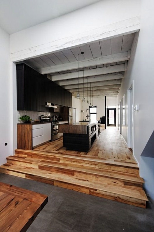
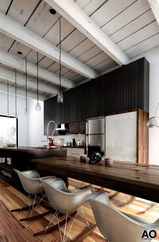
I first found the image of this kitchen on Pinterest and fell in love with the space. It’s everything I like in Interior Design. I decided to go about re-creating this image using 3dsmax and V-Ray, trying to make it as realistic as possible and one that I would be prepared to show online to other CGI artists.
I’ve never really been one for showcasing my work as I’m very critical of what I produce and, probably like most 3d artists, never end up happy with the finished piece…
Here is the original photograph from Pinterest
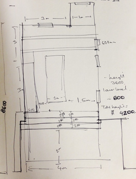
The first step was working out the dimensions of the space as I had no plans or elevations. I drew a very rough plan for the space and worked out the sizes of the furniture and walls based on a standard door being 900mm wide and then used the door in the scene as a marker something I can check all other things in relation to.
Modeling and Camera Matching
I modeled the basic shell of the space, the middle counter-top and then camera matched the view to the photograph. As I’m new to 3D Studio Max (I usually use Cinema4D with VRay) I wasn’t sure of the process of adding a background image within the scene for camera matching (I found a great tutorial that I followed on MintViz). After a bit of jigging around with the camera I had a close enough match.
Next, I completed the full model of the space (trying not to get too sidetracked with the lighting and materials at this stage which is usually tricky as it is the part that I love).
There is nothing very special with the modeling, so I won’t focus on this, even more so since I’m no expert in 3dsmax modeling too (yet). Some of the elements were taken from online sources such as the oven, the chairs, the skull and the Kitchen Aid mixer. They were all un-textured so I added my own textures and materials.
I added a huge window behind the camera location to allow lots of natural light to flood into the space as light casting from behind the camera is visible in the original photograph.
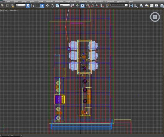
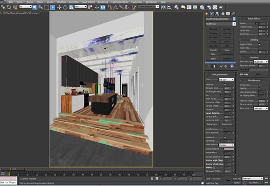
Here is an overview of the modeled scene…
Scene Setup and Lighting
I am a huge fan, as I’m sure many people are, Bertrand Benoits work and I take a lot of inspiration and techniques from his blog. The way he builds his materials, in particular, is a big help for me to see and a constant source of reference as is Peter Gunthrie’s Blog and of course This Blog Im writing for now!
For a long time (using V-Ray on C4D) I would light my scenes by adding my HDRI’s into the environment slot as it is quicker to render with no subdivisions to contend with. Being new to 3dsmax, I decide to follow in the footsteps of others in using the HDRI inside a V-Ray Dome Light.
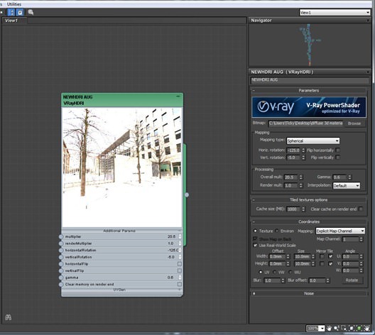
To avoid the grain I set the subdivisions to 40 in this scene and used the ‘Townhouses’ HDRI that Bertrand had very kindly given away in his free material scene. The Gamma is set to 0.6 to add more contrast into the scene. The Horizontal rotation is at -125 and I have changed the vertical rotation slightly by -5.
I usually keep rotating the Dome light in 10 degree increments, and test render until I find a location for the light that I am happy with.
The only other lighting in the scene are a few IES lights underneath the cupboards and beneath the hanging pendant lights.
When I started adding things to the scene, my idea of trying to copy the photography exactly started to go out of the window. I wanted to add my own touches to the space. I have a tendency to get bored with the scene after a while and start changing elements around. This is more apparent in the second view where my Skull obsession starts to creep into my work!
Here are the HDRI settings..
Physical Camera Settings
I use V-Ray Physical Cameras and try to keep as close to a real life camera set up as possible. For interiors I take the f-stop lower so that I can achieve a shallower depth of field. I have also started using Z-Depth instead of the depth of field for speed purposes, but it is really useful and produces great effects.
Materials and Textures
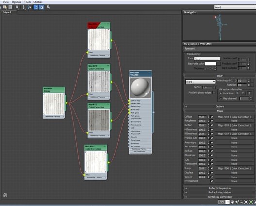
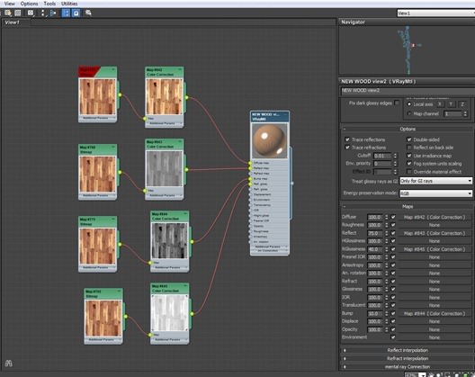
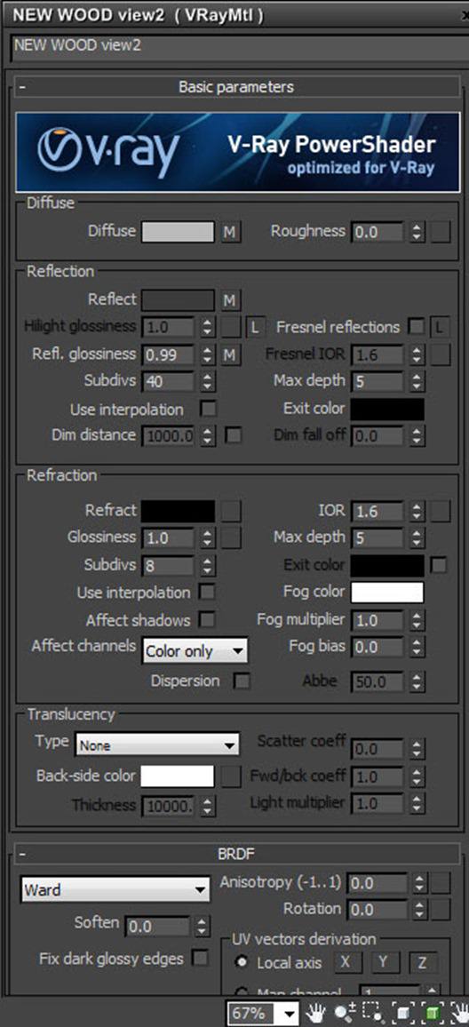
Most of the materials are built in a pretty straight forward way, the trickiest material was probably the floor (which could be much better) and the old wooden beams.
Here is the material set up for the beams..
The floor material…
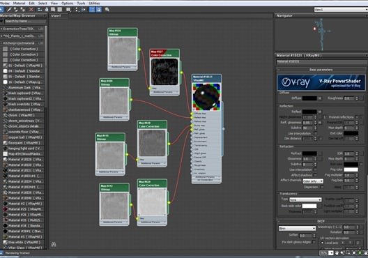
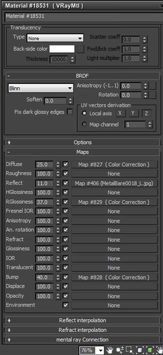
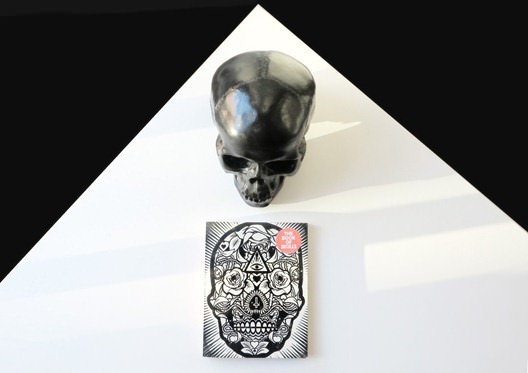
The skull material was based on a skull money-box that I have at home from urban outfitters so I studied the material and tried to match the same effects as in real life. Below is the material breakdown and a photo of the real skull.
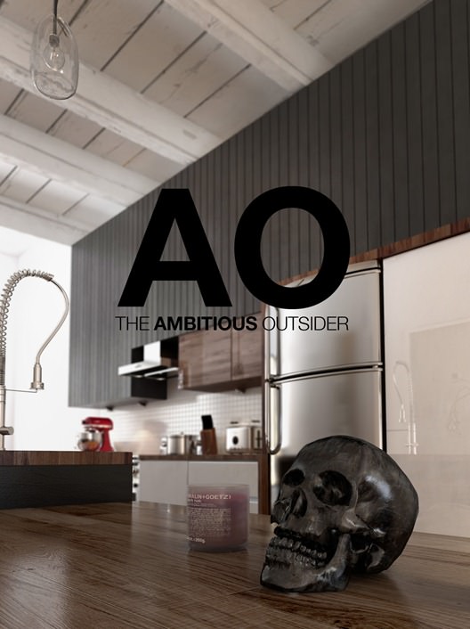
I’ve added below an additional close up image of the skull. The material has a few too many scratches and lines across it compared with the real thing (above). Also, I have just noticed that the skull is missing it’s top jaw! A bit odd and I can’t believe I didn’t notice until now!
Render Settings
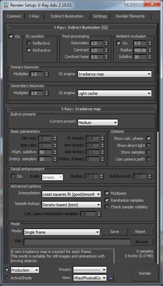
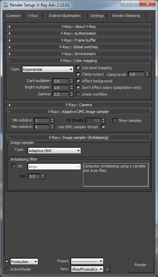
I use Linear Workflow, but don’t strictly follow it as I usually change my color mapping to exponential to help control any burning out that might occur (usually from taking my gamma settings in the HDRI too low).
I always use Irradiance Map and Light Cache as Brute Force is just too slow for me as I’m only using 12 cores on my machine.
Photoshop/Post Production
I experiment a lot in post production using Photoshop and sometimes Magic Bullet. For me, the post work is what turns an image from something good into something much more exciting.
Before using V-Ray, many years back, I had to rely on Photoshop so much more as the realism just wasn’t there. I would cut out and add photographs of real wine glasses or a pile of books and photos of plants as they just never looked believable in the software output.
Using V-Ray has changed my workflow and less Photoshop work was needed. Much more work goes into the modeling and texturing side of things now. However, I still think that without good Photoshop skills an image will be limited and I always like to try new techniques and add as much of a style as I can in Photoshop. For me personally it is still a very important part.
Here’s an animated GIF showing the process…
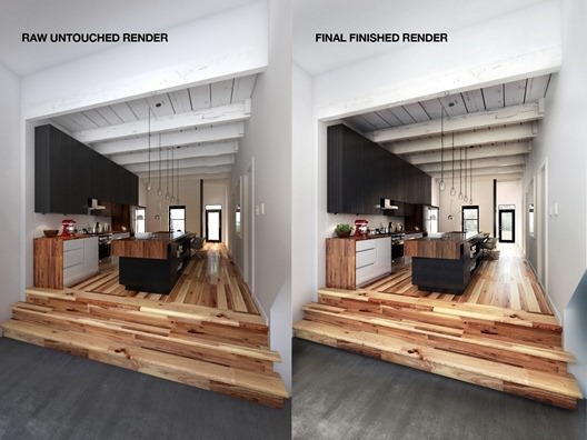
You can also see below (in the side by side image) that a lot of Photoshop work took place on the kitchen image, mainly tonal changes to try and mimic where light hadn’t managed to reach in the render. A lot of burning (on the beams) and dodging to try and add more effects and realism.
I added color tones (more yellow) to the underside of the beams to match more with the real photograph and a general brightness to the rear of the image that was missing in the render.
Well that’s about it I’ve probably missed lots off and waffled in areas that are unnecessary but thanks so much for taking the time to read and the lovely comments I’ve had. A huge thank you to Ronen once again for continuing to provide us with such a useful CGI community, a great source for inspiration and for featuring my images in the first place! It was a big surprise to me and has given me more confidence in my work… Thank you!
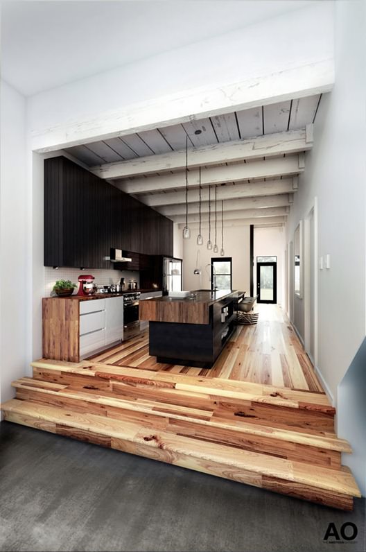
Once again here are the final images below.. Cheers Vicky 🙂


