Making of Esherick House, Part 2
Picking up where he left off in Part 1, Ludvík dives into materials setup in great detail in Part 2 of the Esherick House Making Of series. You’ll also find a nice little scene with some materials to play with inside. I initially thought of adding the Lighting section here too but both are too long and stand on their own anyway, so Lighting will be published in Part 3 shortly after.
 Author: Ludvík Koutný
Materials
Materials are probably one of the most important aspects of my work (that and the lighting), since everything you see is covered with them. First of all… when you use MR, it is crucial for you to only use up to date MR shaders. There are a lot of shaders MR supports, but only a few of them are MR ones, and only a few of those MR ones are up to date ones.
Overall, you should use only these 3 shaders:
- Arch&Design (mi) (A&D from now on).
- Car Paint.
- Up to date Fast SSS Skin + shader by Master Zap, at Zaps Mental Ray Tips.
Of these 3 shaders, A&D shaders are the ones youll use the most. Both the Car Paint and SSS have limited usage in an architectural visualization context.
Every single material in my scene is A&D. I strongly suggest you try to do the same thing. Any time you merge anything from any other scene, or get some scene from someone, and you are not sure that every material is A&D, just create some, and apply it to all merged objects. It is very important that you have no hostile materials in your scene like some V-Ray or Standard materials, otherwise you might end up with some inferior quality shading, artifacts, or worse.
A&D is sort of the equivalent of V-Ray Advanced Material. It is a single material, that you can create everything with it – wood, metal, glass, frosted glass, marble, grass, leaves and even some non-photo realistic materials.
I’ve provided a simple scene with a few material examples. You need at least 3ds Max 2012 to open it.
[wpsharely]
[/wpsharely]
A Few General Rules to Follow with A&D Materials
There are a lot of rules when using Arch&Design materials. I will try to write them down here:
1. Mind your diffuse values
You should never use diffuse color higher than 0.75 white, and darker than 0.04 black. This rule is generally useful for iRay, where it might speed up convergence a lot, but it does also a good job keeping materials realistic in MR. There are no super white or super dark materials in nature. Such as material that would absorb 100% light, or reflect 100% incoming light. Also, by not going under 0,04 black you might avoid some sampling problems. Same applies for diffuse maps.
2. Mind your reflective values
You should never use reflectivity larger than 0.75 unless there are some specific cases for it, such as mirror material, where you can use 0.9 for example.
3. You should always use BRDF by IOR
instead of manually setting facing and perpendicular reflectivity. This will ensure you will get realistic reflection falloff. Use for example 1.7 for plastic, 1.6 for ceramics, 1.8 for wood, 2 for concrete, 4-5 for aluminum, 20-30 for highly reflective metals such as chrome, even 40 for mirror.
4. Never ever use 0 as a value for glossiness
or dividing by zero can occur, which will make your renders take literally forever. Nor should you have any 100% black areas on your glossiness map. To prevent this, you can simply set RGB offset in Output rollout of bitmap node to something like 0.01.
5. Always use glossiness maps instead of reflectivity maps
In the real world, if you have for example wood plank, it has some variance of reflectivity. But that wood plank as a whole is made out of the same material – Wood. All the scratches and surface irregularities do not change the amount of material reflectivity, but only how wide is the direction which reflection is being scattered in. Use reflectivity maps only when you are sure what you are doing, such as multiple materials on one texture (Gaps between tiles for example).
6. ALWAYS, ALWAYS!!! Disable blur on your textures
I have no idea why it is 1.0 by default. Someone at Autodesk messed up miserably. Just right-click the spinner next to the 1.0 value, and it will set it to 0.01, which is minimal value. Make sure it is disabled (0.01) Especially on bump maps!!!
7. Be careful with glossy samples value
Generally, use 16 samples if you have glossiness at 0.6 – 1. 24 samples if glossiness is 0.4 0.6. 32 Samples if glossiness is under 0.4. Rarely you can use 48 samples in case of some metals with low glossiness, such as brushed steel, or very dark materials, such as black leather.
8. Avoid Fast Interpolate Option
since it likes to create artifacts. Sometimes you might use it, but only on materials that have no reflectivity/glossiness maps. I suggest you use it for example on black leather, which usually has very low diffuse and glossiness values. Leave grid density at ½, use 4 lookup points, enable high detail distance and set it to 100mm.
9. Use thin-walled option
If you want thin-walled glass, just check the thin-walled option on advanced rendering options rollout. This option is also necessary if you for example use translucency on objects like curtains, that are only single sided (one polygon thickness).
10. Translucency needs some amount of transparency to work
Weight parameter defines how much of transparency will be dedicated to translucency effect.
11. Use metal material checkbox when creating metals
This will use diffuse color as a reflection color. Avoid using it if your diffuse value is very low. Use it only for raw metals, not painted ones.
Alright, now to the materials of Esherick house 🙂
Wood
Here you can see the setup of the exterior wood.
I used a reflectivity map to give the reflections stronger contrast. I know I advised you against doing so above in this article, but Ive done it after a consideration that there will probably be layer of dust and dirt on top of the wood, which has lower reflectivity than wood coating. I also used glossiness map.
As I already mentioned, you do not need to have 30 different glossiness maps on your drive to change mapped glossiness. Just use RGB Level control in bitmaps Output rollout to control overall glossiness (sharp vs. blurry) and RGB offset to increase/decrease contrast of map. When you lower RGB offset to increase contrast, make sure RGB Level is high enough to avoid super black spots, that would then cause division by zero = very high render times.
I also used very dark contrasty map in A&D built-in AO feature. When you use the built-in AO, always make sure your ambient light is black. Shadow color can be whatever you want, in my case it is connected to a map. Darker shadow color = stronger AO effect. I also used a high radius to make the effect obvious. The map is used there to create more of a dirty corners effect than AO effect.
Use Color From Other Materials (Exact AO) feature is sort of local AO based brute force GI, it calculates color bleeding exactly, so it does not look like a fake, but takes considerably longer to render, so be careful with it and use it only when you know what you are doing. When you use this feature, always make sure Shadow color is set to 100% black.
When you want to use AO without Exact mode, as a detail enhancement, I suggest you use about 0.7 gray as shadow color, so the AO effect is soft, and does not break realism.
I asked my friend to make me a simple script, that would enable AO on all the scene objects for me. You can download it from the share box at the end of this part.
It applies on all the A&D materials that are on selected objects. So simply hit Ctrl+A once you have all materials finished, run the script, and hit OK. You can tweak the settings if you want, but those, that are there now by default, seem to work best… only as a slight detail enhancement to help FG, not as a strong obvious AO layer.
Also, make sure your scene is in correct scale. The radius is script is being set by system units, so in my case, when I use CM as system units, value of 50 means it will be 0.5 meters. You should adjust this value based on the system units you have set up.
The script is a macroscript, so put it in max root\UI\macroscripts folder. In Max, you will find it under Essentials category.
The floor material is done in a similar way. I have tweaked it to look as close to references as possible. You can see a gradual brightness difference of map. This ensure that once it gets mapped on tiles created by Floor Generator, tiles will have slightly randomized brightness.
You can map tiles very easily, by adding UWV unwrap modifier on generated floor mesh, opening unwrap window, selecting all the faces, and using Pack UVs feature. Then scaling all the faces in the unwrap window, to have correct mapping size and orientation.
This is the material that is on various interior objects. As you can see, the setup is very simple. Here, I used that above mentioned Exact AO feature, to get an exact indirect shadow detail.
Concrete and other hard Materials
The concrete setup is a bit more complex. Here, I wanted some extra Dirt definition, so I used AO map in diffuse slot, which offers more control than A&D detail enhancement AO. I used high AO distance and spread to make dirt in corners really obvious. I used dark, green tinted contrasty version of diffuse map in black AO slot to create some nice looking concrete stain effect.
As you can see, I used low reflection glossy samples for such a low glossiness value. Concrete is quite noisy, including bump map, so if you get a little more noisy result due to the low glossiness sampling, it really does not matter, because it gets lost in the noise from diffuse map, glossiness variance and bump mapping 🙂
As you can see, the stone map material is created in similar way. The map that is in bump map slot is instanced on displace modifier applied on the stone wall mesh, as i described above. No displacement used.
Here is material setup of a brick sidewalk. Same story 🙂
Ground Cover
Wooden chips ground material is made in similar way as concrete materials, but with one exception. Highlights+FG only reflection mode is used here. Displace + Bump + Glossy reflections + Very low glossiness would take a long time to render, so this feature speeds it up, with minimal quality difference. As I already mentioned, use this feature only on materials with very high variance and very low glossiness. Such as dark rubber, tree barks, dirt, soil, rough stones and rock, etc…
Same story with the soil material
Foliage
Pretty much all bark materials on trees bushes and shrubs have similar setup, with slight differences like in reflectivity, glossiness, etc. but in general, they are all nearly the same, as on in the following picture.
Leaf materials share the same philosophy. There is one basic material and all the other materials are then derived from it. Grass materials, Weed materials, Shrub leaf materials and Tree leaf materials are nearly the same with some slight deviations.
A few things to keep in mind when creating leaf material:
- Always use translucency. For translucency to work, a material needs to have some amount of transparency. 0.4-0.7 usually works, depends on leaf type.
- Always have translucency weight at 1, you do not want your leaves to be clearly transparent.
- Instance diffuse map to translucency color slot.
- DO USE glossiness maps. On my example, you can see I did not use glossiness map. I really regret it. If I did, my leaves would look a lot better with minimal render time addition.
- You can simply copy (not instance!) diffuse map to glossiness map slot, and adjust glossiness by tweaking RGB level in output. Glossiness slot does not read color data, so it does not matter if map is grayscale or colored. If you would have instanced the map from diffuse slot to glossiness slot instead of copying it, you would then adjust also diffuse map RGB level when adjusting glossiness one. You do not want to do that, so copy it.
- Always make sure you have thin-walled mode in advanced rendering options rollout checked on. You can easily spot it. Your shader ball is going to look weird and refracted unless you check thin-walled mode on.
- Always put opacity map in the Cutout map slot, not in transparency slot. This slot is located under bump map slot. Cutout maps must have Blur disabled (0.01) like other maps, to prevent bright blurry cutout edges.
- DO NOT USE bump maps on leaves… Bump maps + Glossy reflection + Transparency with Translucency + Dense leaf geometry = render time killer. Glossiness map should give you enough variance.
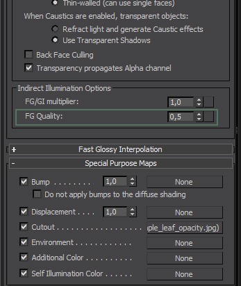
Also, when you have dense and geometrically uneven geometry, such as leaves and grass, you do not need too high FG sampling, because your eye wont be able to spot possible inconsistencies of indirect illumination in such a dense geometry. Thus there is this little feature in A&D shader, that lets you adjust FG quality per shader. On every leaf shader in my scene, I have set up FG quality to 50%, to speed up the FG calculation phase. The picture below shows, where you can find this feature.
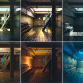
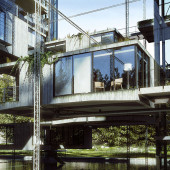
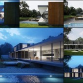
This would wrap up the description of about most important materials. Here are a few renders of finished materials I made during the creation process.
This interior render is a bit noisy, because it was previewed with the iRay renderer, which uses A&D shader too (it is basically a rendering mode of MR).
Thanks for reading this far!
And Ill see you in Making of Esherick House, Part 3 Lighting.













Hi Ludvík,
First of all, congratulations for the excellent work.
In my opinion you have created some of the finest archviz images of that style. Specially your shaders have caught my attention.
I would like to see more archviz work of that level of quality done with Mental Ray.
Can you share your opinion about using iray and how it helps to speed up the production with us? Also I would like to know about the rendertimes you got with your final exterior and interior renderings/size in pixels…Keep up the excellent work!
Cheers,
Christian Miranda
@ChristianMiranda Hey,
iRay has a lot of limitations. It does not speed up anything. It is unbiased renderer like any other (Maxwell, Fryrender, Indigo, etc…) but with benefit of possible (although not necessary) GPU acceleration, very easy setup, and usage of same A&D shader as MR uses. It does not at the moment support for example instancing, motion blur, ambient occlussion, many procedural maps, camera clipping, disabling of visual components (reflections, refractions, shadows). But still might be quite efficient and provide you with great results, if you have a f*****g gold mine to sell and buy a bunch of tesla GPUs 😉
Final output frames were 1920×1080, and average rendertime was 8 hours on a single shot. I could push it down to 4, without minimal quality difference, but since it was a personal project, i did not care about a deadline, and went only for high quality without severe optimization.
great!! I’ve to work it out…really good job, and as the last time: i can’t wait for the next part of your tutorialgreets from berlin, thomas
Wow I was impressed by your images first time I saw them, but it’s only when looking at this article that I really realize how awesome your shaders are ! The wood ones in particular leave speechless !
Thanks for your articles !
I must be the only person on earth using maya and mental ray for arch viz… Nevertheless this is a fantastic tutorial that will surely become part of my reference sheets whenever I’m working on renders. I have enjoyed the simplicity of the A&D materials in the past but have not yet achieved the level of realism that you’ve show here… remarkable. Really appreciate your insight into the calculations that drive the renders and the general rules to follow it goes to 11.
awesome work dude !!! great summery of A&D material settings !! Thousand thanks for sharing this information 🙂
??
awesome work dude !!! great summery of A&D material settings !! Thousand thanks for sharing this information 🙂 @ paulpriv: you are not alone with Maya 🙂 I am working in the automotive visualisation industrie and we are using Maya, mental ray + vray. For private architectural visualizations projects I am using Maya too. I am very jealous about tools like MulitScatter for 3ds Max.
awesome work dude !!! great summery of A&D material settings !! Thousand thanks for sharing this information 🙂 @ paulpriv: you are not alone with Maya 🙂 I am working in the automotive visualization industry and we are using Maya, mental ray + Vray. For private architectural visualizations projects I am using Maya too. I am very jealous about tools like MulitScatter for 3ds Max. That is really a pain in the a… in Maya.
@FlorianDubiel You should have PaintFX, which Alessandro Prodan used in Maya when creating his Farnsworth house using MR 😉
http://www.evermotion.org/vbulletin/showthread.php?t=73894
I have poured over those images by Proden many times over the past few years, it remains some of the finest arch work I’ve ever seen in MR. lots of the text from that thread of comments is in my rendering reference sheets. I use PaintFX for grass but its such a nightmare… I agree w/ Florian Multiscatter looks so much easier to use ( I just want to scatter about some qlty trees that i have in my library it shouldn’t be so hard) Ronan how about getting Prodan to do a paintFX tutorial for us!!!
Hi, this is an awesome breakdown of your work. Valuable in many ways.
I enjoyed mostly your list of tips for the use of A&D materials, and I was wondering if the same general tips are to be applied (where possible) for vray material settings. What would you say about it?
Nice work!
@miki3d Not going over 0,75 white (in vray i would say about 220 white) and under 0,04 (in Vray 8), because Vray uses 0-255 range might give you slightly more realistic color range.
Using mostly glossiness maps instead reflectivity maps should apply too.
And for BRDF by IOR in Vray material, you just check on “Fresnel reflections” checkbox, or something like that.
Rest are pretty much tips to avoid sampling problems, but Vray has a lot better DMC AA sampler, so it does not apply there 🙂
One of the most detailed break-downs ever posted ! Makes me even want to try MR again :- )Diky a tesim sa na Lightning
?Hi Ludvík, will you prepare a 3rd part? lighting rendering 🙂
@FlorianDubiel Yep, he id – and it is going live today very soon 😉
On point 2 of your A&D tips you say
‘You should never use reflectivity larger than 0.75 unless there are some specific cases for it, such as mirror material, where you can use 0.9 for example.’
I assume you mean for BRDF 0 degree reflection? as many surfaces will become almost 100 percent reflective at extreme glancing angles (BRDF 90 degree).
Thanks.
Lee.
@Wizlon No, as i said, you should avoid manually changing 0 and 90 degree reflectivity, and set it to BRDF by IOR, so reflectivity falloff gets derived from IOR value of your material. By reflectivity not larger than 0,75 i was referring to reflectivity parameter in reflection parameters of A&D material.
@Wizlon Glass is one of the exceptions, where you can use higher value. You can download my sample scene and look at how glass is set up. Reflectivity is all the way at 1.
OK. I understand using the IOR to drive the BRDF curve, but if you take glass as an example, this will become practically 100% reflective at extreme glancing angles as will many other materials (to a degree) by limiting the upper level of your reflection to 75 percent, will give less physically accurate results? should you let the A&D materials own energy conservation balance the upper limit of your reflection and keep your reflection at values closer to 100 percent?
Thanks for disscussing this.
Lee.
PS. thank you for the tutorials. The images are stunning.
Exactly, this what I learn form the fxphd class with Master Zap as well. Perhaps 0.75 is the trick 😉 Have you ever compared vray and mental ray and the IOR values? Even with the same value, let’s say 1.6 the fresnel looks different between the two render engines. In mental ray one can use 25 or higher for metal reflections, this is not working in vray I would say.
@Wizlon
@FlorianDubiel http://refractiveindex.info/?group=METALS&material=Chromium
I don’t understand mentalray’s IOR units – metals going up into the 30’s and 40’s seems far to high. Chromium is around 3.6. This is the value I get in Maxwell as well. However in mentalray I have to use such high numbers?
http://mentalraytips.blogspot.com/2007/10/making-better-metal-with-miamaterial.html @Wizlon
@FlorianDubiel I understand how the A&D material works and how to use it. but the units seem arbitrary don’t you think? especially when using an IOR for metals at 50! as opposed to real world values like 3.6. Maxwell will use 1.5 for glass and 3.2 for chrome, these values are more understandable and realistic.
In mentalray we use a value of 1.5 for glass and then 50 for chrome? why? I think I need to ask Zap.
I know what you mean. I thought they are all based on the same formula of Fresnel, hm. In Vray a IOR of 3 is almost as reflective as 25 or so in mr. indeed strange. I would also like to know the explanation.. @Wizlon
Hello there. Great images, tnks for sharing 🙂
About fresnel…
Only use it in non-metal materials, for metals use the 0/90 reflectivity control and the brdf curve… that way you can aproximate more the complex refraction index of a metal, since non-metals have a simple IOR.
Use refractiveindex.info to calculate the IOR and K of each wavelength and the aproximate it with the “0/90 brdf curve control”.
Anyways, in the end of the day will not matter that much, but that’s more correct for sure.
http://en.wikipedia.org/wiki/Schlick's_approximation
Anyone finding these reflectivity values much too high for mental ray w/ in maya? (i’m building some leaf textures) close ups of the leaves have lots of sky reflection off the leaf; especially at glancing angles. The value of 0.35 suggested here looks better to me at 0.035? An I missing something…?
hello, good tutorial
where is the AO script?