Making of Baltic Sea House Grass and Sand
There is no shortage in 3D Grass or Sand making how to articles, and a few been published on this blog in the past. Such was Javier Pintor’s Procedural VRay Sand approach and Sascha Henrichs 3D Sand Dunes modeling approach. This time, Piotr Wolowski offers his approach to this subject by letting us into his personal project – Baltic Sea House, created specifically us a study in recreating the look and feel of a typical Baltic Sea nature surrounding a private residence. Sand & Grass being a main feature here… Enjoy!
Author : Piotr Wolowski
Piotr Wo?owski studied architecture at the Wroc?aw University of Technology and as a student worked part-time gaining experience in creating exterior and interior spaces in films and visualisations. He designs 3d environments paying special attention to creating the right atmosphere in Escalight productions. His interests in design and fine arts, awareness of market changeability keep him up to date and well informed about all the latest technology and software as well as trends.
Introduction
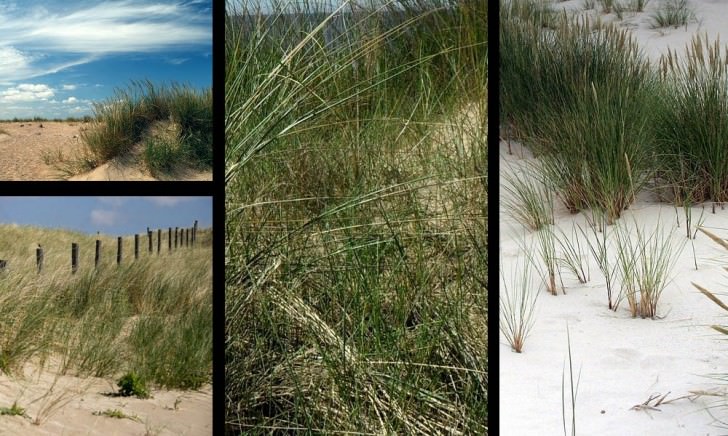
In this project, my goal was to create a study of the Baltic Sea nature near a private residence. Despite placing the building in the center of image, it was only an excuse for showcasing the specific Baltic seashore environment.
In my first ‘making of’ I focused on creating randomized grass and working with displacement to get realistic looking sand.
Non-commercial work is a lot of fun, so it was also a great opportunity to get away
from regular visualization projects and play with my own ideas and inspirations.
Modeling 3D Grass
To make believable looking grass, I needed to create a few different clumps, each composed of different sized and shaped blades, with randomized materials.
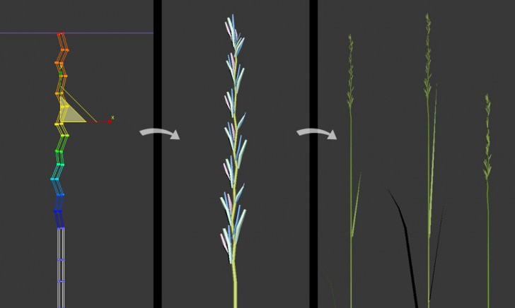
I started from modeling blades with tops. If you have 16 Gb of RAM, or more, it isn’t very important to decrease memory consumption and create very low poly model, as long as you’re going to use VRay proxies and a scattering plug-in such as MultiScatter that I used in this case.
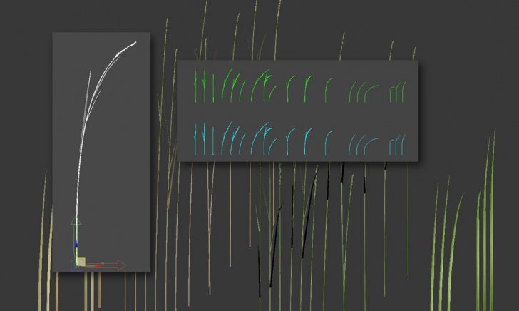
Having created blades of grass, I added height segments using edit poly and swift loop to allow grass bend on the wind. Next, I worked a bit with scaling, bend and FFD modifiers, and got nearly twenty different shaped blades of grass.
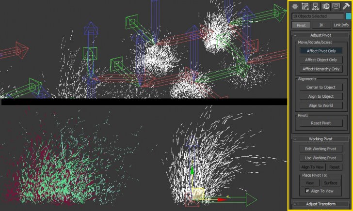
For further work with the MultiScatter plug-in, it is important, to place pivot of each stalk properly, and the same axis of alignment.
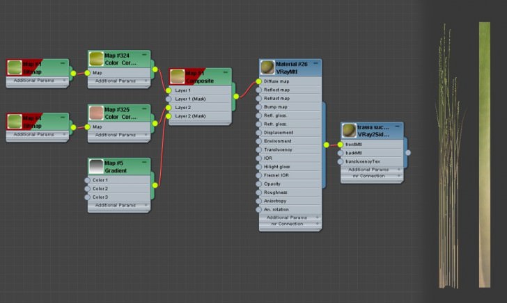
Thanks to Peter Guthries great grass tutorial, I didn’t have to deal with creating a new material, just followed a tried & true recipe.
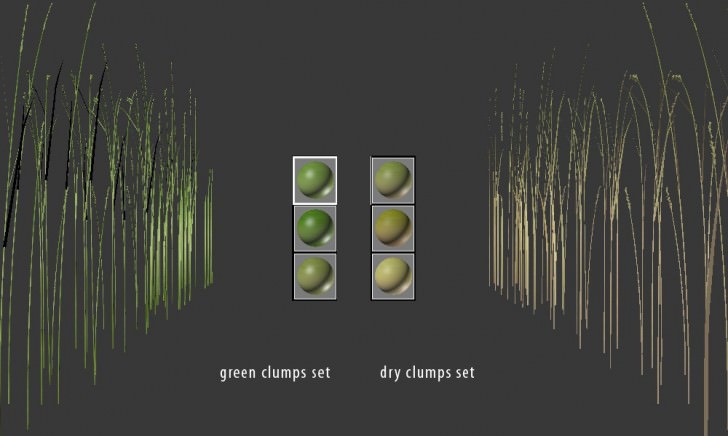
I wanted to have clumps of green and dry grass in scene. Two sets of materials, each of which consisted of three slightly different colors, did the trick.
To get more realistic effect, I mixed a yellow and green diffuse map in dry grass, using procedural gradient map as mask
Creating 3D Grass Clumps
Here comes the fun part!
Preparing over twenty unique realistic looking clumps of grass took me less than half an hour.
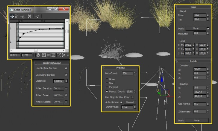
Thanks to the MultiScatter plug-in, the work was really fast and straight forward. First I created a few different shaped bases but it turned out that using only one of them was enough to get random effects.
In the preview rollout I ticked the point cloud preview option, so I could see the real-time effects while changing any settings.
TIP : Points type of preview depends on how close you look at the object in viewport. The closer you move the camera, the better the preview becomes.
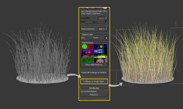
Once I had made a clump of grass, I exported it to a 3d object using collapse to single mesh button, and made another one, changing the rotate and scale settings a bit, the border behavior graph, and modifying the list of objects to scatter.
The idea was to get a slight wind effect in the scene and thats why the prepared blades of grass were bent in one direction. As a result it was easy to control ‘wind’ during work with MultiScatter.
When I was changing the rotation settings, I used smaller values for random control, and higher for constant rotation.
After producing a needed amount of grass clumps I’ve exported them to VRay mesh, and placed the pivot at the bottom of each proxy separately.
Creating Sand Displacement Texture Maps
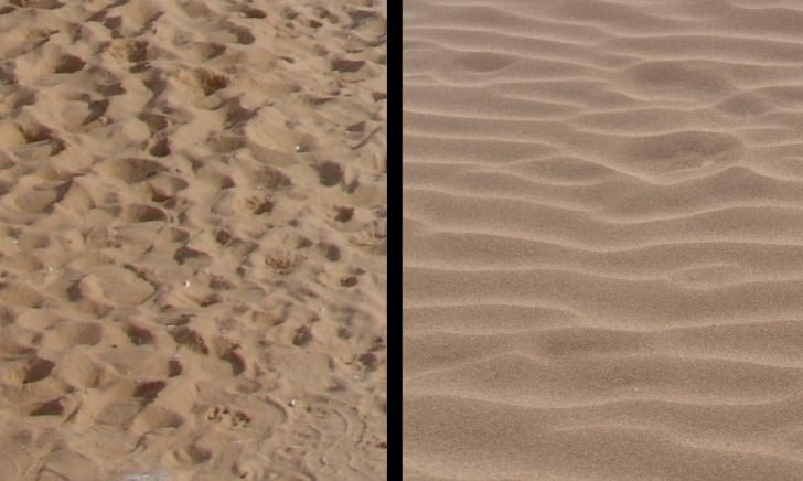
I prepared two sand displacement maps for this scene. Closer to the camera the sand is smoothed by the wind, and deeper in view, there is a path between dunes, where the wind isn’t so strong and as a result the sand surface still has footsteps.
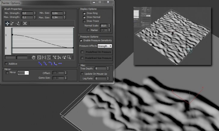
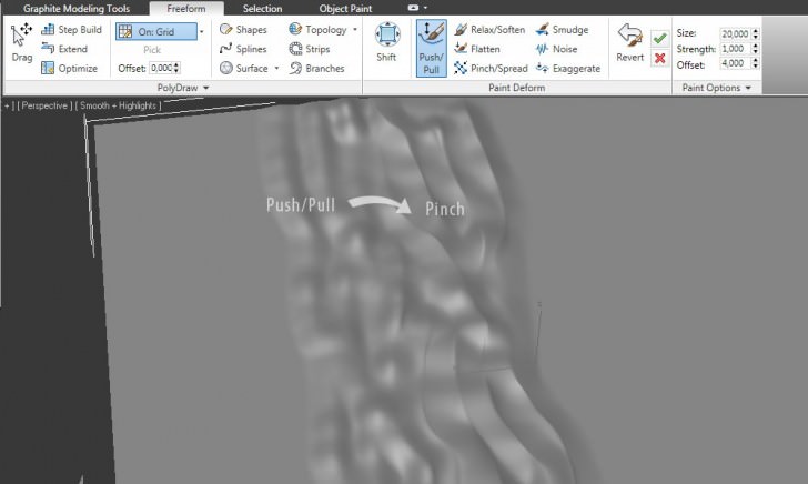
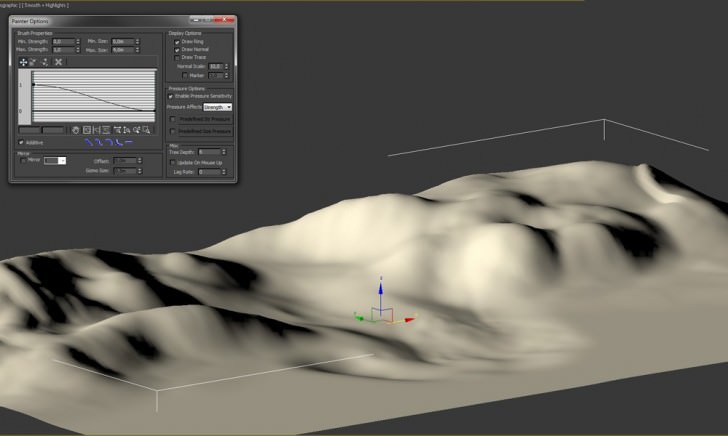
To get started, I created a plane with 200×200 segments. After converting the plane to editable poly I began to modify it using paint tools. There are two ways to access this function in 3d studio One in edit poly rollout on the main panel and the other in the free-form tab on the ribbon.
For bumpy sand I used only push/pull option.
Creating wind-smoothed sand needed a bit more precise painting and using pinch brush to sharpen the edges.
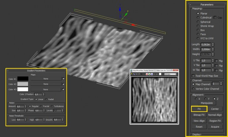
To create displacement map from a 3d object, I used a gradient map for the plane and set UVW Mapping modifier to planar which I placed in such a way that ‘valleys’ were black, and the higher areas white. Rotating gizmo by 90 degrees, and using fit button was the fastest way to get the effect.
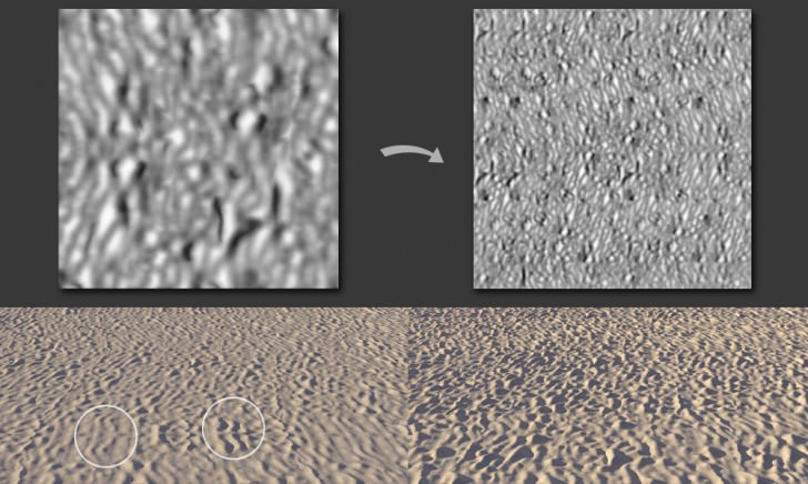
Here are test renders made using the prepared maps. The first one wasn’t perfect so it needed some work in Photoshop with clone stamp. I also multiplied the area and worked on the edges of texture to get rid of any tile effect.
Mapping the Sand
To create the main object for sand, I also used paint effect. I find it the easiest and fastest way, to generate realistic looking terrain in my scenes.
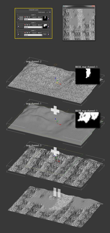
Before applying the VRayDisplacement modifier to my newly created sand plane, I opened the material editor, and created a composite map. I used three layers one for sand bump, second for slightly smoothed sand and the last one for completely flat sand.
To control the visibility of each material I prepared two masks in Photoshop. Using three different map channels, and applying three different UVW Map modifiers (each for one channel), I got a desired displacement map.
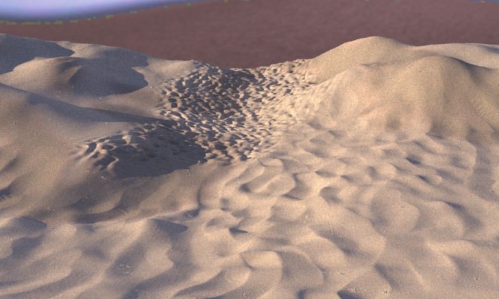
the test render seems to look good, the very strong border between the flat and bumped surface will be covered by grass.
The Sand Material
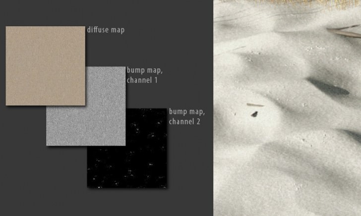
The sand material is very simple. I filled in only the diffuse and bump map slots, leaving the reflection slot empty. Sometimes I use a slight reflection or specular even on rough surfaces but in this case I wanted to make the sand look very soft and fine-grained.
The bump map is composed of a very dense tiled sand texture and a texture simulating clods made by single water drops.
Scattering the 3D Grass
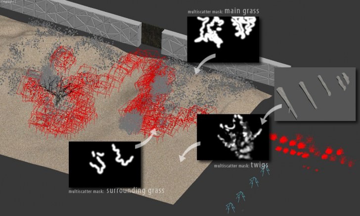
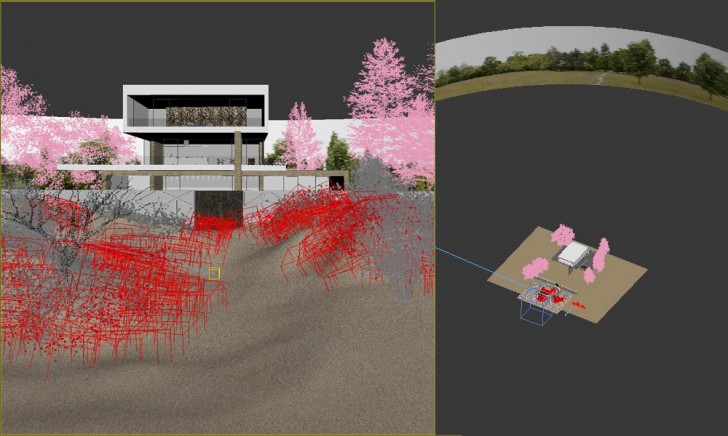
The second time I used the MultiScatter plug-in in this scene was to scatter the grass clumps on sand.
I wanted the grass to appear only on dunes in order to create a closed composition and and thus make the observer look at the center of the image. This time I used masks prepared earlier for the displacement map for MultiScatter masks. It needed some modifications and creating an additional map for smaller grass because border behavior in the MultiScatter plug-in doesn’t work with masks. It gave me an opportunity to prepare some new grass clumps, less dense and with smaller blades.
To make the place look more like a Baltic Sea beach, I also added some dry twigs thrown out from the sea, and scattered them using a mask. The problem was to set a good Z axis value in the move rollout as the elements are very small and displacement changes the sand plane geometry in such a way that it cant be seen in the viewport.
3D Tree Modeling
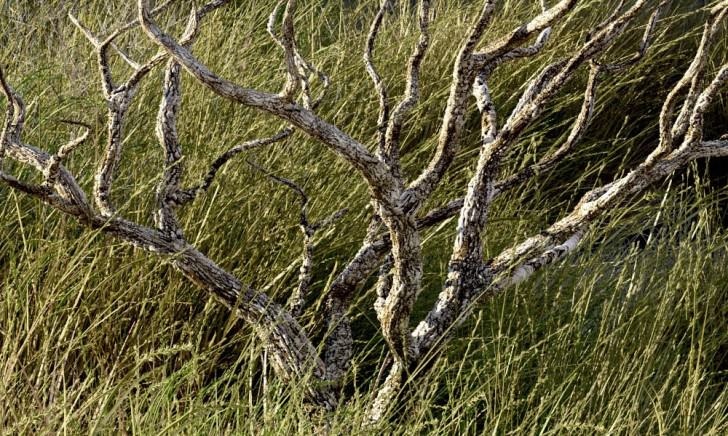
On the left side of the image I decided to add an accent, putting a small dry tree.
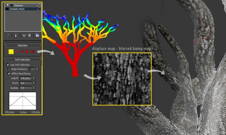
I wanted to have much more detailed geometry of bark than it is needed when we place the tree far from the camera. I used an Evermotion tree, removed the leaves, and increased the density of mesh, applying a Mesh Smooth modifier to it.
Adding three iterations and converting the tree to editable mesh gave a high-poly object ready to use with a classic displace modifier. The model had its original UV coordinates, so I could use the same map which was used for bump in the trunk material. The only problem to solve was the same amount of surface shift on the thicker trunk, and thin branches, which produced an unnatural effect. I simply used soft selection in edit mesh, to ‘show’ the displace modifier the amount of shifting tree geometry in different areas.
The House and Scene Setup
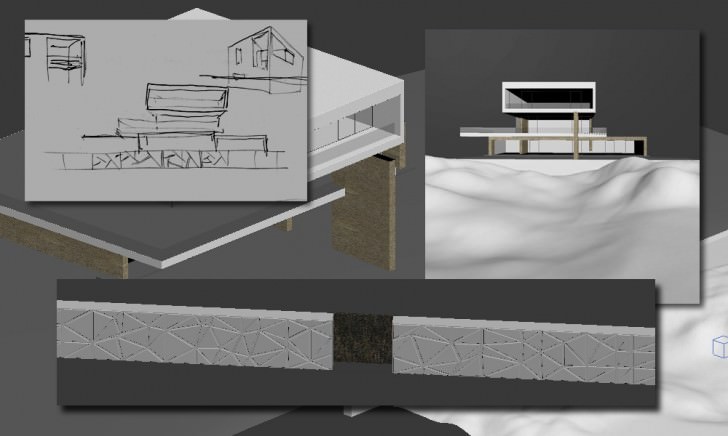
The building used in this scene was a simple design, made for this project. Fast modeling, and simple materials. An important thing was to assign a dark material for the terrace; it helped to avoid a very strong GI reflection on white surfaces of the building.
Before I started rendering, I had added some trees and added an horizon element with the opacity map which I had made some time ago for commercial projects. It improves rendering time and looks very good.
Lighting setup used an HDRI for environment light and slightly yellow colored direct light for the sun.
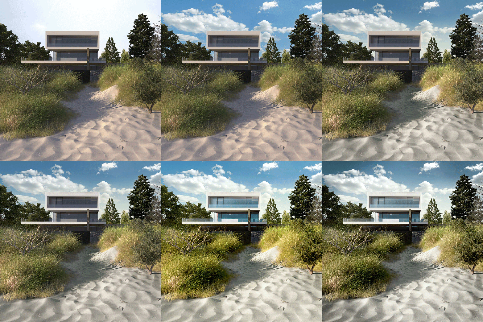
I worked with gamma 2.2 color mapping; it gave me a lighter image with less contrast. It is easy to make the image darker, and increase contrast during the post production. On the other hand, lightening of too dark and strongly contrasted images is very hard and sometimes impossible.
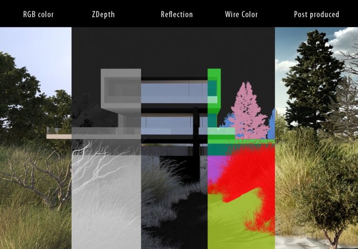
For the post production I used my standard render elements set.
And here is an animated GIF sequence showcasing the stages of post-production (click the image below to see the sequence).
I hope you find this short making-of helpful. It’s hard to write something new about 3d graphic these days 🙂



Fantastic work!
Great read thanks.
Great read Piotr, thanks. Possibility you could share the clump of grass or blade? (pamana@gmail.com).
Best ground details trick i’ve seen)))
great tip on the displacement of the tree! I´ve struggled with this problem before and didn´t come up with a solution….
Amazing work! Thanks for sharing the way you mapped the sand!
Wonderfull !!
can u please write thing like curves adjustment ,levels adjustment, hue saturation adjustment etc on each process of your GIF image for post production. its hard to understand what adjustment r u using in each step.
Thanks for an awesome tutorial
@itschriswebb @ronenbekerman Great making off! Such good work on the foreground!
Thanks for all comments! – 3dsmaxed: I believe, that writing exact values for color adjustments won’t help much, they are individual for each project. The trick is to apply them to separate areas, using well prepared masks.
it’s one of most beautiful images i’ve seen over here; just because the 3d work on sand and grass was accurate and perfect; on present times the post procesing and the over photoshoped elements make architectural visualization more dramatic, but less accurates than 3d one.
on the other hand I must be critic on the over work (perfect over work) on the environment having left the building on a second plane decreasing the quality of the overall image, and making the effort from that environment not so ‘profitable’ (idk other word) at the end.
thanks for sharing, I’m looking forward to apply this
What kind of voodoo magic do you do on the grass in the last gif?
I keep getting grass like in the original rendering and have no idea how to improve it. Yours is sharper, more contrasty, but is it just that?
>JorgeERoa: Nice to hear, you like the image : ) About the house, you’re completely right, I wish I had more time, to improve the architecture – I think it would take another two days of work, but would be worth it.>DushanBoshnyak: I used only ‘levels’ and ‘hue/saturation’ adjustments on the grass, and at the end, globally on whole image ‘color balance’.
Nice, thank You!
so realistic lighting and material, can you share me the sand displacement map!