Black Living by blackhaus
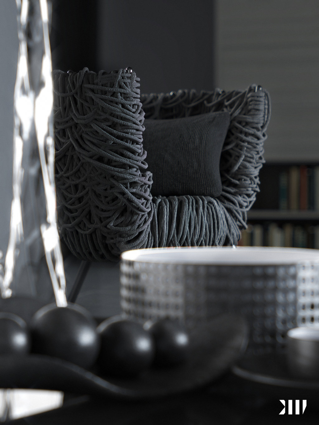
blackhaus shared their latest Black Living Set scene images on the forums, and although it is black by black, it sure did light up the day! Great attention to details here… superb materials & lighting. And you got to love that Campana Vermelha Armchair by Fernando and Humberto.
Searching for that chair I just realized it is from DesignConnected !! That’s a time saver (Direct link to the Vermelha Chair). It seems that the real one comes only in red, is that really so? would love to feel how it is to seat on and get it in black.
Here are blackhauss images that they made in this set.
Check out blackhauss forum thread too Black Living Set by blackhaus


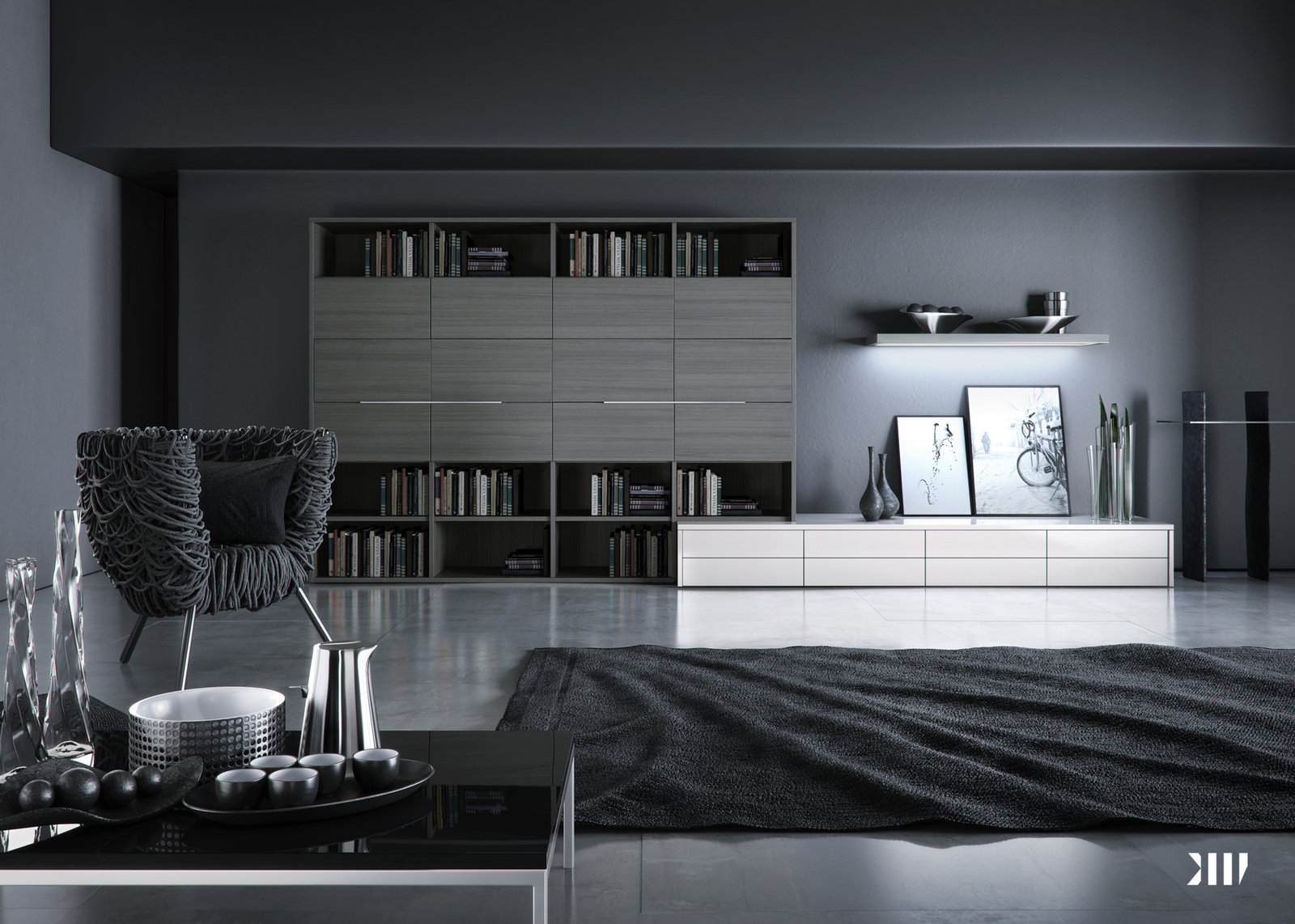
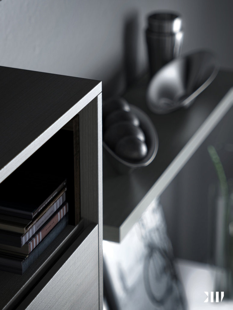
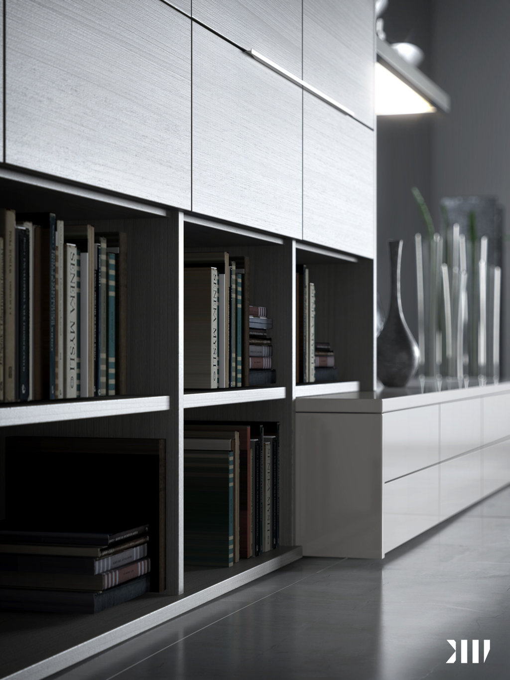
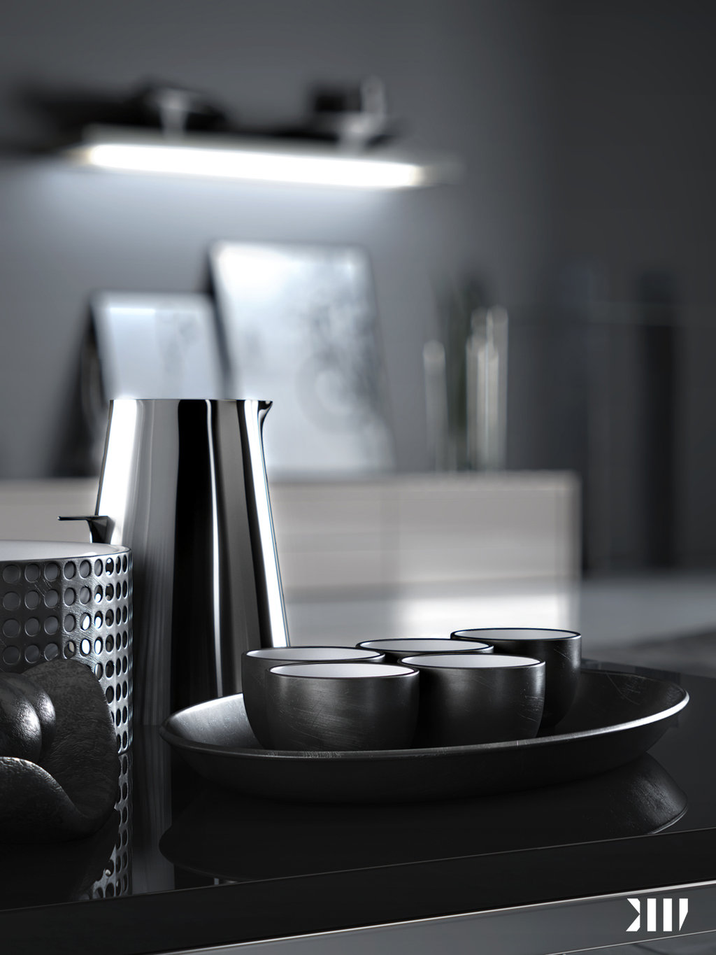
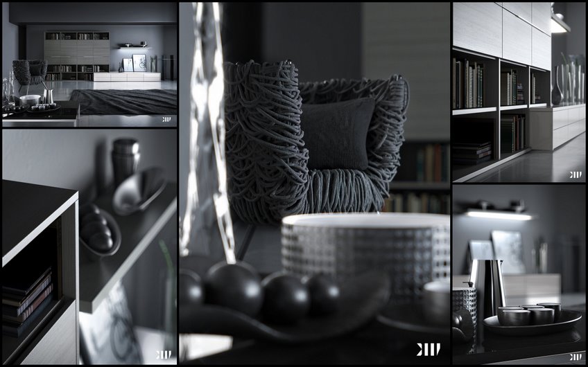

Those are renders haha. Incredible. Exactly the style I love.
Love the mood 🙂 Congratulations Fernando!
Thnks Guys.
Yes Ronen, the Chair is from DC ( Really great model). This beautiful piece of design is produced by irmaos campana you can see more on their site http://www.campanas.com.br/ , Unfortunately the chair came just in RED, but to our needs we transpose it to a black version ( i’d love to have at the studio this chair). Thanks again for the spotlight in your website! and thanks all the guys for the comments.
@FernandoGasperin Sure thing… I like your work, so keep them coming on the forums 😉
I like the soft lighting, it adds a lot to the mood.
Also, I like the attention to detailss, such as chamfered edges.
I really like this… dark modern design and lighting is spot on..
wow gr8
Superb render. Very clean, soft lighting. The dark desing works surprisingly well. How much post work was involved, if any?
@AmerG Thanks AmerG. There are feel steps I made at the post production to enhance the image quality, such as adj.Light, adj.Color, sooner as possible I’ll make a making of entire set. Thnks Dude!
Black is the new white in interior design. I’d like to see a trend where “Everything White & Bright” dies. And Black takes over.
@MikeDugenioHansen I’m a big fan of the “White Supremacy” style in design… but much like in visualization – Going mostly black, allows for some pretty cool lighting to be done 😉
@ronenbekerman@MikeDugenioHansen Hehe Very good this kind of discussion taste hehe. I have to agree that I like a lot of the White Pallet into interior design. like JM architecture make it into their design, it’s fabulous, But in black , in my opinion, You have a so nice luxurious and sophisticated mood at the scene, that the image gets the benefit of it, either way both pallet color to me are pretty cool.
@FernandoGasperin@ronenbekerman@MikeDugenioHansen
According to trend, minimalism, a popular thing in both interior design and architecture, has always tended to portray itself as white and bright.
In the Arch Viz world, I would personally always be more amazed of the Black Photorealistic Picture. Because the “Game of Controlling Light” (GI), is harder within (in my opinion) black environments than with white environments.
This is always present in Day Photography vs Night Photography, where a knowledge of the settings of your camera is crucial, in order to make Night Photography work as you wanted it to.
Very stylish and clean renders 🙂 Great work!
@bpositive Thnks dude!!!
@FernandoGasperin Very very beautifull ! I just wonder how you can manage such sharp renders ! Mine are always a bit blurry… May you light me on your vray settings ? or just give me a quick tips? Congratulations again !
@JulienStievenard@FernandoGasperin You’ll get more then just a quick tip 😉
@JulienStievenard Hey Julien Thanks for the comment. Actually there’s no secret, I used to work with area at the antialising and at the photoshop to give this sharp look I used to work with Unsharp Mask. and the tip could be, work at the photoshop (unsharp mask) with a high value of amout and a lower value at the radius, to sharp the fine details.
The all settings of the render will be explain at the making of! there you could exactly What I did.
Tahnks dude!!
@FernandoGasperin Ok ok ! thank you ! I’ll try to do it on my next render ! Can’t wait for your making of ! 🙂
@FernandoGasperin @JulienStievenard
Really looking forward to the making of part! I’m fairly new to the whole 3D scene, so I’m sure it will be very educational!
Also, the floor shader is damn sexy!:)